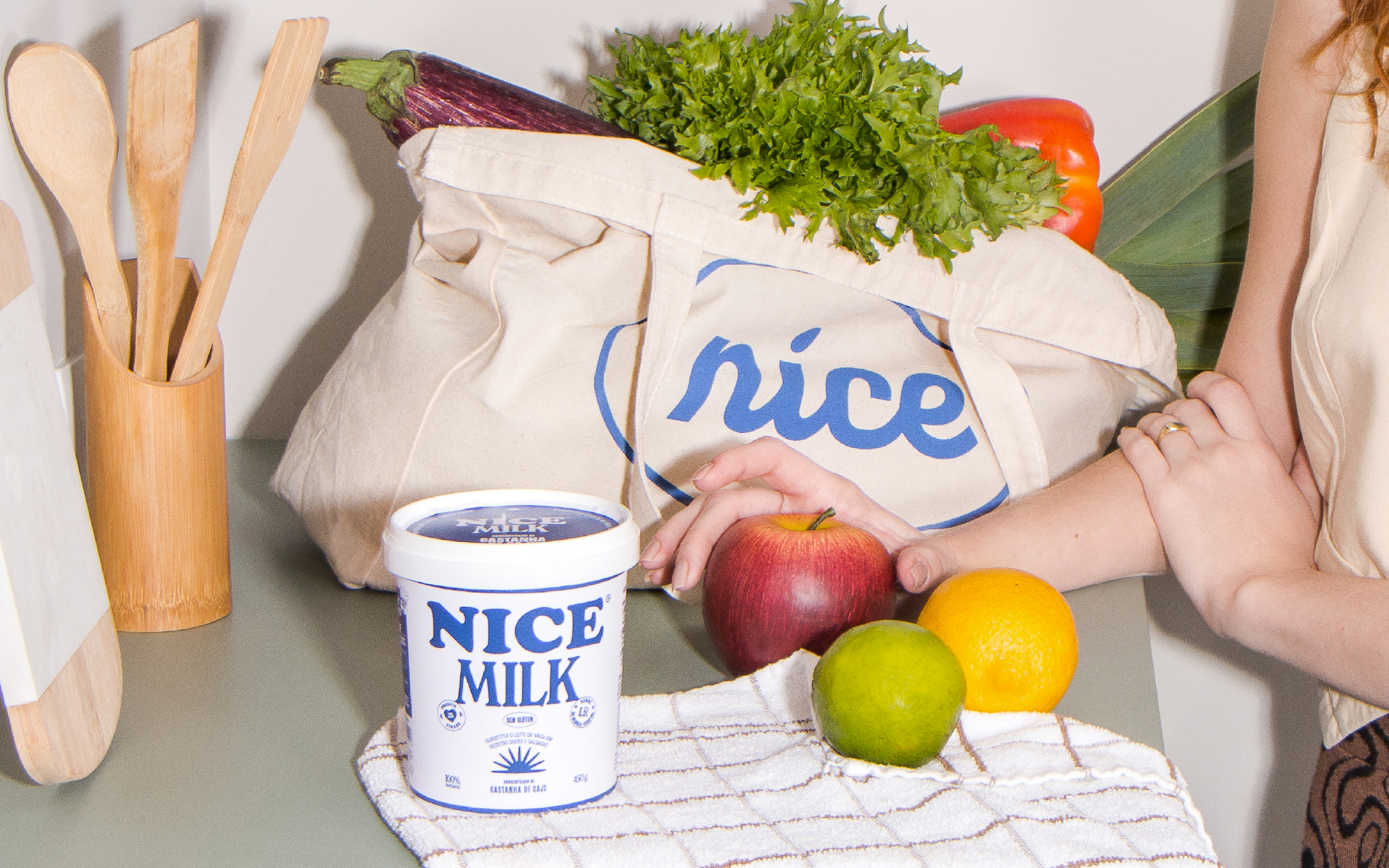
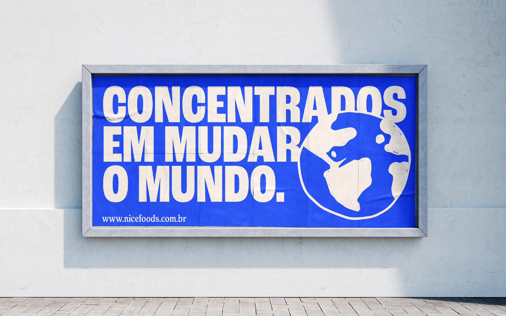
Nice Foods is a digitally native plant-based food brand based in Brazil and founded in 2020. The brand offers sustainable and healthier alternatives to animal-based dairy products. It aims to expand and democratize plant-based food products, enabling people to prepare recipes for emotional and affective bonding without experiencing adverse reactions or violating their dietary restrictions.
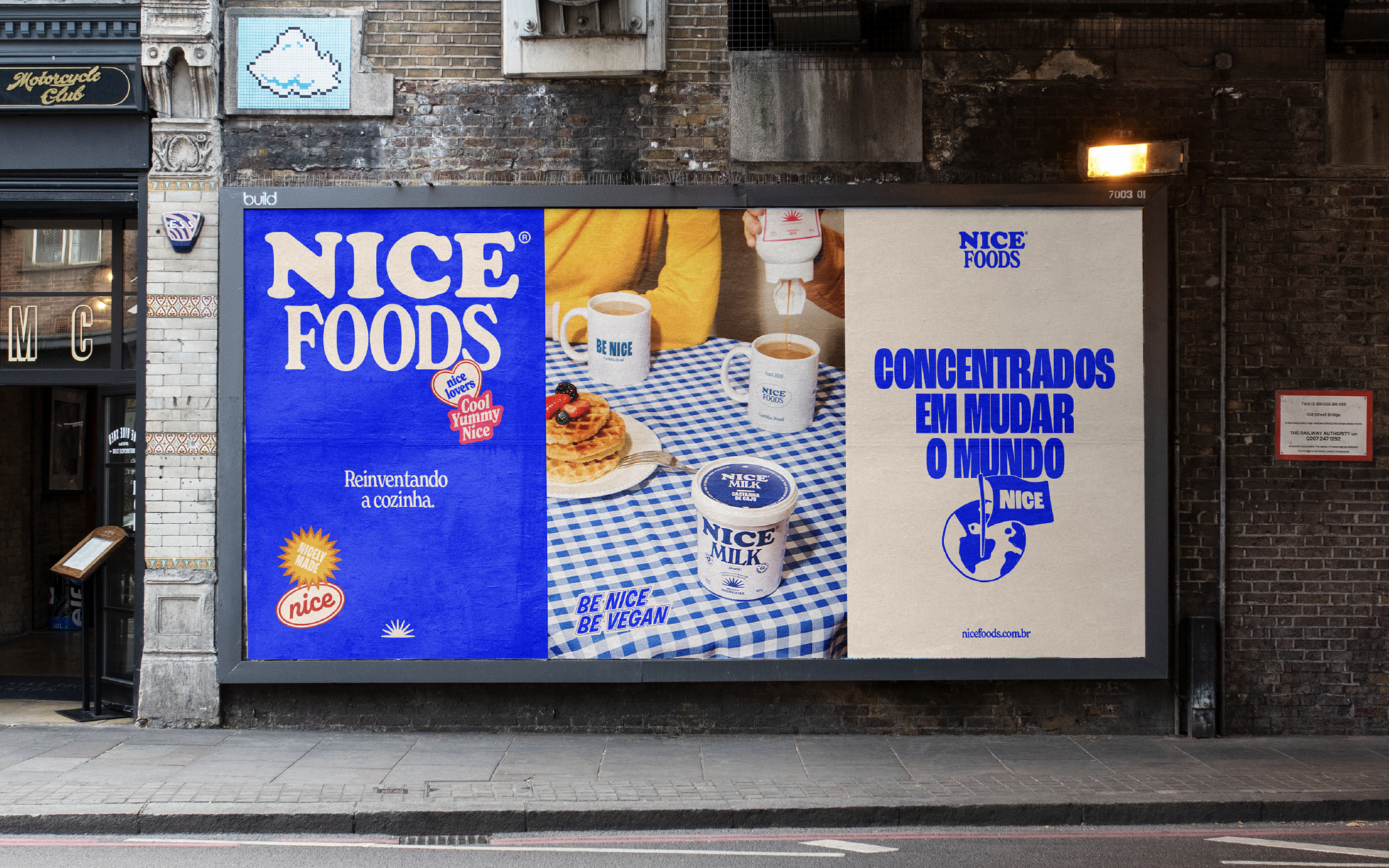
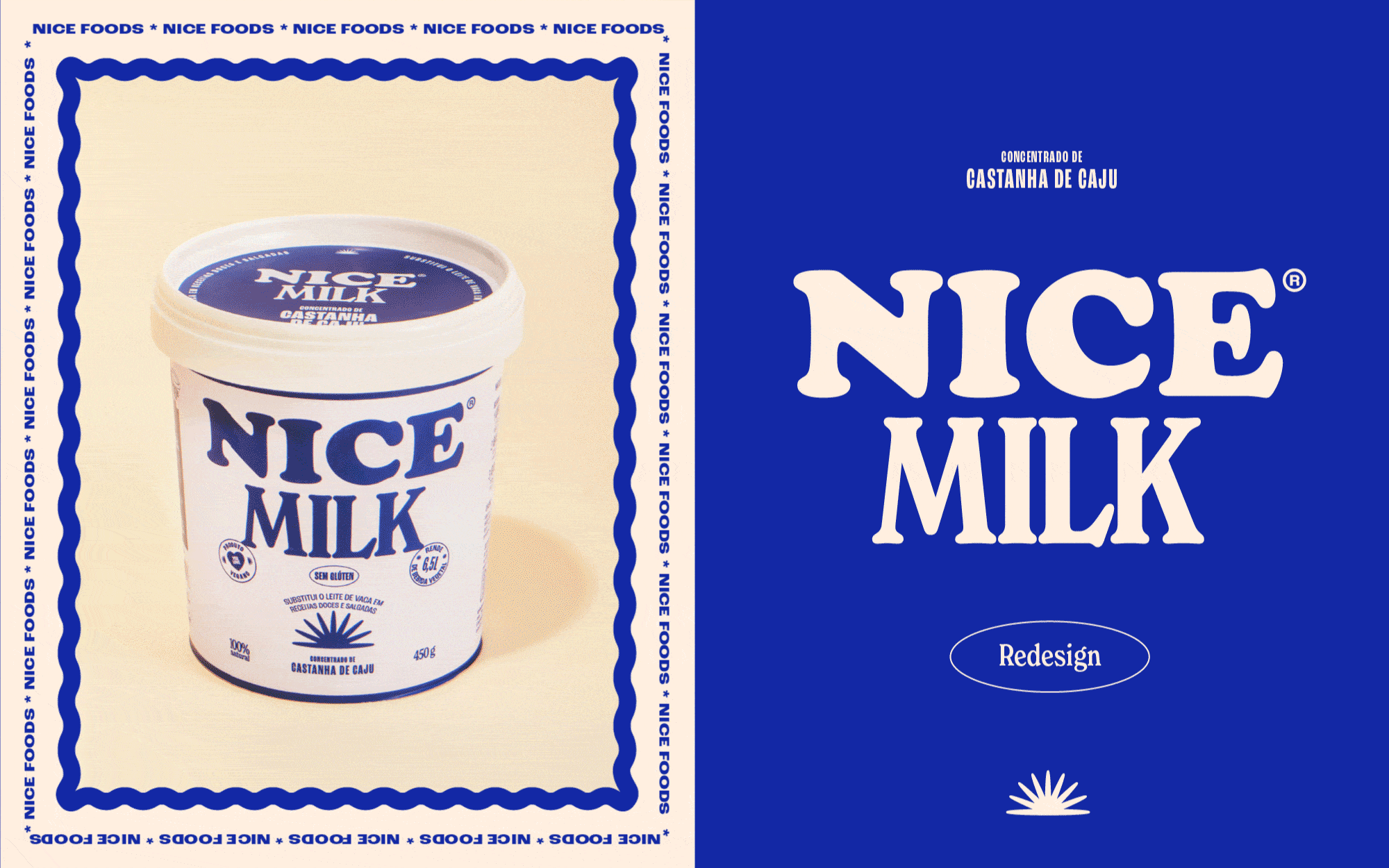
In 2022, Nice approached FatFaceStudio for a full rebranding and redesign of their packaging lines.
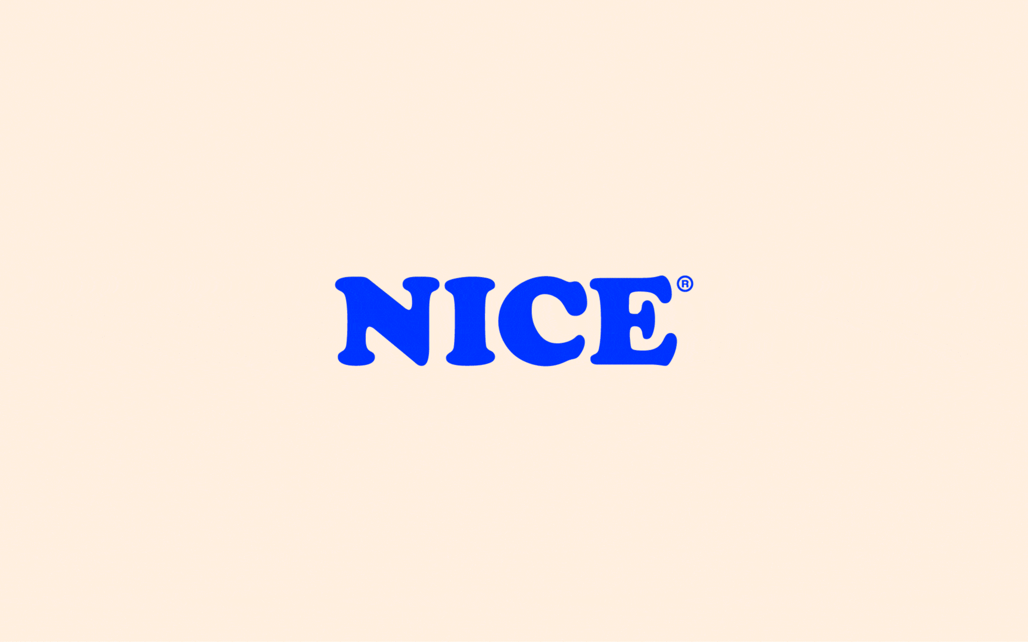
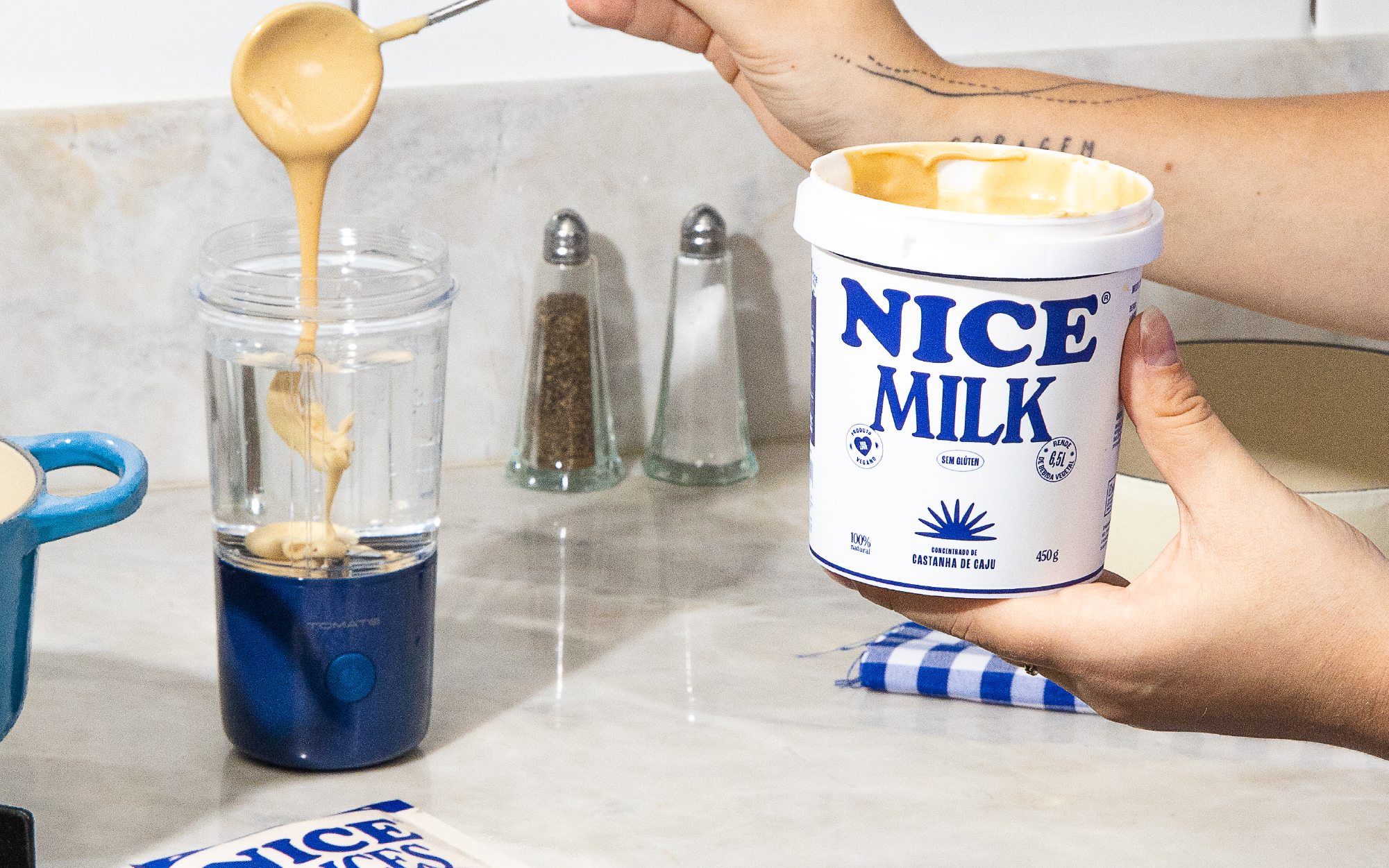
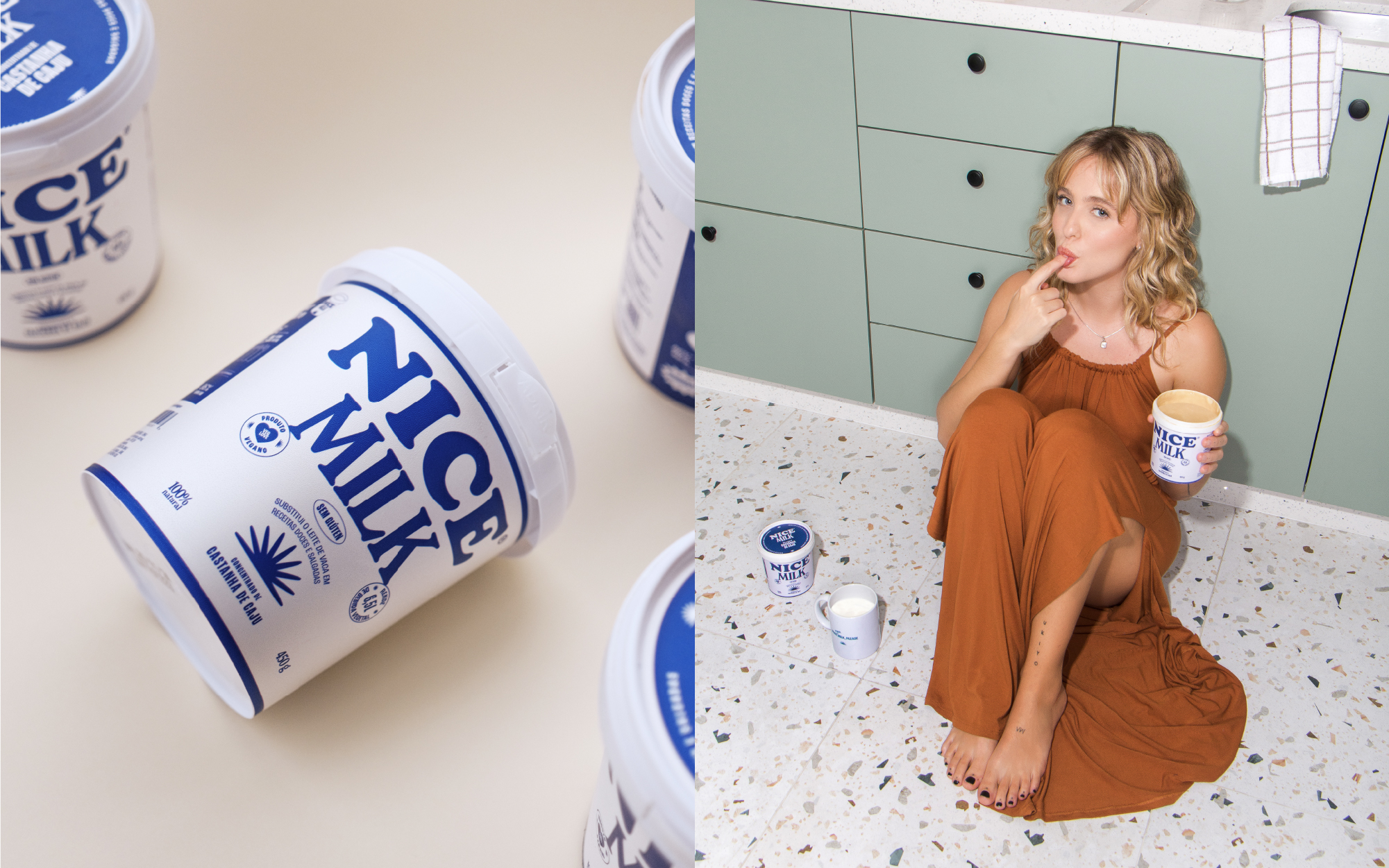
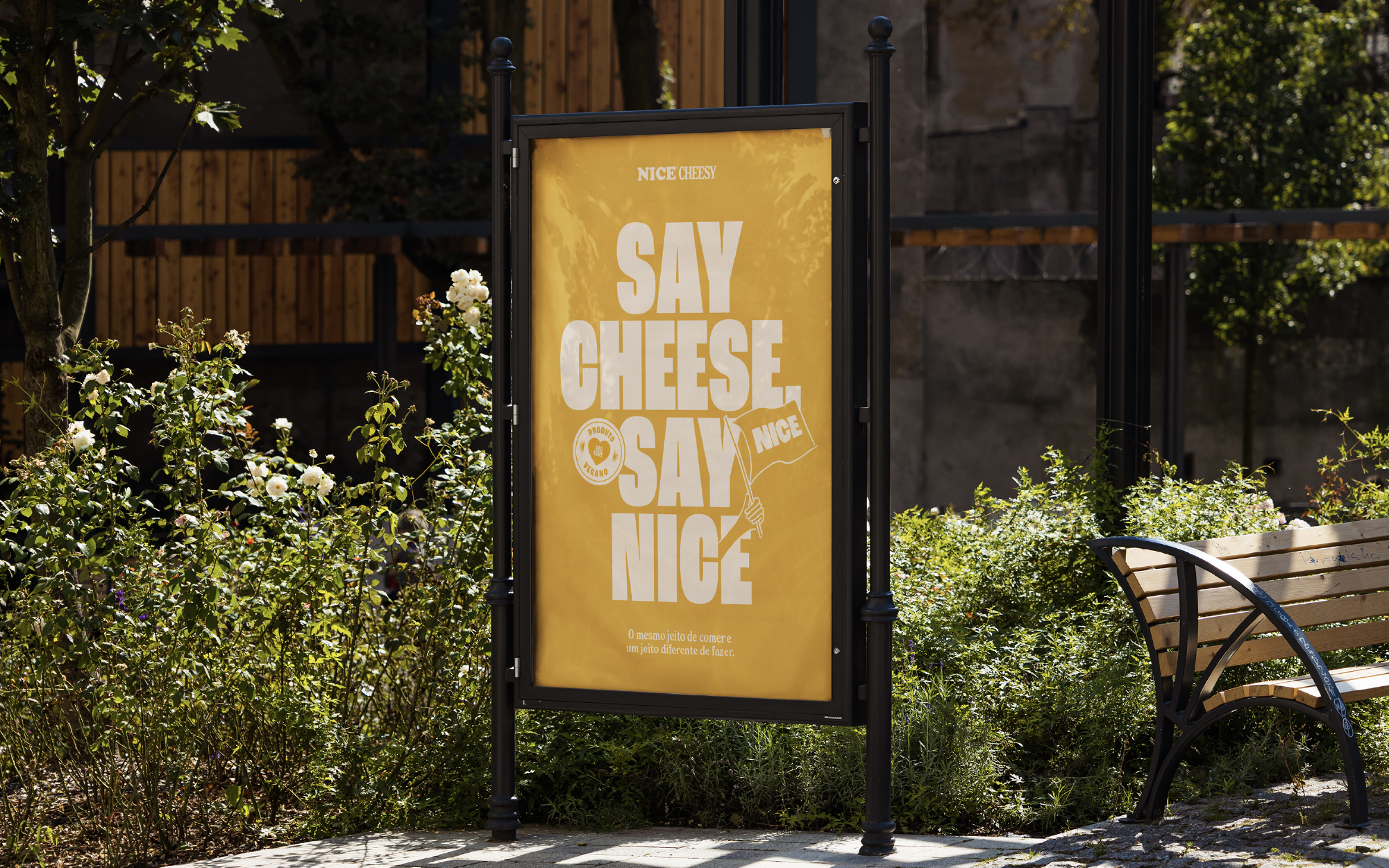
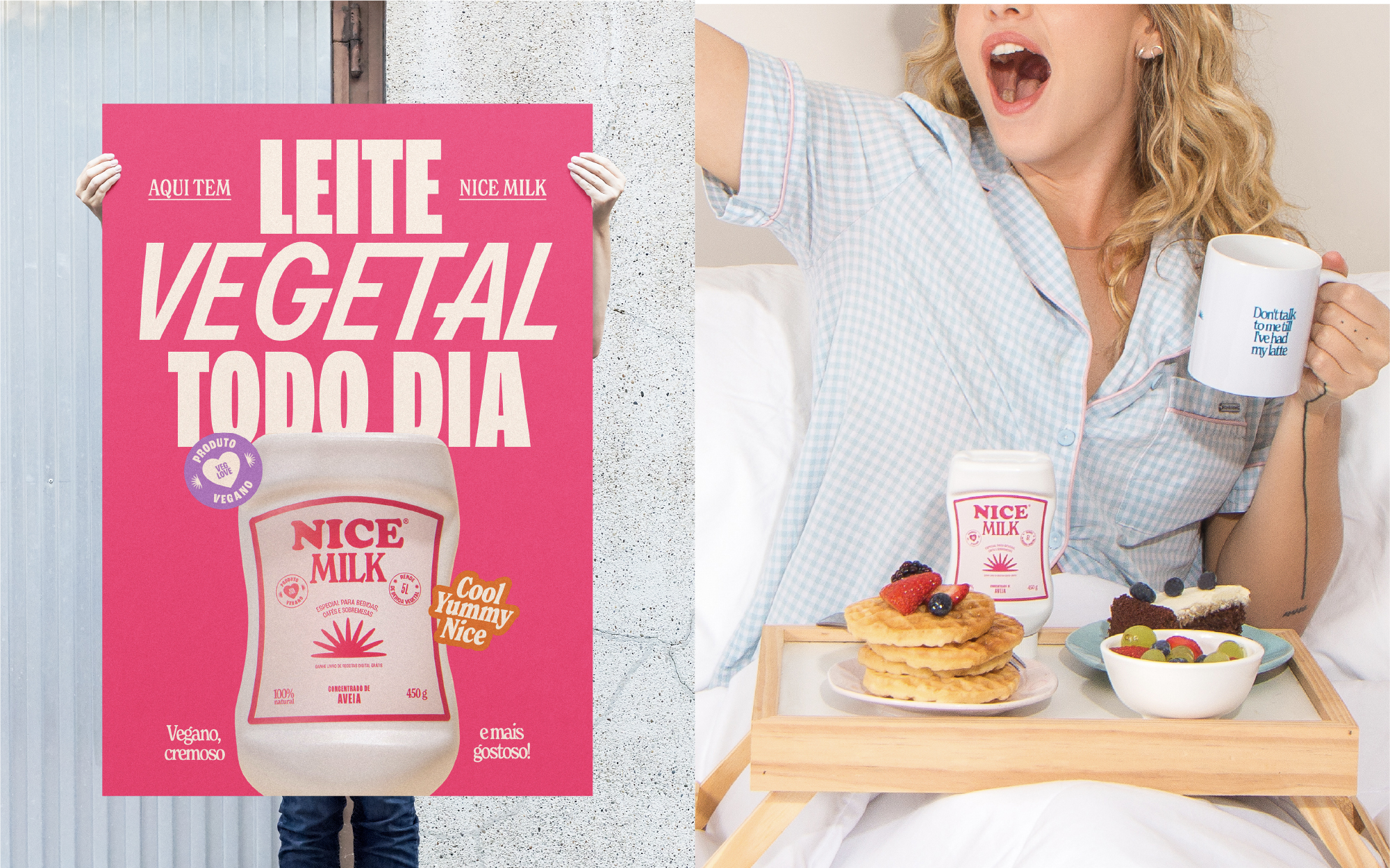
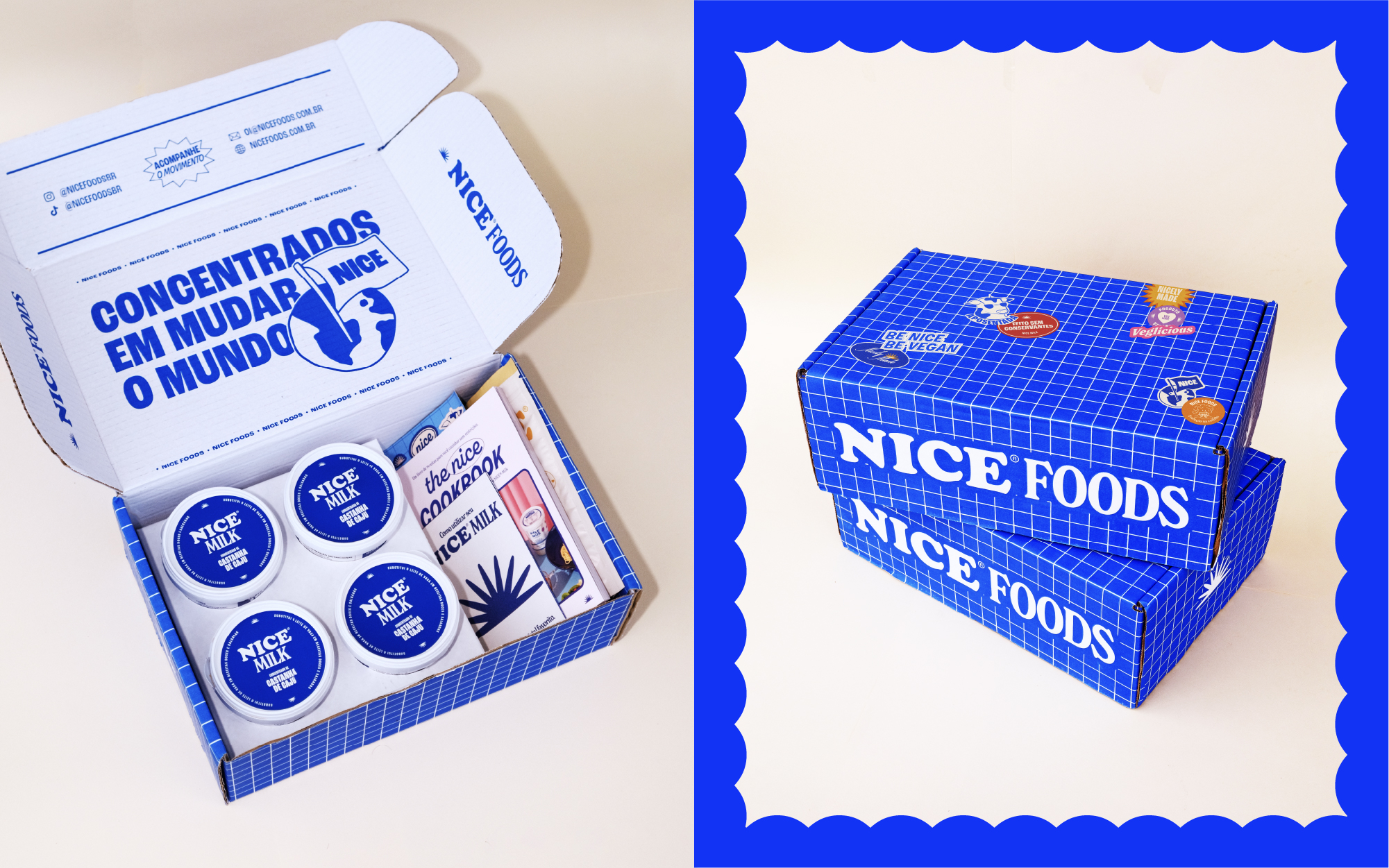
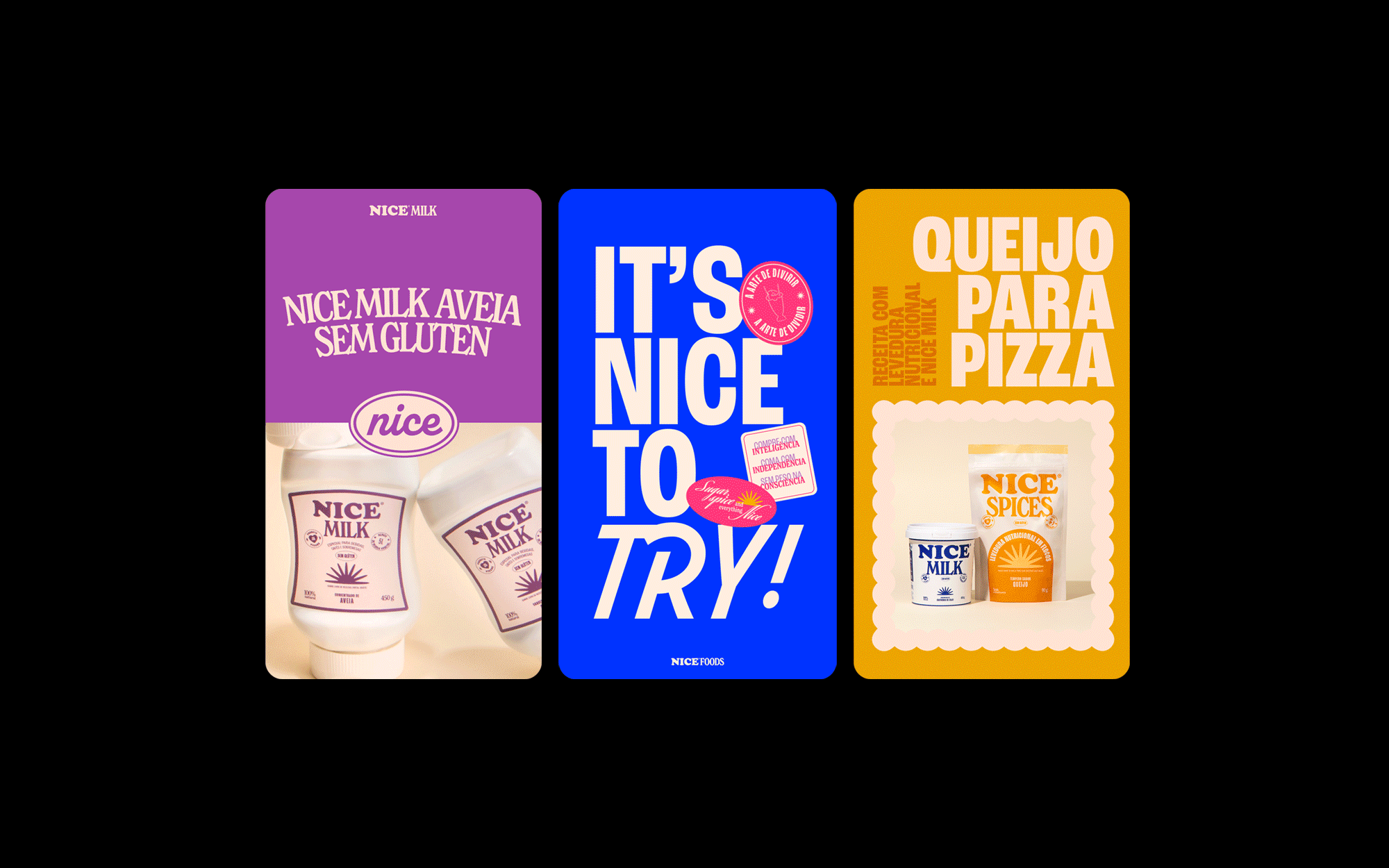
The logo redesign embodies the essence of proximity, curiosity, and excitement. The typography has softer serifs, more breathing area and better-balanced visual weight. The symbol is a redesign of its original mark, depicting the sun rising at the break of dawn, and symbolizing new beginnings.
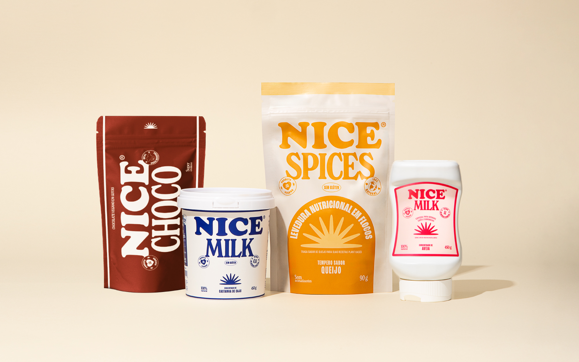
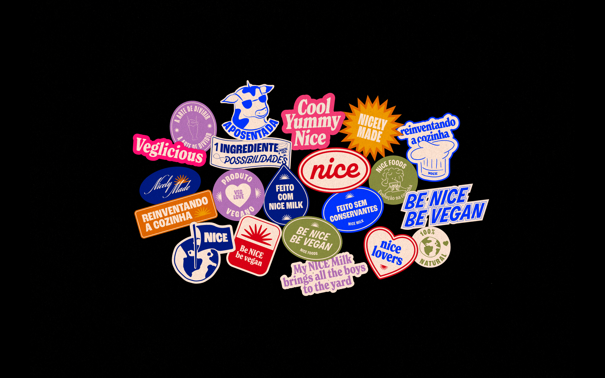
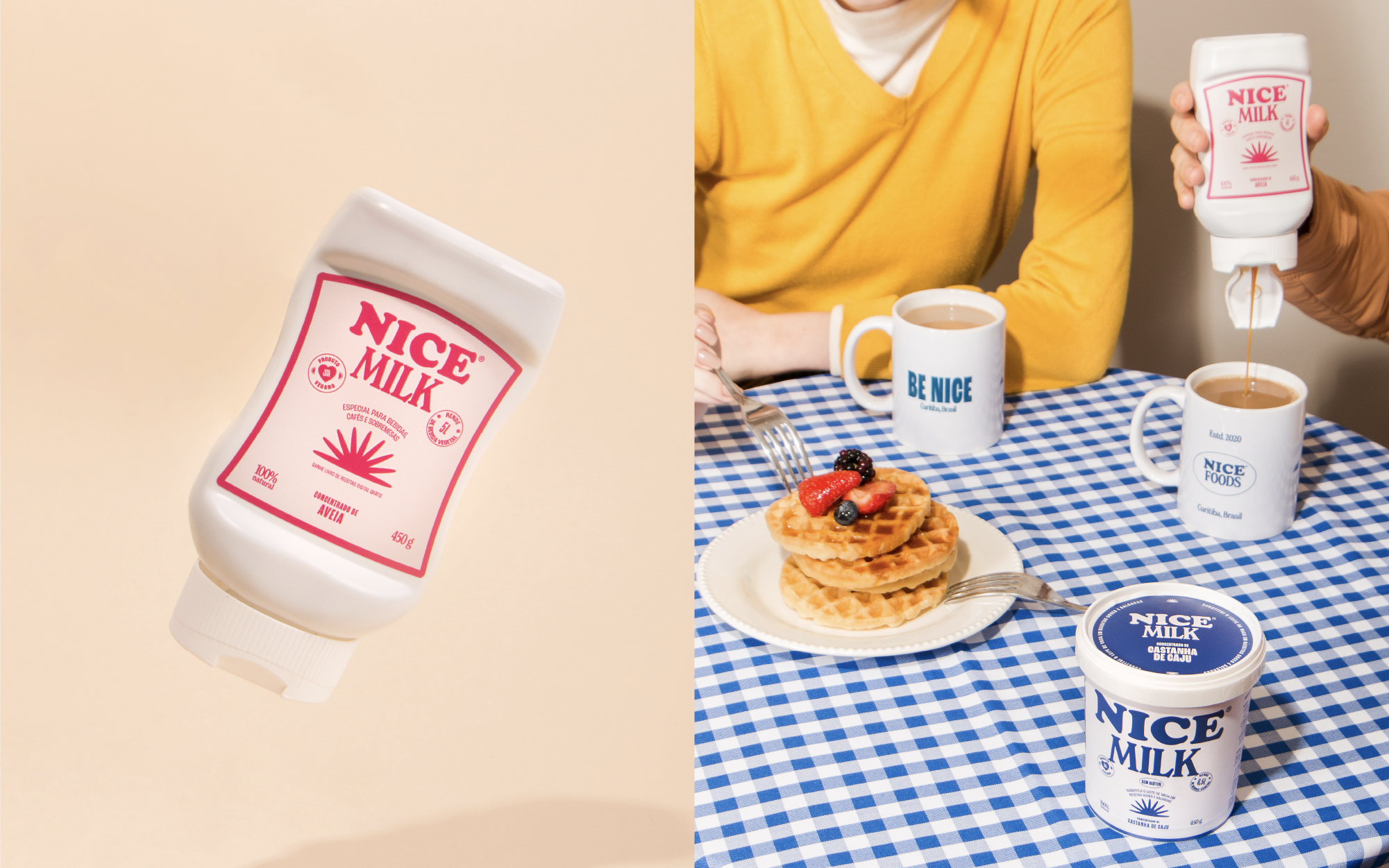
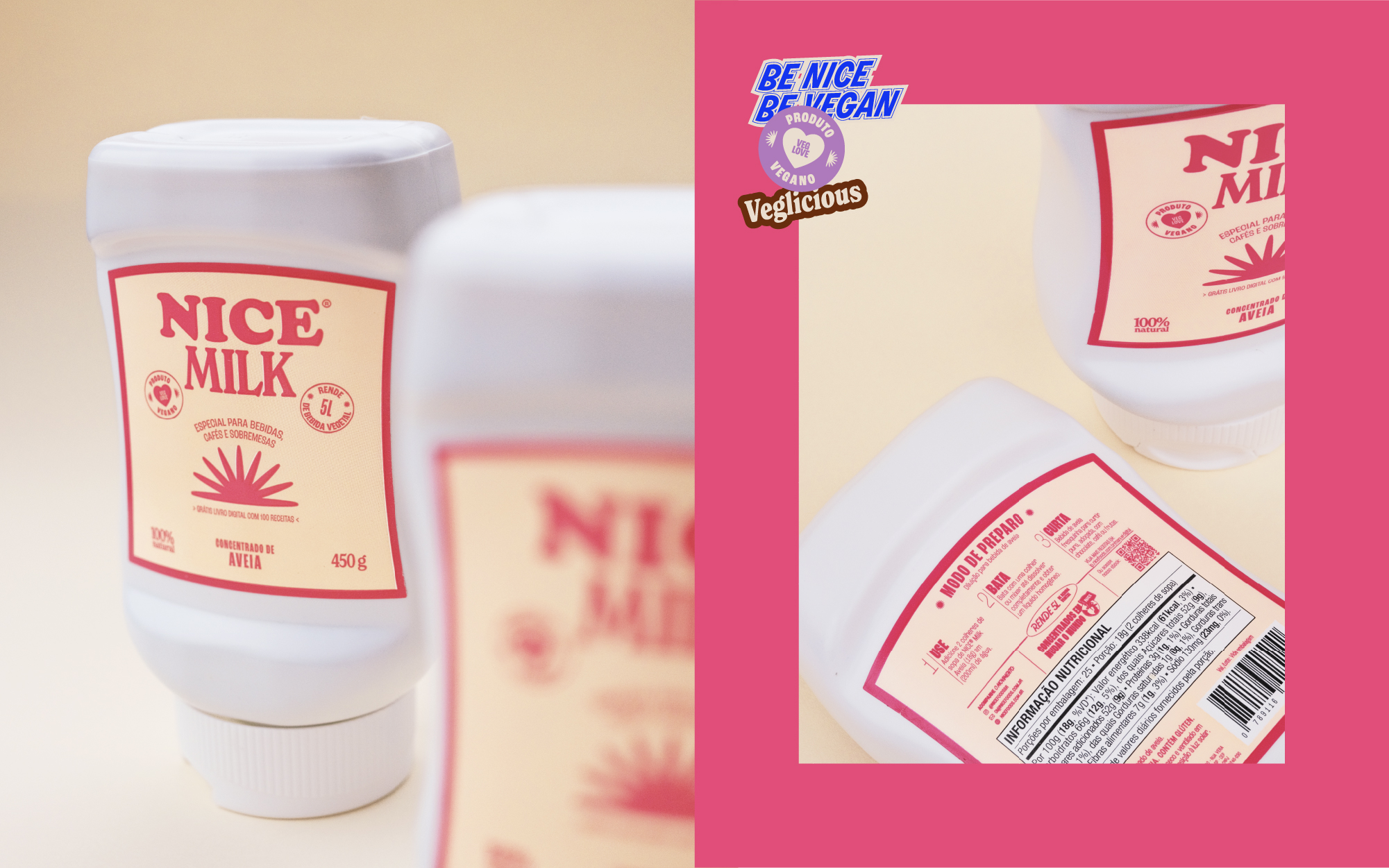
The institutional palette consists of blue, light blue and cream. The supporting palette consists of eight colors – each with two semitones, divided by products to represent characteristics of each food.
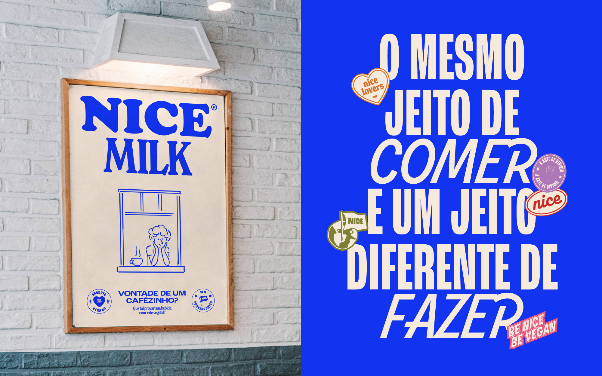
Nice Foods caters vegetarian and vegan individuals who seek a plant-based diet while also cherishing the nostalgic memory of their traditional recipes. Additionally, it’s intended for those with lactose and/or gluten intolerances, as well as individuals concerned about health and/or sustainability. Nice Foods is the only brand offering concentrated plant-based milks in Brazil. Another unique feature is its collection of online content focusing on vegan food, as the democratization of this subject matter is paramount for the company. Through these publications, Nice also showcases the versatility of its products, enhances its engagement on social networks and fosters an active community of customers.