Bloom recreates adult drinks for Robinsons
- Extending squash to answer new needs and moments
- Refreshed designs broaden appeal beyond core
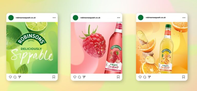
Bloom has redesigned Robinsons Cordials and Creations, two of the brand’s newer ranges that appeal to consumers looking for a squash that goes beyond the norm.
Bloom has been working with Britvic for over 15 years. This latest work is part of a full masterbrand relaunch. The more premium Cordials and Creations ranges were developed to renew interest in the dilutes category beyond families.
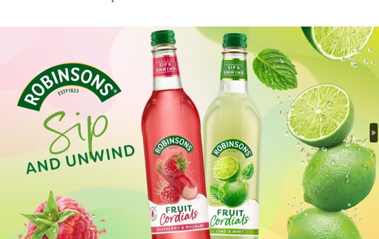
Research showed that the designs needed to work harder to tell adult shoppers that this isn’t the Robinsons they grew up with. While these two line extensions have all the refreshment of the core brand, they have much more sophisticated, exciting fruit tastes. The new packs had to live up to the premium, crafted and mouthwatering liquids.
The new designs also differentiate the ranges better, giving people choices that increase engagement in-store. Creations bursts with fruity brilliance, offering tantalising flavour collisions perfect for the consumers looking for a more exciting drinks experience. Cordials exudes sophistication, promising an upscale experience whether enjoyed with water or blended into mocktails or cocktails.
Elevating refreshment
‘Our mission was to modernise both lines, captivating a new generation of families and adults,’ says Astrid Kogler, Associate Creative Director at Bloom. ‘Cordials and Creations unleash the endless possibilities of squash. We balanced giving the designs their own unique identity while seamlessly blending into the masterbrand. Now Robinsons has the joy and excitement it deserves, with appeal for any age, on any occasion.’
Bloom’s graphics inject energy into the brand, moving from the old static fruit to a joyful sense of movement. The more premium Cordials feature refined fruits and select botanicals tumbling across the label. Creations appeals to a slightly younger audience with bold fusions and dynamic splashes. Typography plays a crucial role – Filson Soft paired with energetic scripts that balance craft with a human personality.
Bloom’s in-house Visualising Department expertly brought fruits and droplets to life. The final designs promise fruit that feels alive – add water and delicious magic is unleashed in the glass.
A fresh, modern look
These new designs play an important part in bringing Robinsons to the attention of a new generation. While its unique heritage of refreshing generations of Brits is still important for the brand, delivering joyfully refreshing fruit experiences is the key to its appeal. Robinsons now has a design that makes it more relevant to more people more often.