Cocoro Fried Chicken
Cocoro means rooster love and is based on a Japanese word that translates to “heart” or “spirit.”
The brand name embodies warmth, sincerity, and the sense of home-cooked love that goes into every chicken dish. Cocoro is suggesting that the food is made with care, passion, and a desire to nourish the soul.
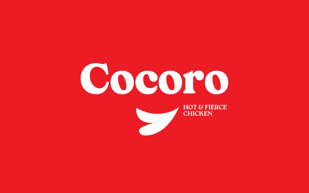
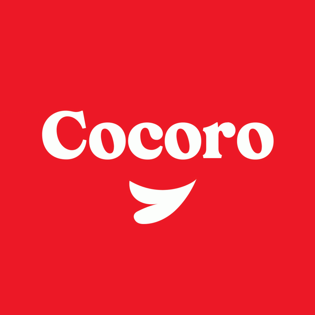
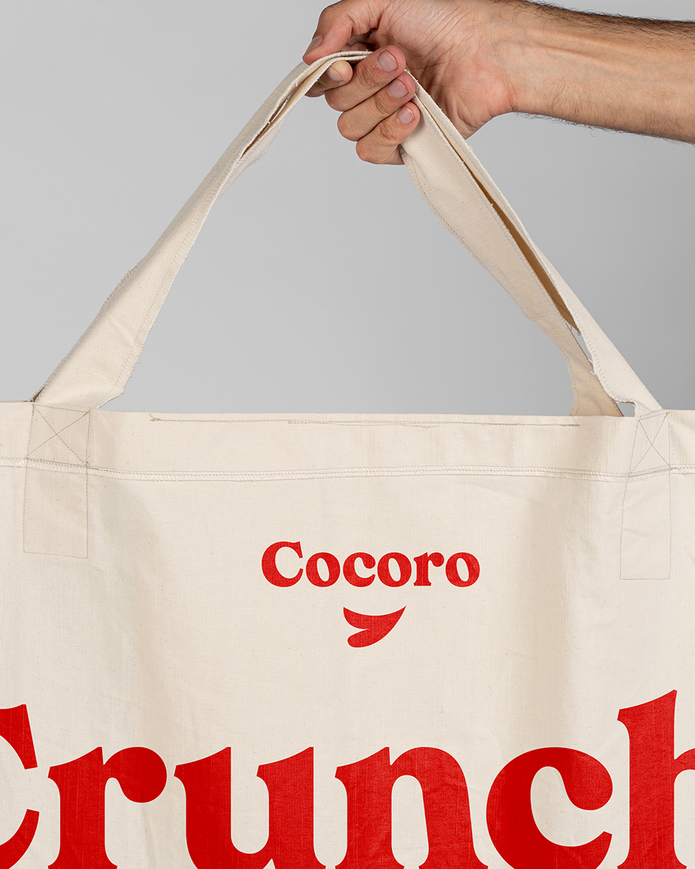
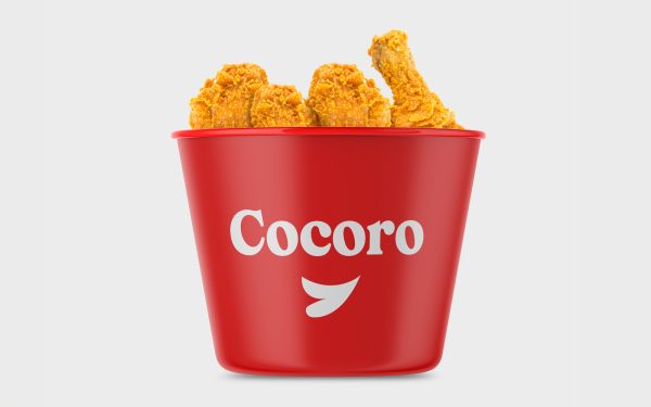
Logo Design
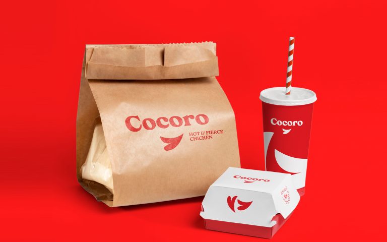
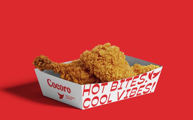
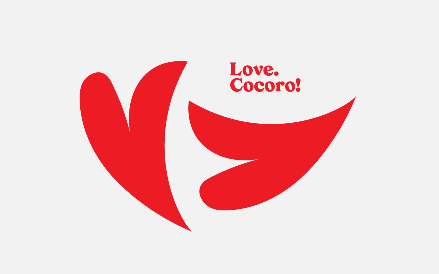
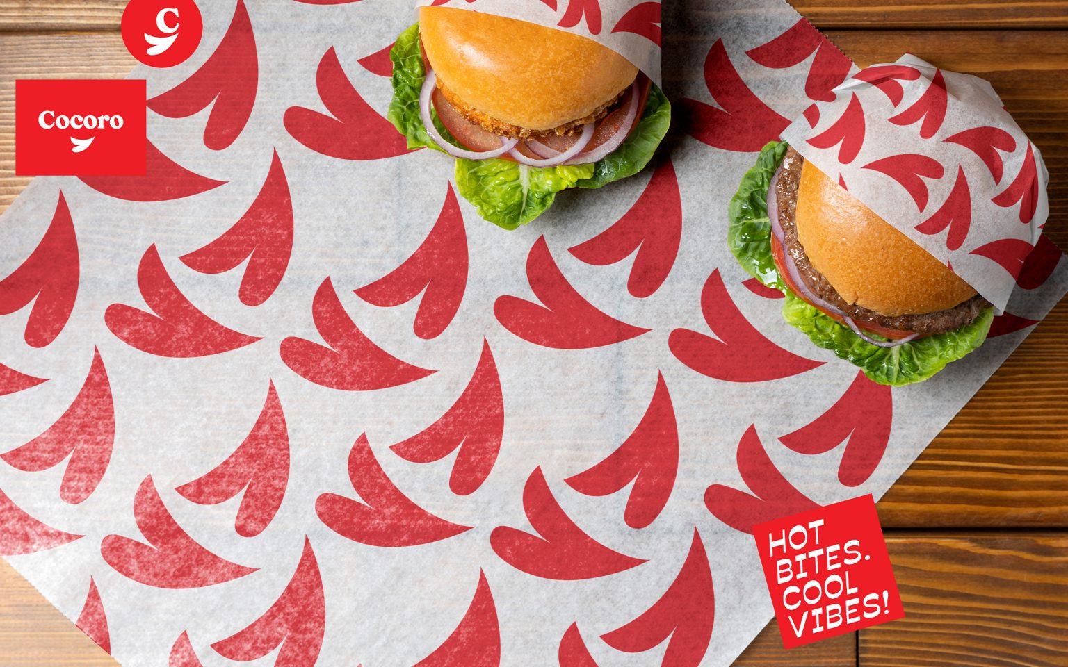
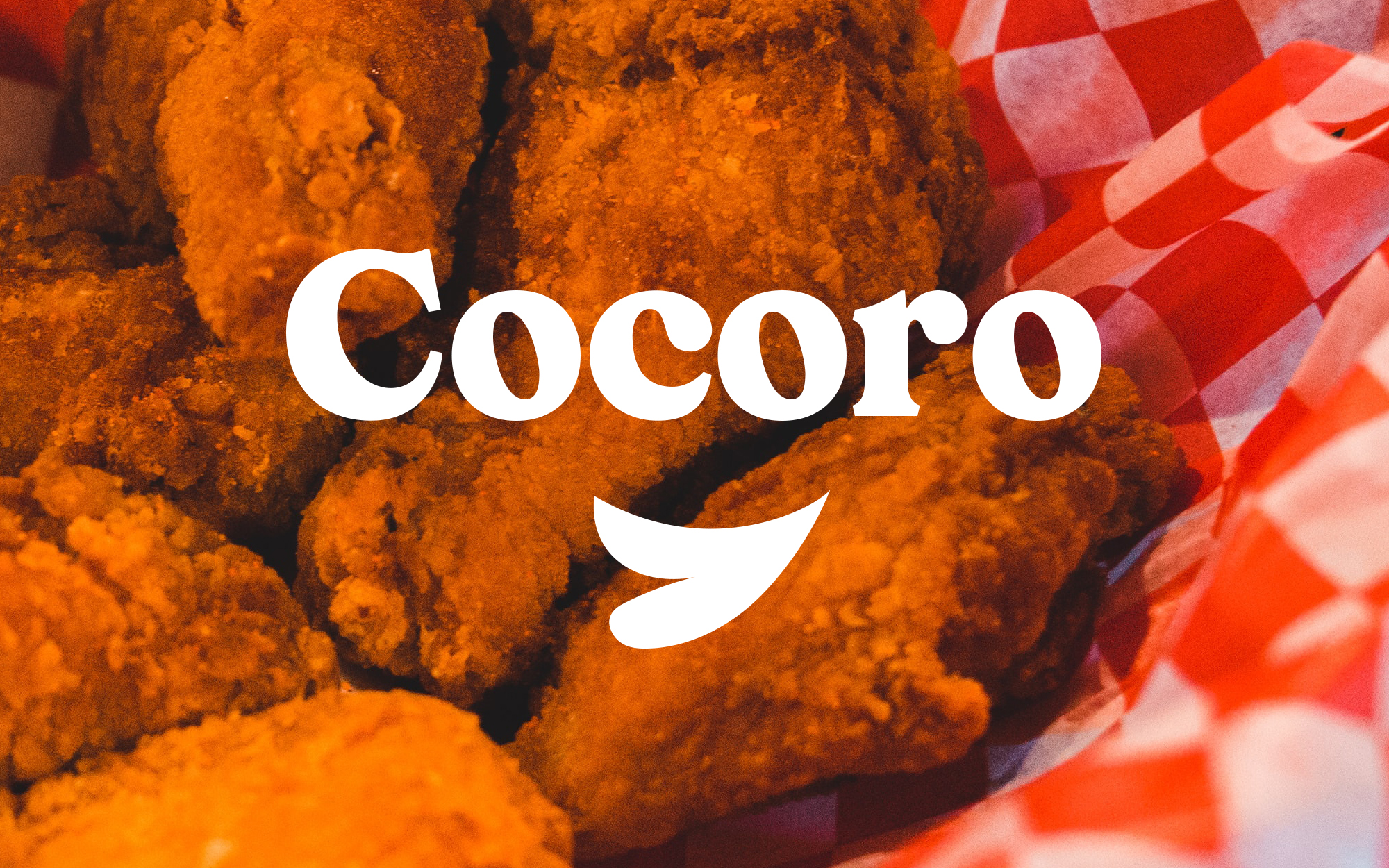
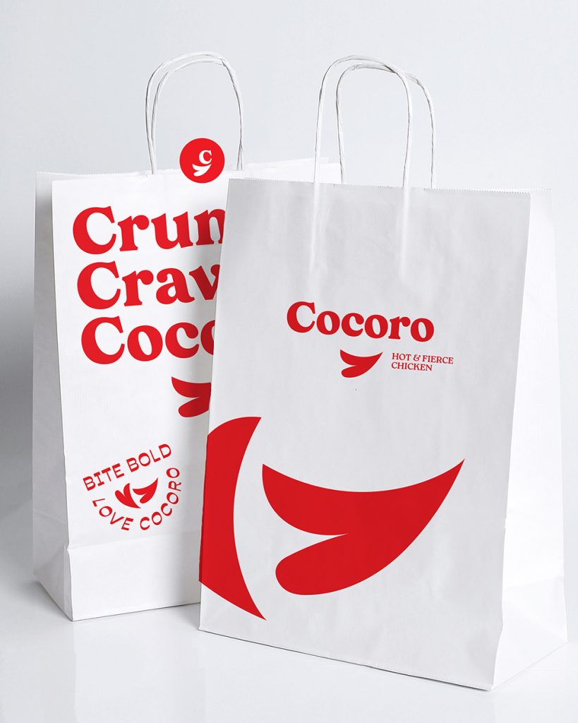
The logo conveys simplicity and modernity, aligning with the restaurant’s aim to provide a high-quality food experience in an approachable and inviting way. The heart-shaped wing underneath the logo is a powerful visual metaphor. It reinforces the “heart” aspect of Cocoro, while cleverly incorporating the primary product—fried chicken. The wing in the shape of a heart visually connects the love for great food and flavor with the restaurant’s specialty, evoking warmth and comfort. It symbolizes not just the food but the feeling of being cared for, creating an emotional bond with customers. Furthermore, some wordings are used as part of the identity, such as Bite Bold! Love Cocoro!, Hot bites, cool vibes! that are used in various means.
Color Palette
The main color is bright red that reflects warmth and appetite. The brand color stimulates hunger while also reinforcing the emotional warmth associated with Cocoro’s ethos.
Cocoro represents more than just delicious fried chicken. It’s about heartfelt cooking, creating a warm, welcoming space, and building lasting emotional connections with customers through the food they love, in a vibrant and fun way.
Brand name, Logo & visual identity
Sophia Georgopoulou Design – ALL RIGHTS RESERVED
#cocoro #chicken #restaurant #restaurantbranding #friedchicken #qsr #streetfood #fastfood #rooster #red #logo #logodesign #visualidentity #brand #sophiagdotcom #sophiageorgopouloudesign #sophiageorgopoulou #Branding #packaging #visual #brandidentity #graphicdesign #logodesigner #athens #greece