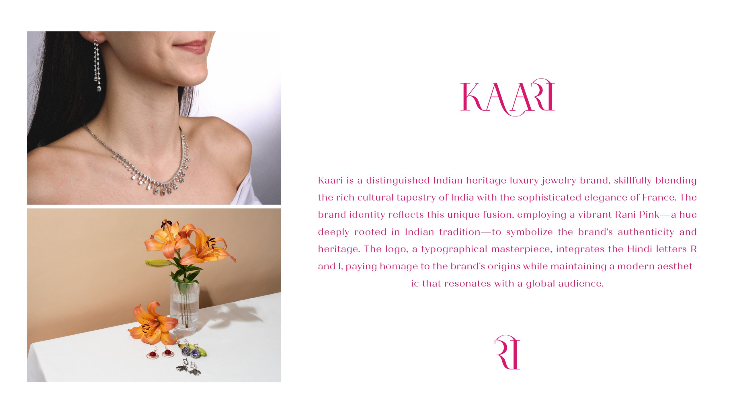
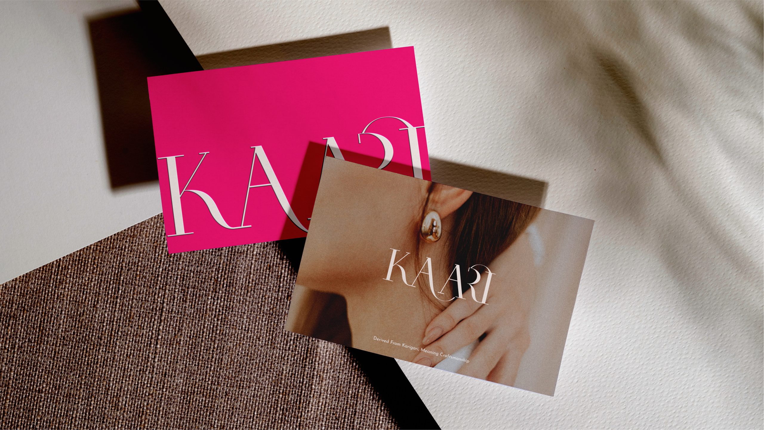
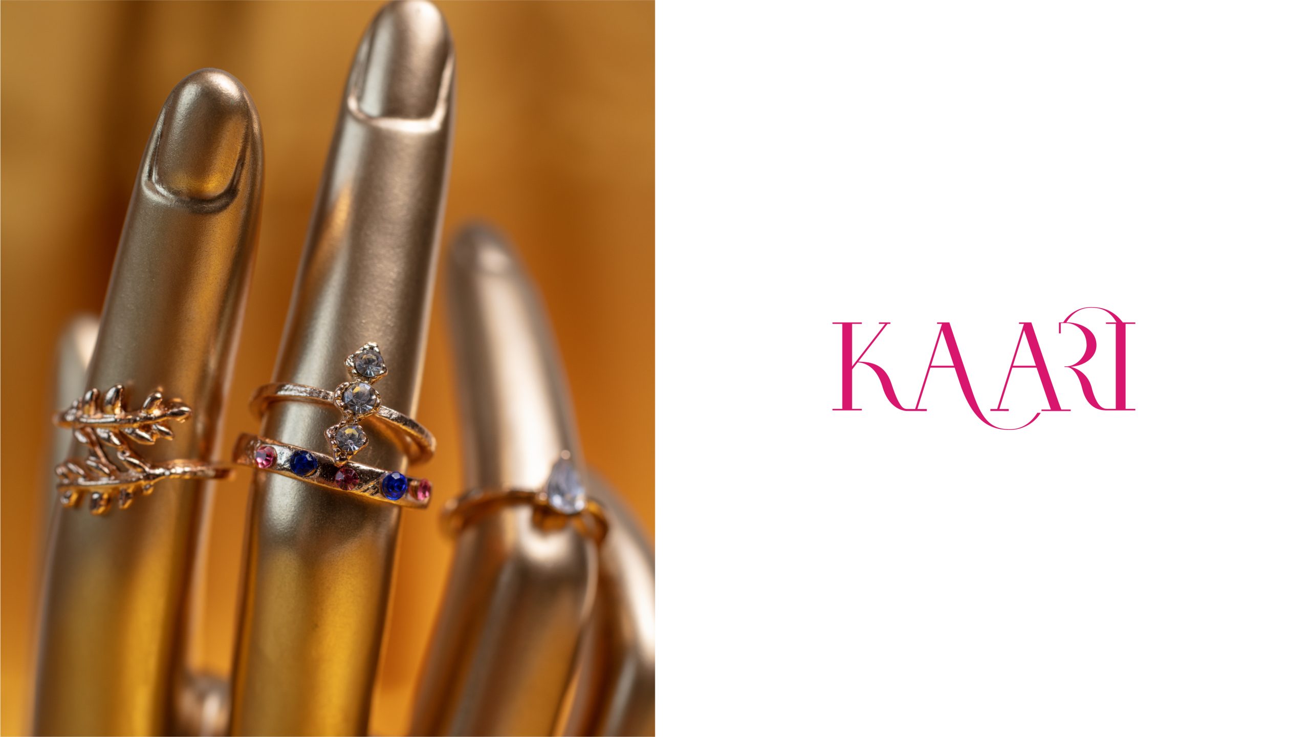
Kaari – A Fusion of Indian Heritage and French Elegance
Kaari is a luxurious jewelry brand that seamlessly blends the richness of Indian heritage with the sophistication of French design. Our brand identity captures this unique duality, creating a visual narrative that resonates with both tradition and modernity.
At the heart of Kaari identity is the bold Rani Pink, a color deeply rooted in Indian culture, symbolizing passion, royalty, and vibrancy. This bright hue is more than just a color; it’s a statement of the brand’s Indian essence, proudly representing its cultural origins while making a striking impression in the French luxury market.
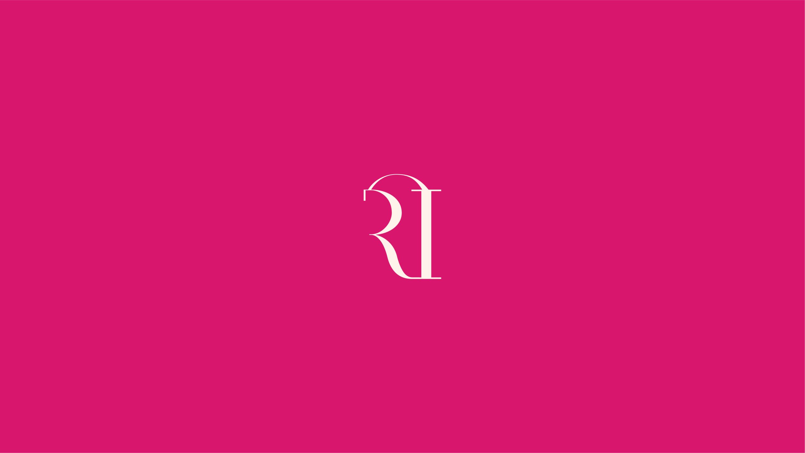
The logo itself is a masterpiece of typography, where the Hindi letters ‘R’ and ‘I’ are intricately woven together. This design not only highlights Kaari’s commitment to its Indian roots but also presents it in a way that appeals to the refined tastes of our premium clientele in France. The subtle yet powerful integration of these letters creates a symbol that is both meaningful and aesthetically captivating.
Kaari brand identity is a celebration of contrasts—traditional yet contemporary, bold yet elegant. It speaks to a discerning audience in France who appreciate the artistry of Indian craftsmanship while embracing the sophisticated allure of French luxury. Through this carefully crafted identity, Kaari invites its audience to experience jewelry that is not just an accessory but a piece of cultural art that tells a story of timeless elegance.