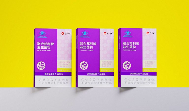
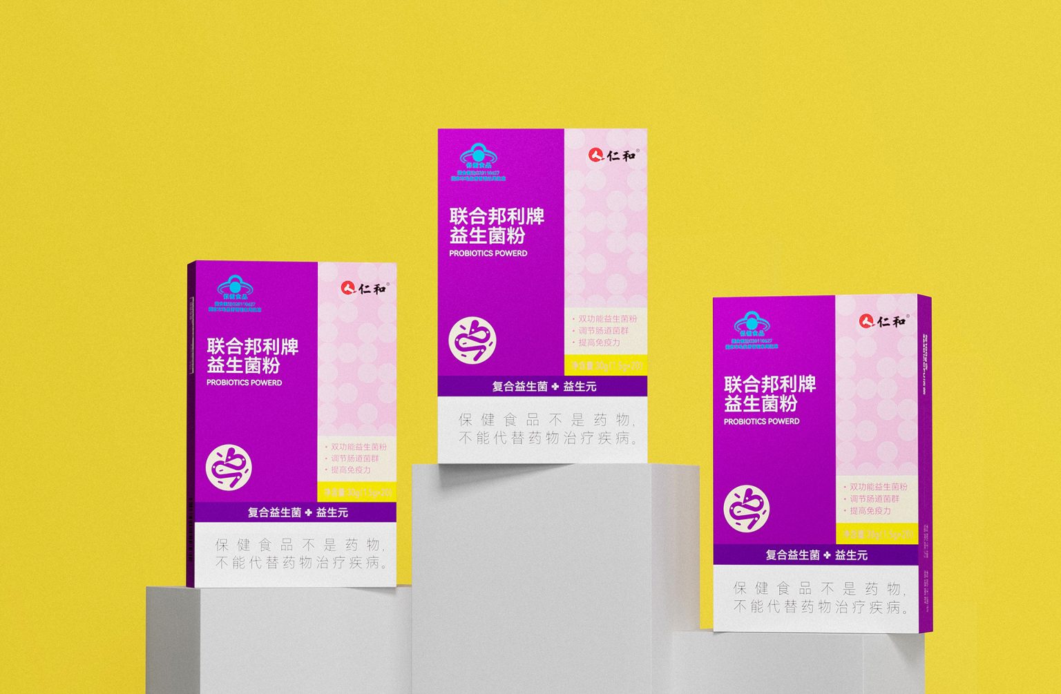
The packaging design for this probiotic powder focuses on a clean and straightforward visual approach. The primary green color represents health and vitality, creating an immediate connection to wellness. The yellow dotted area adds a playful touch while maintaining a sense of balance. The bilingual typography, in both Chinese and English, ensures accessibility for a wider audience. The icons and symbols effectively communicate the product’s benefits without overwhelming the viewer, enhancing user understanding. Branding elements are positioned prominently, conveying trustworthiness and aligning with a professional healthcare aesthetic. The use of contrasting colors and a clear layout helps differentiate key information, enhancing readability and creating a visually appealing, functional design.


