The Brief:
The challenge was clear transform the existing packaging design for VS Mani & Co. while retaining the essence of the current structure and design guidelines. The goal was to create a packaging system that reflected the brand’s authentic South Indian heritage while addressing the disconnection between the current westernized coffee packs and the generic snack designs.
The Idea:
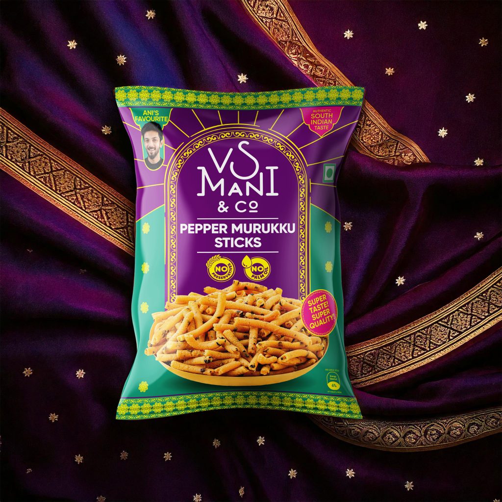
We envisioned a packaging design that brought South India’s rich cultural tones to life. By introducing traditional patterns, vibrant yet regal colors, and subtle motifs, we created a visual identity that celebrates the brand’s roots. Each pack reflects the warmth, authenticity, and vibrancy of South Indian culture, creating a cohesive brand story across coffee and snack ranges.
The Execution:
The redesigned packaging draws inspiration from the vibrant and intricate patterns of South Indian sarees and the striking colors found in Tamil Nadu’s (India) temple sculptures. We aimed to maintain the brand’s established minimalistic style while enhancing its cultural connection through thoughtful use of color and motifs.
By incorporating bold, contrasting colors reminiscent of saree combinations, we ensured the packs would resonate deeply with customers, evoking a sense of familiarity and nostalgia. The motifs, inspired by traditional saree borders, add an elegant touch, elevating the visual appeal without overwhelming the design.
These elements not only create a cohesive and culturally rich identity but also provide a high recall value for the product and brand. By keeping the core colors of the coffee packs intact, we respected the existing customer recognition while introducing layers of cultural depth. The result is a packaging design that feels rooted in tradition yet refreshingly modern, capturing the essence of South India in every detail.


