HALFDAY Unveils Brand Refresh, Marking a New Era for the Iced Tea Company
Earthling Studio makes a splash with the rebrand of HALFDAY, reimagining the prebiotic iced tea as a symbol of fun, freedom and the feeling that good times are ahead.
Halfday Iced Tea approached Earthling Studio with the ambition to become the definitive premium prebiotic iced tea.
With the better-for-you drinks category becoming increasingly crowded Halfday needed to ensure its functional benefits were clear and that the great classic taste of the liquid shone through. The aim was to create an aspirational yet welcoming brand world for shoppers looking to balance healthy choices with maximum flavor and a little maverick fun.
This imperative sent the team on a journey to identify an occasion and capture a feeling that the brand could own and build a moat around; one that felt appropriate to ready-to-drink iced tea while being uniquely suited to Halfday. After research and ideation, the answer turned out to be right in front of us.
Call It a HALF-DAY
With the pace of life ever increasing and consumers yearning for a little time to reset and recharge, the spirit of a half- day became the perfect muse. The sunny midday moment when worries are kicked to the curb and the feelings that good times are ahead are unleashed. Led by the brand idea and tagline, “Make a Break for It” the team strived to make Halfday synonymous with freedom and escapism; to be a 12-ounce excuse to let your hair down, grab some friends and hit the gas towards somewhere good. Rejecting the category cliches of provenance, purity and folksy front porches, HALFDAY is all about capturing the buzz of ditching something boring and making the most of the time we’ve got. No worries, just potential.
Capturing the Spirit of an Era
This brand idea dovetailed perfectly with the classic taste sitting at the heart of Halfday’s product, inspired by those brands that rose to prominence in the 90s heyday of iced teas. A liquid that is sweet and fruit-forward made relevant for today with less sugar and prebiotics. This nostalgic taste harked back to an era of rising freedom and creativity, of eclectic color and analogue and digital technologies colliding. This combined with the brand idea provided a rich palette to start to build a refreshed brand identity.
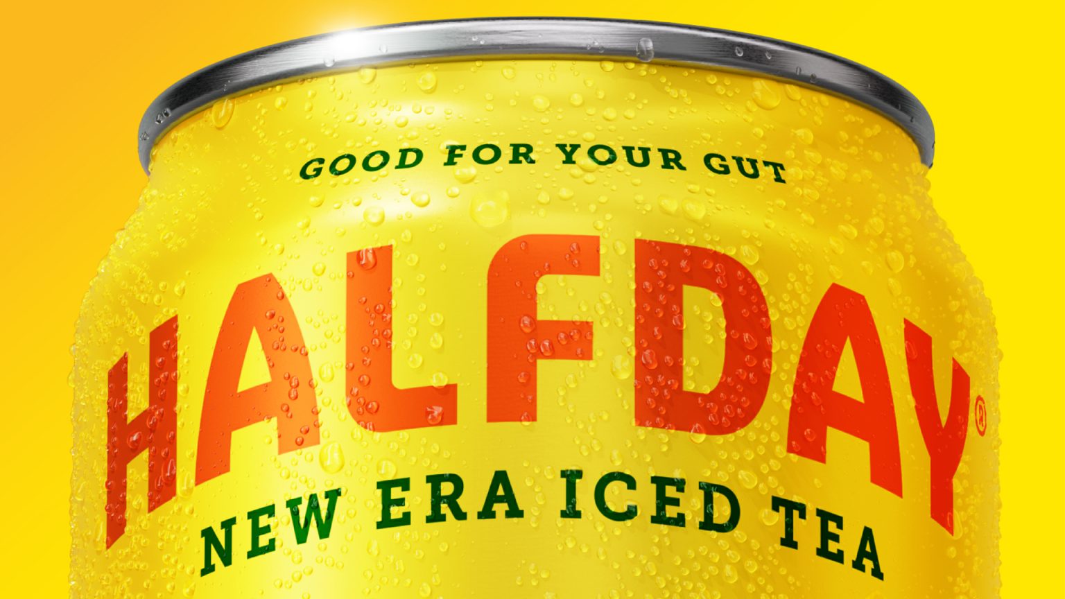
Logo – The new arched logo, crafted in collaboration with Rob Clarke, pays homage to the spirit of an era with a refined expression that’s contemporary, uplifting and unique, delivering greater clarity and standout across the brand. Two secondary versions of the logo (wave and repeat) provide flexibility for applications beyond the core packaging.
Type – Born of the logo and inspired by 90’s posters and editorial design, the new headline font (Strippy regular), was chosen for its bold, square and charismatic forms. The accompanying sub-head font (Museo slab) adds a touch of craft and premiumization to the mix.
Color – An unashamedly bodacious mix of contrasting colors, inspired by the product’s sweet flavor and loud fashion from iced teas heyday.
Illustration and Patterns – A wider suite of bespoke illustrations, created with the help of Ana Moreno, were inspired by the ‘make a break for it’ brand idea, capturing moments of escapism like the lakeside canoe, backyard pool floatie and the beach chairs. Vivacious patterns featuring sliced and cut versions of the hero fruits capture a maverick spirit with a modern twist.
Tone of voice – The brand’s TOV is evocative of Halfday’s glass-half-full outlook on life inspired by the co-founder’s health journey that led to Halfday’s creation, radiating enthusiasm and excitement with a maverick carefree spirit. No worries, just potential. The brand idea ‘Make a Break for It’ features alongside other freedom-related rallying cries like ‘out of office in a can’, ‘we’ll see you out there’ and ‘call it a Halfday’.
Packaging – The new packaging evokes a sense of nostalgia for bright and carefree days while placing renewed emphasis on key health and nutritional benefits. Proudly showcasing the new logo, with an accompanying statement of intent (New Era Iced Tea), as well as bold colors, playful illustrations of the ingredients and a clear visual hierarchy. Every can also features a back-of-pack discovery ‘moment of escapism’ illustration, inspired by each flavor’s individual recipe.
This adds up to a brand that confidently proclaims good times are ahead. So, grab a HALFDAY, let your hair down and feel the sun on your back. We’ll see you out there ✌
Earthling Creative Partner, Stephen McDavid
“Halfday’s reimagined branding is designed to confidently proclaim good times are ahead. A visual and verbal expression, that proudly announces a new era for the iced tea company taking inspiration from its playful past but looking forward instead of back. With its benefits and classic taste shining through, along with an evocative occasion at the heart of the brand we’re aiming to surprise and delight loyal consumers while captivating a new generation of iced tea drinkers.”
HALFDAY Co-Founder, Mike Lombardo
“From day one, Halfday has been about delivering more than just iced tea – it’s about crafting moments of joy and wellness that feel both authentic and refreshing. This rebrand marks the pivotal moment for us, showcasing how far we’ve come and the bold and innovative future we’re building. We’re here to redefine iced tea with gut-healthy benefits and significantly less sugar – without ever compromising on taste.”


