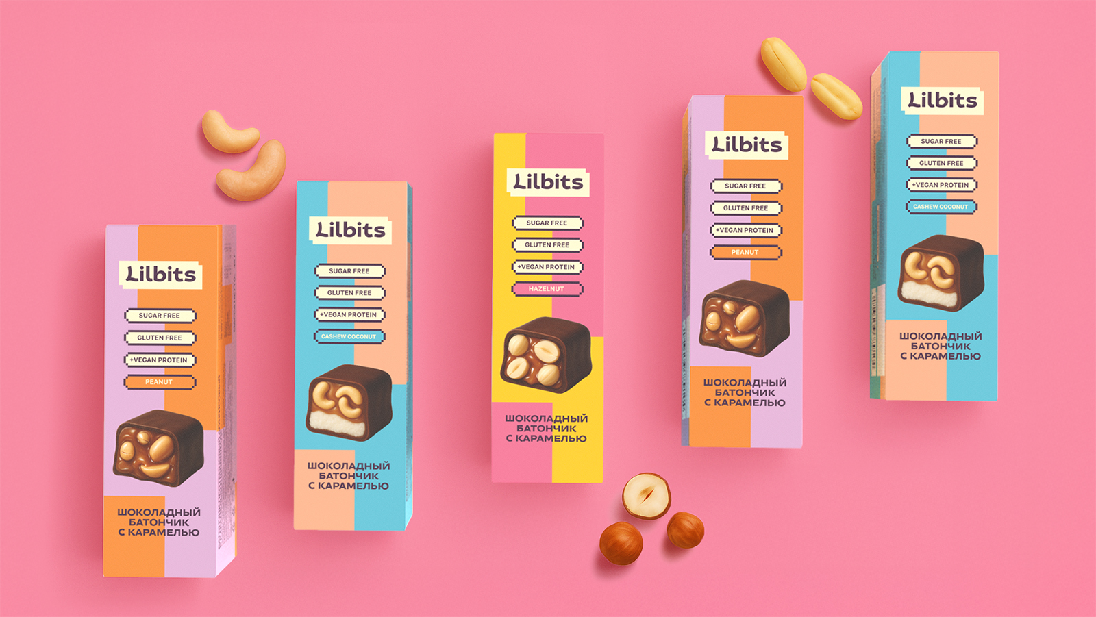
Lilbits — a little more than just natural snacks!
Objective
Develop a name, brand platform, and packaging design for a line of natural snacks, establishing the foundation for flavor differentiation.
Target audience: Active women in central regions, aged 25–35, who follow a healthy lifestyle. The primary brand archetype is the Creator.
Purchase missions: Convenient and tasty snacking.
Solution
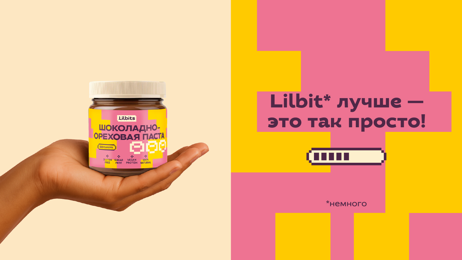
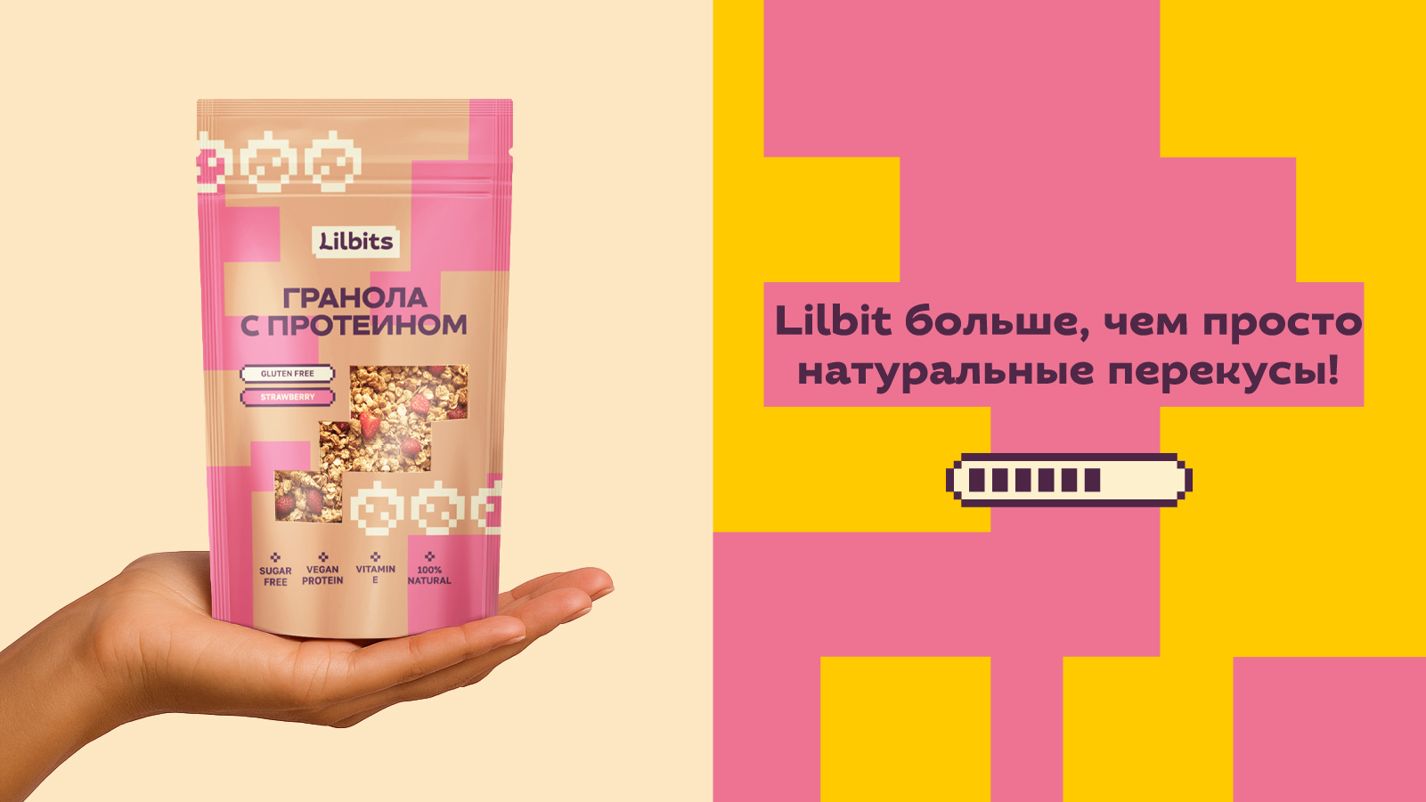
We created a compact, lively, and memorable name—Lilbits—which plays on the words little bites (small bites of pleasure) and lil’ bit (reflecting the brand’s concept of small steps toward a goal).
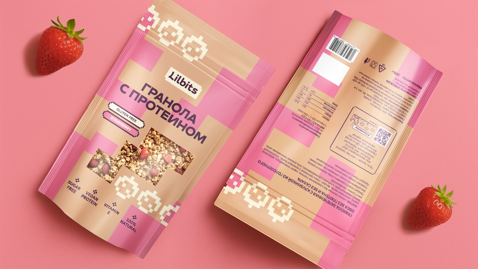
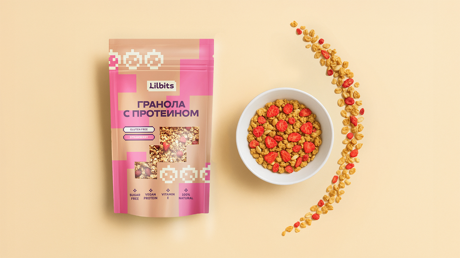
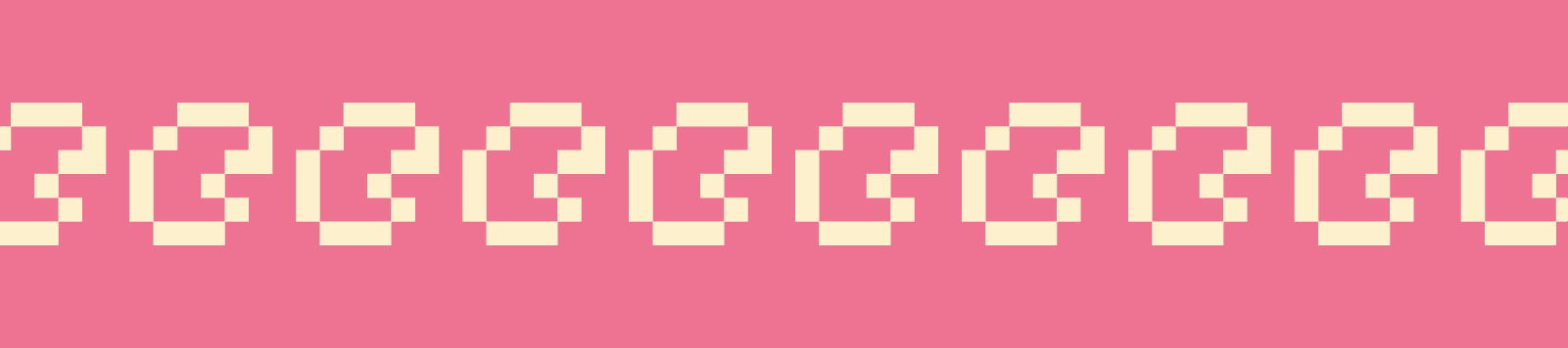
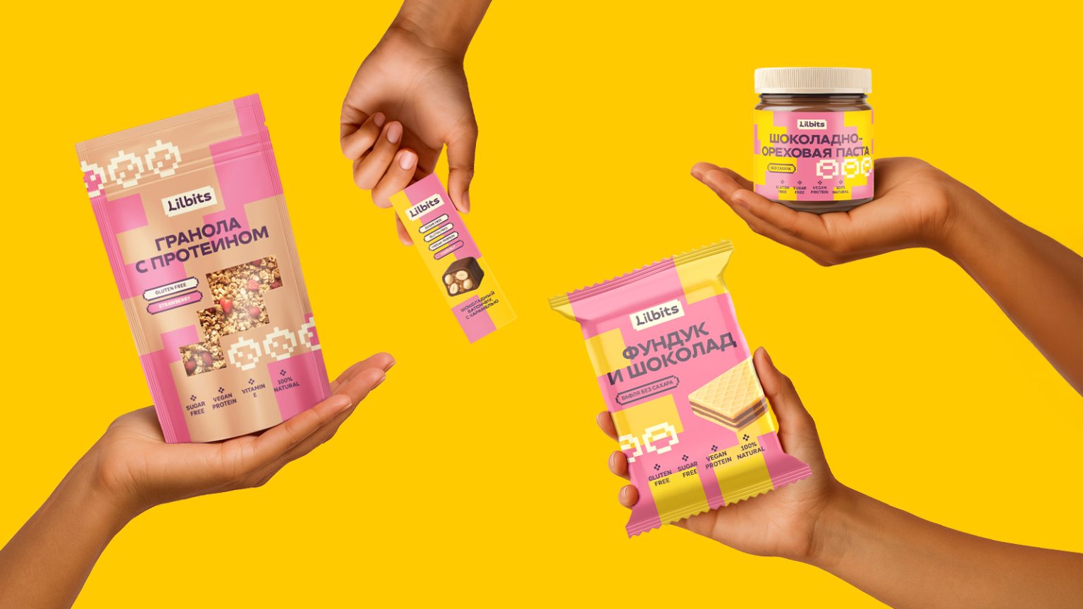
Visual style: A pixel pattern nods to retro gaming, evoking warm nostalgia among millennials. It unifies the product line while remaining flexible for new flavors. The vibrant color palette and clear block structure help quickly communicate the flavor and USP—especially important for impulse-buy products.
Result
A brand that speaks its audience’s language—fresh, bold, and energetic. It makes healthy snacks not just good for you but also desirable. The visual system is easily scalable for new SKUs and formats.