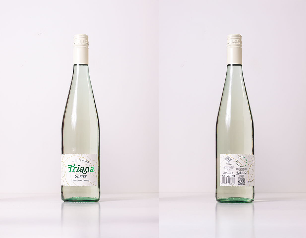
This branding and packaging design project carried out by the Interletraje design studio for Manzanilla Triana Spritz reflects a meticulous focus on the authenticity and freshness of the product.
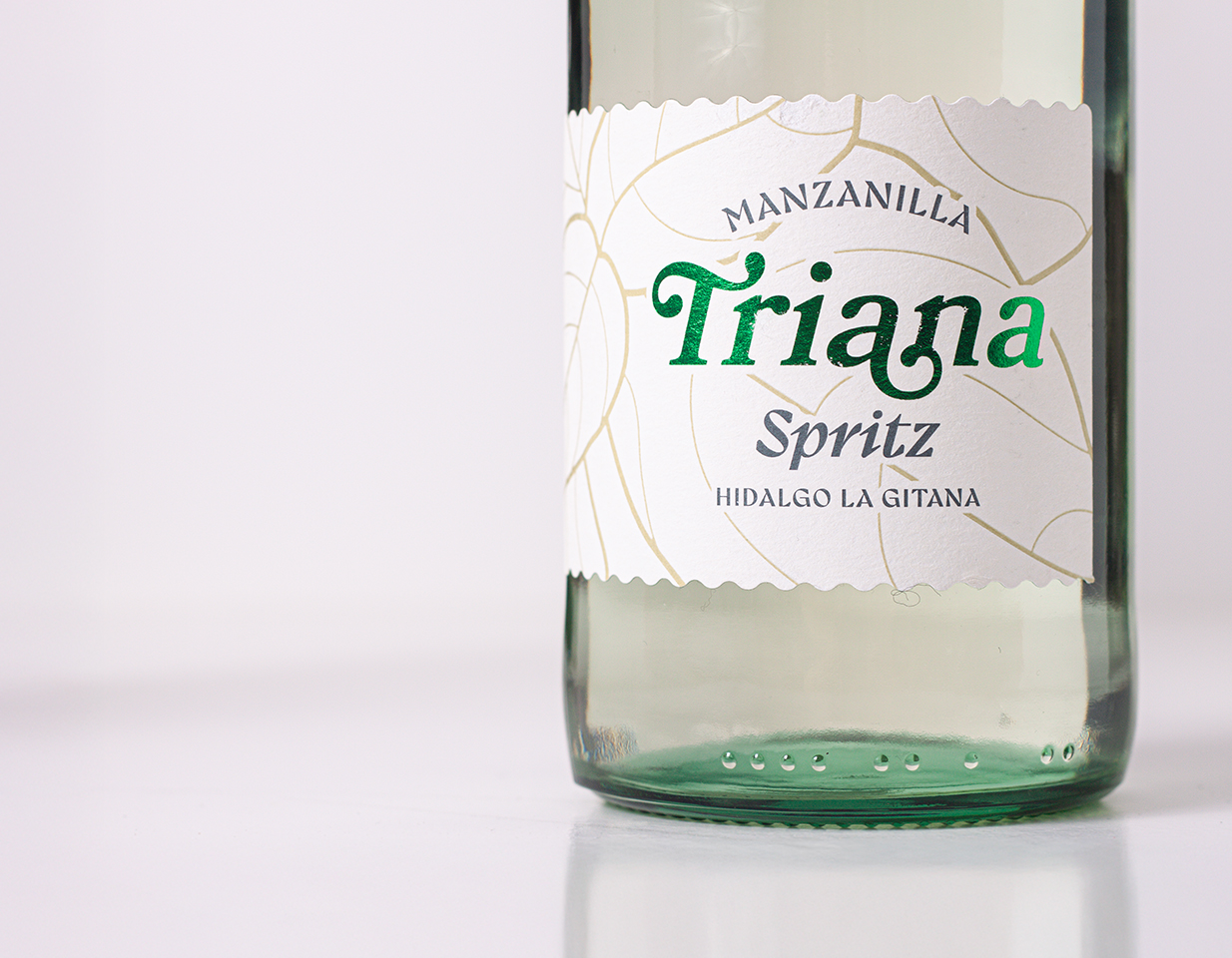
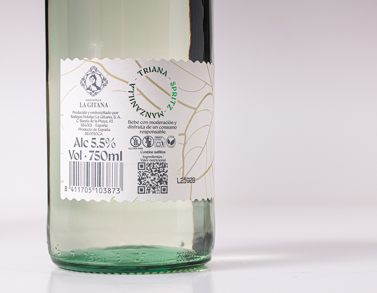
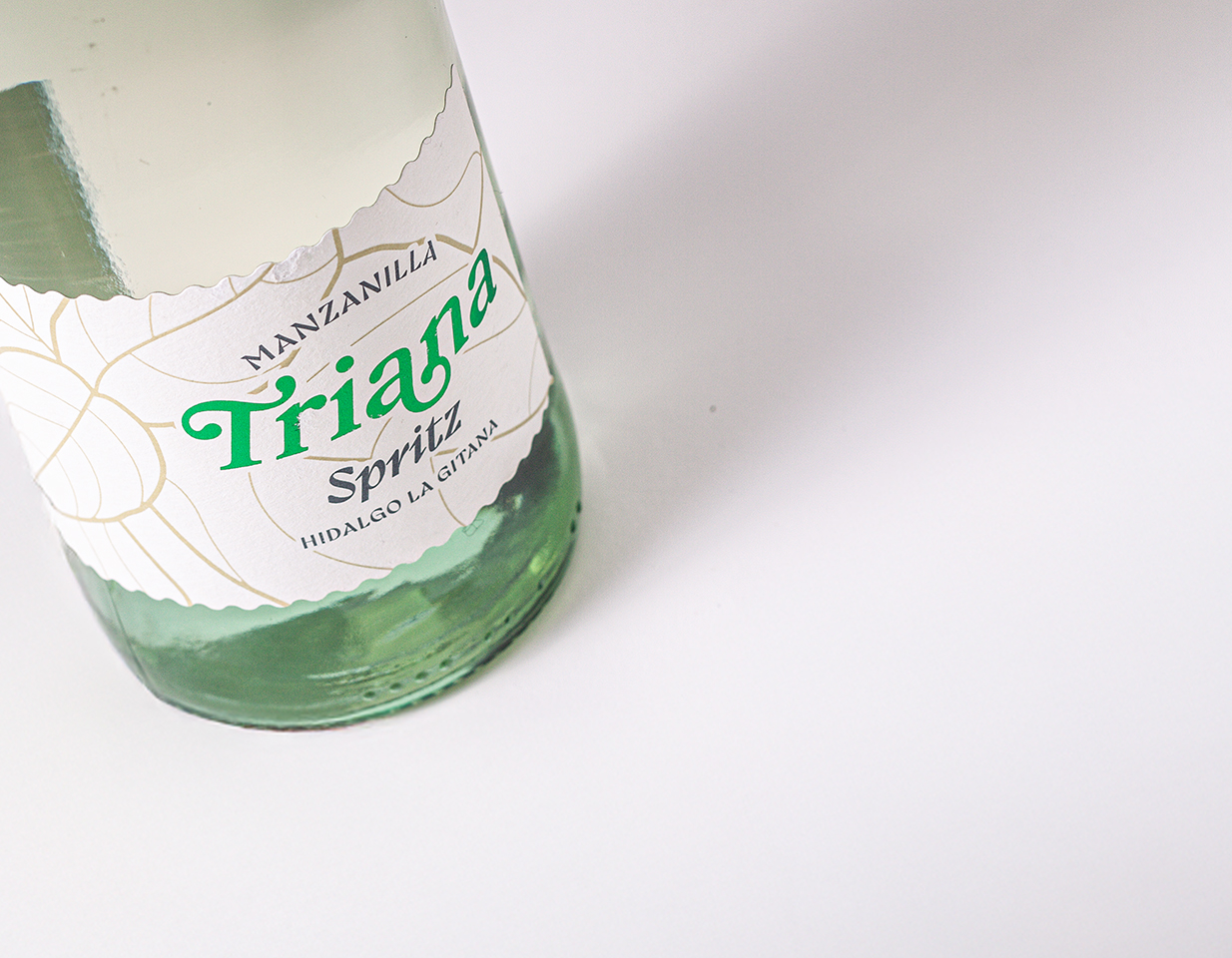
A visual brand identity has been built that evokes naturalness and craftsmanship, taking advantage of inspiration from peppermint as a conceptual axis. The packaging design incorporates sensory and tactile elements that reinforce the exclusivity of the product:
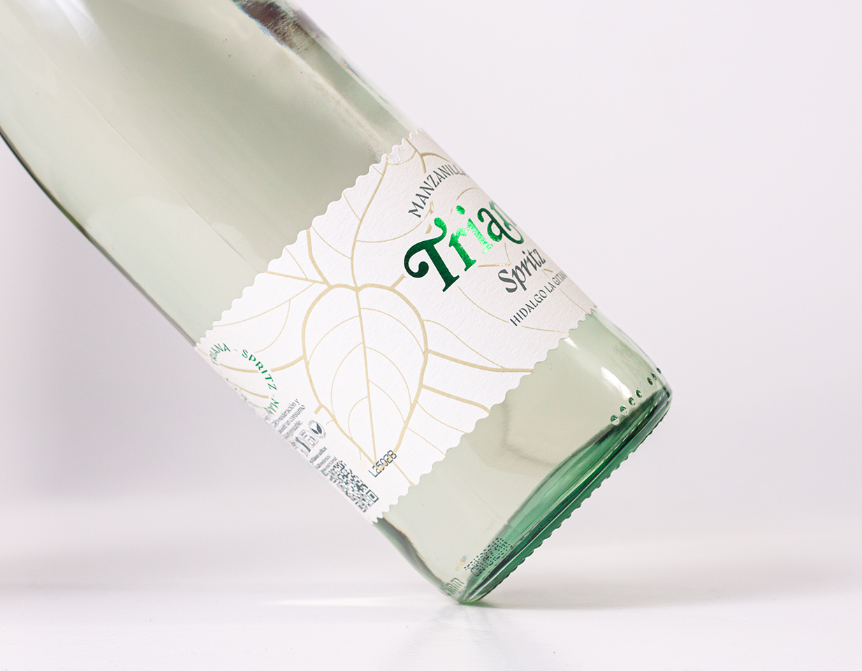
- Use of green as the main tone, highlighted with printed finishes for greater visual impact.
- Recycled paper in a cream tone and rough texture, which conveys an artisanal and sustainable character.
- Zigzag die-cut, evoking the vein of peppermint and generating a dynamic visual texture.
- Typography chosen with a balance between tradition and modernity, using the Bookman family for the logo and Gyst for the marketing texts, with a flag composition that breaks the conventional linear layout.
- Premium finishes, including green print details and transparent screen printing to highlight the veins of the peppermint leaf, providing depth and sophistication.
The result is a solid brand universe, where every detail contributes to communicating the essence of the product: freshness, naturalness and differentiation in the market.