

In this edition of Curator’s Insight – Let’s talk Amando designed by AUGE design
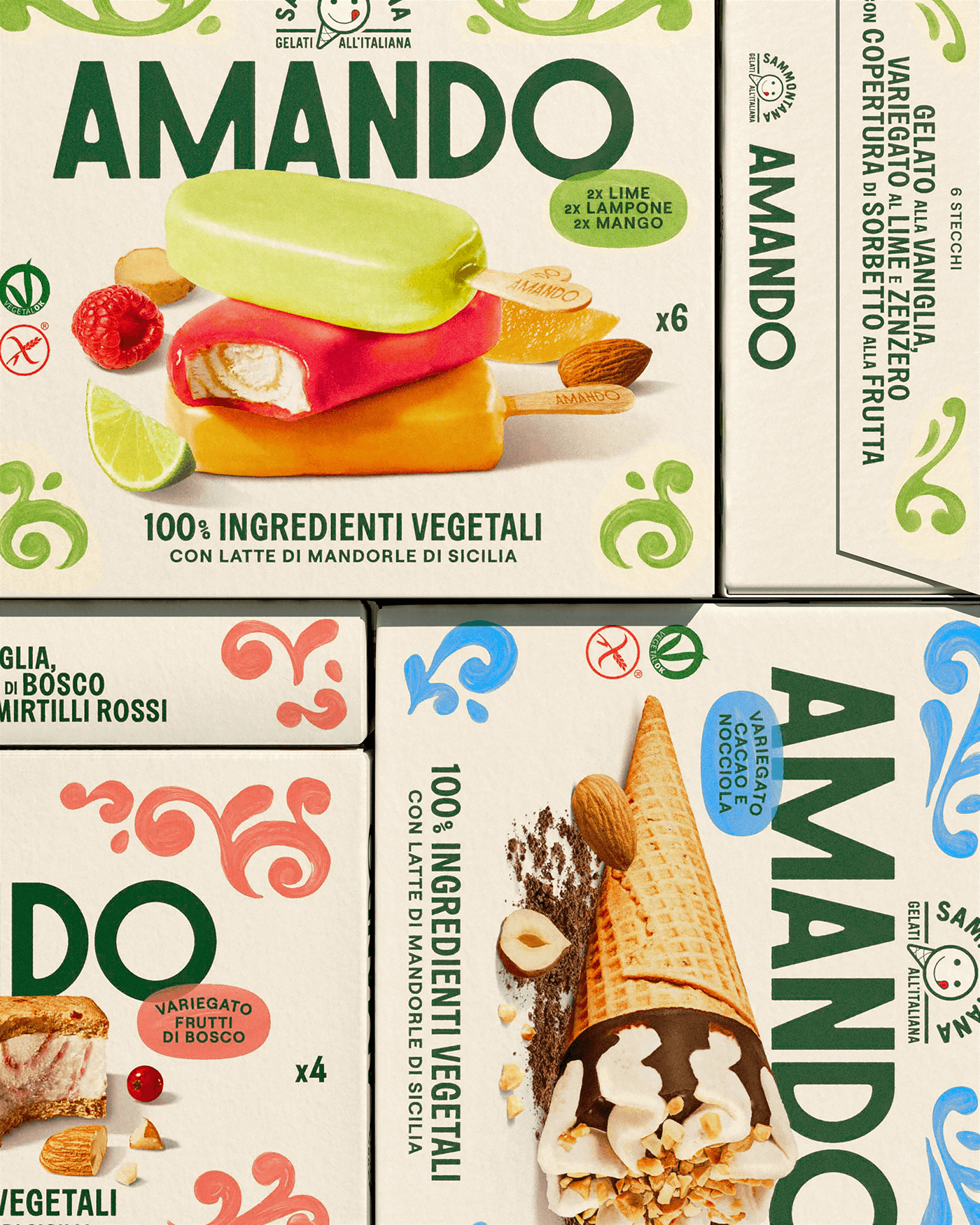
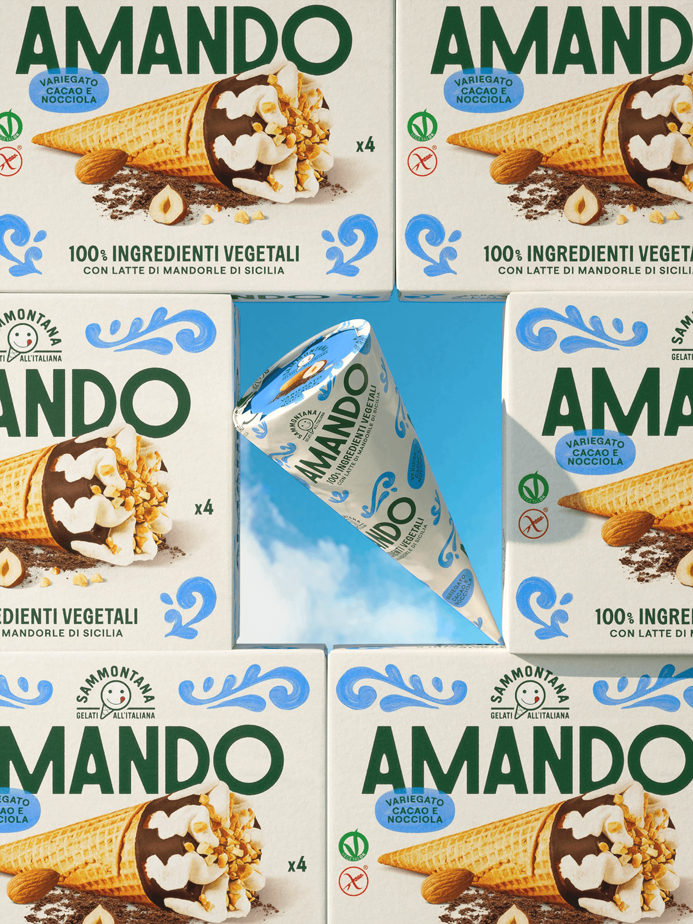
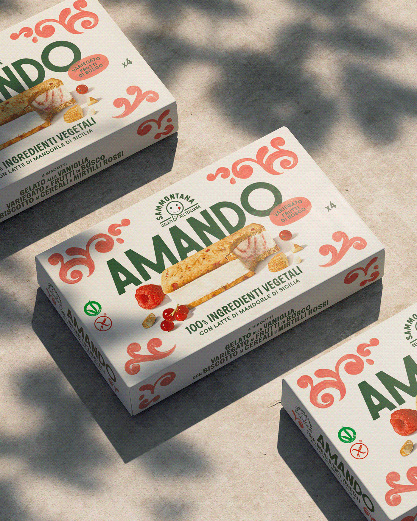
We’re talking about a full-blown sunshine-soaked Italian vacation in a box. As a lowkey gelato enthusiast myself, I gotta say: this relaunch hits all the right notes while playing its own melody.
Right off the bat, Amando’s packaging feels like a walk through a Sicilian piazza — vibrant, breezy, sunlit — but with that clean, modern twist Gen Z (and design snobs like me) adore. Instead of crowding the box with health claims and noise, it gives us air. Like, literal breathing room. That negative space is doing heavy lifting to make the product look premium and uncluttered.
That logo, slightly retro, subtly geometric font nods to old-school Italian signage but keeps things approachable. And the almond-shaped counter in the “A”? Yes, design nerds, we see you.
In a freezer aisle full of hyperrealistic photography or Nordic-white wellness brands, Amando stands out. Not by being loud, but by being confident. It doesn’t borrow the tropes of “cool” — it creates its own visual language.
Amando is not a generic health-forward vegan option wrapped in trend-chasing minimalism. It’s a thoughtful, joyful, and culturally rich reimagining of what plant-based indulgence can look like.
Executive Creative Director: Davide Mosconi
Associate Creative Director: Andrea Mastroluca
Designer : Nadia Parentini, Federica De Cesare
Animation: Alessandro Sasso
3d Artist: Sara Bigagli
Photo: Food Pirate Studio



 salutifg
 ADStudio
 WeAreDepot
 Manuvila
 Yellow Umbrella Creative
 Toka
Toka Studio Zak
 Atiq Alam
 monther al omari
 Modern Theory
 Sirka Agency
 DESIGN CONCEPTS
 Eva Chistyakova
 Puigdemont Roca
 marianaaworks
 bloomburo
 andreamarinnn
 Alina
Alina Saadmost
 Bruhken
 Maruf Nishat
 Richest Branding Pvt. Ltd.
 Sophiagdotcom
 saifullahmaslool
 Up-Brands