1. What is this product about?
NECTARPURE FusionMax Whey Protein is more than just another supplement—it’s designed for superior nourishment and superior experiences. Enhanced with the clinically proven probiotic BC30™, this fast-absorbing whey isolate doesn’t just deliver protein—it boosts gut health, immunity, and muscle recovery, all with unmatched bioavailability, clean formulations, and delicious flavor.
2. Concept Behind the Packaging Design
DN Designs sought to reimagine how whey protein is presented in the market. Rather than go with the typical dark, gym-centric packaging, they envisioned a design that radiated sophistication, cleanliness, and lifestyle appeal. A minimalistic white box with understated design elements—centered on clarity and elegance—helps NECTARPURE stand apart as a premium, trust-infused brand.
3. The Solution
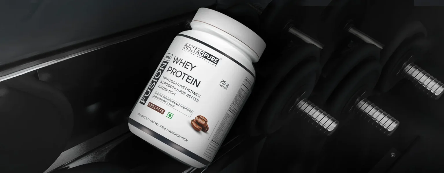
Logo and Identity: A simplified, modern logo contained within a refined rectangular frame. Dual-tone (white and blue) typefaces—TT Wellingtons and Corbert—distinguish “Nectar” and “Pure,” balancing sophistication with clarity.
Minimalistic Label Design: White packaging—stark in the sea of darker labels—provides visual relief and highlights key USPs, such as BC30 probiotics and superior digestion.
Strategic Design Process: DN Designs’ structured approach included an initial briefing, market research, ideation via mood boards and reference materials, prototype mockups (3D), and final delivery in print-ready formats.
4. The Technique Used to Design the Packaging
DN Designs combined strategic branding with visual clarity:
Research-Driven Ideation: Understanding the whey protein category’s saturation and shifting consumer preferences toward health-centric, lifestyle-focused design. Mood & Reference Boards: Curated visuals helped anchor the tone and guide design direction.
Minimalist Aesthetics: Choosing white base, clean typography, and restrained visual elements to project luxury, purity, and trust.
3D Mockups & Visualization: These tools enabled accurate, immersive pre-print evaluation, ensuring the design would feel as premium in hand as it looked on screen.
5. What Makes This Packaging Unique?
Bold Differentiation: The white packaging is a clear departure from genre conventions dominated by black and bold graphics—this fresh visual approach positions NECTARPURE as aspirational, not just functional. (DN Designs)
Focus on Clean Messaging: The packaging elevates the product’s USP—clinically backed ingredients, high absorption, gut-friendly formulation—rather than cluttering the visual space.
Cohesive Brand Identity: From logo and label to website and 3D ad visuals, every touchpoint reinforces NECTARPURE’s essence—science-led, elegant, trustworthy.
6. The Results
Market Impact: The premium, minimalist packaging helped NECTARPURE carve out a niche in an oversaturated whey protein market, aligning it with lifestyle and wellness rather than just hardcore fitness.
Enhanced Brand Perception: The thoughtfully designed box communicates quality, transparency, and superior science—resonating with a health-conscious consumer base that prioritizes clean labels and efficacy.
Multi-Touchpoint Reinforcement: The design extended beyond packaging into a compelling 3D advertisement and a user-friendly website/UI-UX—ensuring consistency across the brand experience.
Wrap-Up
DN Designs’ approach to the NECTARPURE project showcases how elevated, purpose-driven design can transform a supplement into a lifestyle statement. By prioritizing simplicity, premium cues, and scientific authenticity—all wrapped in elegant packaging—they helped NECTARPURE stand out, communicate confidence, and connect meaningfully with health-savvy consumers.


