Product: Non-Vegetarian Protein Chips
Brand:
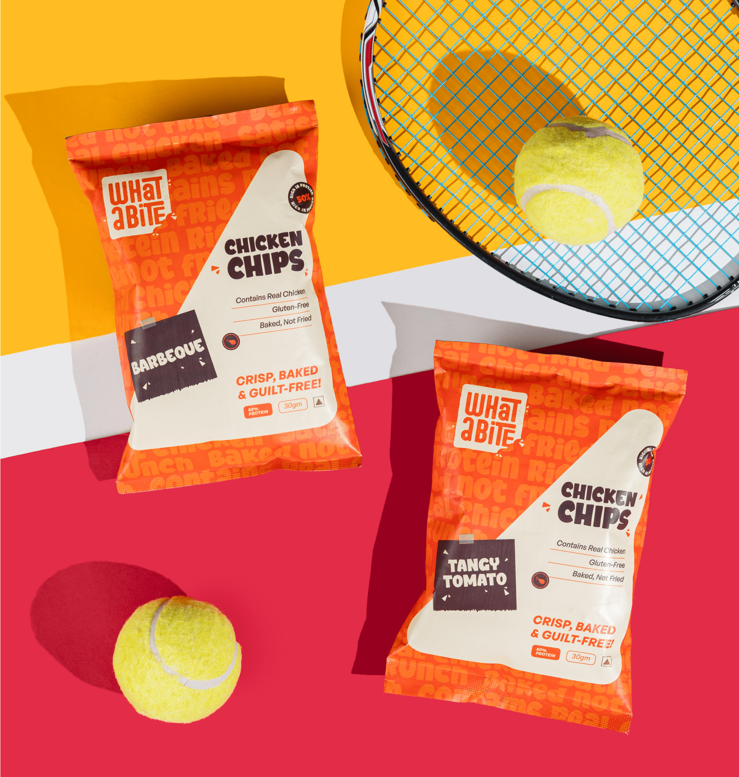
WhatABite
We designed the identity and packaging for ‘WhatABite’, one of India’s first non-vegetarian chip brands—redefining what snacking means in a country where vegetarianism often dominates the conversation.
About the brand:
India is home to one of the world’s largest vegetarian populations—but what many don’t realize is that its non-vegetarian market is equally massive, passionate, and underserved. WhatABite was born from this insight: to create a bold, high-protein snack that lets people enjoy real flavor and real nutrition—without the guilt.
The brand’s mission was simple yet revolutionary—to blend protein-packed goodness with crave-worthy crunch. And we were entrusted with bringing that idea to life visually.
About the product:
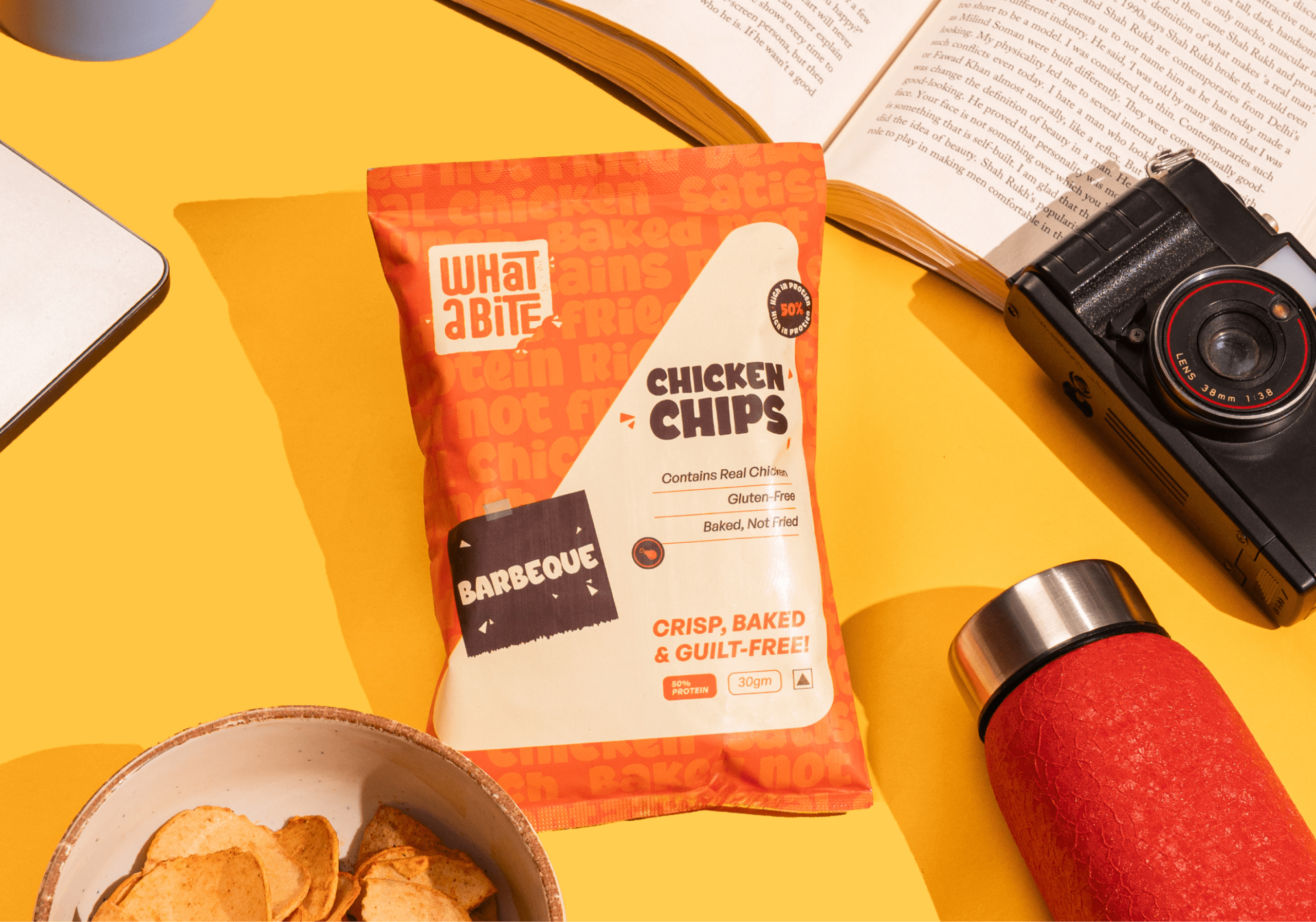
WhatABite isn’t your regular chip. It’s a high-protein, non-vegetarian snack crafted for those who crave both taste and nutrition. The name itself—WhatABite!—is expressive, playful, and deeply sensory; it captures that instant reaction of joy when you bite into something delicious. Every element of the design had to live up to that emotion—crispy, bold, and unapologetically tasty.
About the design:
Our design goal was to ensure the product looked craveable, modern, and distinctly Indian, without slipping into the “jerky” aesthetic—which remains foreign to most Indian consumers. We wanted it to feel exciting, not intimidating.
We achieved this through three core design decisions:
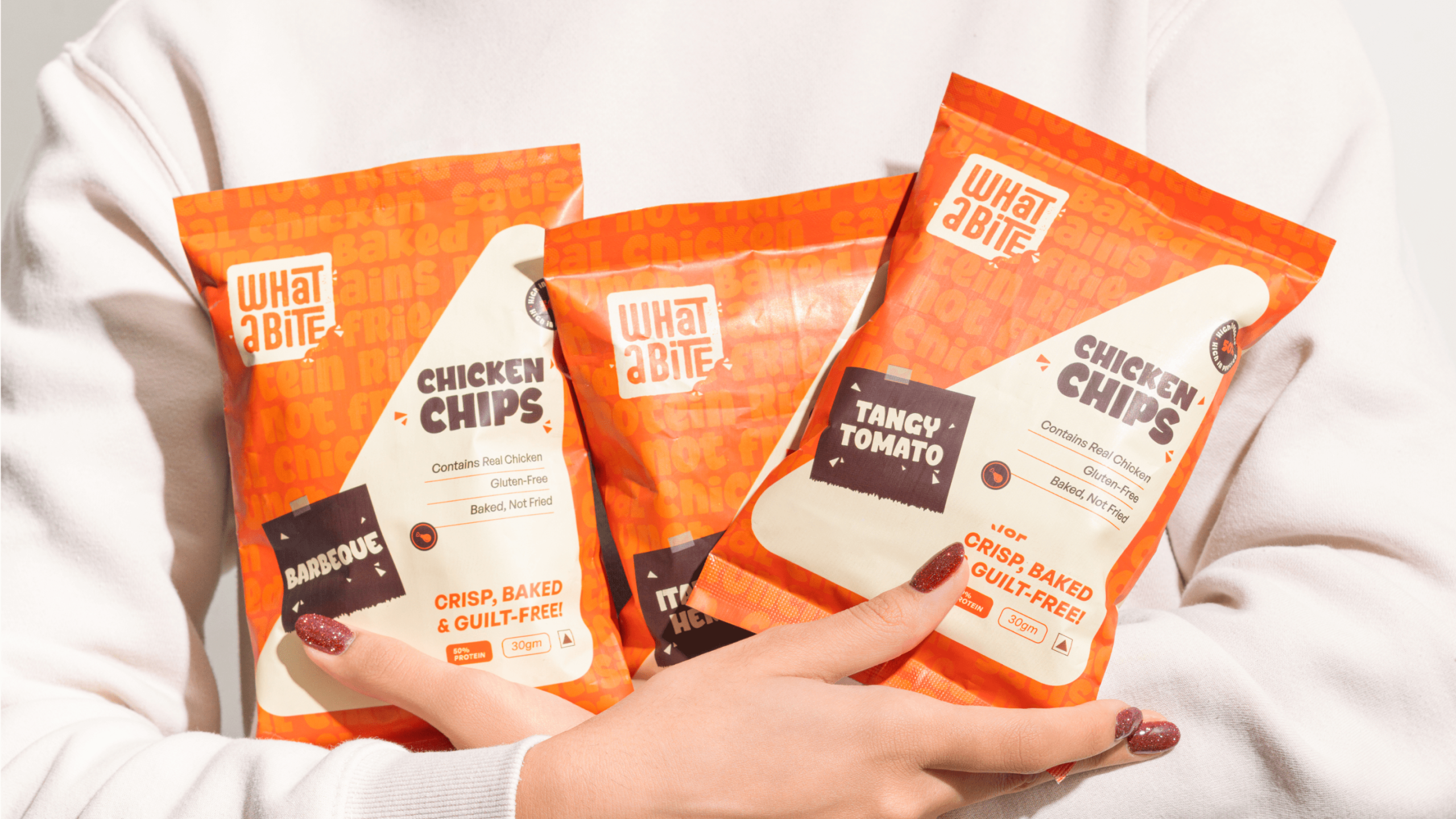
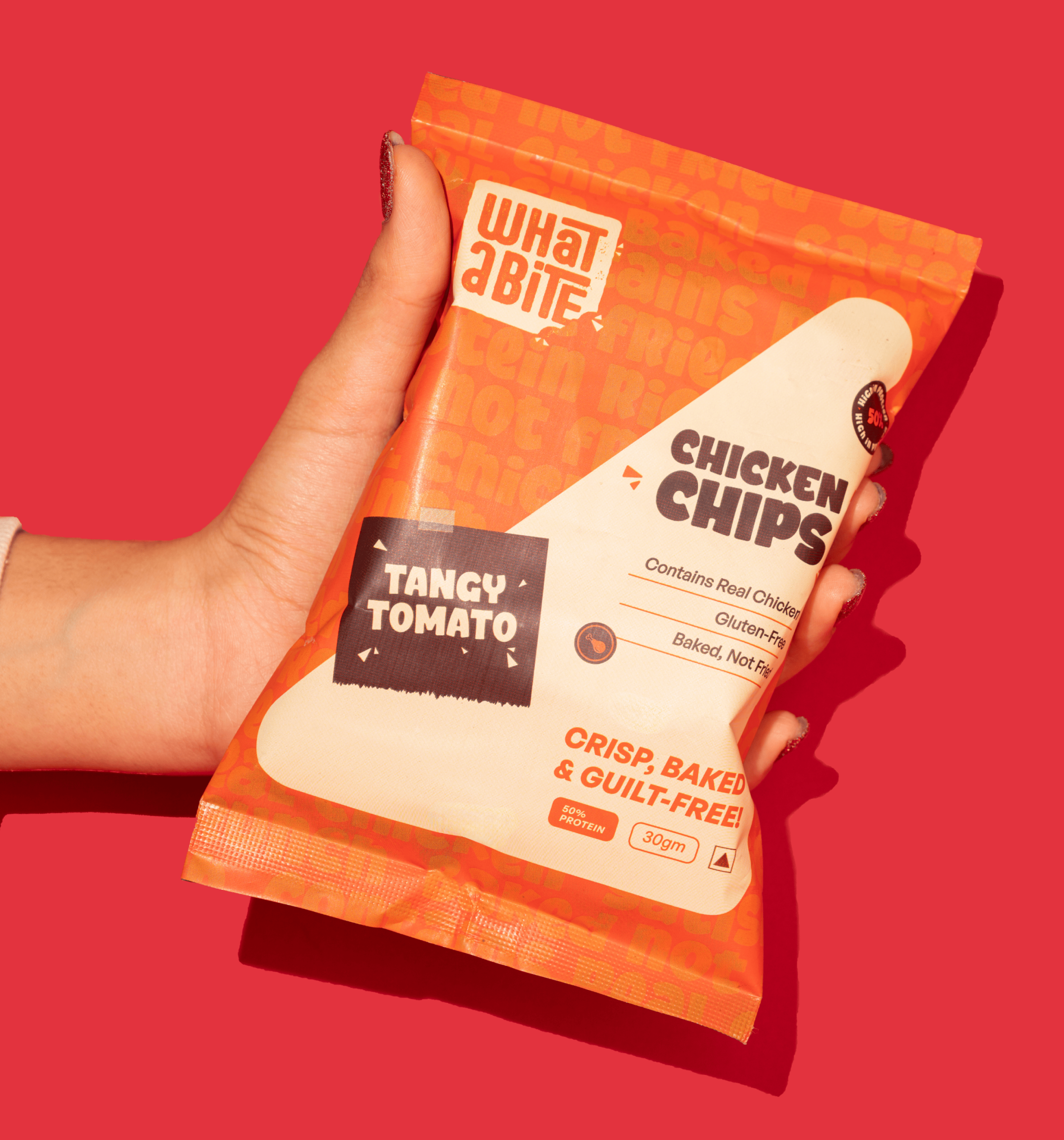
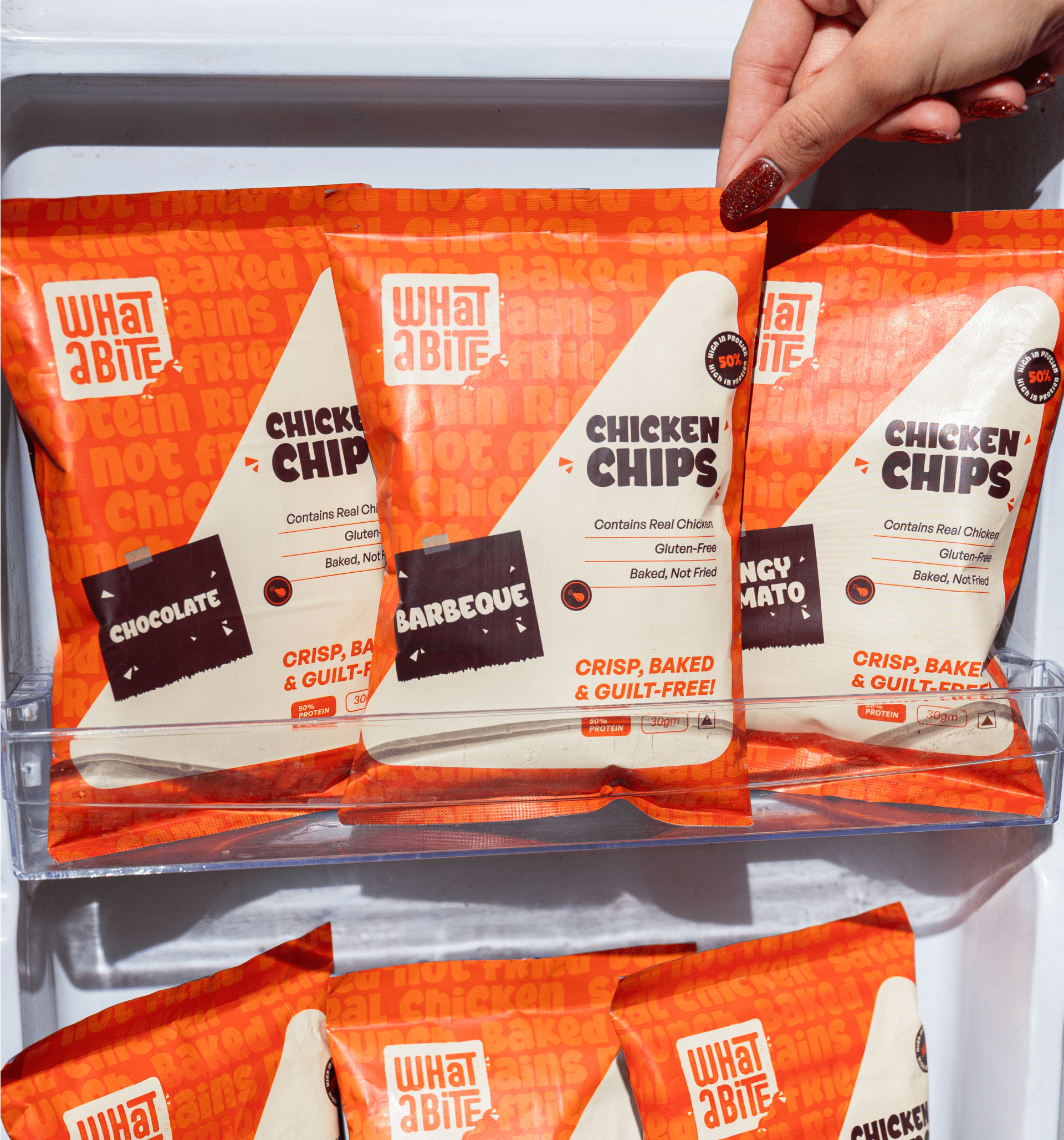
1. Bold & Warm Color Palette: Dominated by rich reds, deep oranges, and warm yellows, the packaging evokes hunger, energy, and the sizzling warmth of spices. These hues immediately draw attention on crowded supermarket shelves—both online and offline.
2. Expressive Brand Identity: The WhatABite logo is crafted to sound as dynamic as it looks—playful typography paired with subtle curves that mimic the crunch of a bite. The visual rhythm of the wordmark itself makes the name feel alive, crisp, and irresistible.
3. Taste-First Visual Language: Each pack features mouth-watering imagery and flavor cues designed to highlight indulgence while keeping the product rooted in the “snackable” category—not in foreign concepts like jerky. The design captures that perfect middle ground between crunchy fun and protein fuel.
Easter egg:
Hidden within the background texture are subtle line patterns resembling ripples—symbolizing the “burst of flavor” that spreads with every bite. It’s a small but powerful nod to the brand’s name and its sensory promise.
Brand’s extension:
WhatABite stands at the intersection of taste and nutrition—a rare sweet spot in India’s snacking world. While most brands either go too healthy or too indulgent, WhatABite manages to be both. Our design mirrors this balance: loud enough to tempt, clean enough to be trusted.
Current scenario:
Since launch, WhatABite has become a conversation starter—especially among younger consumers seeking protein-rich alternatives that don’t compromise on flavor. Its bold design language, paired with a proudly Indian narrative, has helped it carve out a fresh identity in the competitive snacking space.