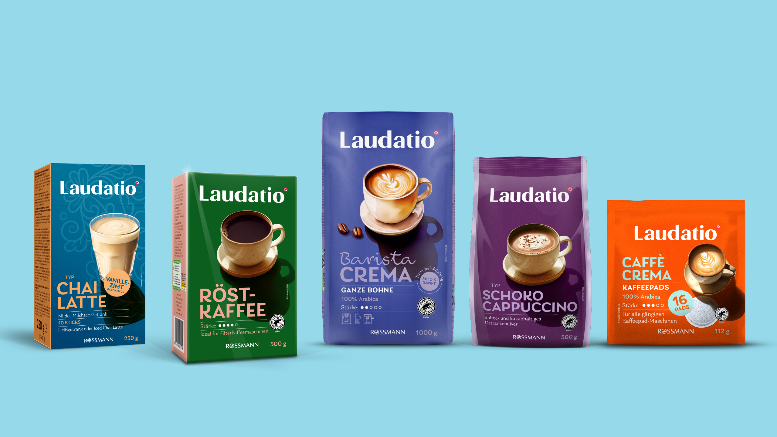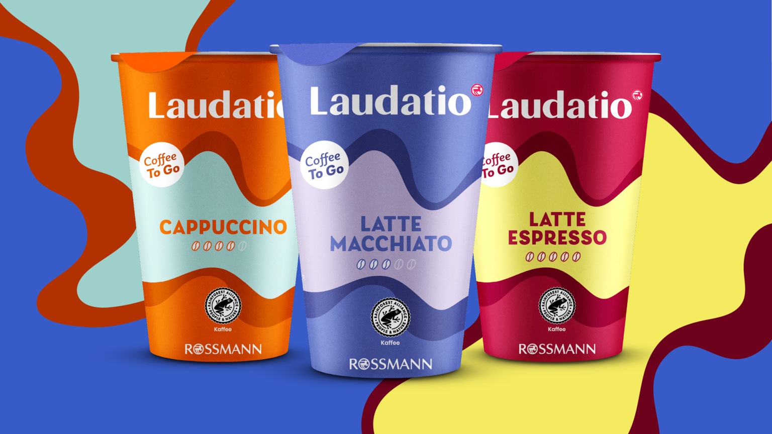
MILK’s redesign of Rossmann’s private label Laudatio modernizes the overall look significantly: from a rather plain and inconspicuous appearance to striking, bold-orange packaging with clear typography and a more appetizing product presentation. The new look feels fresher, more contemporary, and ensures stronger shelf presence.
Objective/Challenge
The previous design appeared very reserved, somewhat outdated, and offered little differentiation within the coffee segment. The goal was to visually sharpen the brand while better conveying the product’s quality and emotional appeal. At the same time, recognizability and a mainstream look needed to be maintained despite the modernization and rejuvenation of the brand identity.
Approach/Special features
The new design focuses on strong brand presence (Laudatio prominently at the top), warm and signal-strong variety colors, and clear, high-contrast typography. The product image now takes center stage, with its elongated shadow evoking a sunny coffee moment. Supported by a clean information structure and distinctive icons, the packaging overall feels more modern, emotional, and impactful on the shelf.