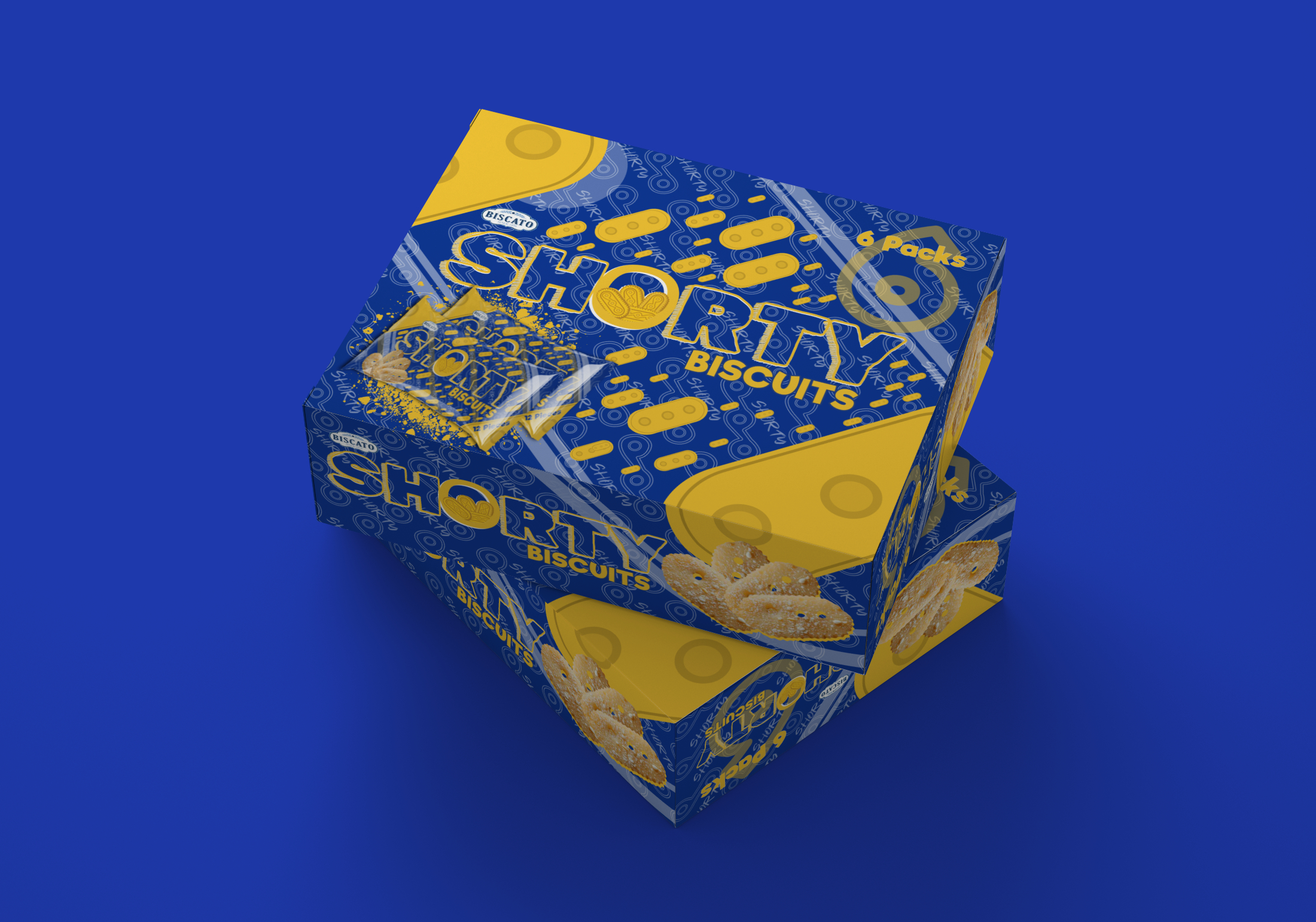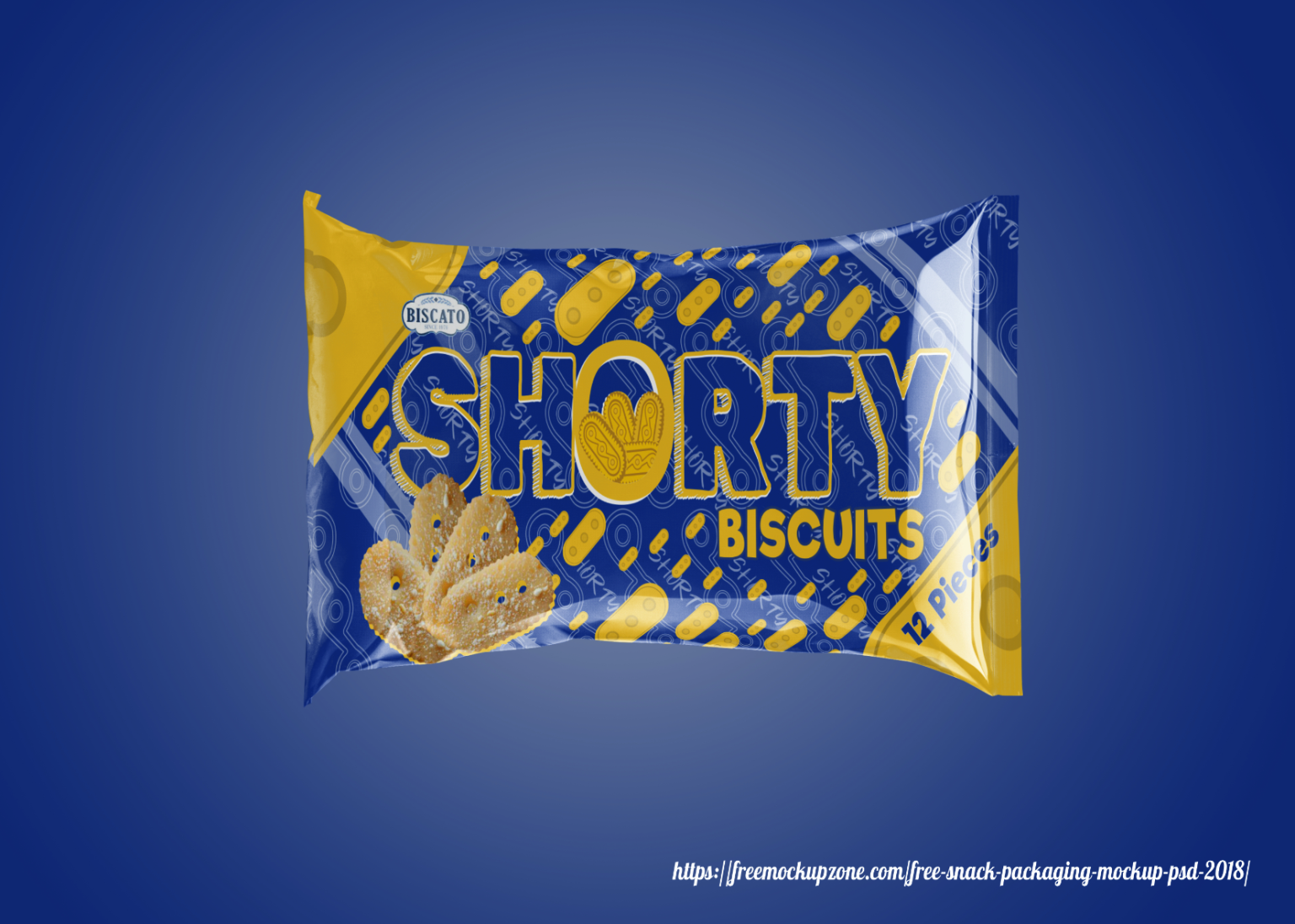
This conceptual, unofficial packaging design for the “Shorty” biscuit brand by Biscato Company features a deep blue background, chosen to preserve the original colors of the classic pack.
MOCKUP PROVIDED BY: https://freemockupzone.com/free-snack-packaging-mockup-psd-2018/ The biscuit photo was generated with ai tool piclumen.
NOTICE: This is an unofficial concept design created for portfolio purposes only. [Biscato] and its logo are the property of their respective owners. This project is not affiliated with, endorsed by, or associated with [Biscato] in any way.
هذا المشروع غير رسمي وليس له صلة بالشركة الاصلية و جميع الحقوق محفوظة و العلامة التجارية
Although an unofficial concept, this packaging aims to be visually striking and memorable, utilizing detailed background illustrations, distinctive logo elements, and modern design principles to stand out on the shelf and strengthen brand recognition. The new logo, crafted in vibrant orange, prominently features the letter “O” containing four biscuits inside, emphasizing the product and reinforcing brand identity. The overall design combines playful graphics, bold typography, and a complementary color scheme to attract consumer attention and convey a fun, energetic personality.