ABOUT
Macoritti mini grissini are a flagship product of Macoritto Valentino, beloved for their crunchiness, lightness, and playful character. For the US market, we were tasked with designing a packaging system that could translate the authenticity and joy of these Italian grissini into a visual language that resonates with American consumers. The goal was to create a line that stands out on crowded supermarket shelves while communicating the product’s Italian heritage, quality, and fun personality… all in a single glance.
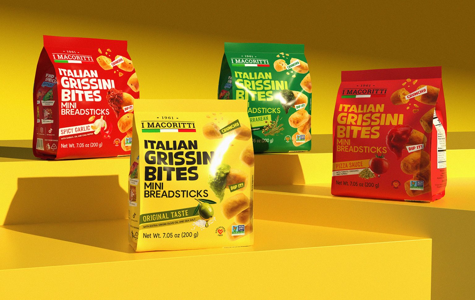
CONCEPT
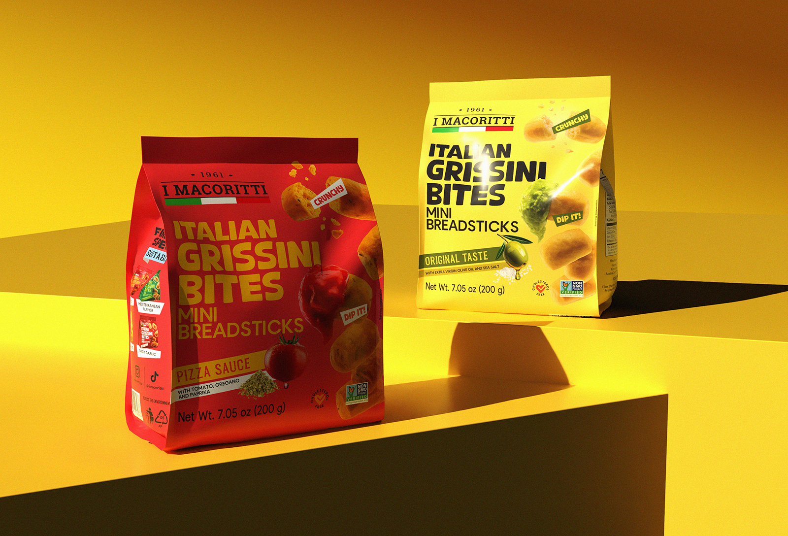
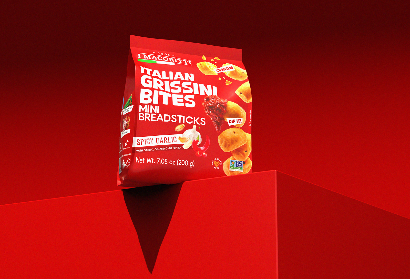
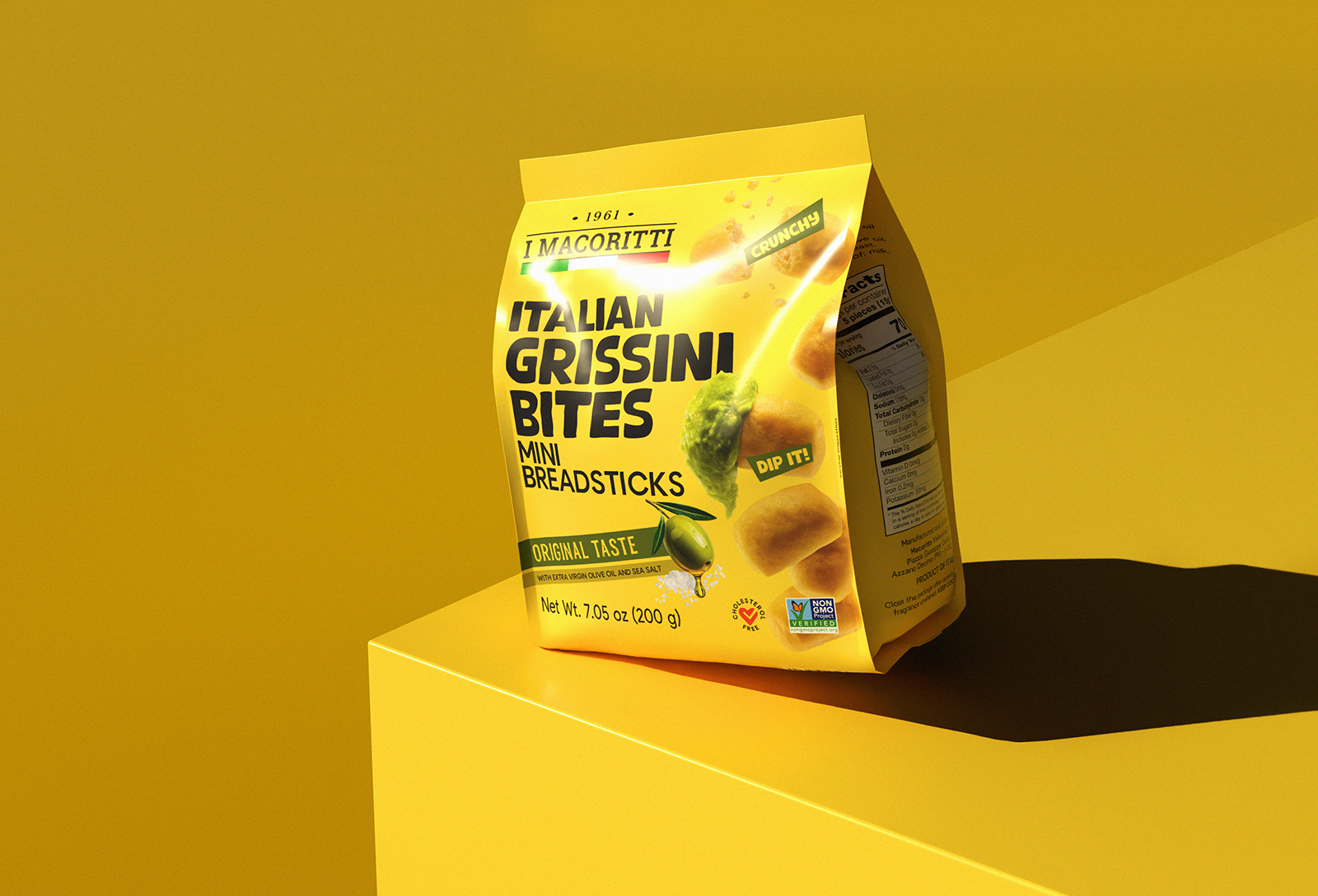
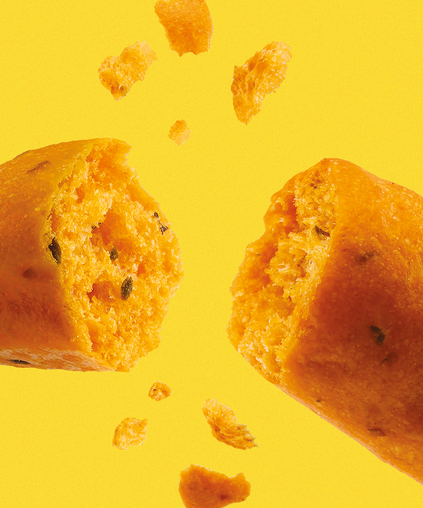
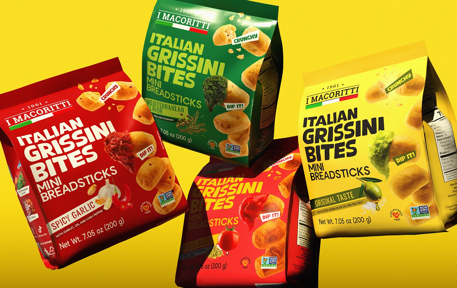
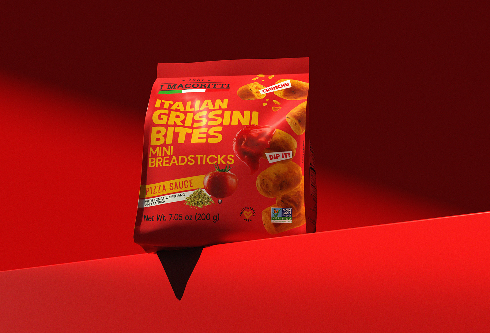
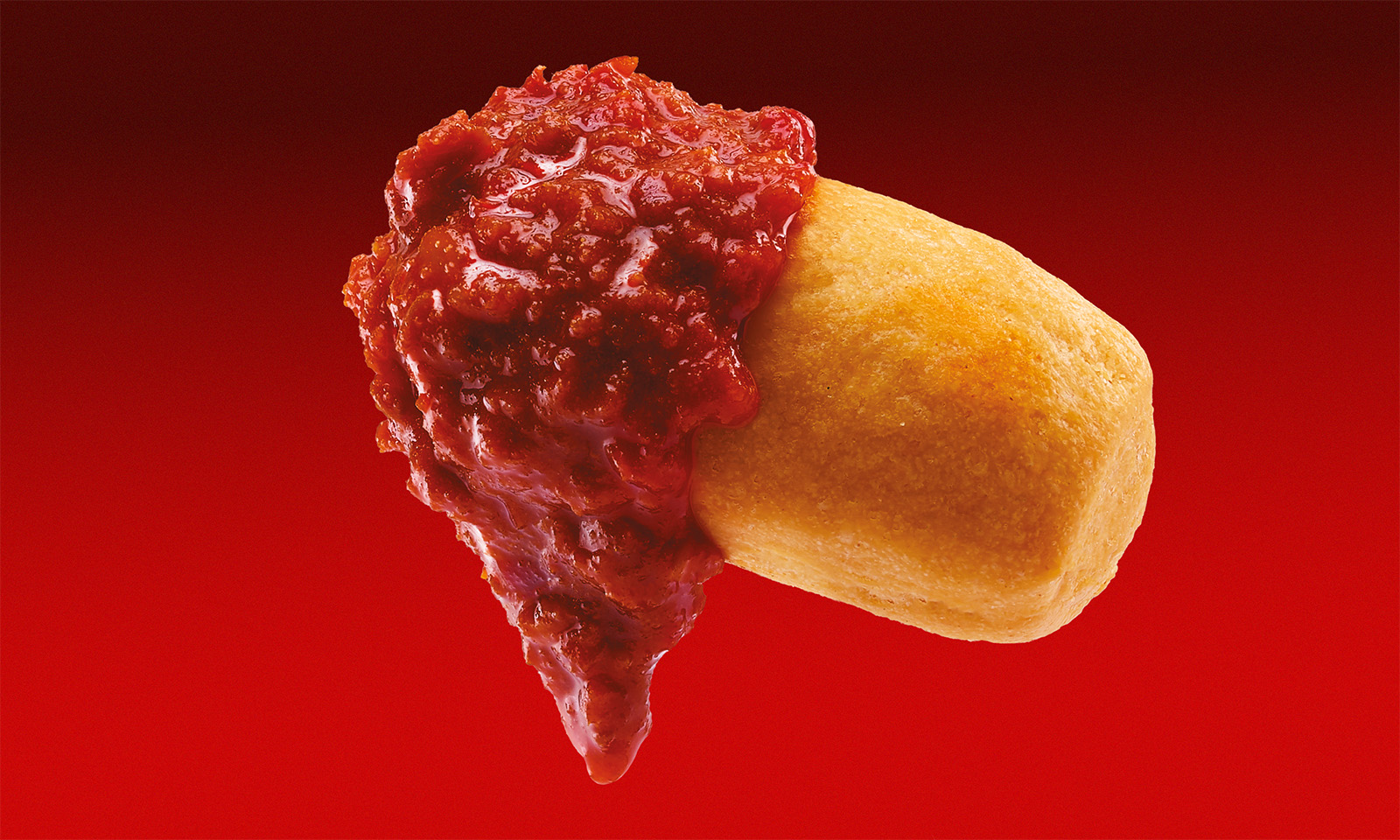
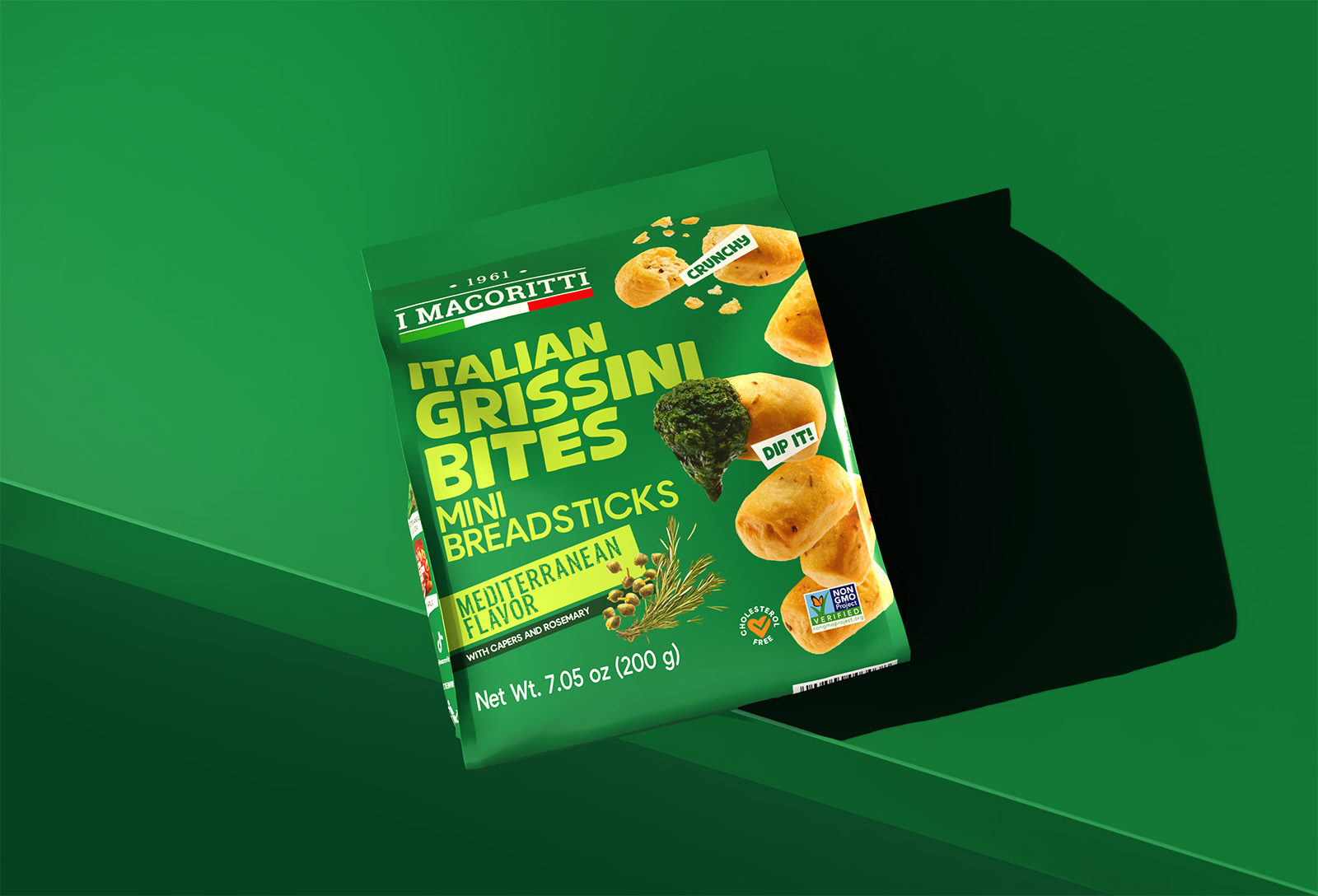
The concept behind the redesign was simple yet powerful: “Italy in a bite.” Each package needed to tell a story, the essence of Italian craftsmanship, the joy of sharing, and the sensory delight of the product itself. We envisioned a system where bold, saturated colors, dynamic compositions, and playful graphics convey the grissini’s lightness and crunch. Each pack showcases XXL grissini floating in mid-air, suggesting effortless movement and enjoyment. A single grissino dipped in a sauce nods to the American ritual of pairing, creating an immediate, relatable moment of consumption.
SOLUTION
To achieve this, we combined market research, sensory analysis, and design thinking. Our team explored US retail shelves to understand visual trends, product hierarchy, and consumer expectations. Parallelly, our in-house gastronomists analyzed each flavor to highlight its unique qualities, from texture to taste profile. The final solution is a playful yet functional system: bold hero colors aligned with each flavor, a hand-crafted bold font suggesting accessibility and simplicity, and clearly displayed product benefits. The back of the pack integrates heritage storytelling with a vintage family photo, connecting consumers to the brand’s Italian roots, complemented by pairing suggestions and a QR code directing users to recipes and lifestyle inspiration.
RESULT
The new Macoritti packaging is a standout system: visually striking, highly functional, and culturally resonant. It communicates the product’s lightness, crunchiness, and Italian authenticity at first glance, while the “Italy in a bite” claim encapsulates the experience of enjoying a simple yet joyful snack. The packaging elevates the product into a playful, contemporary, and highly recognizable icon on US supermarket shelves, bridging Italian tradition with modern, international design sensibilities.