ABOUT-
ZUKAE is a self-initiated branding and packaging design project that reimagines what Korean instant noodles could look and feel like in a modern, global market. The goal was to challenge how instant noodles are traditionally perceived as often loud, overly colorful, and cluttered, and instead, to redefine them as a premium, culturally rooted experience.
Inspired by Seoul’s street food culture and late-night dining habits, ZUKAE aims to give a familiar comfort food a global identity that feels refined, authentic, and desirable. This concept bridges two worlds: Korean heritage and modern simplicity, making the brand relatable to both local and international audiences.
SOLUTION-
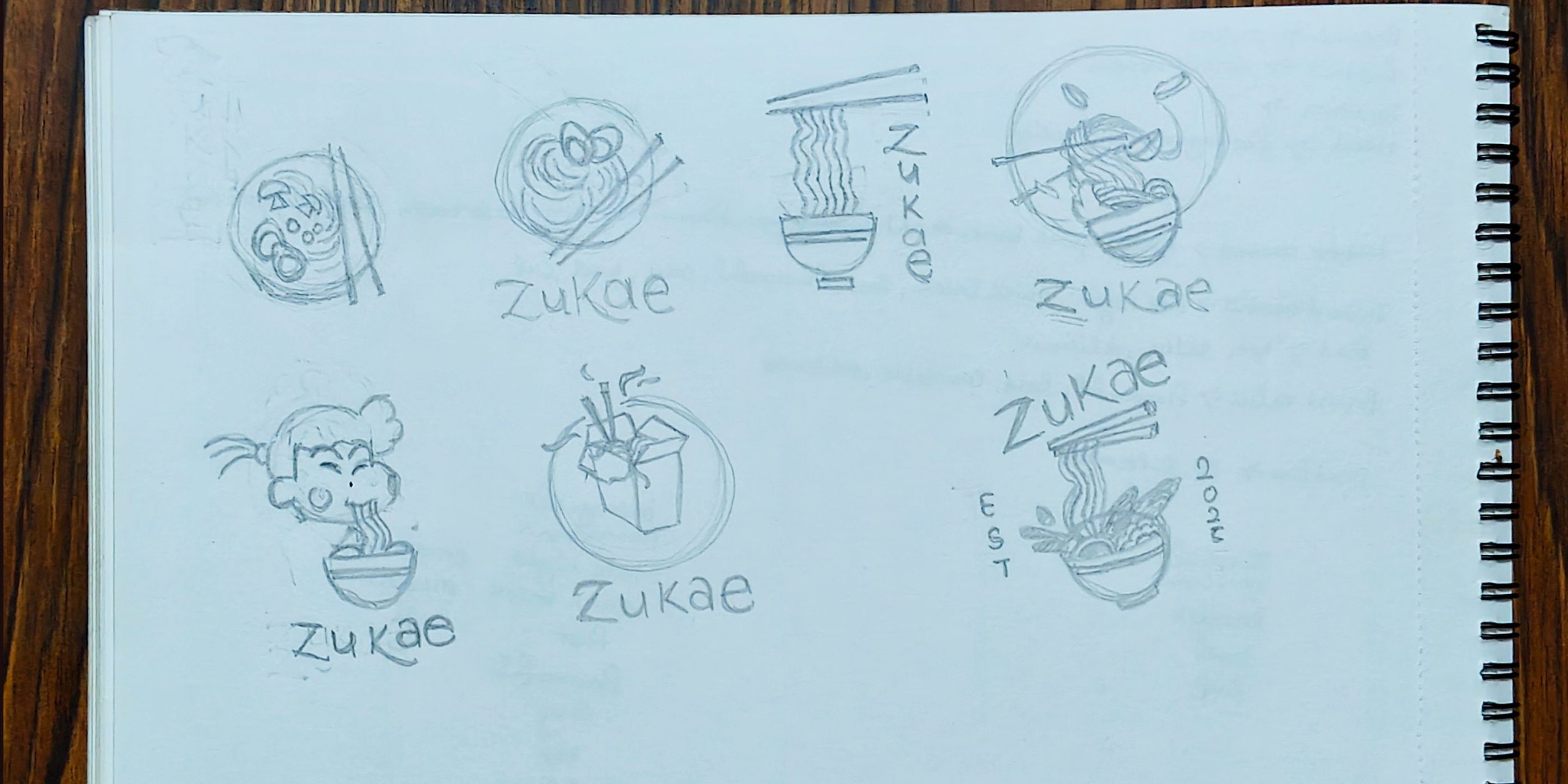
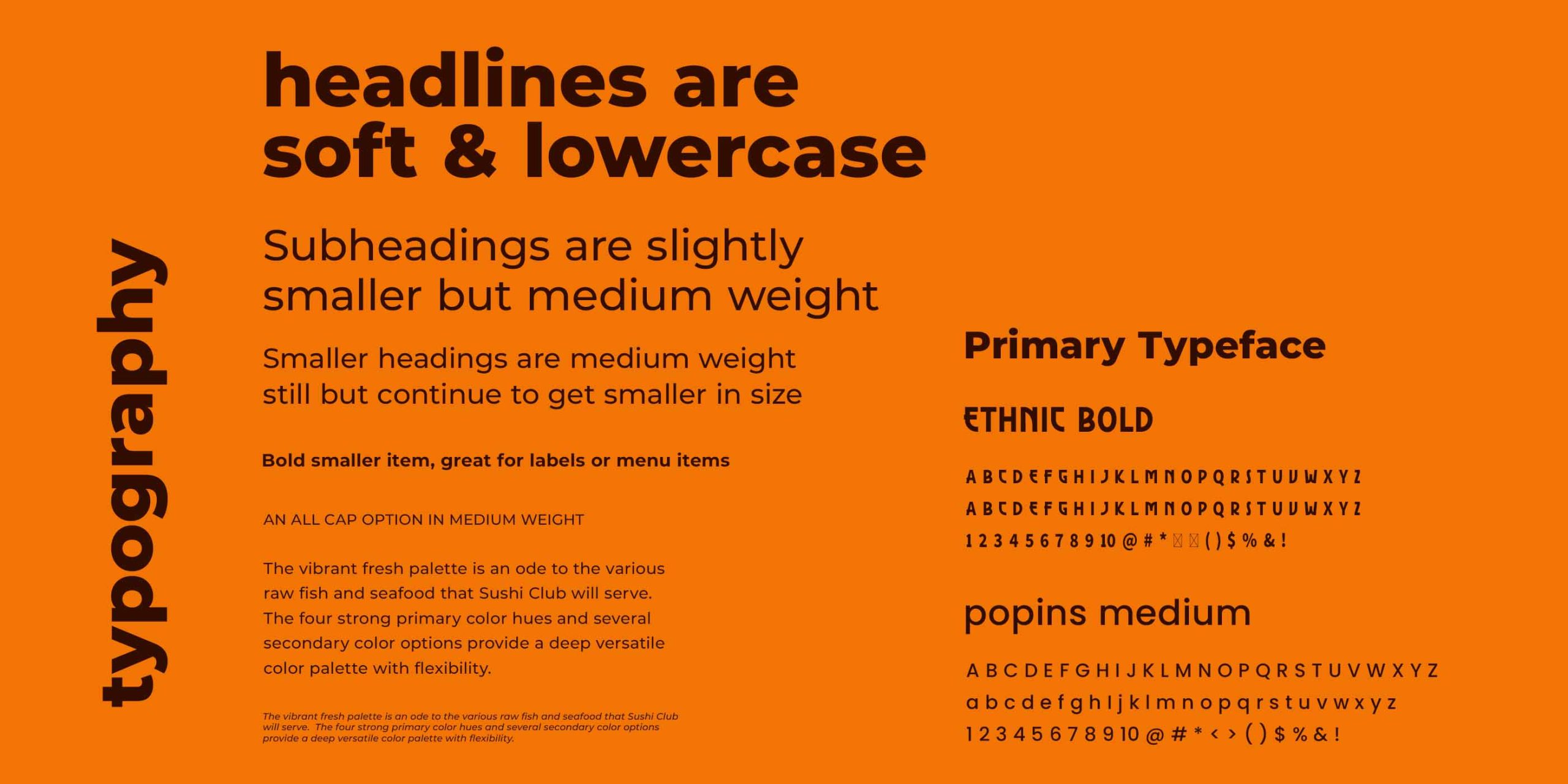
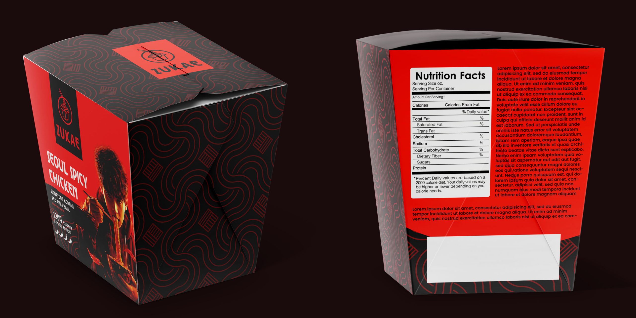
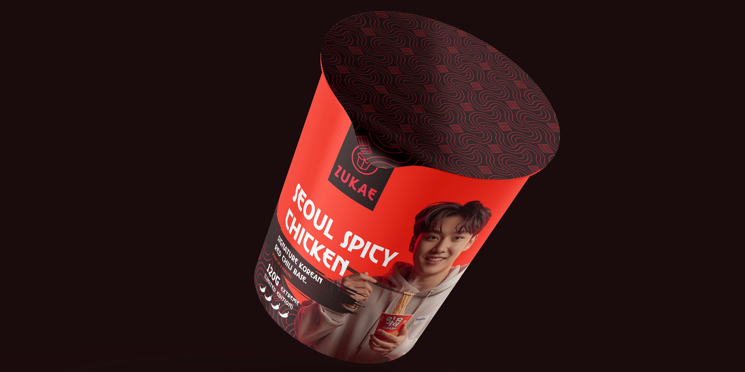
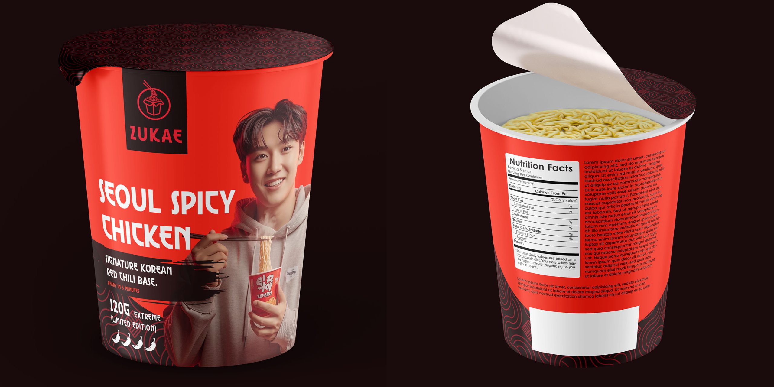
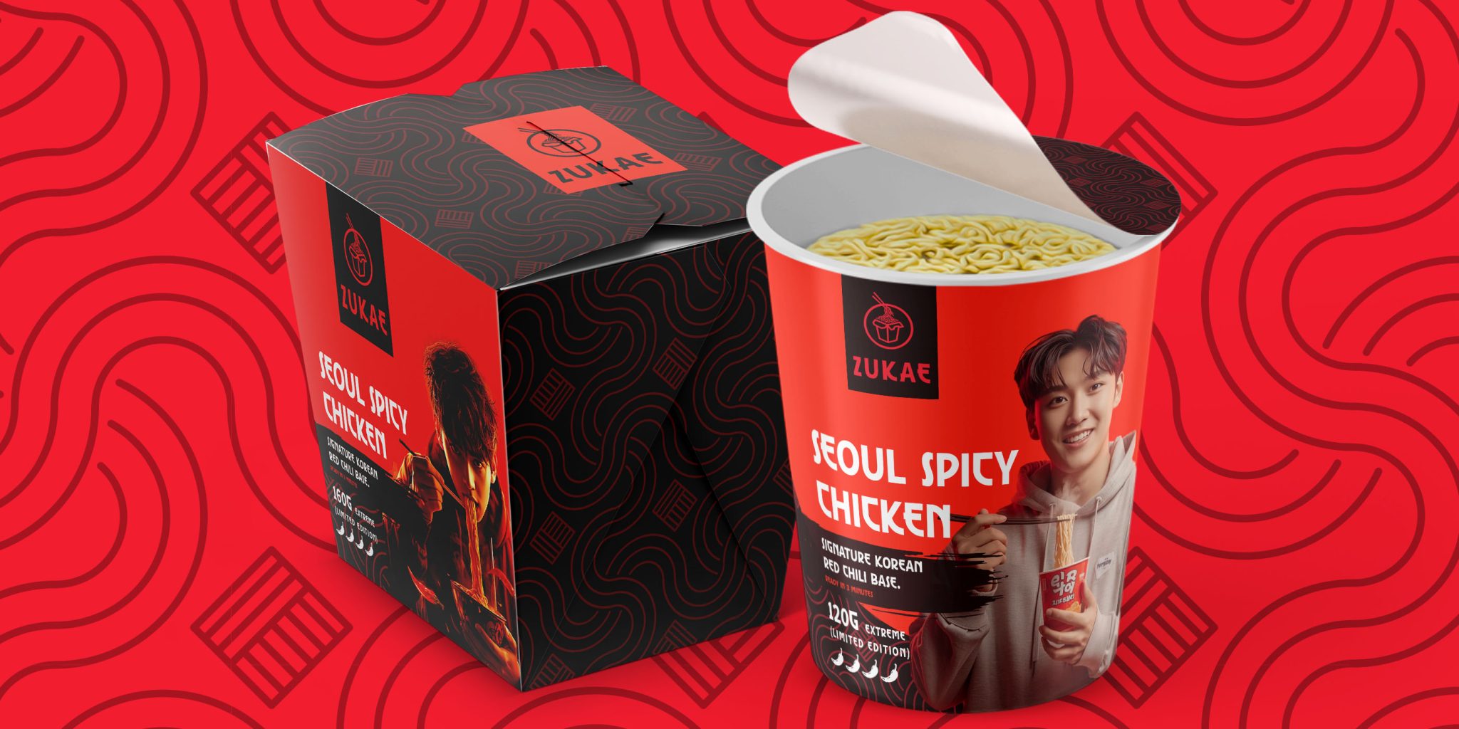
The visual identity blends traditional Korean aesthetics with modern minimalism. The logomark draws inspiration from vertical Korean letterforms, reinterpreted into a horizontal composition for universal readability and brand flexibility.
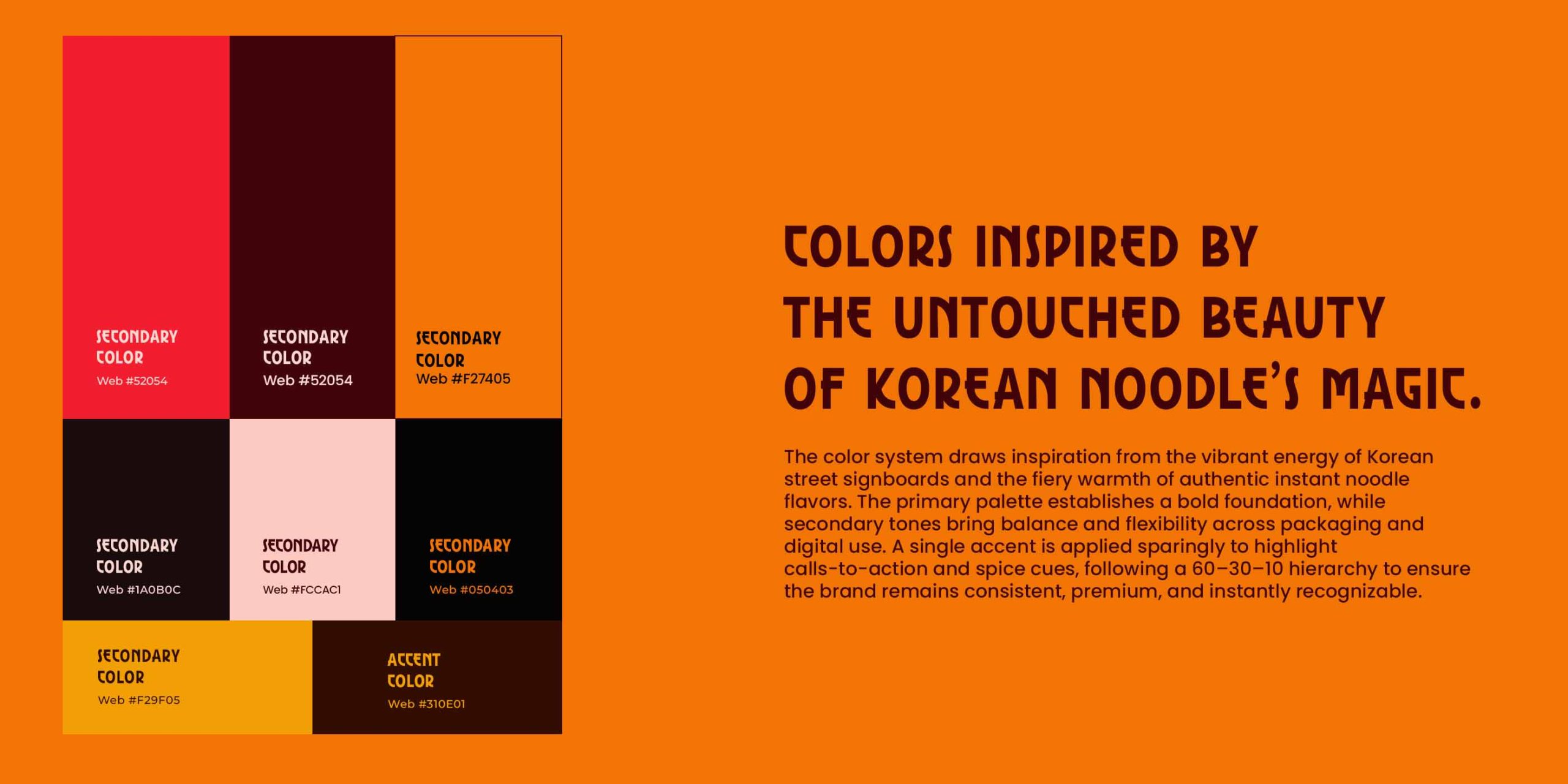
A warm, spicy color palette mirrors the neon-lit energy of Seoul’s food alleys while creating immediate appetite appeal. These colors are balanced by clean negative space, allowing the packaging to feel both bold and premium.
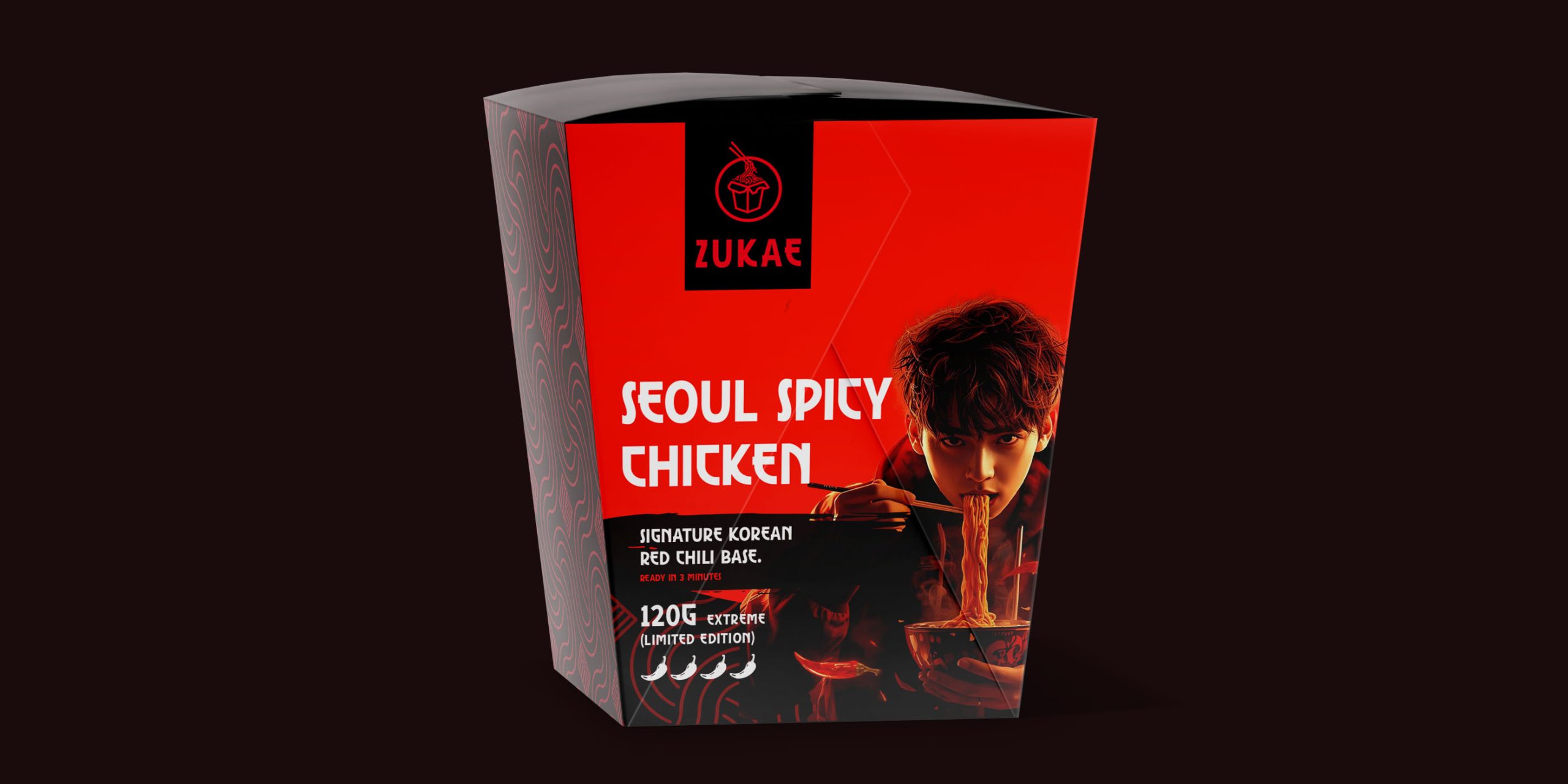
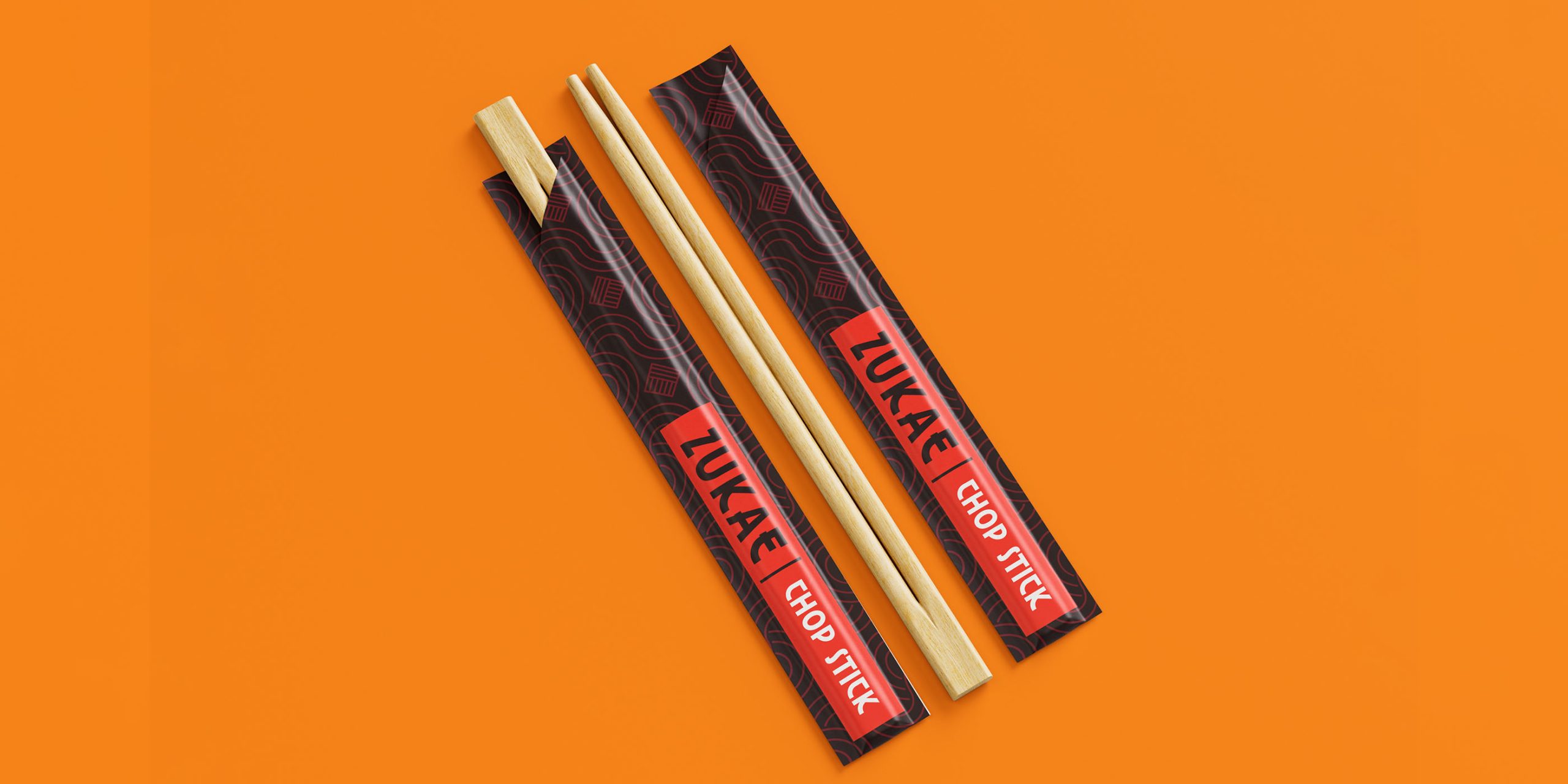
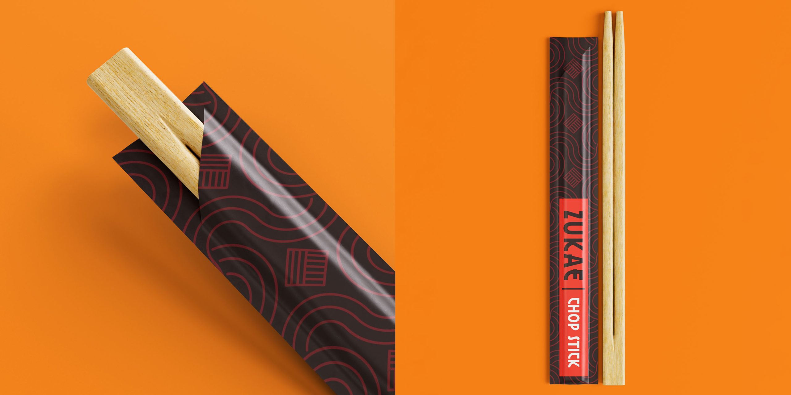
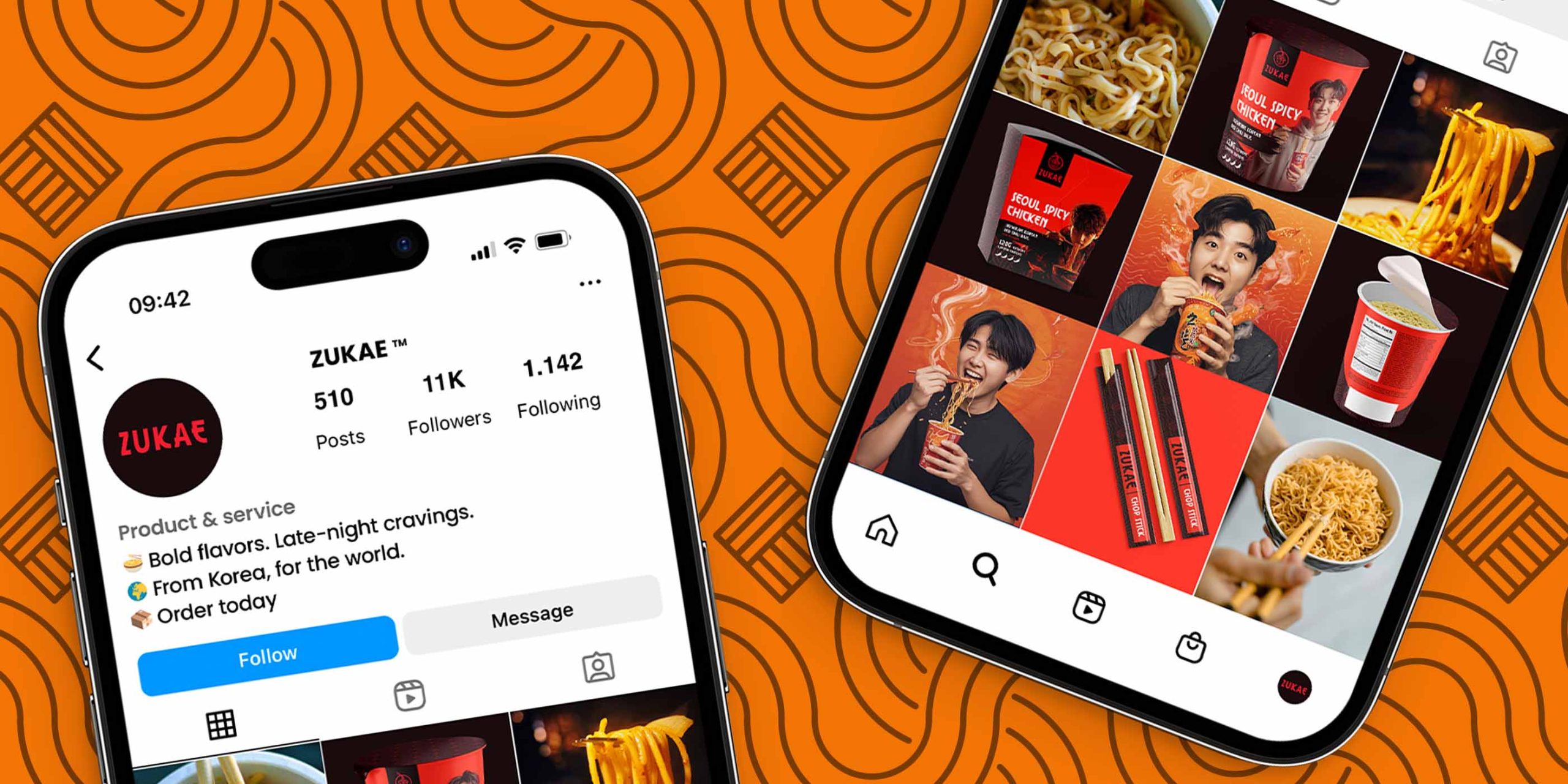
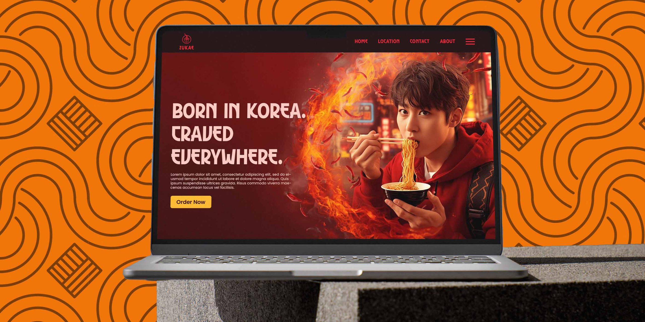
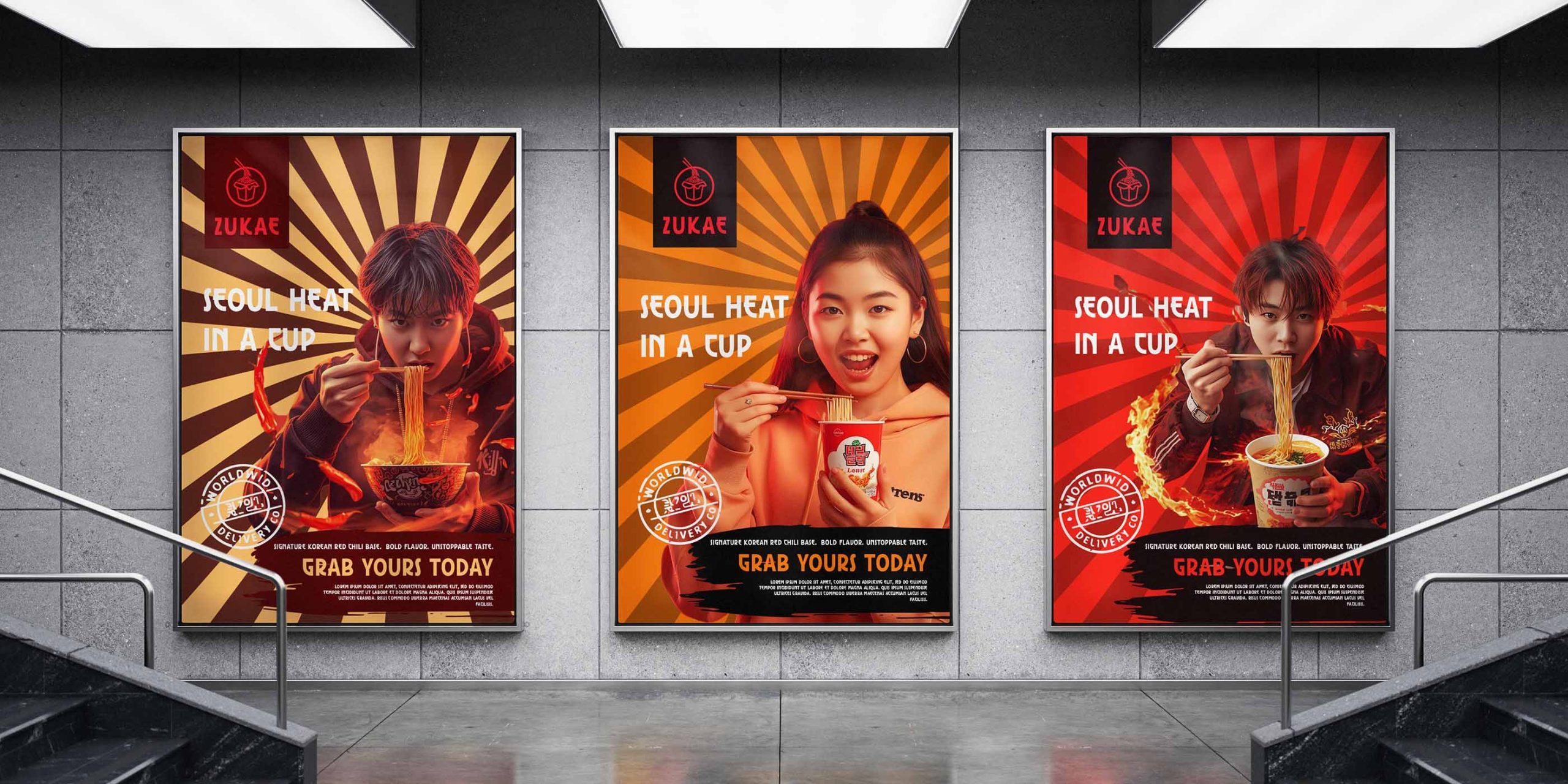
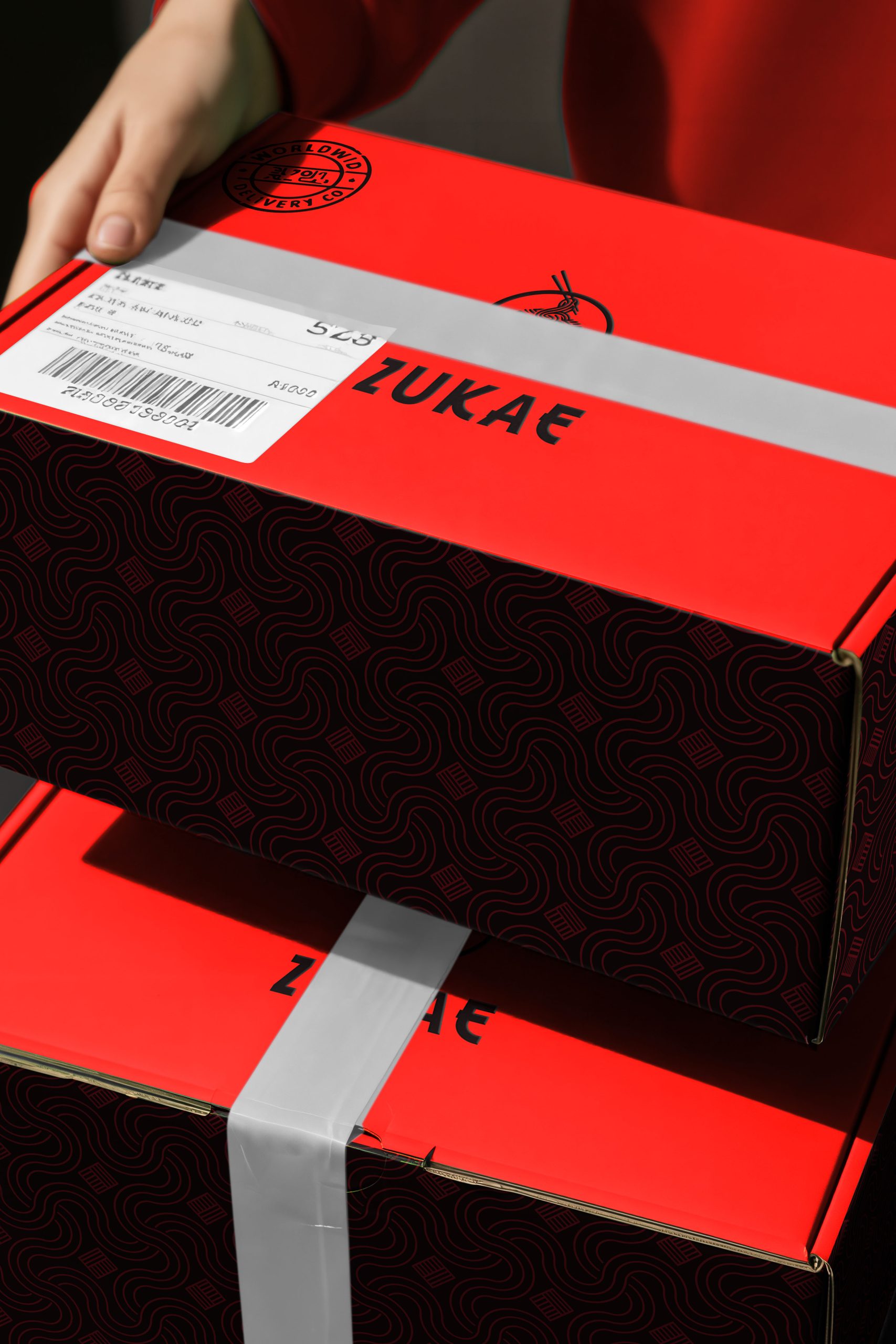
The design system extends beyond the noodle cup and encompasses flavor sachets, chopstick sleeves, and delivery boxes. Each element follows a unified grid and material system, maintaining consistency across print, digital, and eCommerce applications.
The minimal structure and bold color usage were chosen to stand out on both digital platforms and physical shelves, positioning ZUKAE as a lifestyle-driven noodle brand rather than just a quick snack.
RESULT-
The result is a distinct, premium instant noodle identity that feels authentic yet aspirational. ZUKAE design system tells a complete story from the packaging to the unboxing moment. that resonates with modern consumers seeking authenticity and style in everyday products.
The new identity communicates flavor through form, culture through color, and personality through restraint. It demonstrates that even an everyday D2C and FMCG product can evoke emotion and global desirability through clarity, strategy, and strong storytelling.
DESIGNER’S INSIGHT-
This project reflects my belief that premium doesn’t always mean complex. Sometimes, it’s about clarity, consistency, and storytelling — creating a brand system that not only attracts attention but emotionally connects with consumers.