Affogato Brand Design Reimagines Self-Care through NÜMA
NÜMA began as a conceptual brief exploring the emotional landscape of modern self-care. The challenge was to build a brand not from a product, but from a philosophy — the rhythm of a breath. The brief asked us to translate the duality of stillness and movement into a complete identity system. NÜ represents grounding, structure, and presence; MA represents motion, release, and flow. Together, they form NÜMA: the balance between pausing and opening, inhaling and exhaling, holding and releasing. Our approach was to create a visual world that could hold this duality with clarity, softness, and intention.
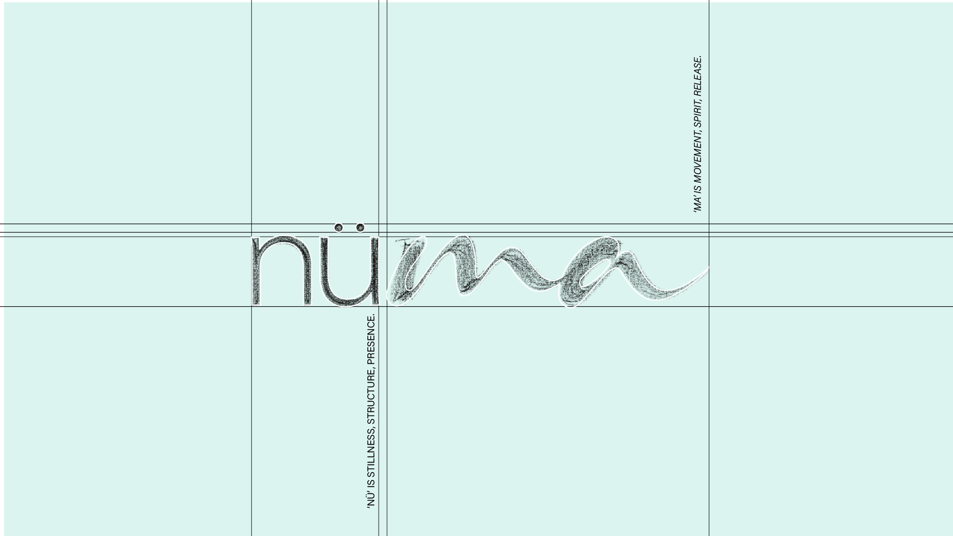
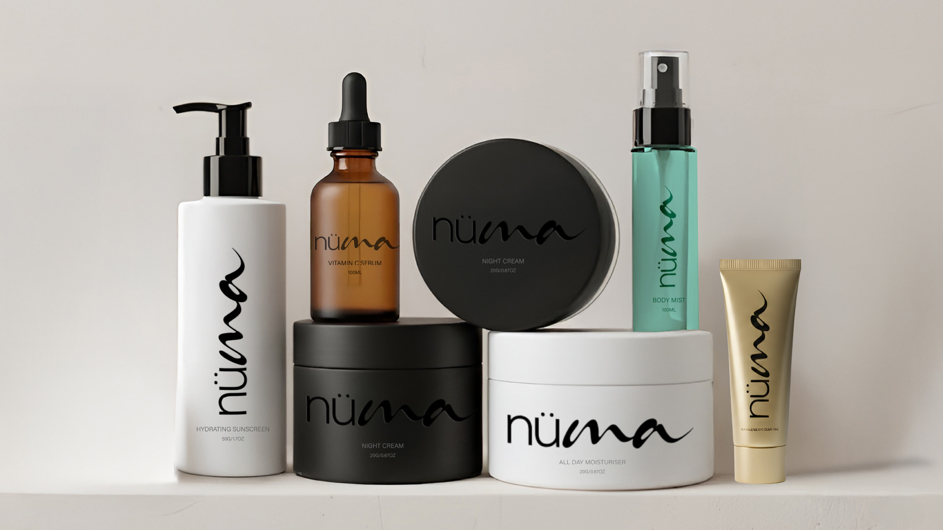
To express this philosophy, we crafted a wordmark built on contrast.
NÜ is designed in a structured sans serif, giving the brand its anchor — calm, minimal, and intentional.
MA flows in a soft, expressive script, bringing movement and emotional depth.
This juxtaposition became the foundation of the identity strategy: a system where stillness and flow coexist.
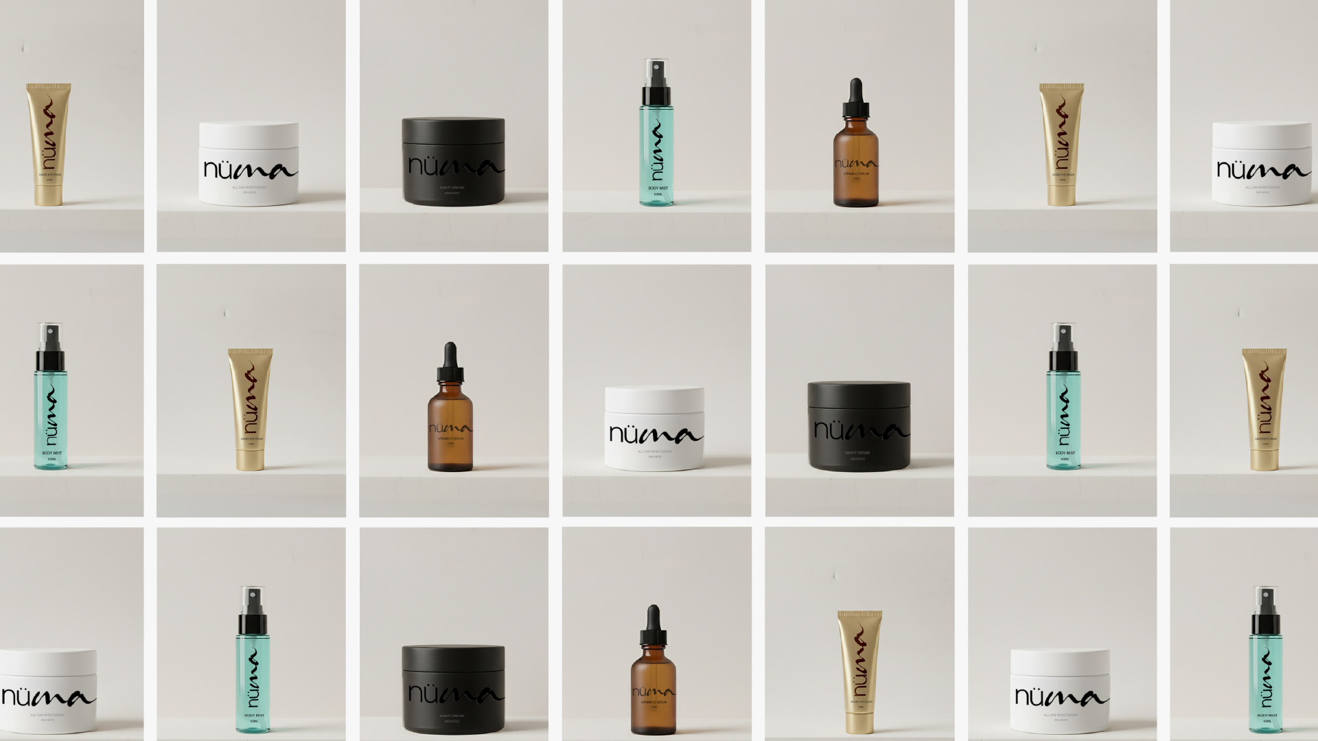
We extended this duality into the full visual language:
- Minimal layouts paired with fluid gestures
- A calm palette grounded in Transformative Teal
- Functional typography softened with expressive accents
- Packaging that offers visual quietness with subtle motion
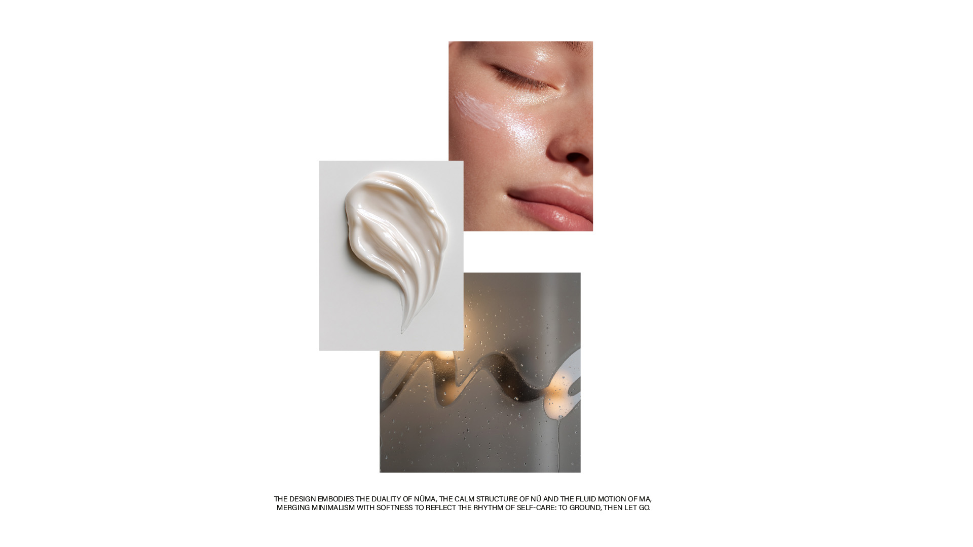
Every touchpoint — from shower-glass imagery to lotion textures — was designed to echo the inhale-exhale rhythm that defines NÜMA.
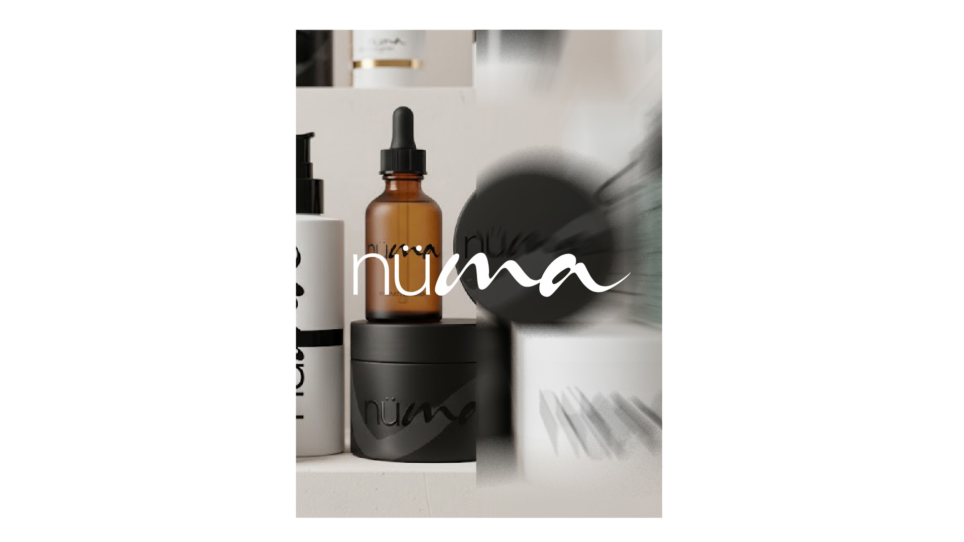
The outcome is an identity that feels like a breath — grounded yet fluid, calm yet alive. The visual system moves gently between structure and softness, creating a brand world that embodies the essence of modern self-care. Through intentional contrast and emotional design thinking, we crafted a complete ecosystem where philosophy becomes form. NÜMA emerges as a breathing identity: serene, expressive, and unmistakably memorable, capturing the quiet power of returning to yourself and flowing forward again.