Packaging concept for MINERALIAN
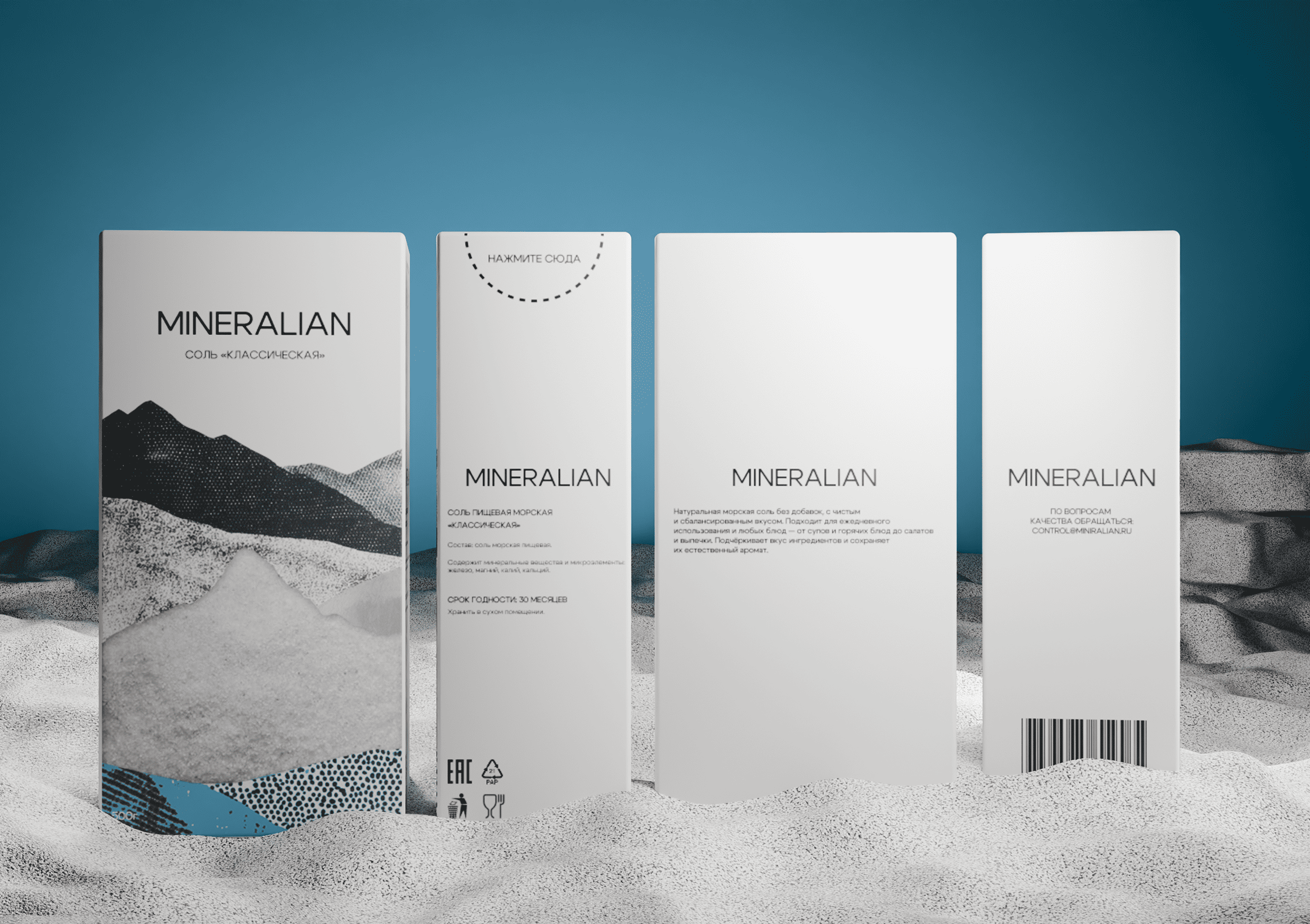
MINERALIAN is a line of natural mineral salts with distinct flavor profiles, created to make everyday home cooking more expressive without extra effort. The goal of the packaging was to bring the range into one coherent visual system that feels restrained, modern, and instantly recognizable — while clearly communicating the product’s mineral, nature-origin story.
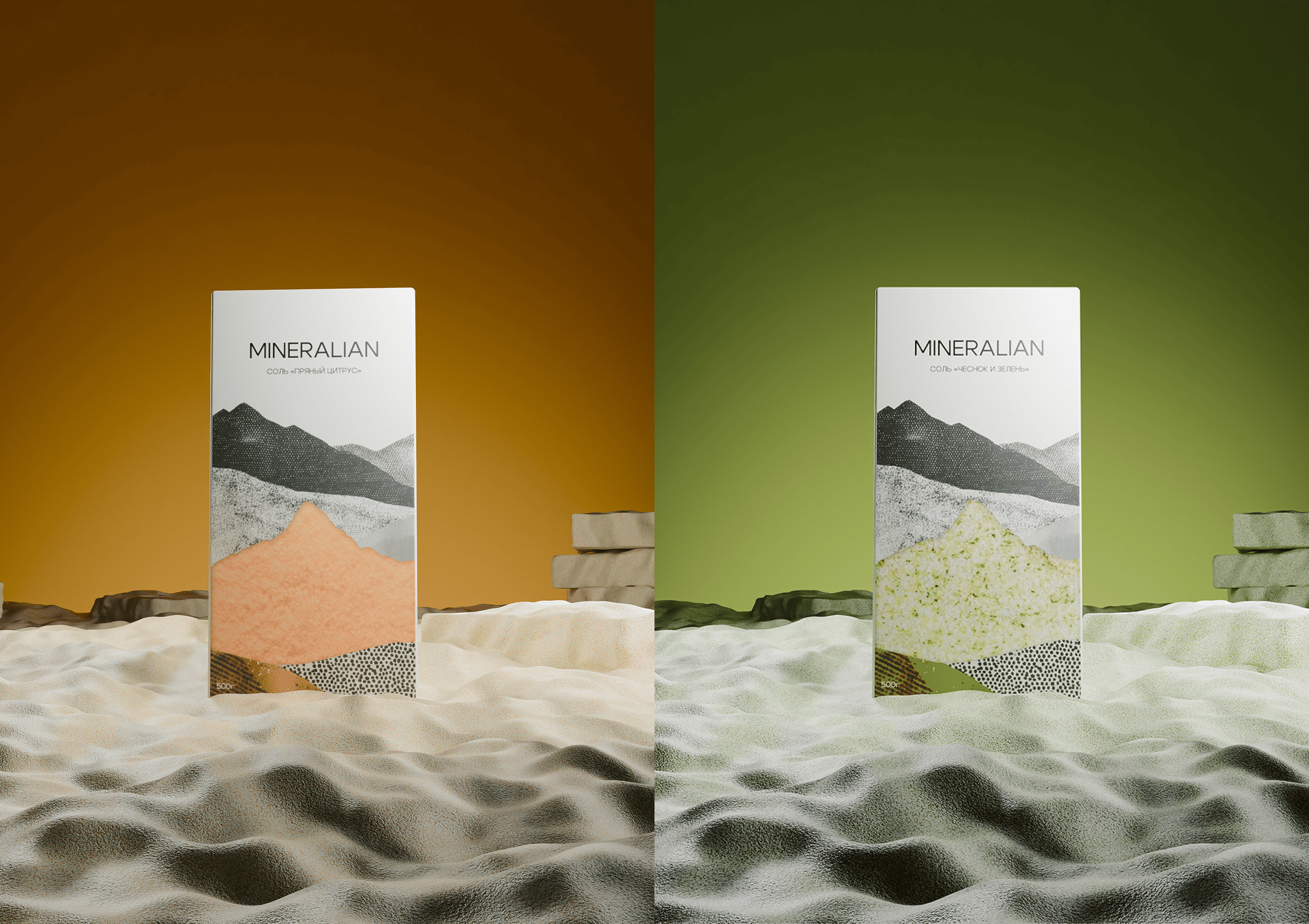
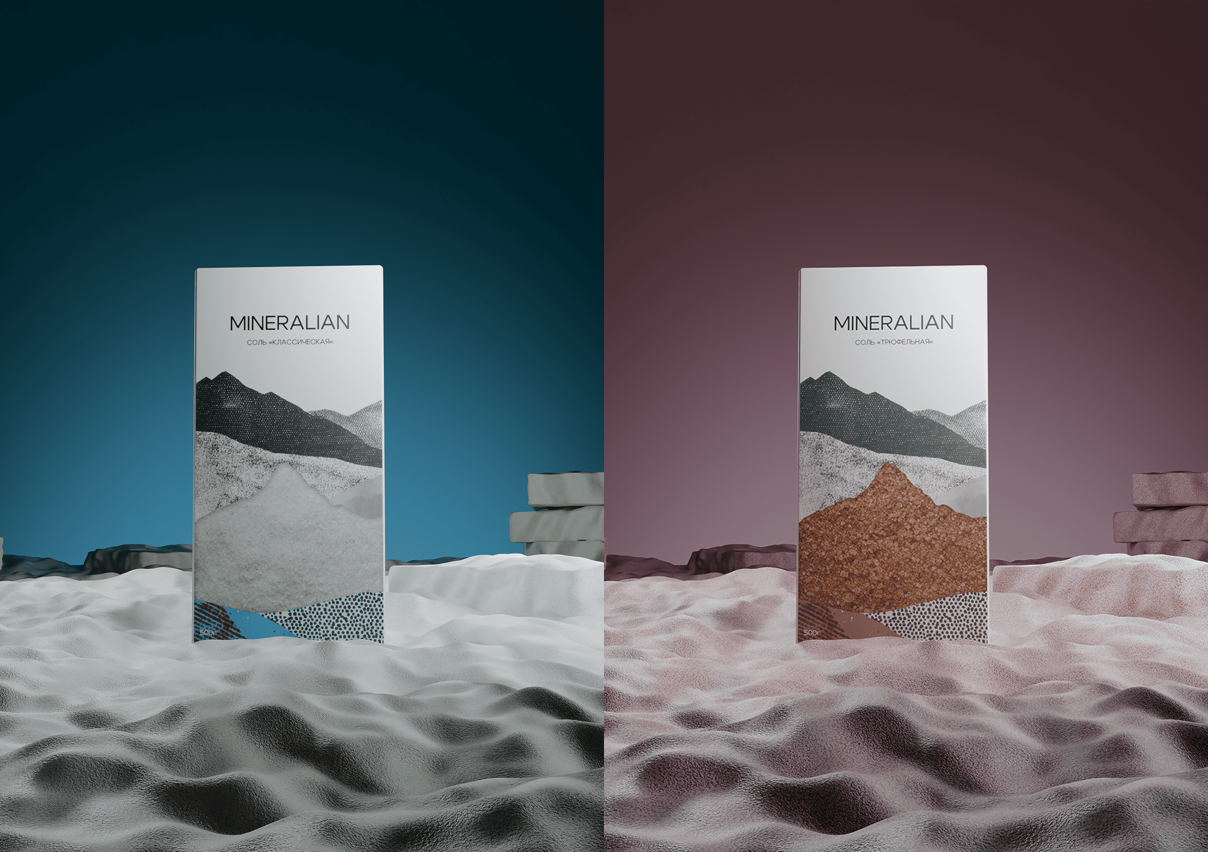
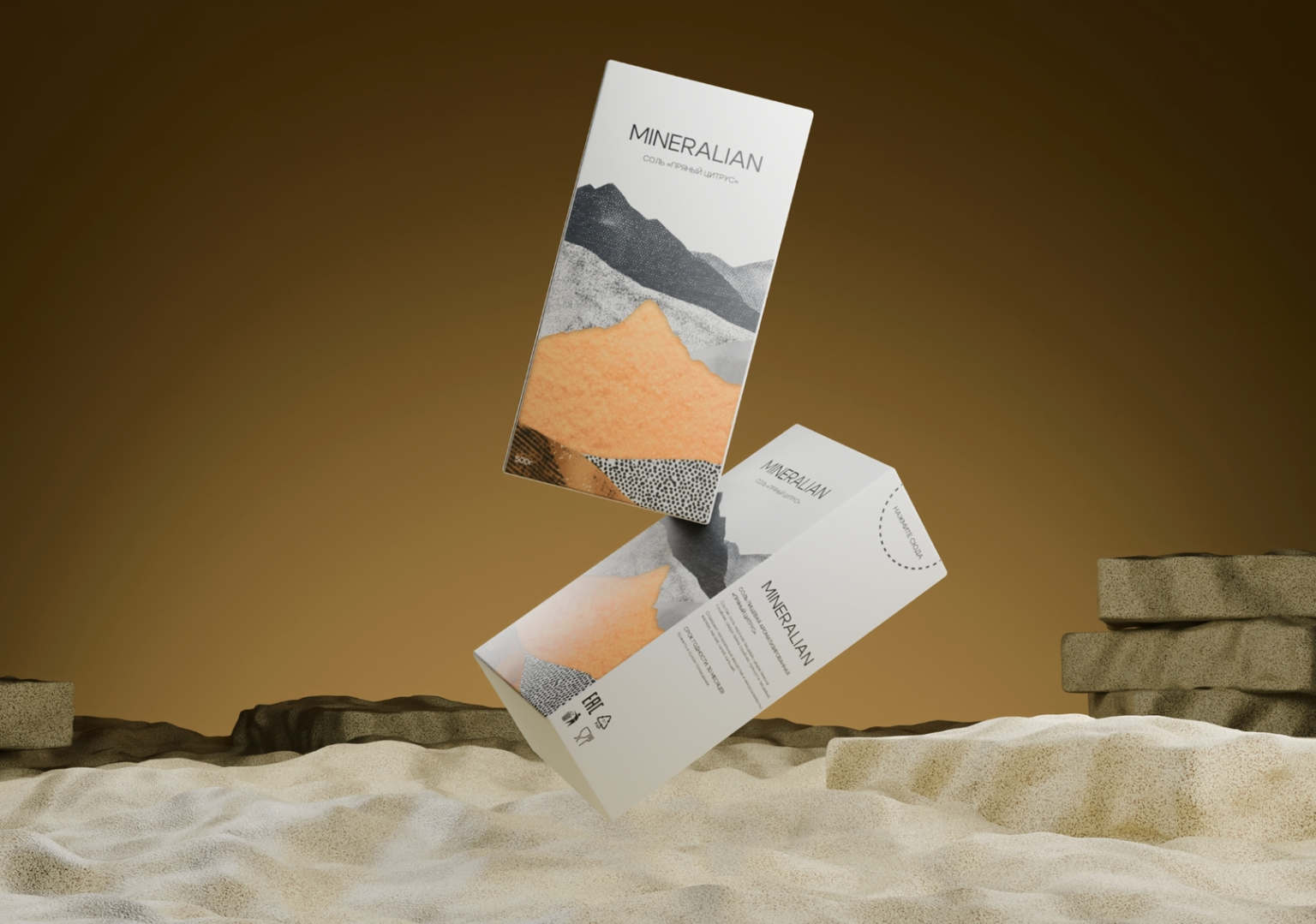
The concept is built around mineral geology and salt extraction: natural structures, stone, crystals, and layered rock formations. These references are translated into abstract graphic shapes and tactile textures — not a literal “natural” look, but a refined, design-forward language that feels almost interior-object-like. Clean composition, generous negative space, and carefully tuned typography reinforce a sense of clarity, quality, and conscious choice.
Each flavor gets its own character through color and subtle shifts in form, while the overall system stays consistent across the line:
- 01/ Spicy Citrus — more dynamic visuals with warm accents.
- 02/ Herbs & Garlic — fresher, cool green tones and softer lines.
- 03/ Classic — the most minimal, clean, and understated version.
- 04/ Truffle — deeper, richer color with a premium emphasis.
The result is a flexible packaging system that speaks about minerals and flavor without relying on direct food imagery, scales easily as the range grows, and fits the expectations of urban aesthetes aged 25–45 who value aesthetics, natural ingredients, and well-considered details.