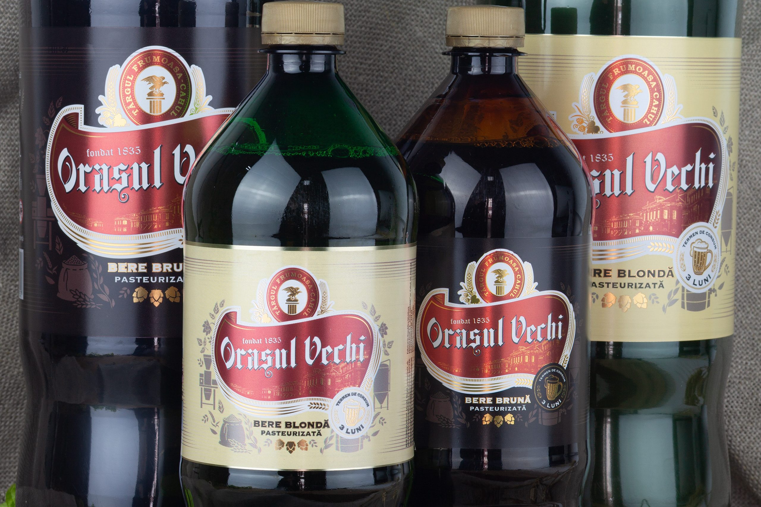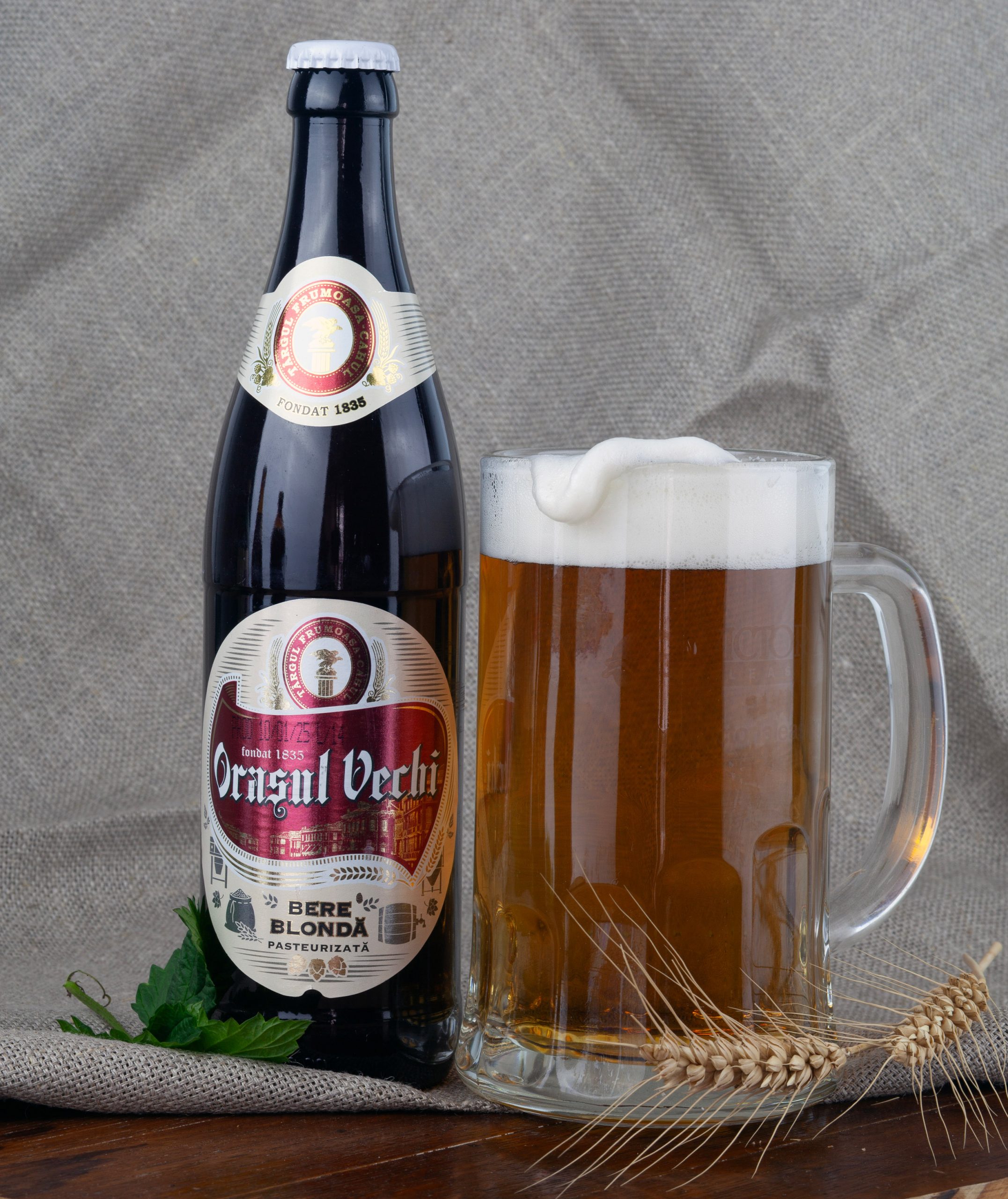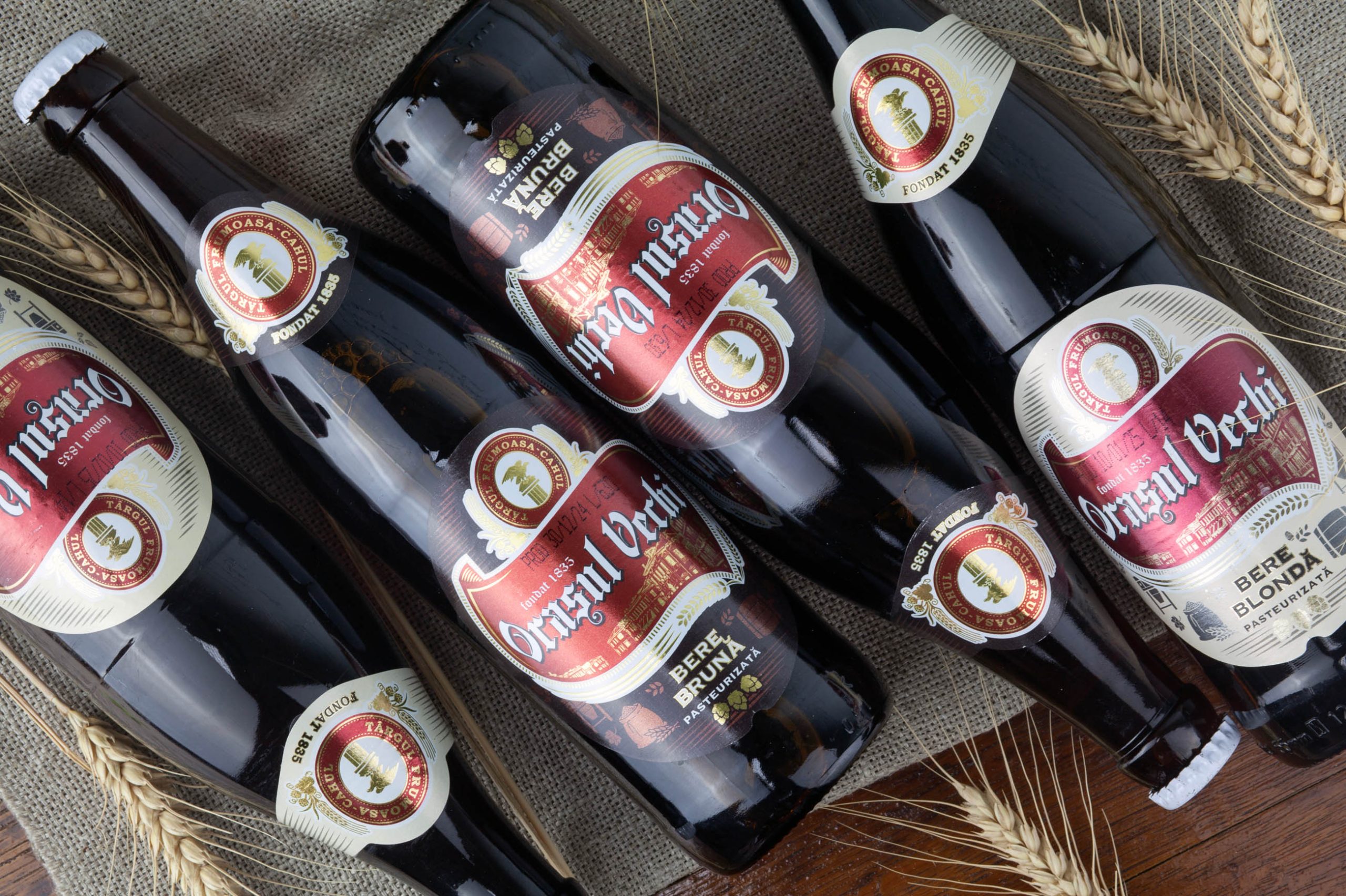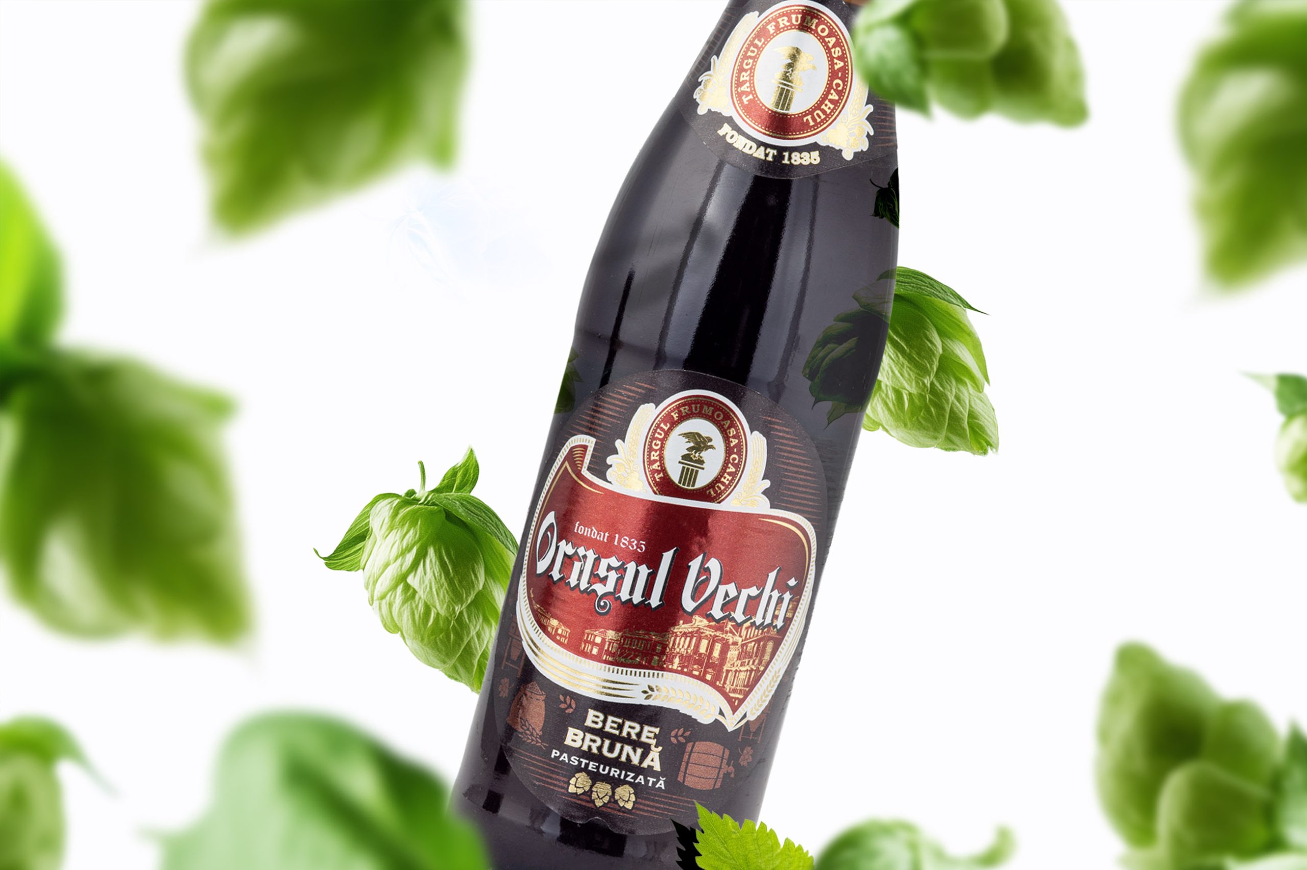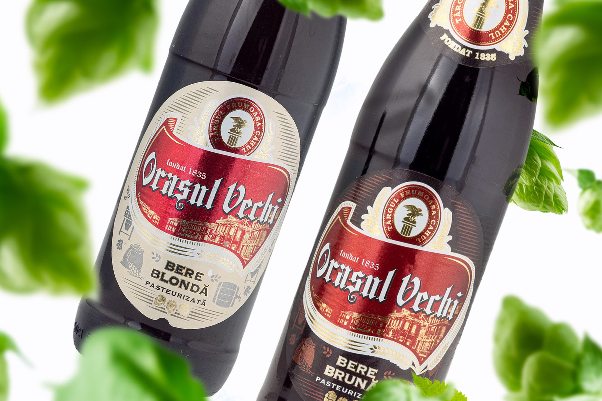
We carried out a complete rebranding for the @orasulvechi.md beer label – from concept and illustration to graphic composition and typography. While preserving the idea of tradition, we brought a fresh, clearer, and more visually coherent look that stands out on the shelf.
The design incorporates symbols of the old town and elements that highlight the brewery’s long-standing heritage (founded in 1835), while clearly indicating the beer type: blonde, pasteurized, with a 3-month shelf life.
A new packaging for a beer with history – now with a fresher, clearer, and more attractive identity.