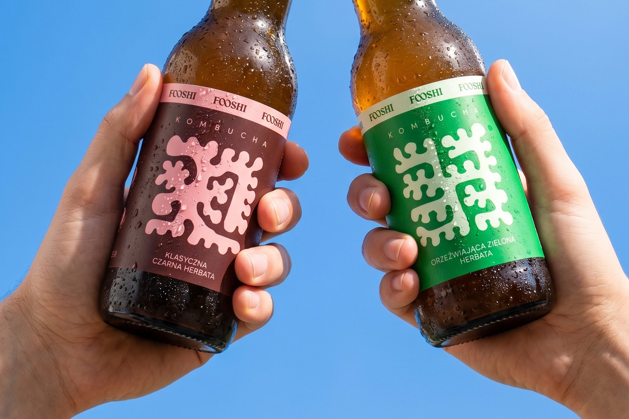

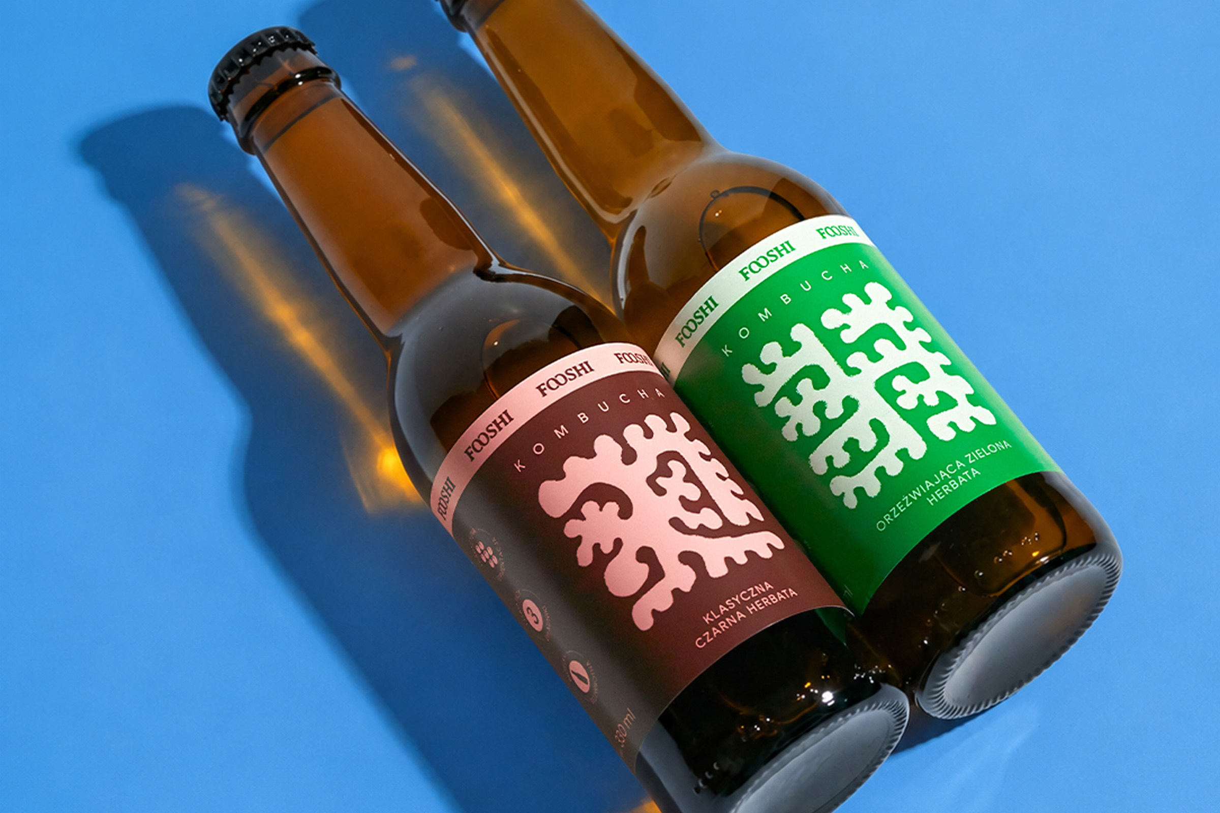
Fooshi is a new brand of naturally fermented kombucha, brewed through a multi-week fermentation process and entering the highly competitive functional beverages market, which is growing by approximately 8% annually.
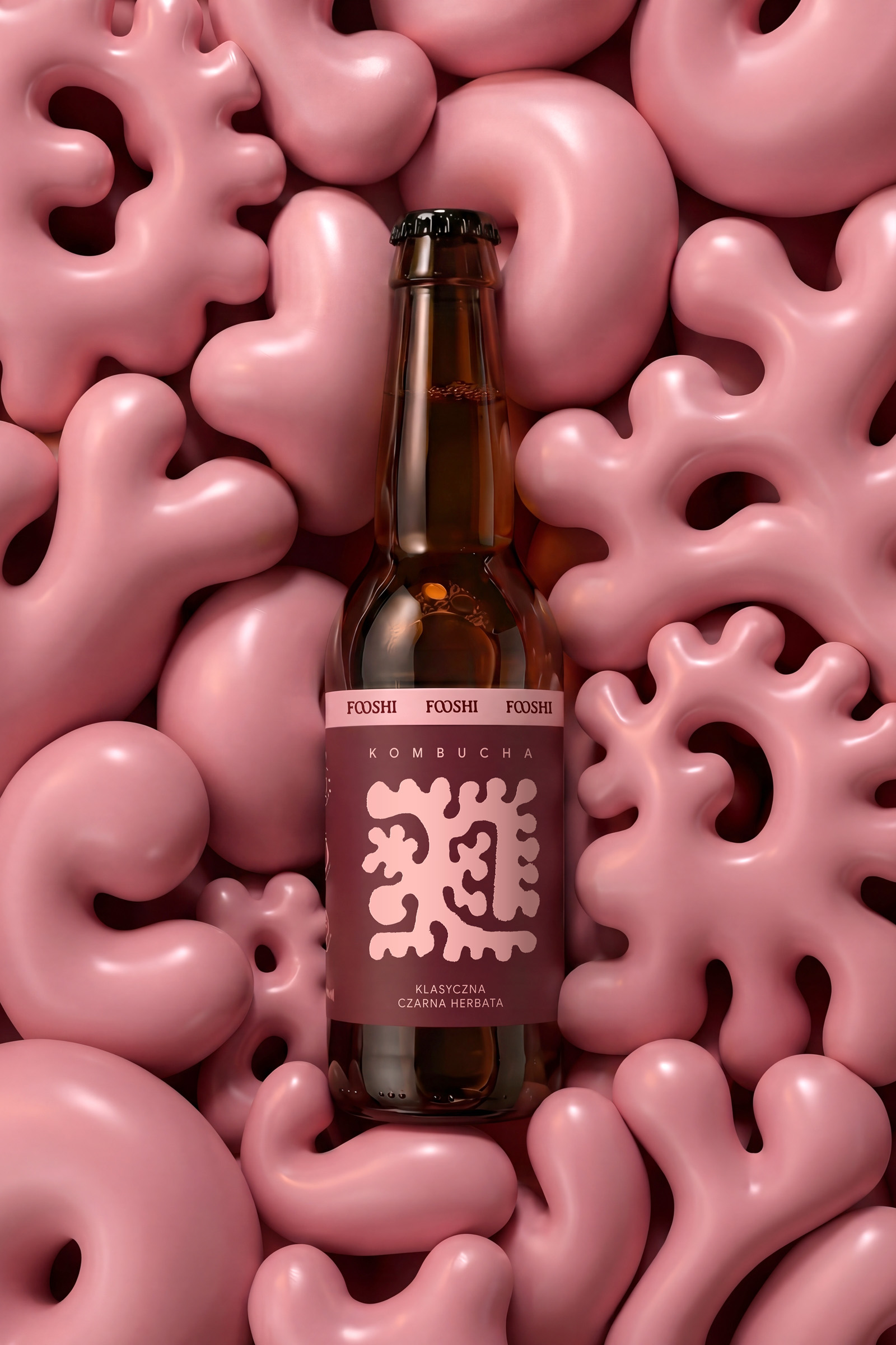
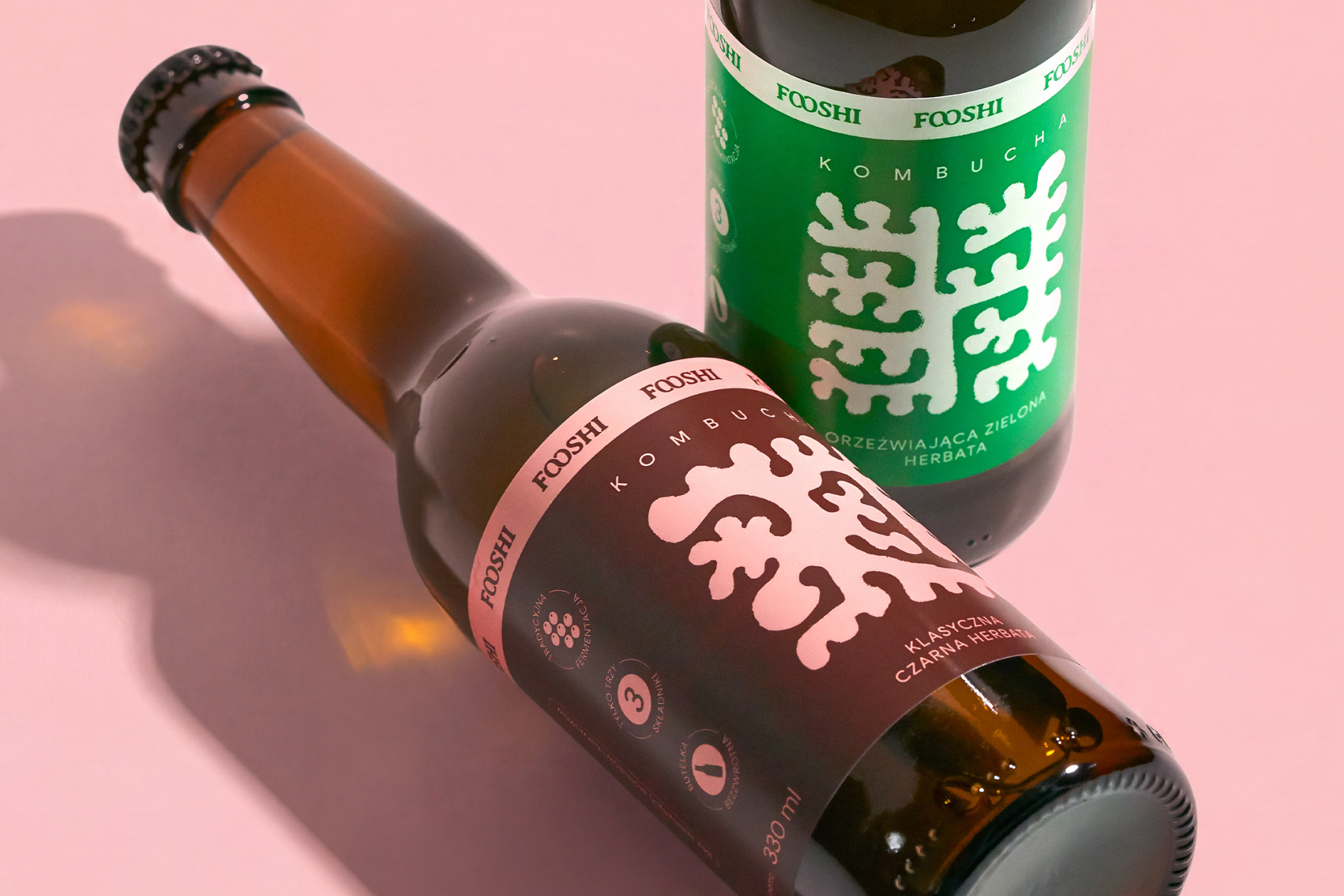
The name is inspired by the Japanese word fushi, meaning longevity. The double “o” in the logotype forms an infinity symbol, visually reinforcing this idea. The abstract illustrations on the labels reference the fermentation process itself.
The biggest challenge was time and budget. The project was executed in a model closer to a startup than a traditional FMCG brand launch – on our side, this meant short design sprints and the creation of three label designs; on the client’s side, a small initial production run and a rapid rollout into retail distribution.
The brand is already on the market.
Curator’s Insight
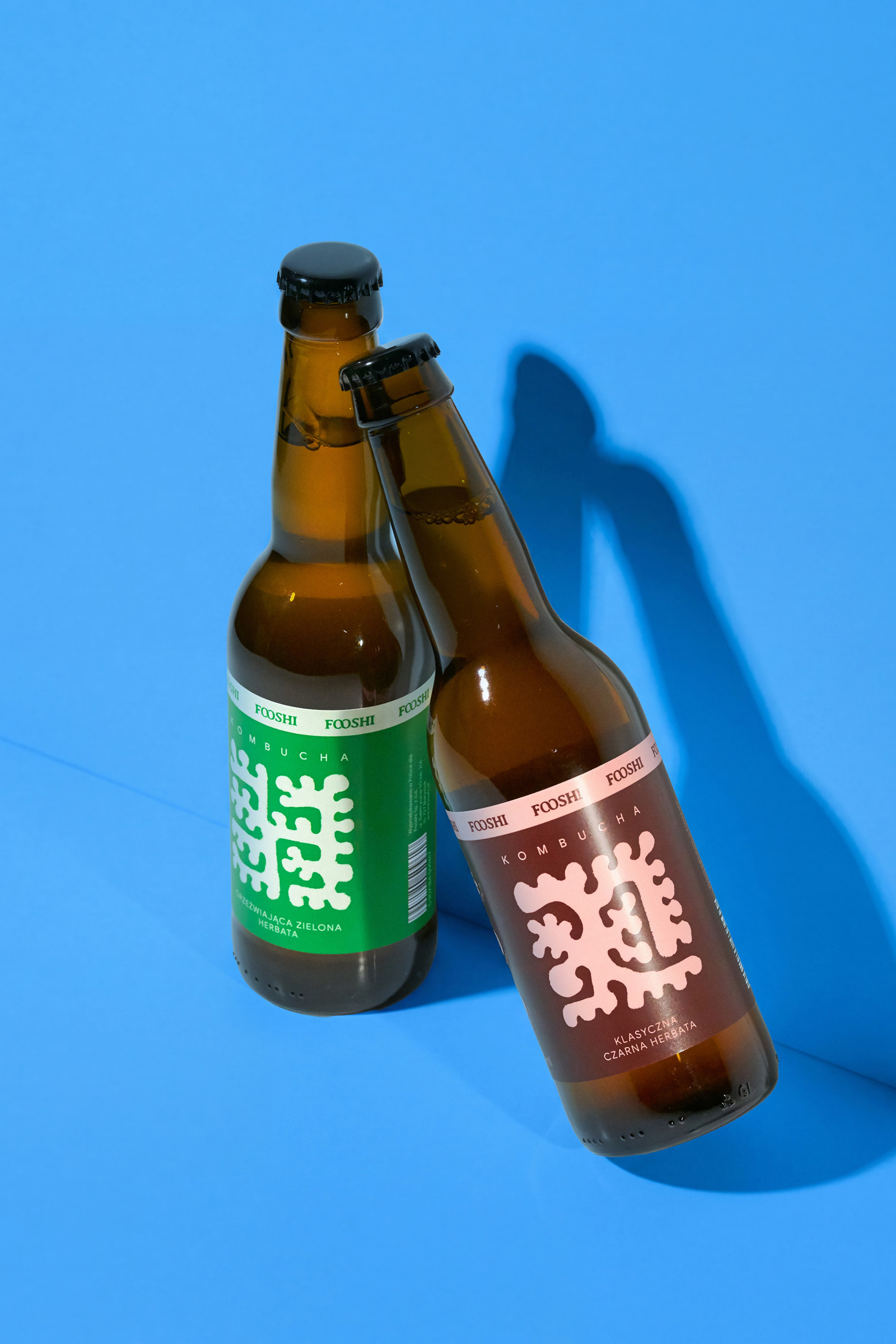
The fermentation process is notoriously difficult to visualise without veering into the clinical or the overly literal. What works here is that the abstract mark on each label feels alive without needing to explain itself. It has the quality of something growing, spreading, or blooming, which maps naturally onto how kombucha is actually made. Paired with a tight, confident typographic system and a colour palette that does the range navigation work cleanly, the result is a brand that looks considerably more resourced than its startup-sprint origins suggest. That gap between budget and output is, quietly, the most impressive thing about it.
 lunapanda
 Tridimage
 Analoguecreative
 lettera7
 alchimistestudioParis
 Lana B
 Colossal
 Pivot Studio
 M&A CREATIVE AGENCY
 monther al omari
 Anastasia Cherepanova | xtramez
 Hollóka Grafikai Műhely / Graphic Design Studio
 BOLD branding
 Antonia Skaraki
 Pâmella Lorrany
 Z9BKAdsgn
 Francesco Paternoster
 b1studio.ro
 Chris Creative Works
 Boordon
 Dmitriy Kuzovlev
 Brand Society
 yasharpic