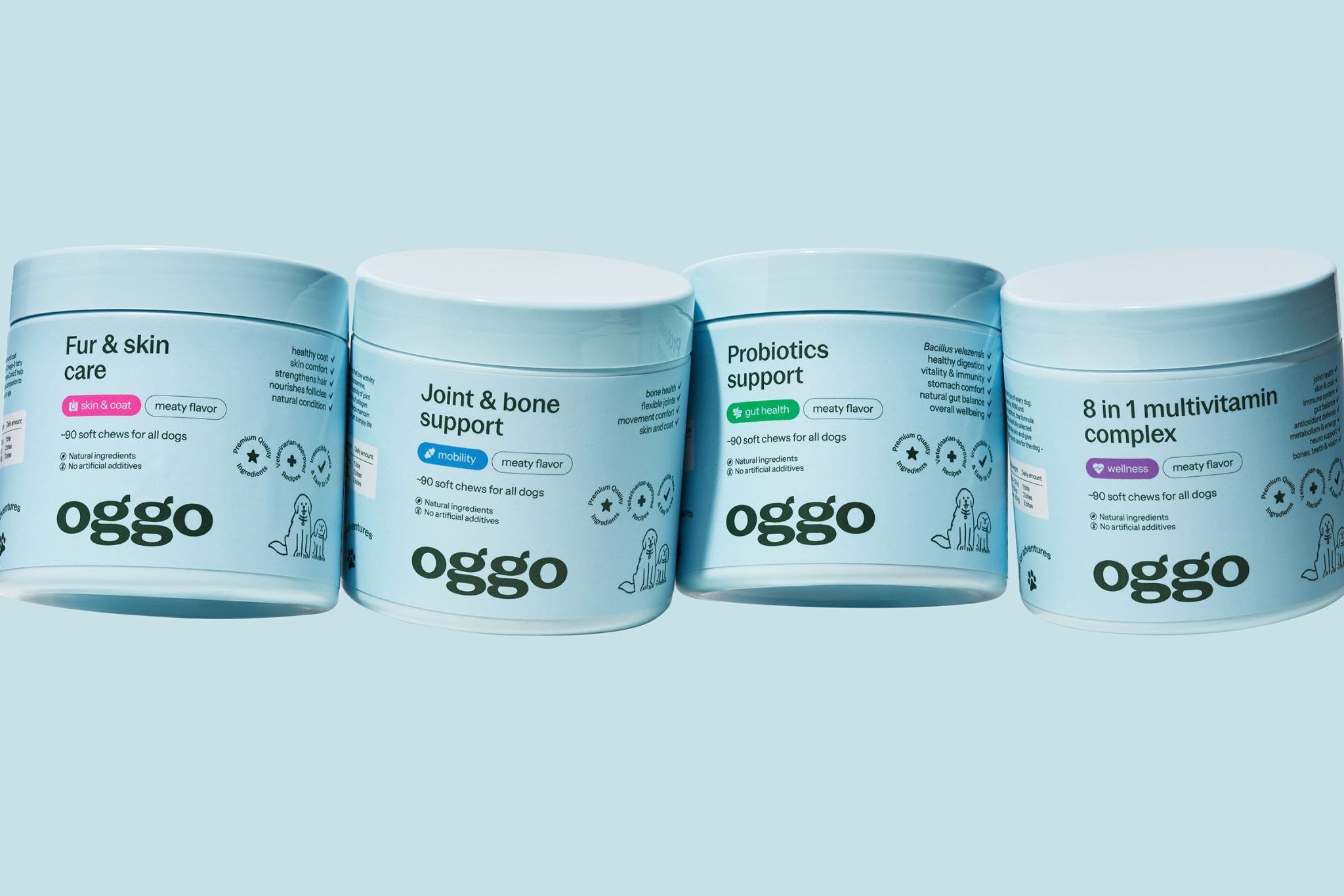

Oggo was born from a clear promise: no more second-guessing which supplement to choose for your pet. A simple choice matched to a specific need — joints, coat, digestion, or energy. The brand takes a holistic view of dog and cat health: rather than just addressing symptoms, it supports full vitality, from an observed problem to a visible transformation.
The name Oggo echoes the popular, affectionate term for a dog, “doggo.” The repeated “g” sound gives it rhythm and easy memorability, while staying open enough in meaning to leave room for the portfolio to grow. The tagline Fuel for Adventures highlights pets’ energy and wellbeing.
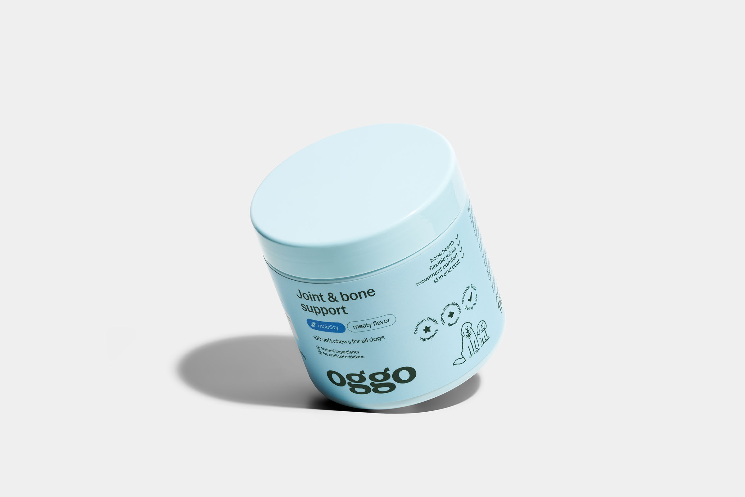
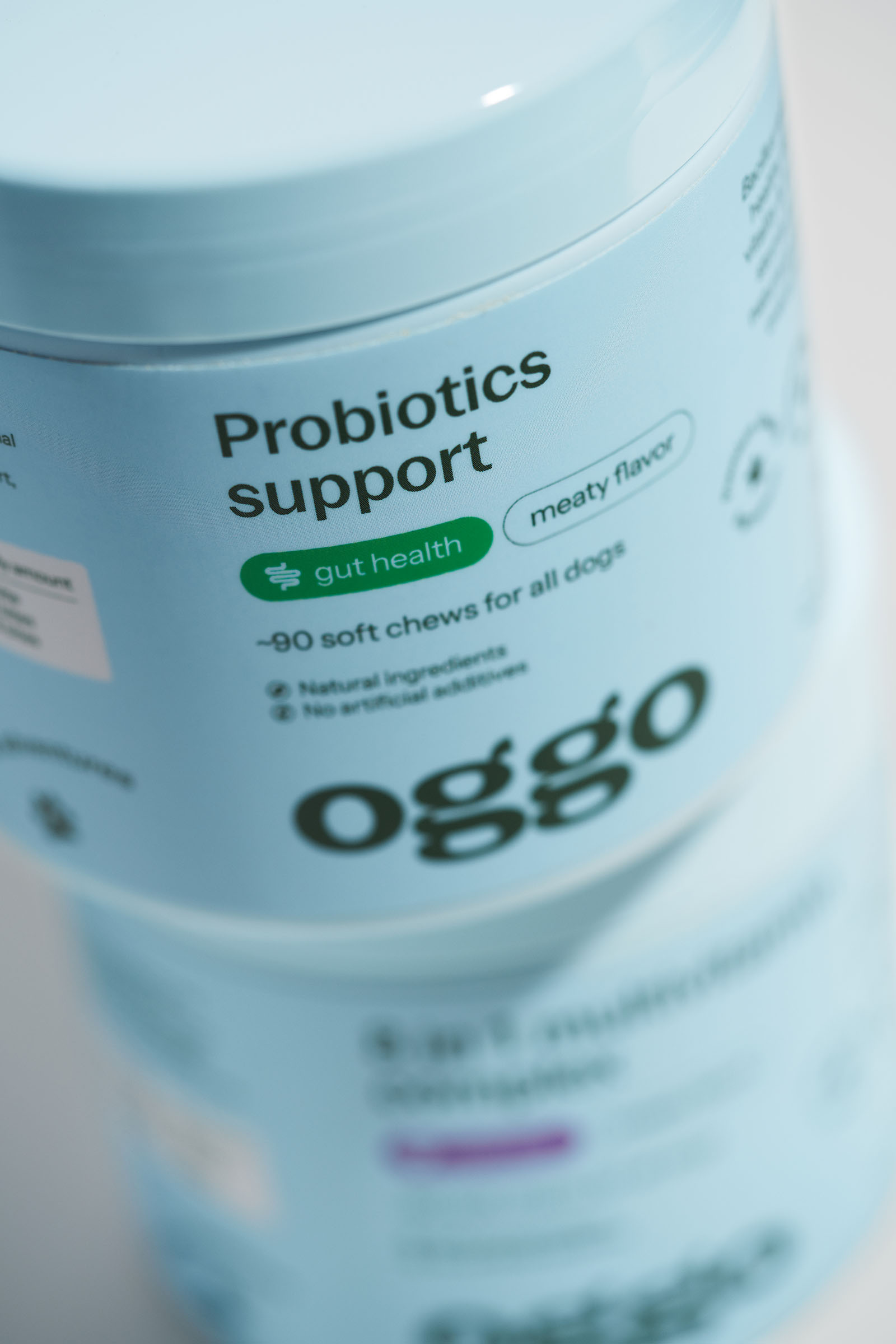
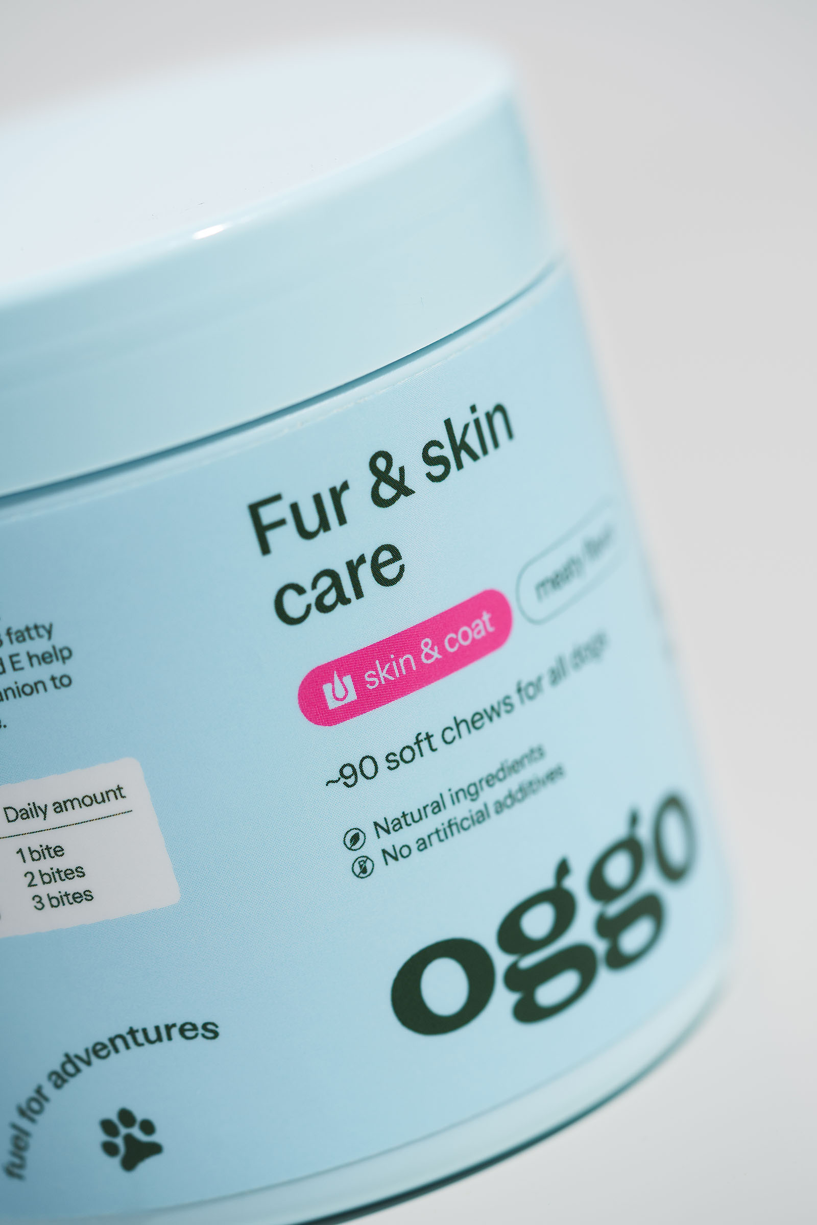
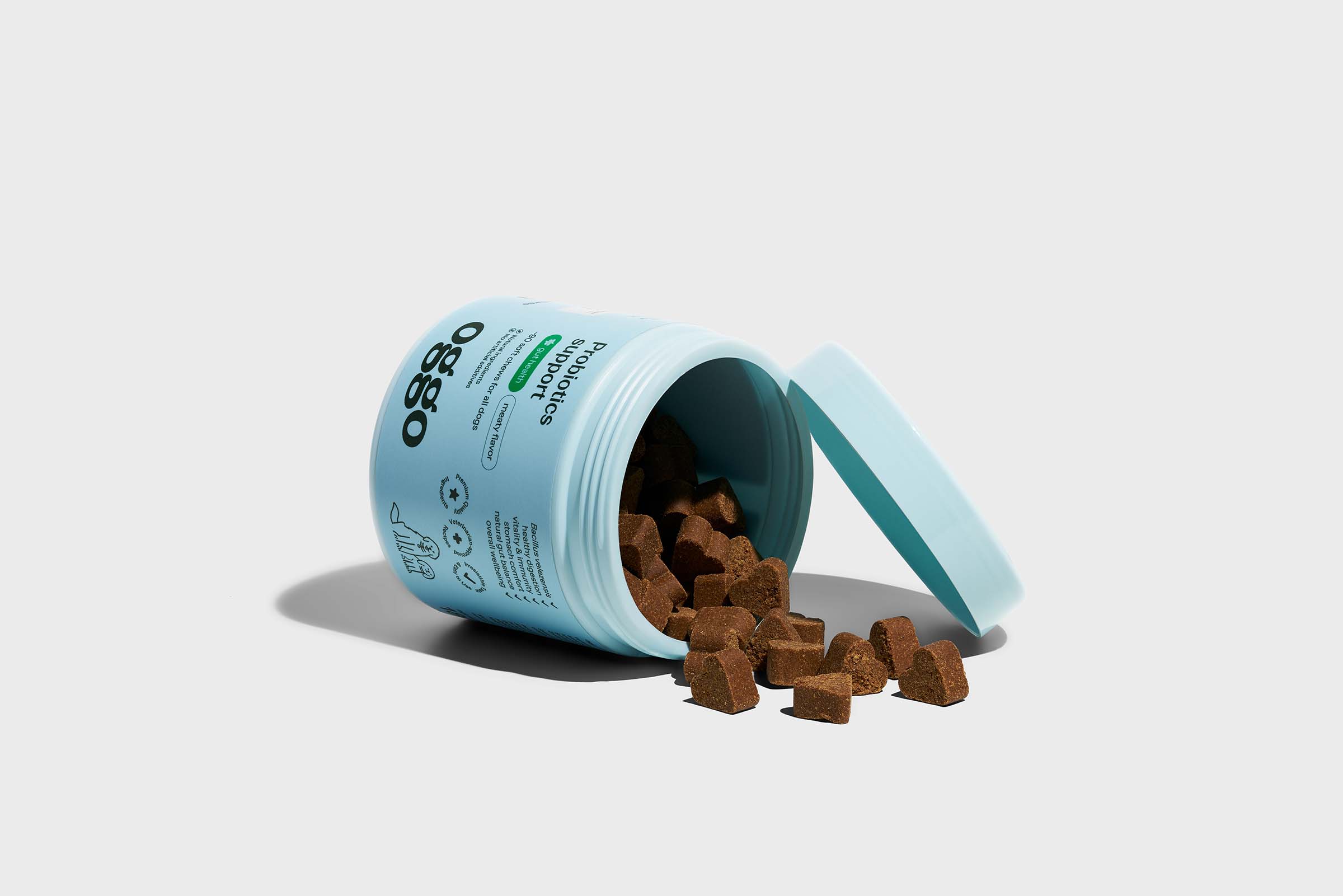
The logo and identity were designed to feel friendly and approachable. A soft typeface in the logo, hand-drawn animal illustrations, and a gentle palette of core colors let the brand balance associations with both medicine and play. A complementary system of bolder colors is used to categorize products, each corresponding to a specific function — gut health, wellness, mobility, skin & coat.
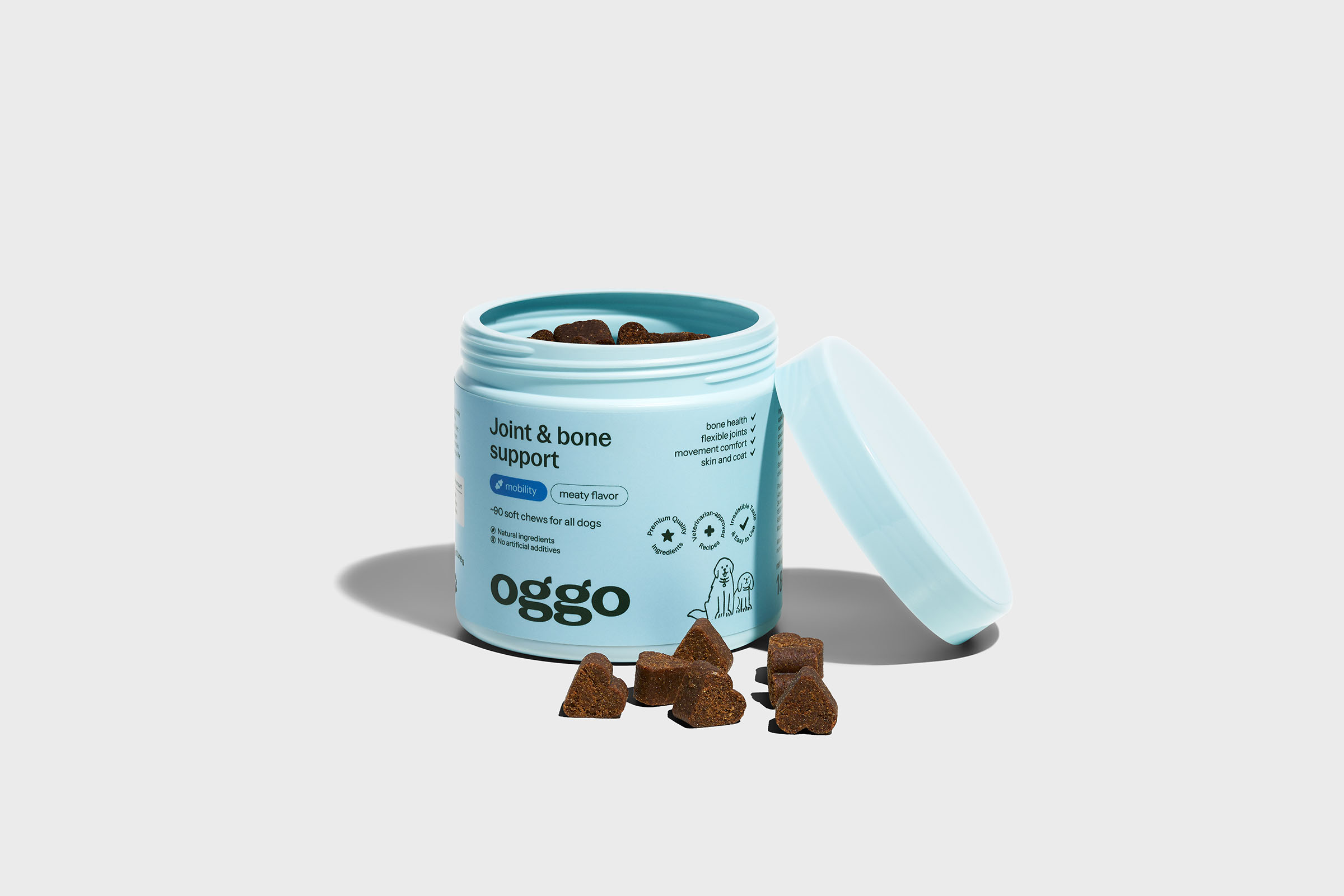
The result of the collaboration is a comprehensive brand identity for a company offering dietary supplements and cosmetics for dogs and cats. Thanks to a consistent packaging and communication system, users can easily find the products they need.



 Lizaveta Kharitonyuk
 Bonsanco Creative Studio
 DesignRepublic
 GIRAFA STUDIO
 PiotrWisniewski
 Sophiagdotcom
 monther al omari
 CreativeWise
 Modern Theory
 SoreThumbStudio®
 Modern World Studio
 Palashcc
 Valérie Colace
 andreamarinnn
 Chochoi Creative
 Hi estudio
 bachir bachchar
 Aferdini
 AUN BRANDS
 vitoramockup
 InterWish
 ash123456
 Studiotaketwo