
“NUT Whisky” The Goddess of the Heavens: Sculpting Modern Luxury Through Ancient Egyptian Cosmology
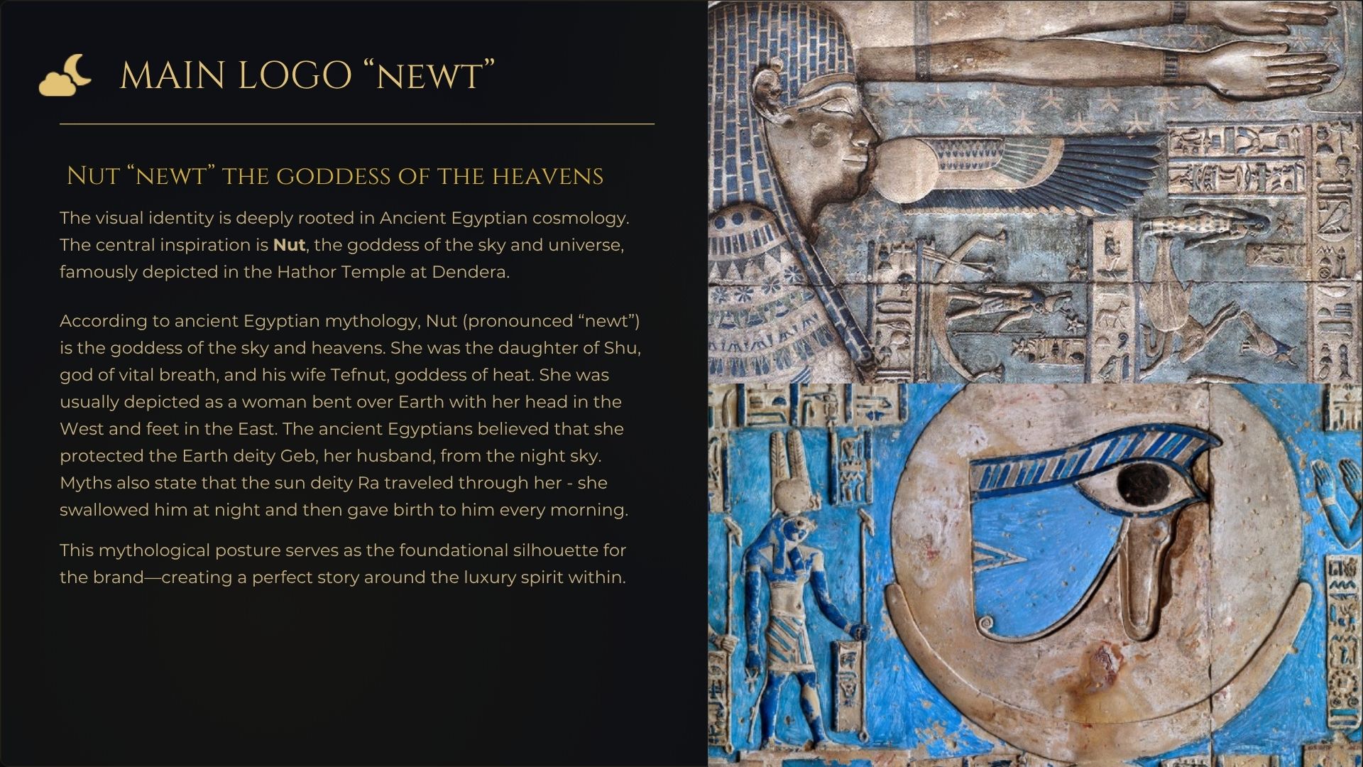
The conceptual genesis of “NUT Whisky” began by looking upward—specifically to the ancient ceiling of the Hathor Temple in Dendera. As an Art Director, my vision was to translate the iconic, two-dimensional depiction of Nut, the Ancient Egyptian goddess of the sky, into a modern, tactile luxury experience.
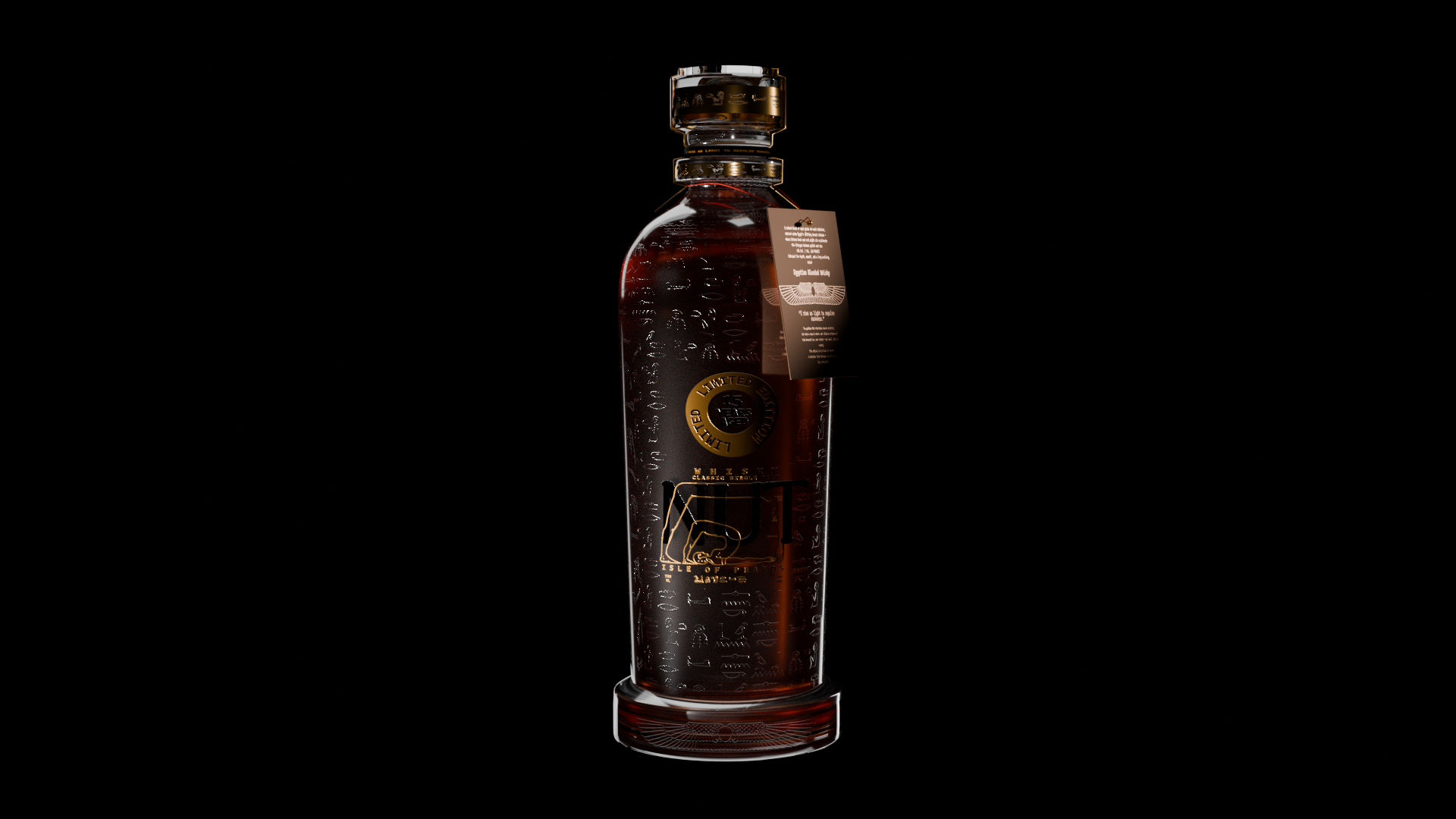
In mythology, Nut’s body arches over the earth, forming the vault of the heavens to protect the world below. I abstracted this celestial pose to create the brand’s core visual identity, where her curved silhouette arches seamlessly over the wordmark. This structural choice is highly intentional: it symbolizes cosmic enclosure and the eternal preservation of the 15-year-aged single malt resting inside.
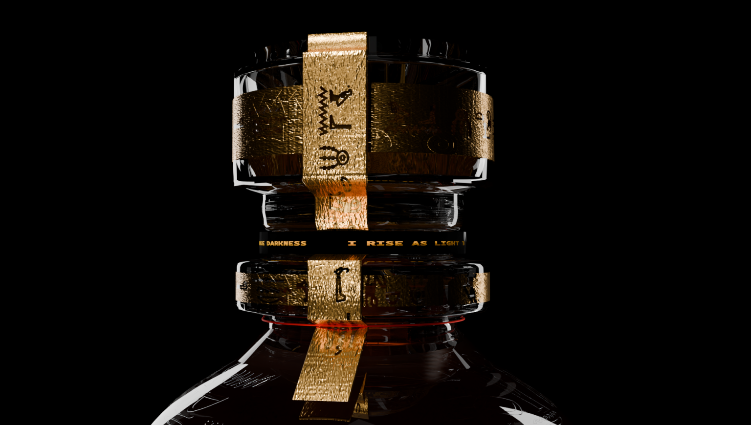
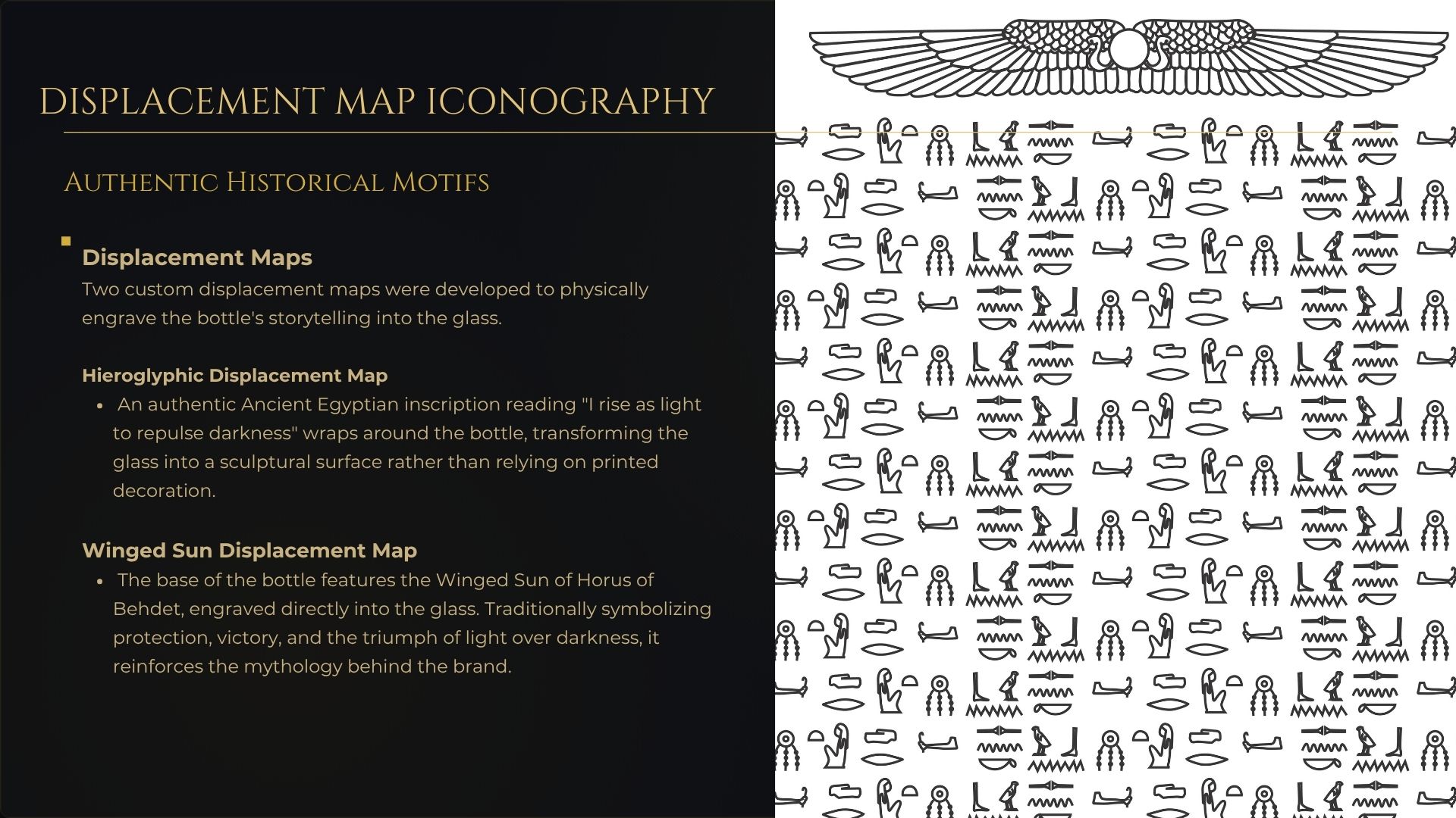
Instead of standard printed labels, I used 3D displacement maps to turn the bottle into a sculpted artifact. The glass is deeply etched with hieroglyphics that translate to: “I rise as light to repulse darkness”. This texture gives the bottle a premium, tactile grip and catches the light, making the amber whisky glow like a temple relic. Finished with a carved base of Horus, the design perfectly merges ancient mythology with modern luxury packaging.
To explore the complete 3D workflow, material texturing, and visual campaign, please view the full project portfolio here: https://www.behance.net/gallery/254013867/NUT-WHISKY-the-goddess-of-the-heavens-/modules/1477286517
Curator’s Insight
The most demanding decision in this project is turning the wordmark itself into the goddess figure rather than pairing an illustration next to a name. Letting the U and T arch to form Nut’s body means the typography has to do double duty as both legible text and figurative silhouette, which is a much harder brief than illustrating a myth beside a logo.
The etching strategy is worth studying closely too. Rather than printing hieroglyphs onto a label, the glyphs are cut directly into the glass, so they only become visible once light and liquid interact with them. That is a meaningful bet, since it means the design partially disappears in flat lighting and only fully performs when the bottle is held, poured, or backlit on a bar shelf. It rewards physical handling over a quick glance, which fits a fifteen year aged product positioned toward a slower, more considered purchase.
The neck detailing carries a similar logic. Multiple gold bands stacked with inscribed text extend the narrative vertically rather than cramming everything onto the front label, giving the eye a reason to travel the full height of the bottle instead of stopping at the wordmark.




 krrrrrllii
 babyage
 Deep
Deep monther al omari
 Atiq Alam
 TUERCA Studio
 neo creative studio
 Pinot Agency
 Pixels Studio
 Anastasia Cherepanova | xtramez
 awaiskhadim
 Studio Be Design
 Belova Oksana
 We Craft Studio
 ArtDesignByDIna
 Ananya Taran
 Nadezhda Gorelikova
 orhanirmaktasarim
 WillBe
 Hi estudio
 43oz
43oz Rosario Lo Iacono
 alchimistestudioParis