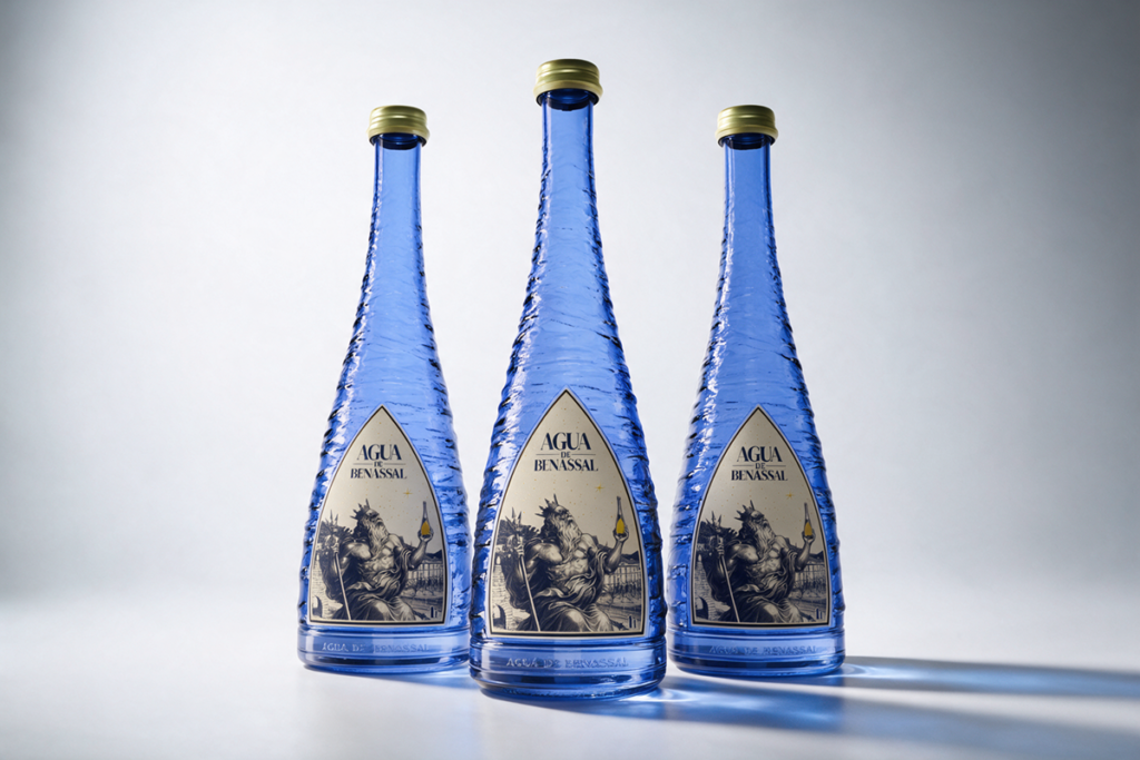

Arrels is a comprehensive packaging and brand identity redesign project for Agua de Benassal, Spain, conceived with the aim of restoring and highlighting the connection between the brand, the water, and the territory from which it originates. The project is based on one essential idea: the packaging should not simply be a container for the product, but an extension of its origin, history, and identity.
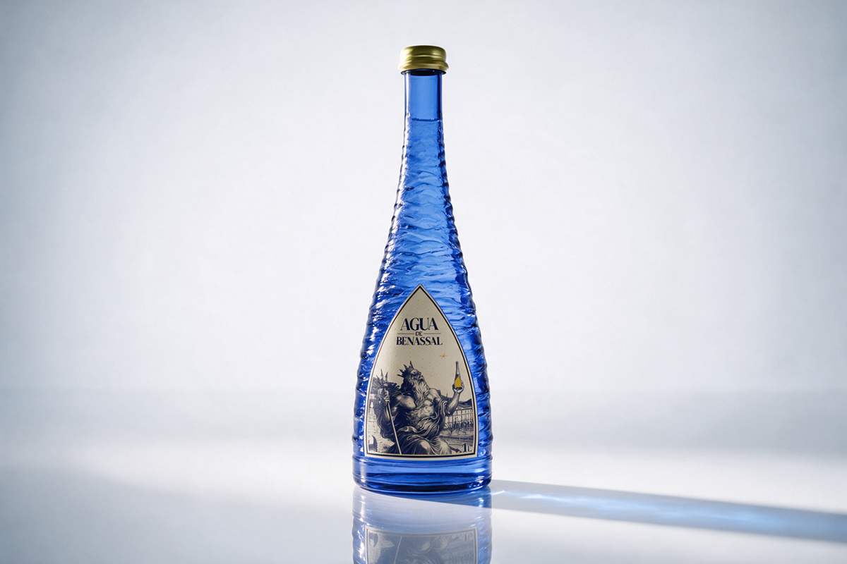
One of the main changes introduced by the project is the complete transformation of the bottle. Conventional glass is replaced with recycled glass, whose distinctive blue hue also takes on a conceptual value within the project. This colour creates a direct connection with water while reinforcing the visual identity of the new bottle. The surface of the packaging features a relief inspired by the waves and movement of water. Beyond its aesthetic function, this element responds to a number of practical needs: it makes the bottle easier for users to grip, helps reduce the risk of breakage in the event of a fall, and contributes to minimising friction and vibrations during transportation to the point of sale.
The label originates directly from the place where the story of Agua de Benassal begins. Its silhouette is not based on an arbitrary shape, but is inspired by the entrance to the spring: a stone structure with more than one hundred years of history. This architectural element becomes the formal structure of the label, establishing an immediate connection between the object and its place of origin. In the lower-left corner, the town of Benassal itself can be recognised, integrated into the background of the composition and reinforcing the relationship between the brand, the landscape, and the territory.
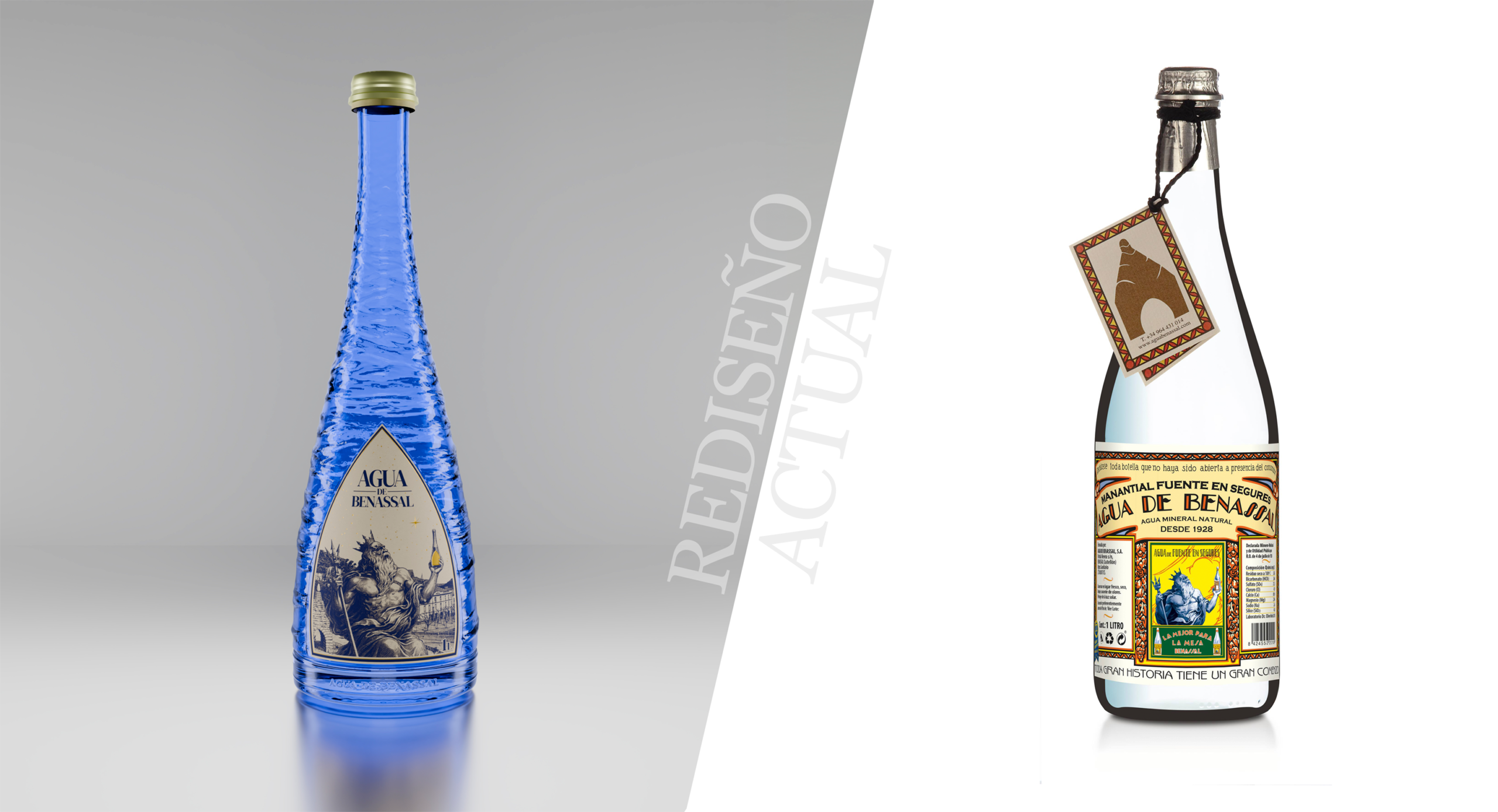
One of the most recognisable historical elements of Agua de Benassal is the figure of Neptune. Rather than removing this element during the process of updating the brand, the redesign brings it back and makes it the central protagonist of the new identity. Neptune appears holding the new bottle, creating a dialogue between the classical imagery associated with water and the brand’s new contemporary visual language. In this way, a symbol belonging to the past becomes a bridge between the history of Agua de Benassal and its new identity.
The project also includes a redesign of the Agua de Benassal logo, aiming for a more elegant, contemporary, and timeless expression that can coexist with the brand’s historical elements without losing its recognisability. The new identity therefore establishes a balance between memory and renewal: preserving the elements that form part of the Agua de Benassal visual heritage while reinterpreting them through a contemporary visual language.
Sustainability is another fundamental pillar of Arrels. With the aim of reducing the environmental impact associated with packaging production, the proposal uses recycled glass and introduces a label made from 100% recycled rice paper. From a graphic perspective, the project uses only one blue ink, reducing the resources required for production and simplifying the printing process. The golden details featured on the label introduce a final narrative layer. Inspired by the starry nights of Benassal, particularly characteristic during the summer, these small accents act as points of light within the composition.
Arrels is not simply a redesign of a bottle. It is a reinterpretation of Agua de Benassal’s identity through its origins. A project that seeks to allow users to recognise the place from which the water comes even before opening the bottle, and to understand that inside it there is not only water, but also territory, history, nature, and memory.





 krrrrrllii
 babyage
 Deep
Deep monther al omari
 Atiq Alam
 TUERCA Studio
 neo creative studio
 Pinot Agency
 Pixels Studio
 Anastasia Cherepanova | xtramez
 awaiskhadim
 Studio Be Design
 Belova Oksana
 We Craft Studio
 ArtDesignByDIna
 Ananya Taran
 Nadezhda Gorelikova
 orhanirmaktasarim
 WillBe
 Hi estudio
 43oz
43oz Rosario Lo Iacono
 alchimistestudioParis