

CAUTION: When a Warning Becomes an Irresistible Invitation
CAUTION begins with a word that usually makes us pause. It signals intensity, asks us to take care and prepares us for what comes next. For a harissa brand, that warning becomes an invitation: something hot is waiting, and curiosity makes us want to taste it.
The concept captures a familiar moment for anyone who enjoys spicy food. The first taste brings flavour, followed by heat. There is a brief hesitation, perhaps a smile, and then the desire to add a little more. CAUTION gives that moment a name. The very word that suggests restraint becomes a call to action.
This tension sits at the heart of the identity. The name announces the product’s character before the packaging is opened, allowing consumers to imagine the sensation for themselves. “Be careful” takes on a playful second meaning: “Go on, try it.” The warning remains understandable, while its context turns it into an appetising challenge.
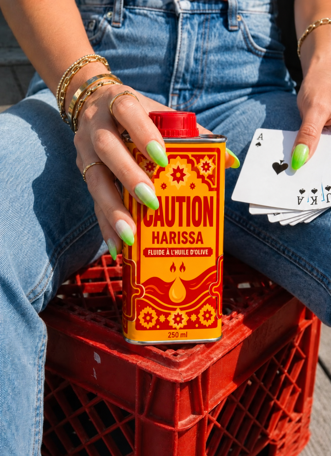
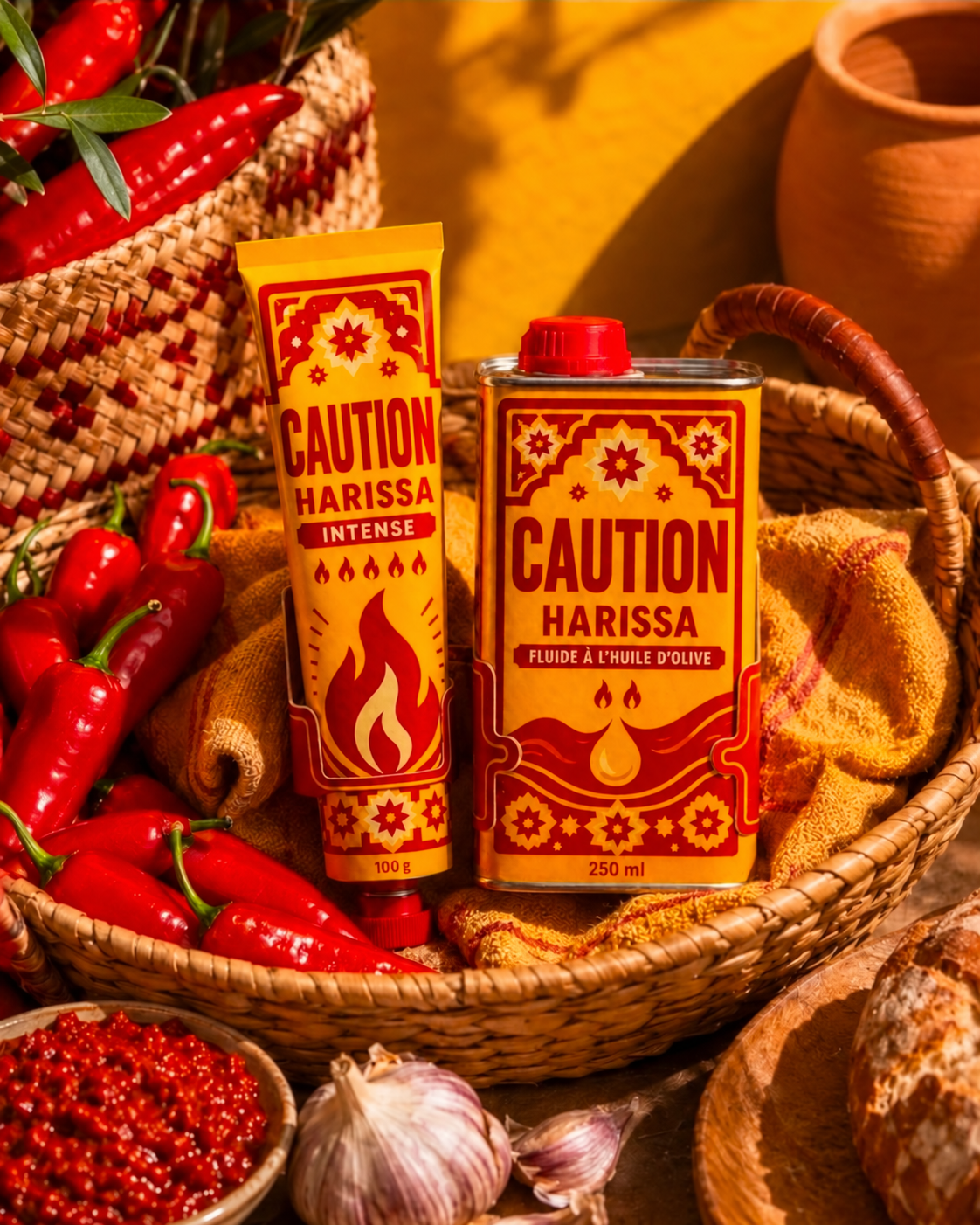
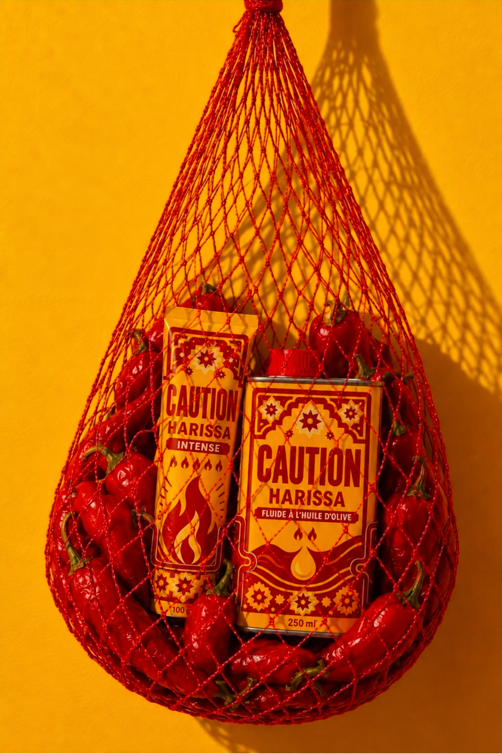
The packaging expresses this idea through a vivid yellow and red palette. Yellow brings warmth and visibility; red connects the identity to chilli, flavour and heat. Tall, bold, condensed lettering gives CAUTION a direct presence, placing the name at the centre of the experience. Its visual authority makes the playful meaning more immediate.
Geometric ornaments and floral motifs evoke Tunisian decorative traditions, grounding the identity in the cultural world of harissa. These details bring richness and familiarity to a name borrowed from the language of warnings. The combination gives the brand a distinctive voice: assertive, generous and closely connected to the pleasure of eating.
The two formats share this visual language while expressing their different product personalities. The intense harissa tube features a large flame and a row of smaller flame symbols. The fluid harissa with olive oil uses flowing lines and a droplet motif. The name, typography, colours and ornamentation maintain a coherent relationship across the range.
The concept reflects L’Alchimiste Studio’s Data-to-Emotion approach by giving a product characteristic an emotional role. Heat becomes anticipation; anticipation becomes curiosity; curiosity invites the first taste. The packaging builds its story around the consumer’s imagined experience, making the name part of the appetite itself.
CAUTION turns a word of warning into a reason to reach for the product. It acknowledges the heat with humour and leaves room for that familiar response: just a little more.




 United Creatives Studio
 Kingdom & Sparrow
 Anastasia Bakhmatskaya
 CreativeWise
 Great and Golden
 Ximena Ureta Design Studio.
 Sorted Branding
 Lisa Sirbaugh Creative
 vitoramockup
 YQIAN
YQIAN Navegante
 Anastasia Cherepanova | xtramez
 Polaris Designs
 pavlyai
 Milena Kocharyan
 monther al omari
 Mohamed sherif midoo
 DESIGN CONCEPTS
 mmdesign
 markcreativestudio
 Rosario Lo Iacono