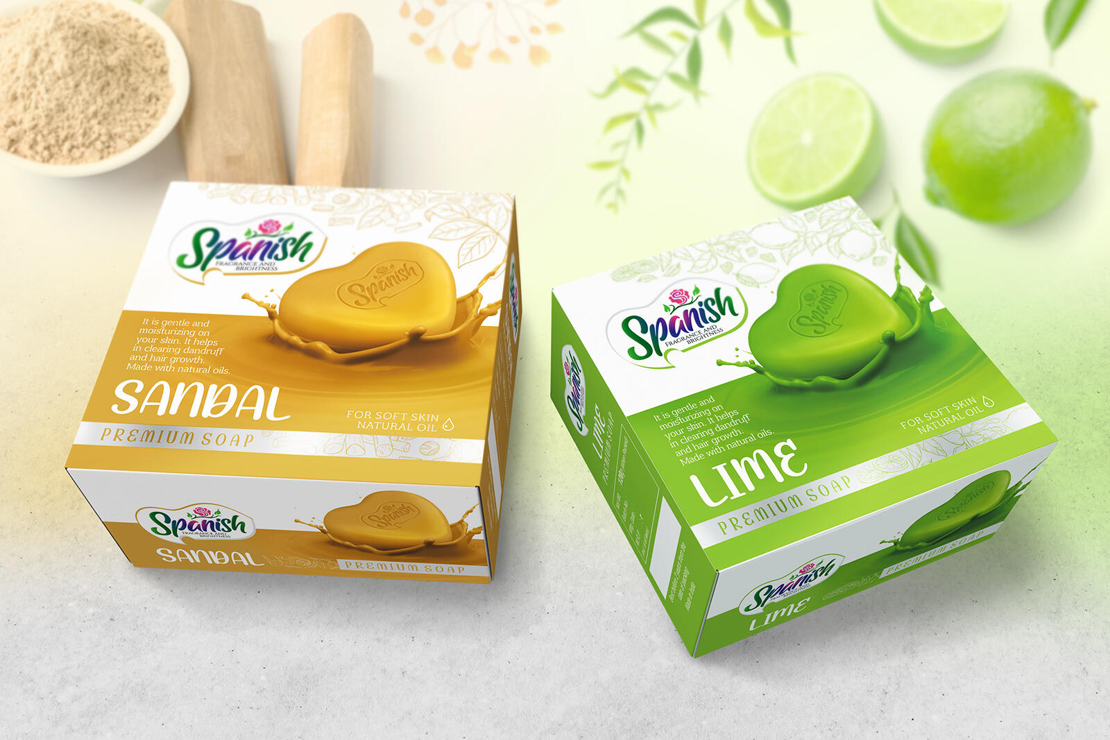
SPANISH ‐ PREMIUM SOAP, BOX DESIGN
We wanted our design for the SPANISH team to truly focus on the quality of the product. In order to do so, we started by creating a logo using hand-drawn script style lettering, emitting a premium magic feel. The logo contains a rose that symbolizes fragrance and beauty, with a ‘S’ letter in the middle. The gradient from pink to green emits the feeling of vibrancy & fragrance.
We developed a design that targets to inspire special feelings such as quality, cleanliness and purification. Visually each product expresses the color and scent of the contents of the product. We created a 3D structured soap image which is used as a key element in the design. The design elements, images and vibrant colors arranged on white background created a spacious and bright packing which raised the product into a premium category. The resulting design is truly gorgeous & gave the products light, rich & natural feel which made customers feel invited & helped the packaging to leap out from the shelves and gets clearly identified.