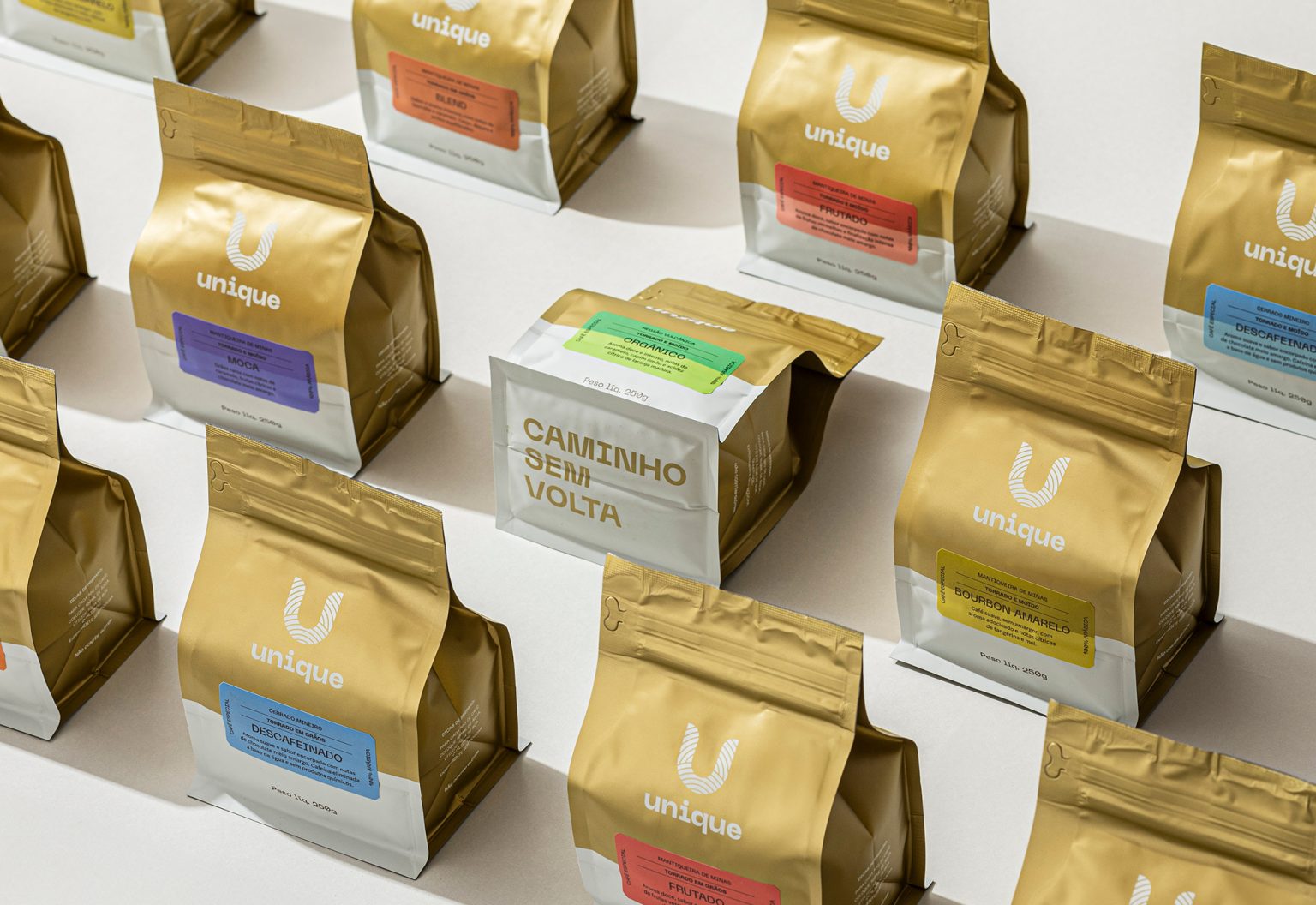
The rebranding of Unique was driven by the desire to refresh the brand’s identity while preserving the sophistication and care that have always defined its journey. The new visual language brings a sense of lightness, modernity, and versatility, reflecting the excellence of its coffees and celebrating their origins. A project that reinforces Unique’s position as a leading name in specialty coffee in Brazil.
The Unique logo reflects the brand’s singularity, inviting consumers to explore the rich world of specialty coffee. Inspired by routes and journeys, it symbolizes the meeting of flavors, aromas, and discoveries, highlighting the authenticity and personalization that make Unique a truly distinctive brand.The icon carries multiple meanings, subtly evoking the shape of a coffee cup. The lines that form the “U” represent paths and directions to be explored, while also symbolizing coffee plantations and the drying process on the patio. Additionally, these lines allude to a fingerprint — a symbol of individuality and uniqueness — directly connecting to the concept of being “Unique.”
The Tiger line is inspired by the term “tigrado” (“tiger-striped”), used by Italian espresso masters to describe the dark streaks in the crema of a perfect coffee, reminiscent of a tiger’s skin.
Visually, the line’s identity blends retro design elements from the 1950s, 60s, and 70s with the contemporary clarity that defines Unique, resulting in a visual communication that is both nostalgic and modern.
The stamps created to represent Unique’s different coffee types were inspired by route signs and traveler passport stamps. As a result, the illustrations follow an iconographic aesthetic. Used on the coffee packaging, the stamps adopt the colors from the secondary palette corresponding to each coffee flavor.


