

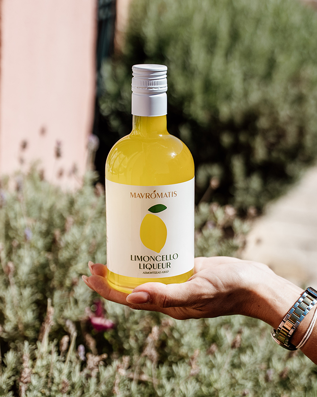
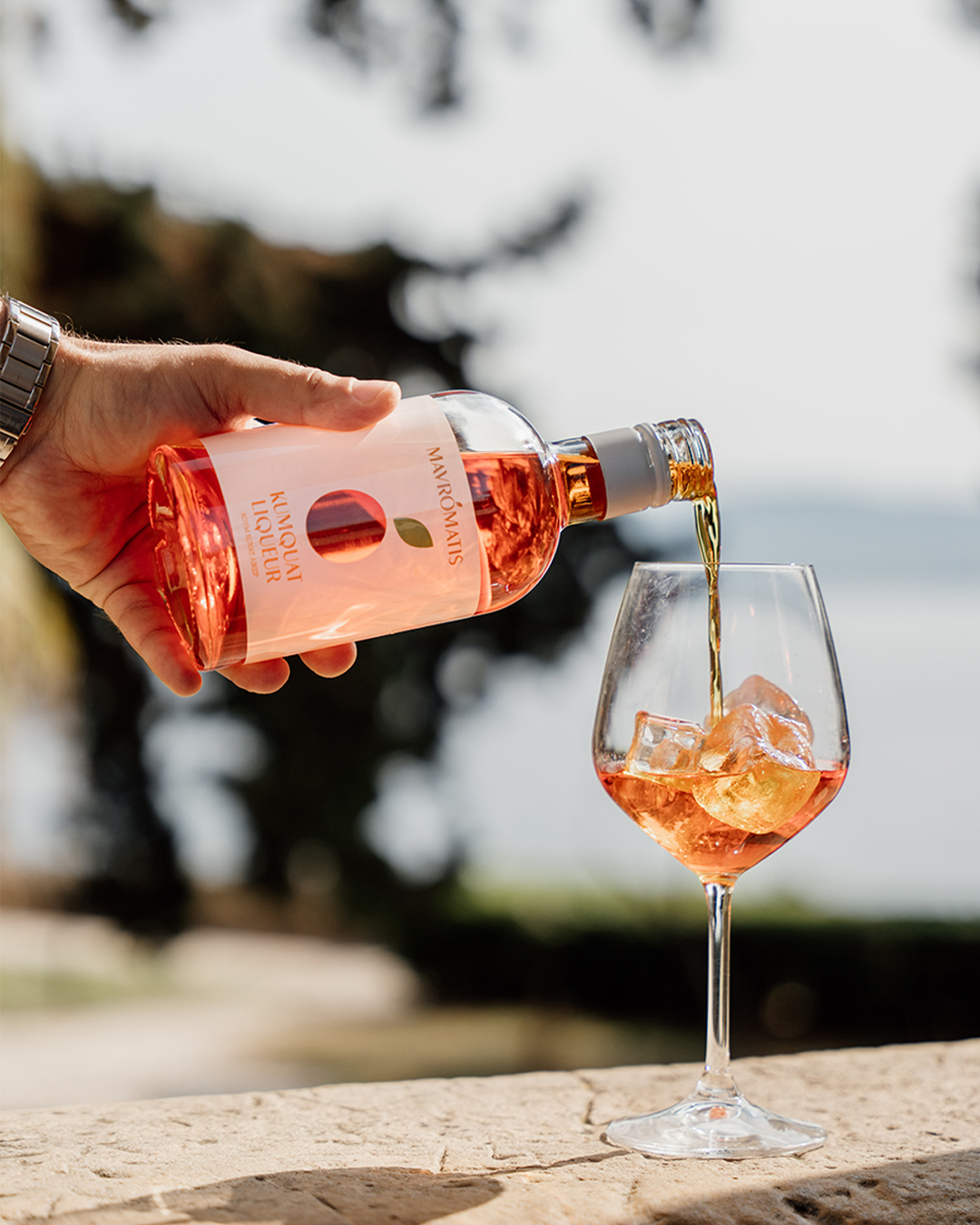
Rooted in the luminous atmosphere of Corfu—the island where these liqueurs are produced—the design draws conceptual inspiration from light as both a physical and symbolic element. A see-through label was selected as a deliberate gesture of transparency, allowing the product itself to participate in the visual narrative and subtly assert its quality. The design language is resolutely minimal, privileging restraint over excess, and elevates the product through clarity, balance, and an economy of means.



 lunapanda
 Tridimage
 Analoguecreative
 lettera7
 alchimistestudioParis
 Lana B
 Colossal
 Pivot Studio
 M&A CREATIVE AGENCY
 monther al omari
 Anastasia Cherepanova | xtramez
 Hollóka Grafikai Műhely / Graphic Design Studio
 BOLD branding
 Antonia Skaraki
 Pâmella Lorrany
 Z9BKAdsgn
 Francesco Paternoster
 b1studio.ro
 Chris Creative Works
 Boordon
 Dmitriy Kuzovlev
 Brand Society
 yasharpic