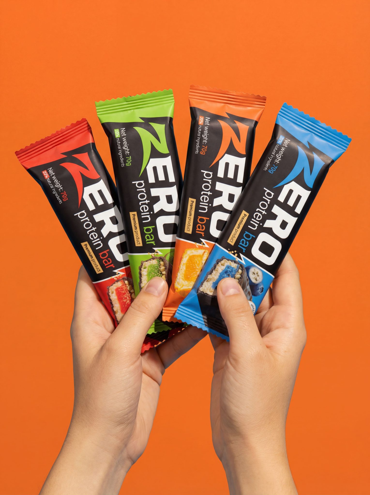

ZERO Protein Bar — Packaging Concept
ZERO is a fictional protein bar brand created as a conceptual design project.
The goal of the project was to develop a bold, eye-catching packaging system that clearly stands out on the shelf among competing sports nutrition products.
The brand name ZERO reflects clarity, energy, and focus — a clean visual statement without unnecessary complexity.
Concept & Idea
The core idea behind the ZERO packaging is strong visual differentiation.
In a market oversaturated with similar layouts and muted palettes, this concept uses high-contrast colors, minimal typography, and a powerful logo to immediately grab attention.
Each flavor is defined by a distinct color code, making the product easy to recognize and navigate at a glance.
The product line includes four flavors:
- Blueberry
- Strawberry
- Orange
- Kiwi
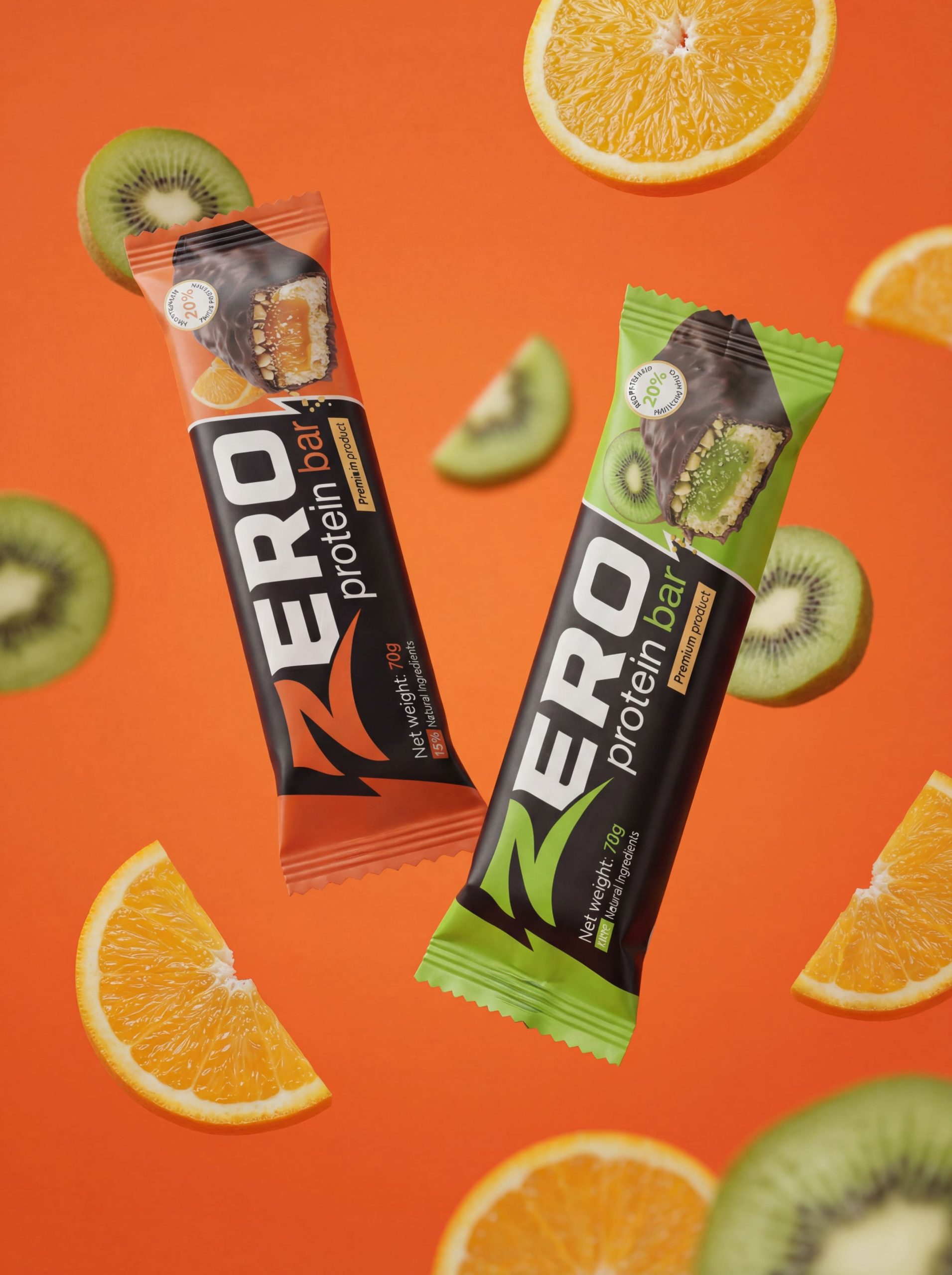
Each flavor is highlighted through a dedicated color accent combined with a realistic product cutaway, emphasizing taste and texture.
Design & Materials
The packaging is designed in a matte finish, enhancing the premium feel and reducing visual noise from reflections.
A vertical logo composition strengthens shelf presence and creates a confident, athletic character.
The typography is bold and minimal, focusing on legibility and impact, while the large “ZERO” logotype serves as the main visual anchor of the design.
Result
This concept demonstrates how color, contrast, and simplicity can be used to create a strong brand identity in the competitive protein bar segment.
ZERO is not a real commercial product — it is a designer-led exploration of packaging as a branding tool, where clarity and boldness become the main competitive advantages.
AI Tools Note
AI-based tools were used in this project to visualize the packaging design in realistic scenarios.
They were applied specifically for mockups and presentation purposes in order to demonstrate how the concept works on physical packaging.



 eldiyar
 monther al omari
 Ximena Ureta Design Studio.
 vitoramockup
 Up-Brands
 Sophiagdotcom
 Peter said
 ayeidadezigns
 Tancybox
 宏洛图品牌设计HONGLT
 Modern Theory
 Dozen Agency
 Atiq Alam
 Olio Studio
 Ruchi S. Joshi
 mmdesign
 awaiskhadim
 Octasoft
 United Creatives Studio
 Kingdom & Sparrow
 Anastasia Bakhmatskaya
 CreativeWise
 Great and Golden