
About the Project
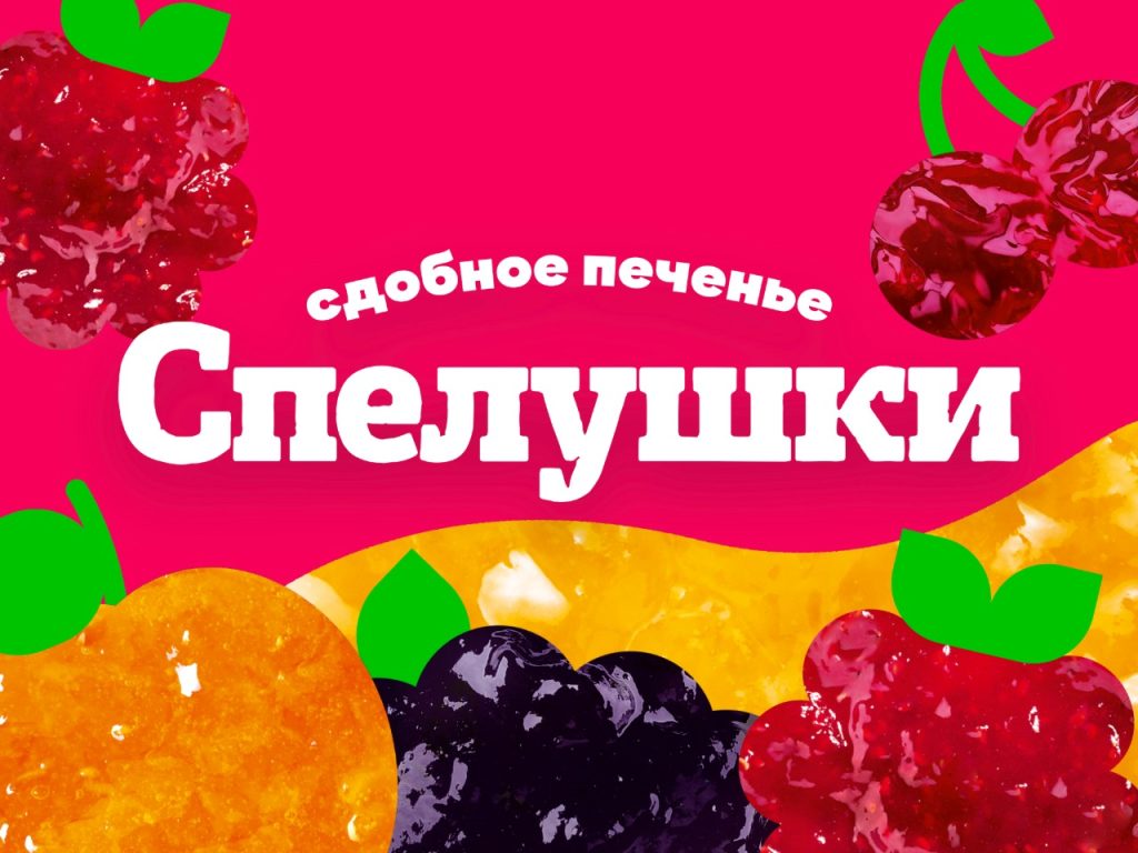
Weavers Brand Consultancy developed a contemporary packaging design for Darletto’s new line of Spelushki butter cookies. The main visual element is the artistic metaphor of the filling, combined with a transparent window on the front panel of the package. The design successfully balances trendy minimalist graphics with a food zone that is easily understood by the mass consumer.
Task
Darletto Confectionery Company tasked Weavers Brand Consultancy with developing a conceptual and adaptive design for the new Spelushki butter cookie product line. The agency was given clear technical and marketing objectives:
- Create a modern, dynamic, and shelf-stable visual language that departs from the traditional “retro” templates of the confectionery category.
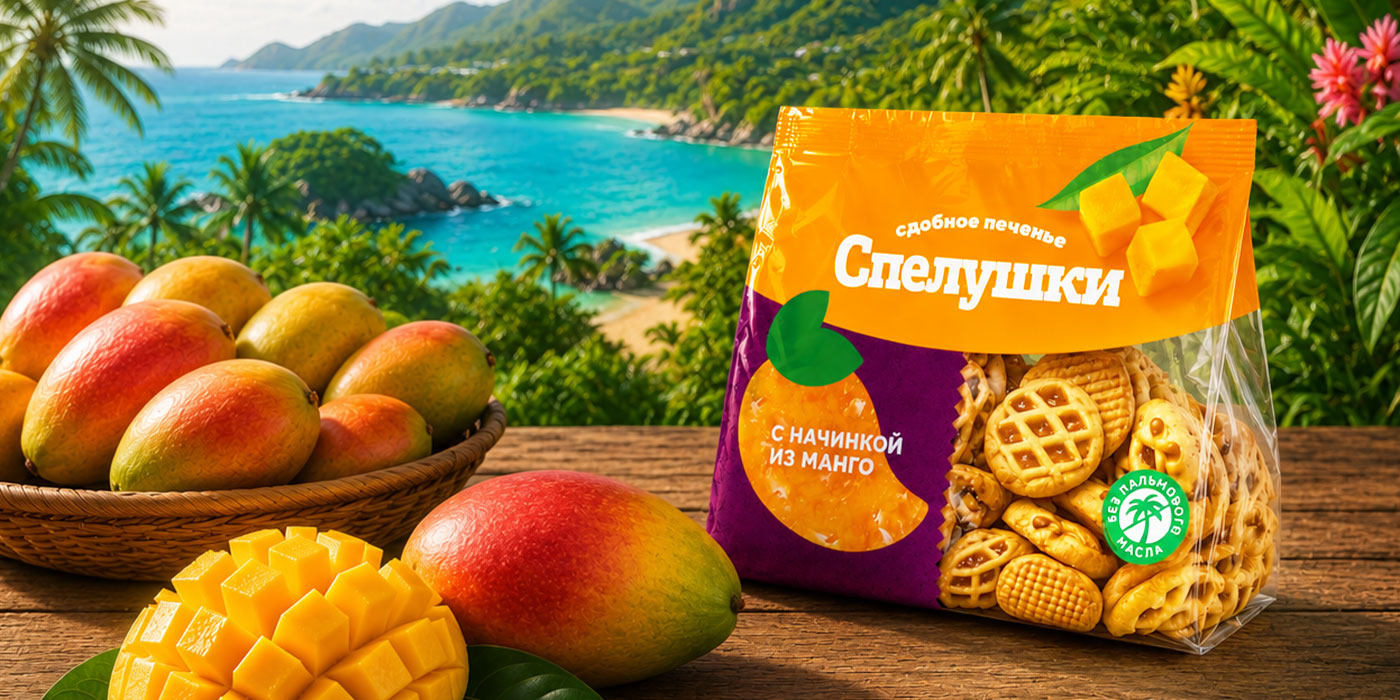
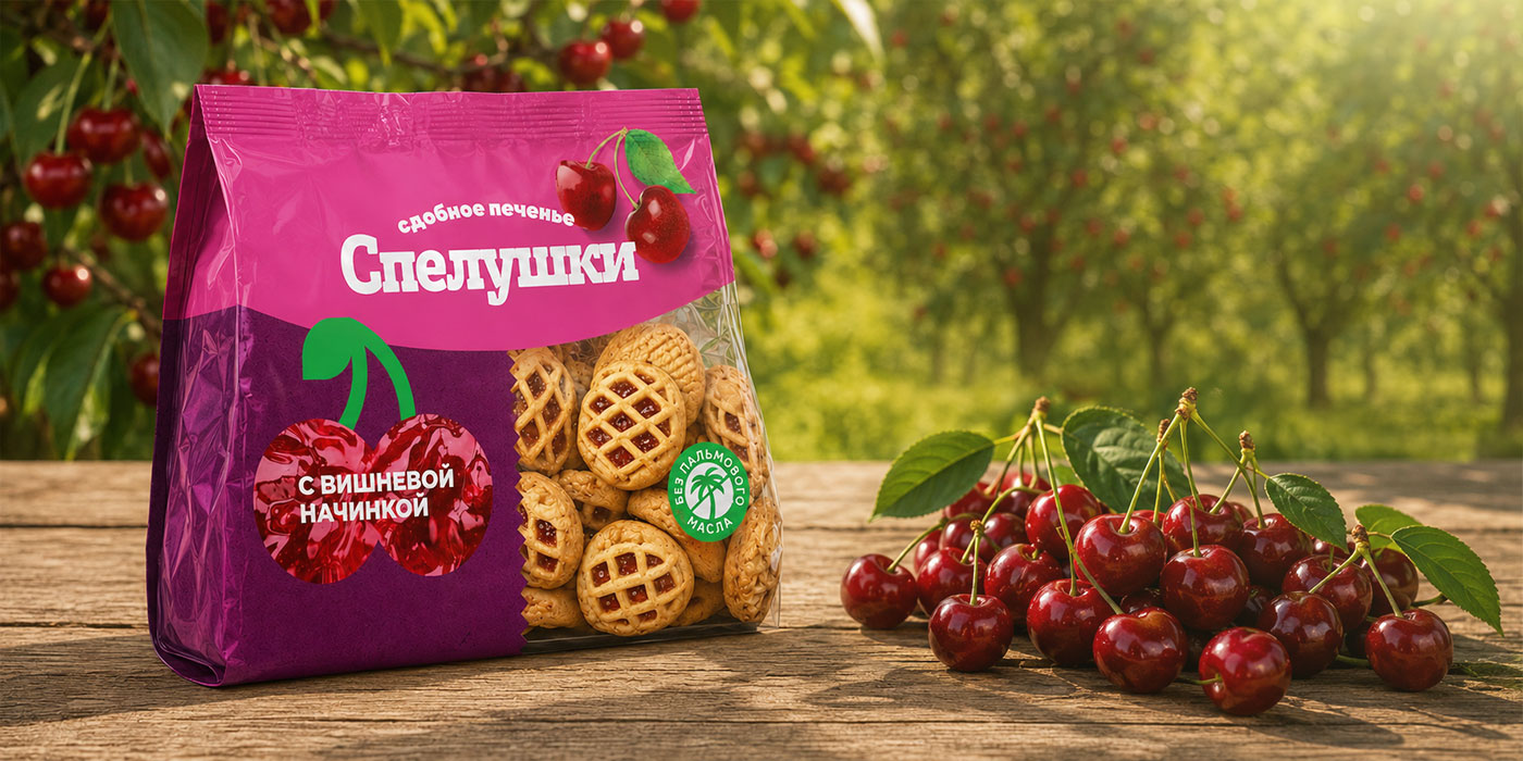
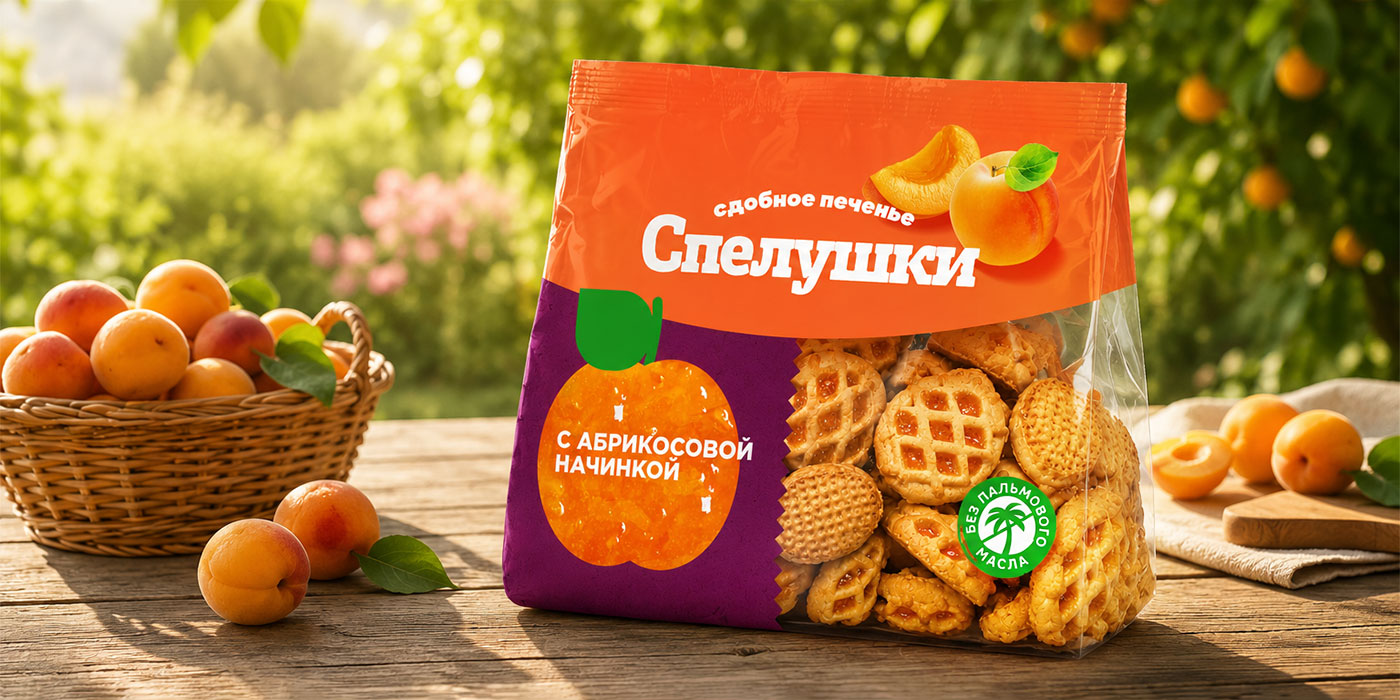
- Transparent window: An open area of 30-50% of the lower front of the packaging showcases the appetizing appearance of the cookies.
- Assortment matrix: blackcurrant, raspberry, cherry, apricot, and mango.
The magic of the name: how ripeness, warmth, and comfort are combined in one word
The name “Spelushki” conveys the semantics of ripeness, warmth, naturalness, and homeliness. Our designers developed a rounded, soft, yet modern, and highly legible white font for the logo, which is placed against a contrasting background.
Deep color and a filling metaphor: creating a new visual language for the packaging
The key visual dominant of the design was our unique graphic technique—an image of the filling in the lower left corner of the package. This artistic metaphor looks modern and unusual, clearly demonstrating the cookie’s key ingredient.
The transparent window is naturally integrated into the packaging design as a continuation of the dynamic wave at the top. It occupies approximately 40% of the front panel, allowing the customer to immediately assess the product’s appetizing qualities.
Since flavor recognition in a split second is crucial for the product matrix, each sku received a deep, rich background color and a large, contrasting food zone on the left side.
Naturalness in the details: a green stamp on the packaging
A key accent on the front is the “Palm Oil Free” stamp, a round green stamp. It emphasizes the natural ingredients of the baked goods and their commitment to health, addressing the main concern of modern consumers.
“Spelushki” in a new design: a balance of minimalism and rich flavor
The updated “Spelushki” line creates a unified, monolithic, and cheerful splash of color on the shelf. The design successfully balances trendy minimalist graphics with a packaging structure and food zone that are easily understood by the mass consumer.

 monther al omari
 43oz
43oz Thirst
 Carreto Concepts Design Studio
 M&A CREATIVE AGENCY
 pastellofactory
 Omar Altayeb
 Cocoon Prague
 古戈品牌
古戈品牌 Pascal Riviere Design
 ZIMO Studio
 alchimistestudioParis
 Valérie Colace
 Platon Ivantsov
 Leyma Design
 Dina Gamal eldin
 clermentza
 Redlana
 anushrishah
 Natania Doshi
 NewFolderStudio
 francapovilla
 Mother Tongue Design
 CJMartins