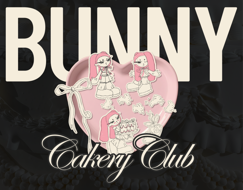

Bunny Cakery Club: A Character-Driven Brand Identity for an Artisan Cake Bakery
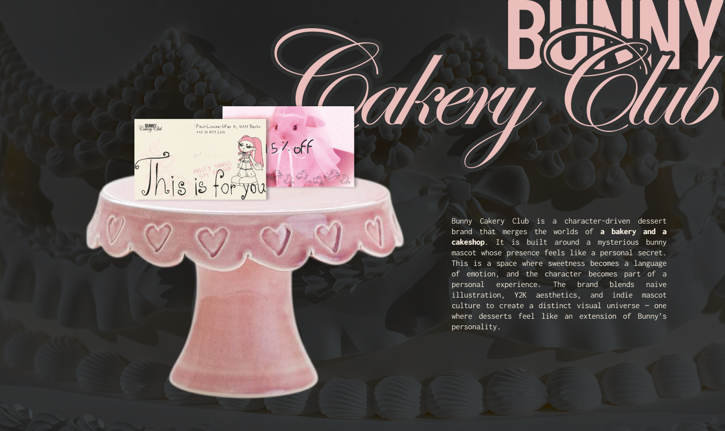
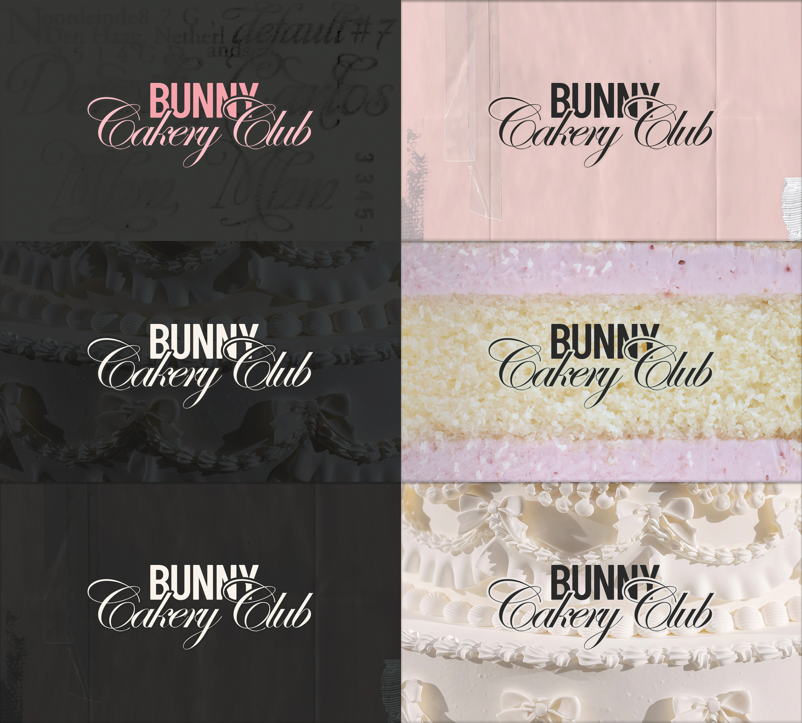
Bunny Cakery Club is an artisan dessert brand built around personality, emotion, and a sense of belonging. At the center of the identity is Bunny — a mysterious hand-drawn character whose presence transforms the brand from a traditional bakery into its own visual universe. Rather than functioning as a decorative mascot, Bunny becomes the voice, mood, and emotional core of the brand. The identity combines naïve illustration, expressive hand-drawn graphics, Y2K influences, and indie mascot culture to create a world that feels playful, imperfect, personal, and instantly recognizable.
CHALLENGE
The contemporary dessert market is filled with visually similar brands. Many bakeries rely on polished typography, neutral color palettes, minimal packaging, and familiar visual codes that communicate quality but rarely create a deeper emotional connection. For a younger audience, the product itself is only part of the experience. Personality, storytelling, community, and emotional identification increasingly shape the way people connect with a brand. The challenge was to create an identity that could stand out in a crowded category while giving people something more memorable than a beautiful cake — a character and a world they could become emotionally attached to.
SOLUTION
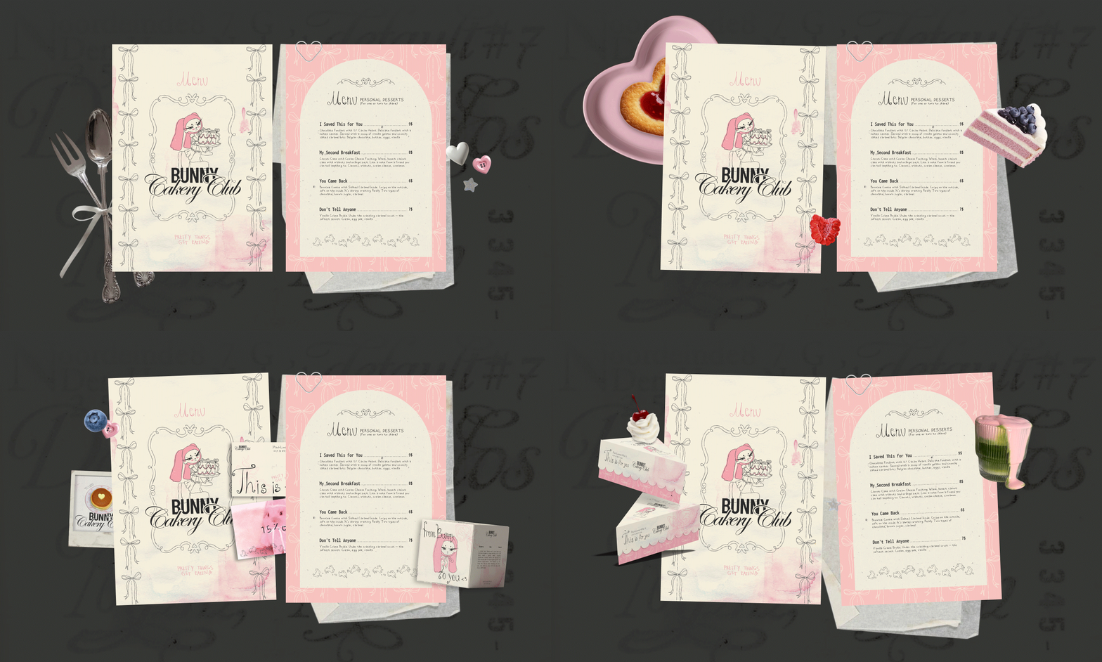
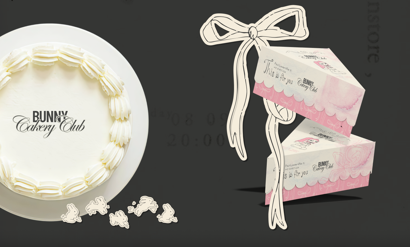
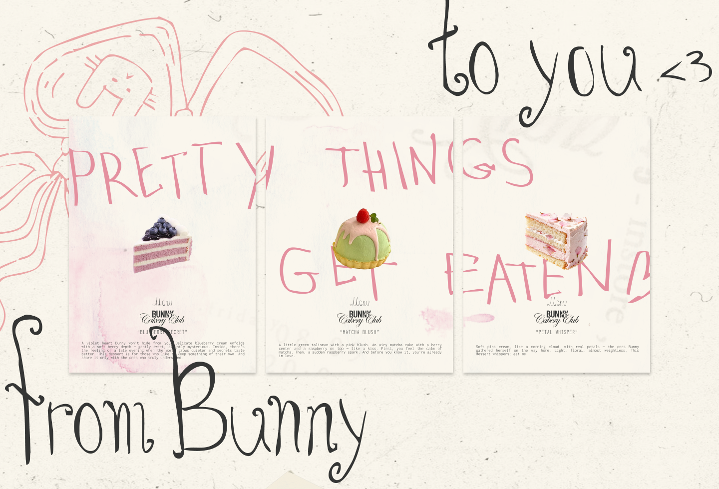
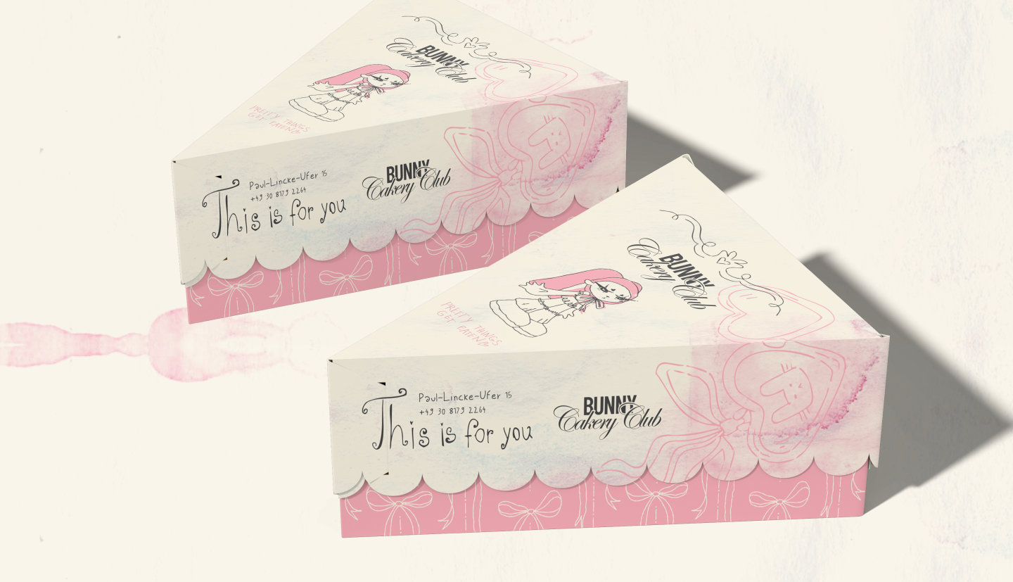
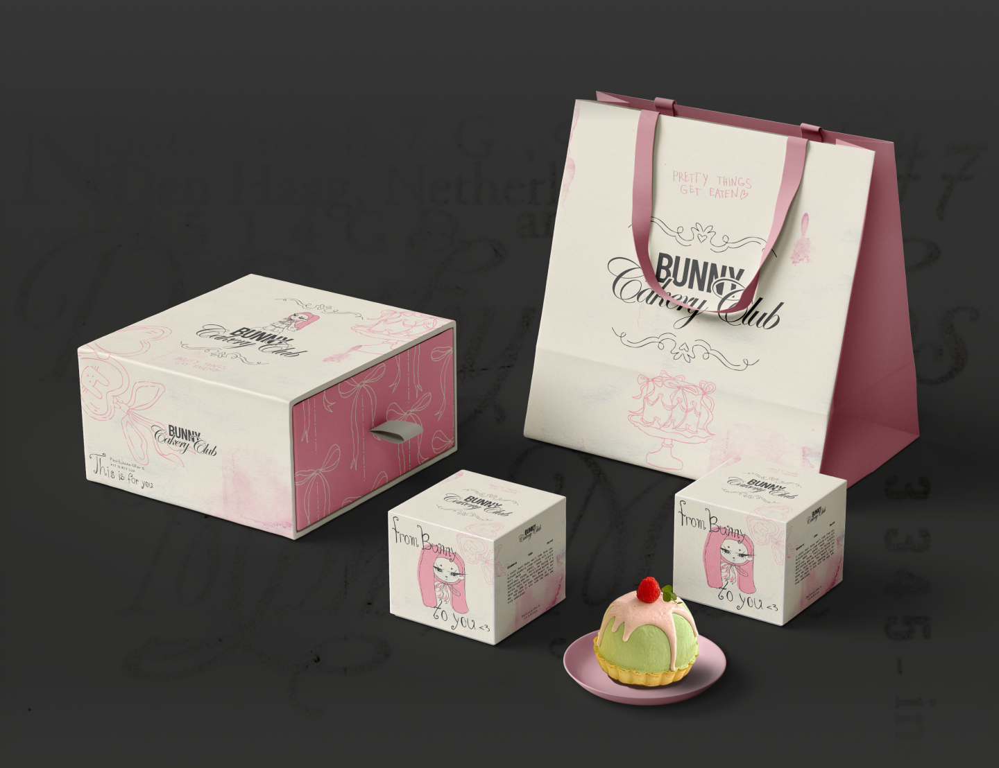
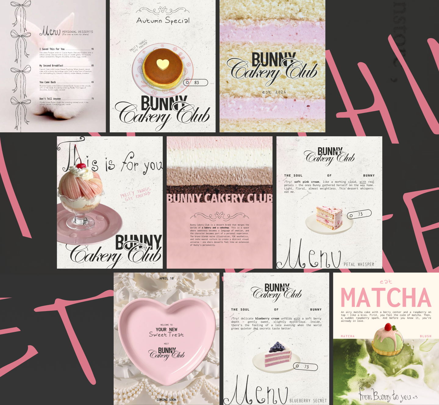
I turned the mascot from a decorative element into the heart of the brand. The entire identity was developed around Bunny as an independent personality. Instead of creating a conventional bakery identity and adding a mascot afterward, the visual system grows directly from the character. Bunny appears across packaging, communication, merchandise, and digital content, creating continuity between every brand touchpoint.
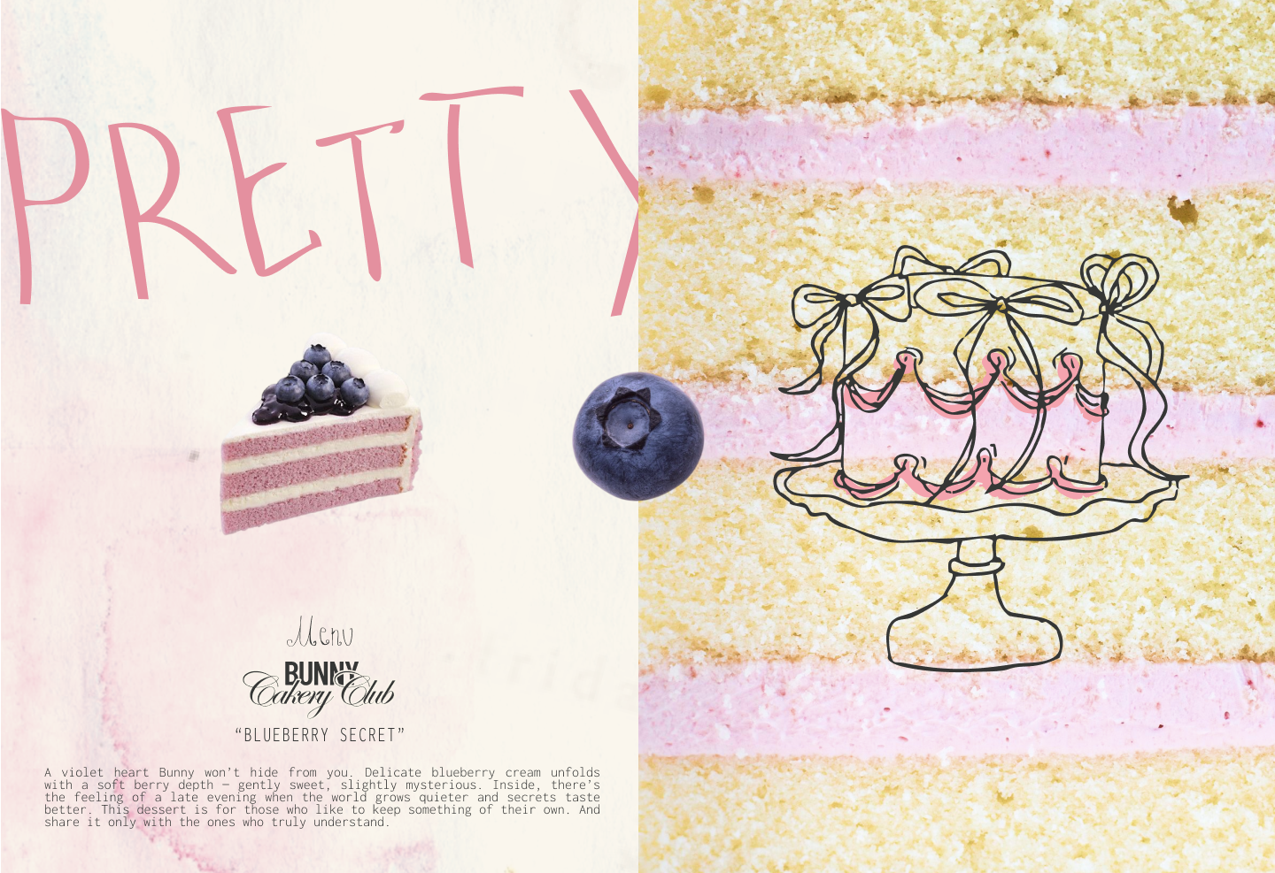
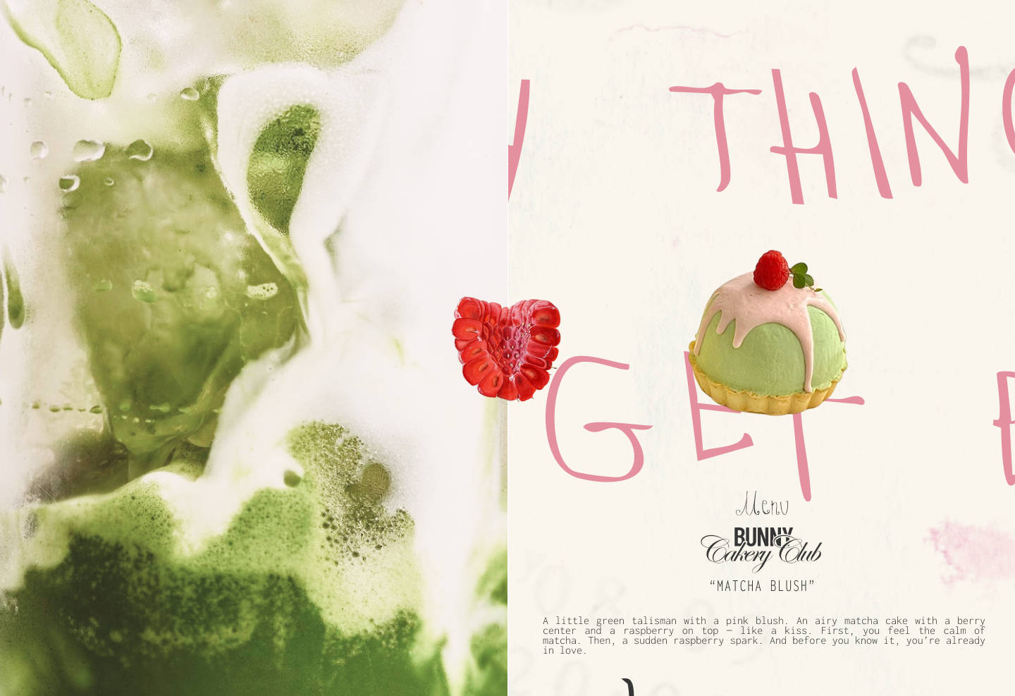
The intentionally imperfect drawing style makes the identity feel spontaneous and human rather than overly polished or corporate. Expressive lines, playful compositions, handwritten details, and unexpected interactions between the character and typography give the brand its distinctive attitude. The result is a visual language that feels less like traditional bakery branding and more like entering Bunny’s own world.
CHARACTER & ILLUSTRATION
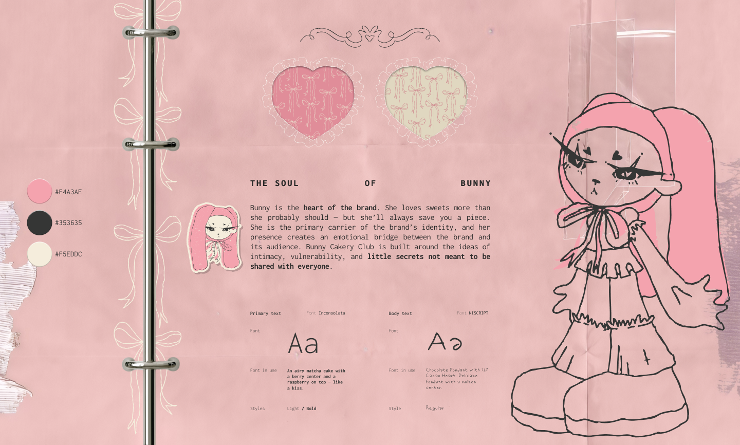
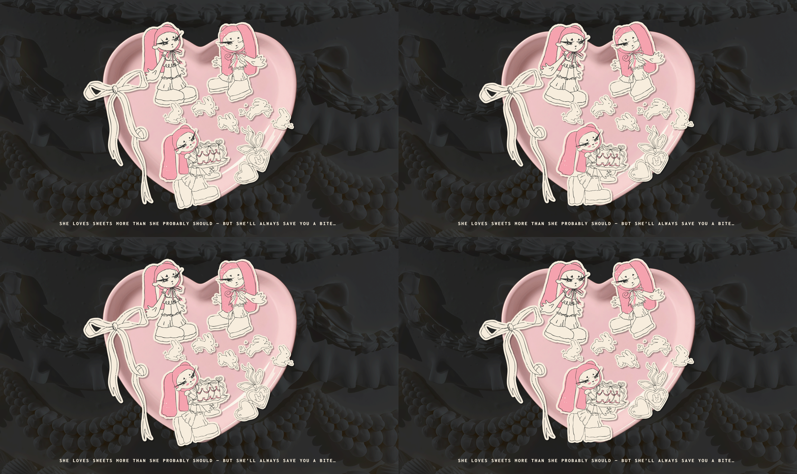
Bunny is the central graphic element and the emotional voice of the brand. The character was designed to feel recognizable without becoming overly polished or commercial. Its naïve proportions and expressive hand-drawn linework create a sense of intimacy, spontaneity, and individuality. Across the identity, Bunny changes poses, expressions, and situations, allowing the character to communicate different moods while remaining instantly recognizable. This flexibility turns illustration into a living system rather than a fixed brand asset. Each new application can become another small episode in Bunny’s story.
VISUAL LANGUAGE
The visual language combines naïve illustration with references to Y2K aesthetics and indie mascot culture. Handwritten typography and deliberately imperfect graphic details create contrast with more structured brand elements, giving the identity a balance between spontaneity and consistency. Rather than aiming for traditional ideas of refinement, the system embraces character, imperfection, and emotional expression. This creates an identity that feels contemporary and culturally relevant while maintaining a distinctive personality of its own. The verbal language continues the character-driven approach. Short, handwritten phrases create the feeling that Bunny is speaking directly to the audience. The tone is playful, personal, slightly mysterious, and subtly seductive, making brand communication feel closer to a private message than conventional advertising. Together, visual and verbal elements create a more direct relationship between the character and the audience.
OUTCOME
The result is a cohesive brand that works as both a visual identity and an emotional ecosystem. Bunny Cakery Club stands out through a recognizable mascot, a distinctive illustration language, and a strong sense of personality that separates it from the conventional aesthetics of the dessert category.
Emotionally, the character creates intimacy, familiarity, and a sense of belonging. Visually, the system gives the brand a memorable and ownable world. Commercially, its flexibility allows the identity to grow across packaging, merchandise, digital communication, collaborations, and future product launches. Bunny Cakery Club becomes not simply a place to buy desserts, but a world people can recognize, connect with, and want to return to.
 Up-Brands
 Almighty
 Desember Design Studio
 Daria Levina
 Yuliya Likhacheva
 carola matalinares
 daniitenaa
 StudioMordius
 Simon Pendry Creative
 Sti&Co Design
 Yasmin Sherif
 Roberto De Simone
 aseelstudio
 Rabia zouina
 UPRISE
 HazelBishop
 Qianyu Liu
 siyajacob
 Rohan Barwal | D2C Brand Identity, Logo & Packaging Designer
 Karen Salem
 omarchafik
 nastyaabeketova
 Roberto Núñez Studio