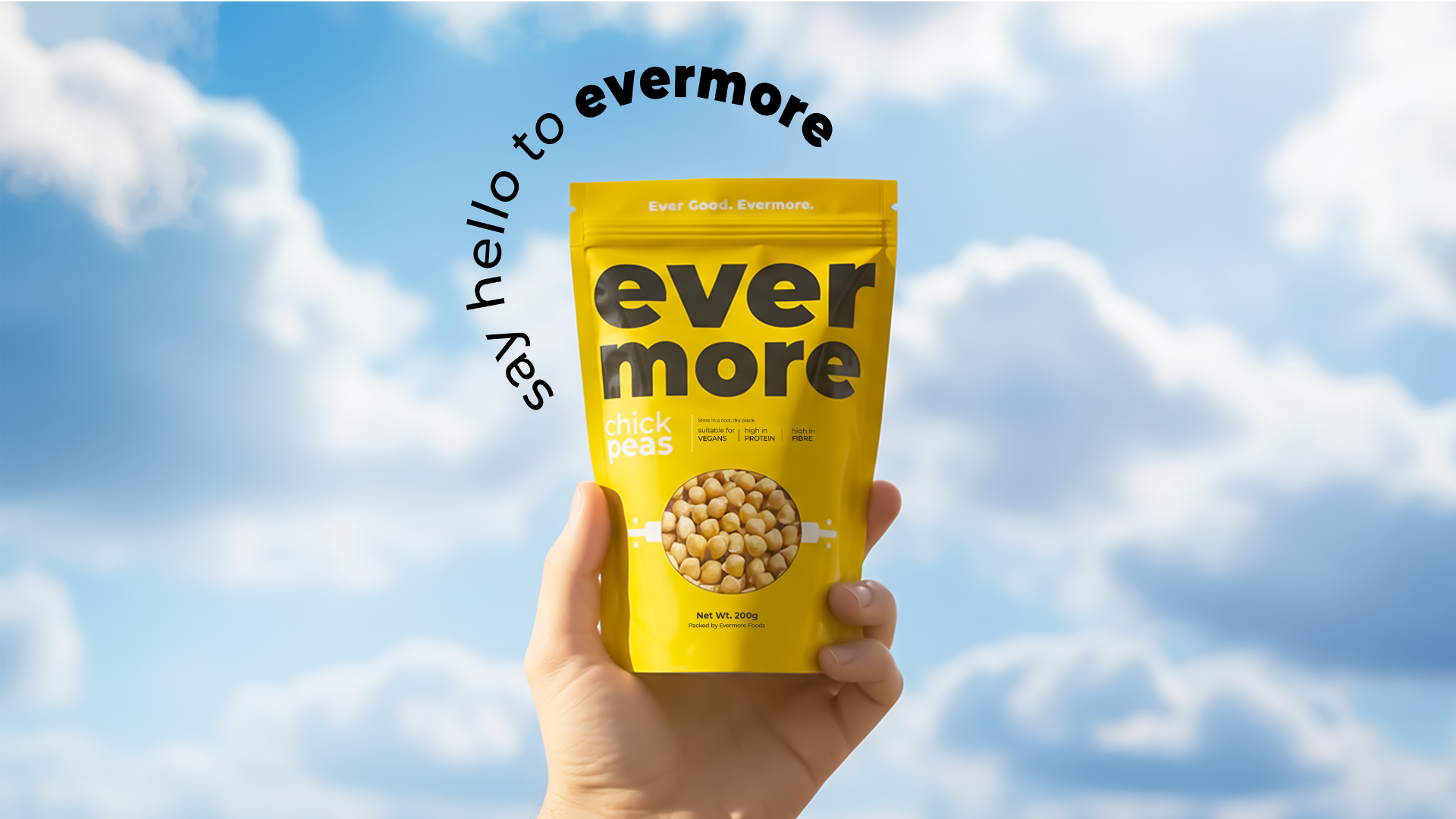

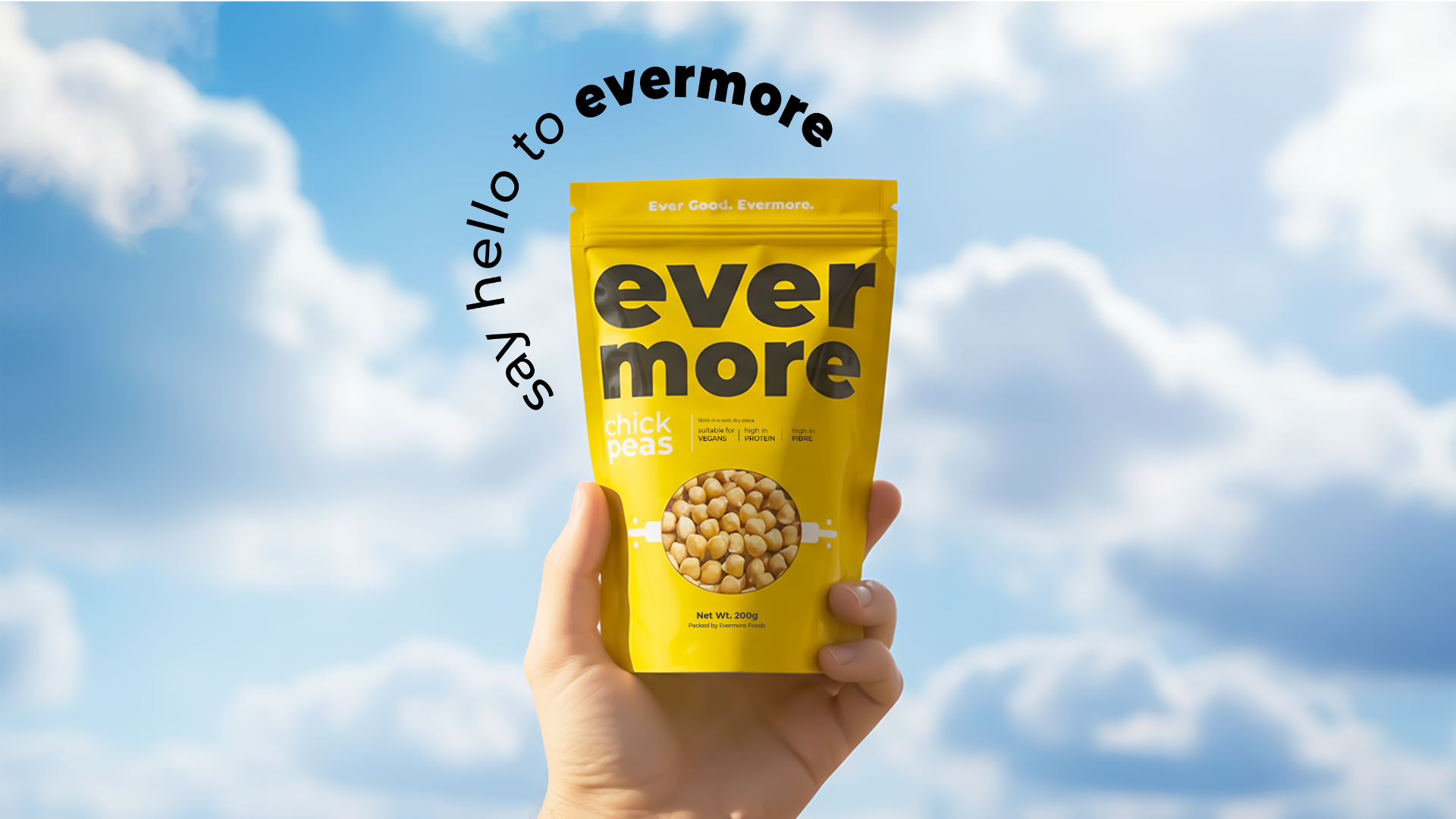
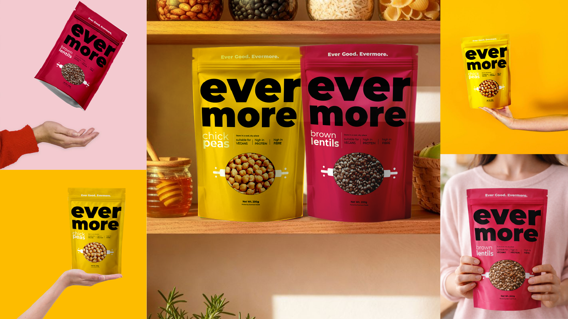
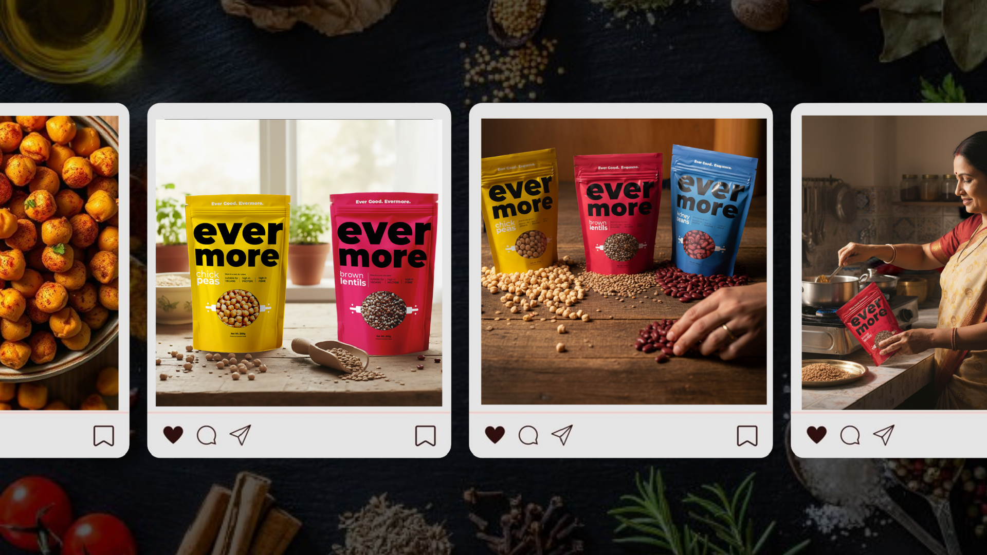
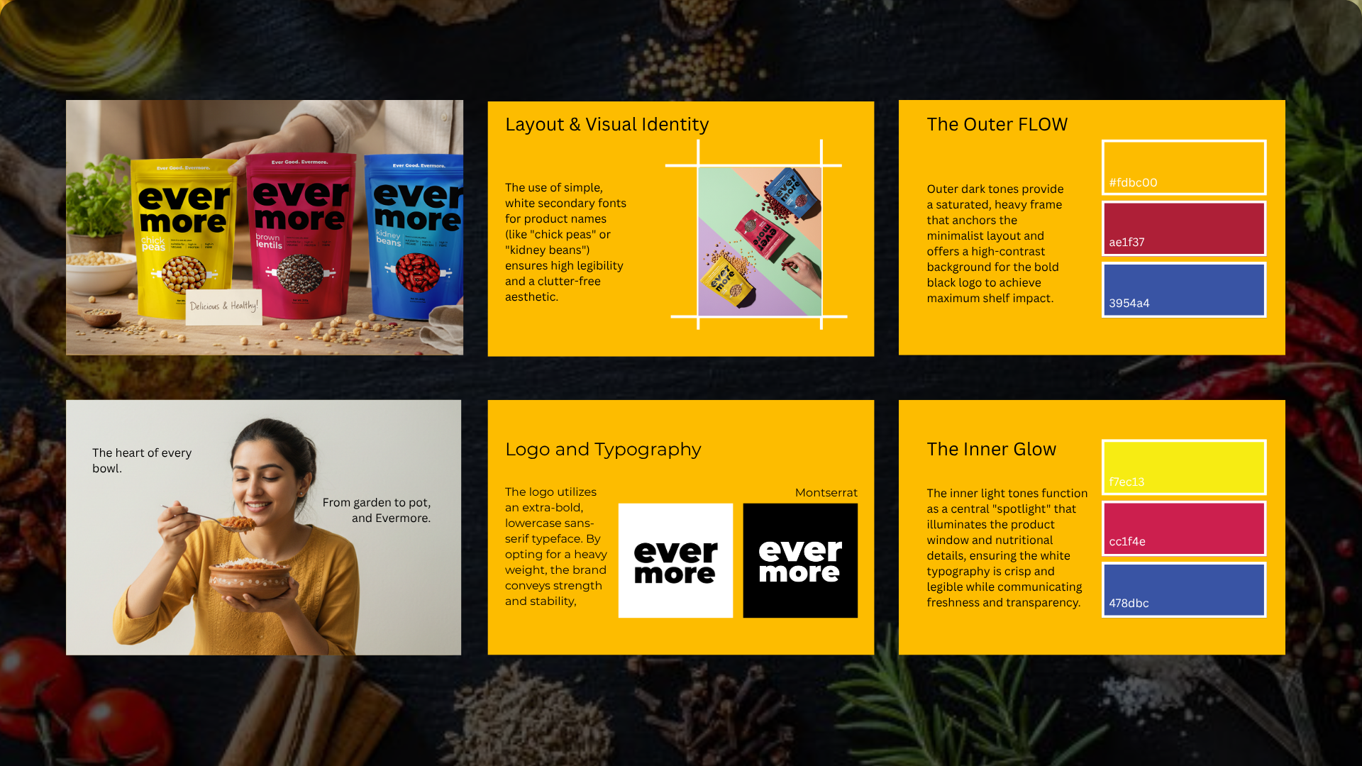
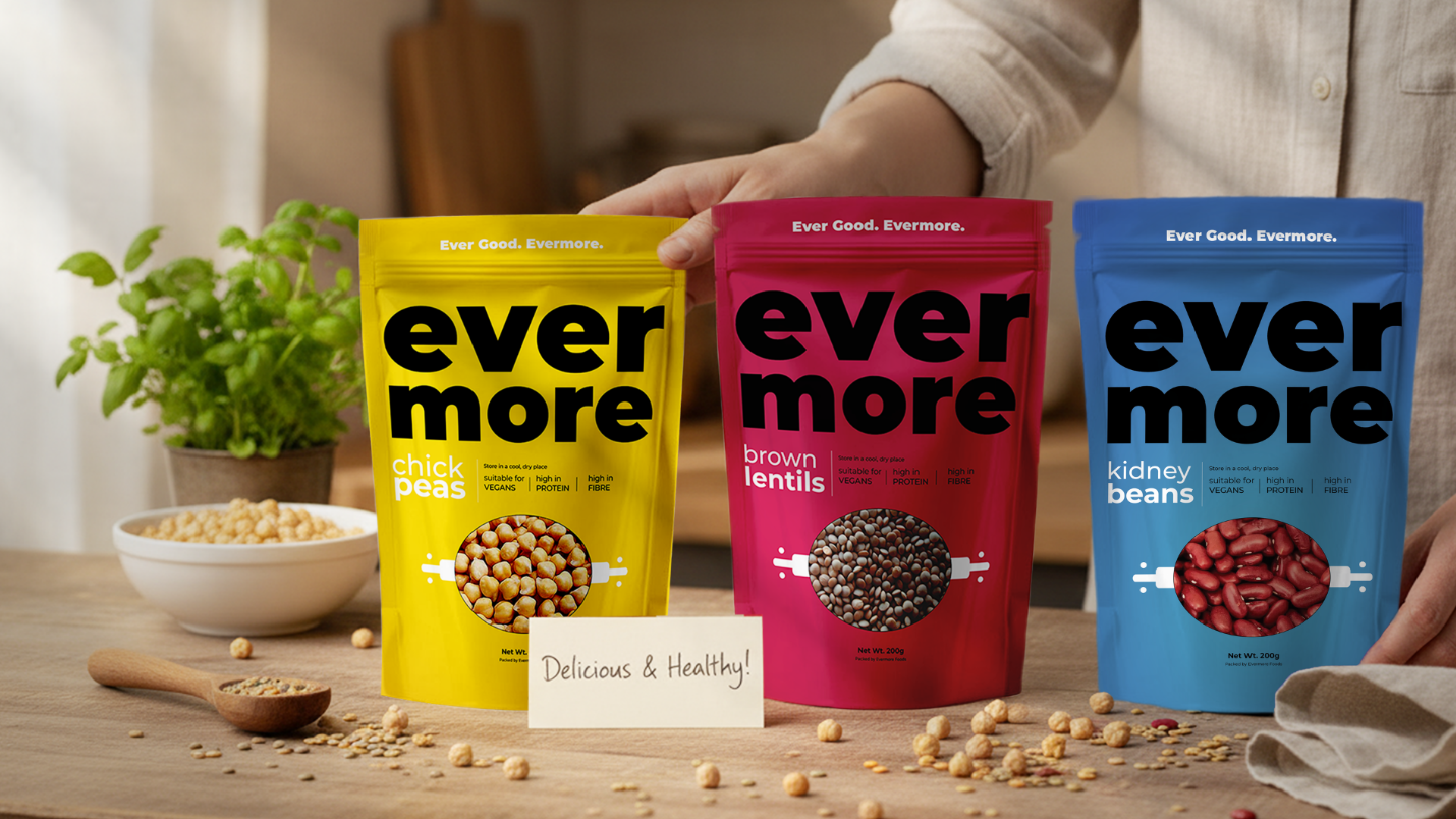
EVERMORE is a contemporary pantry brand built around bold simplicity, everyday nourishment and lasting reliability. The range includes chickpeas, brown lentils and kidney beans healthy kitchen staples presented through a vibrant and highly recognisable packaging system.
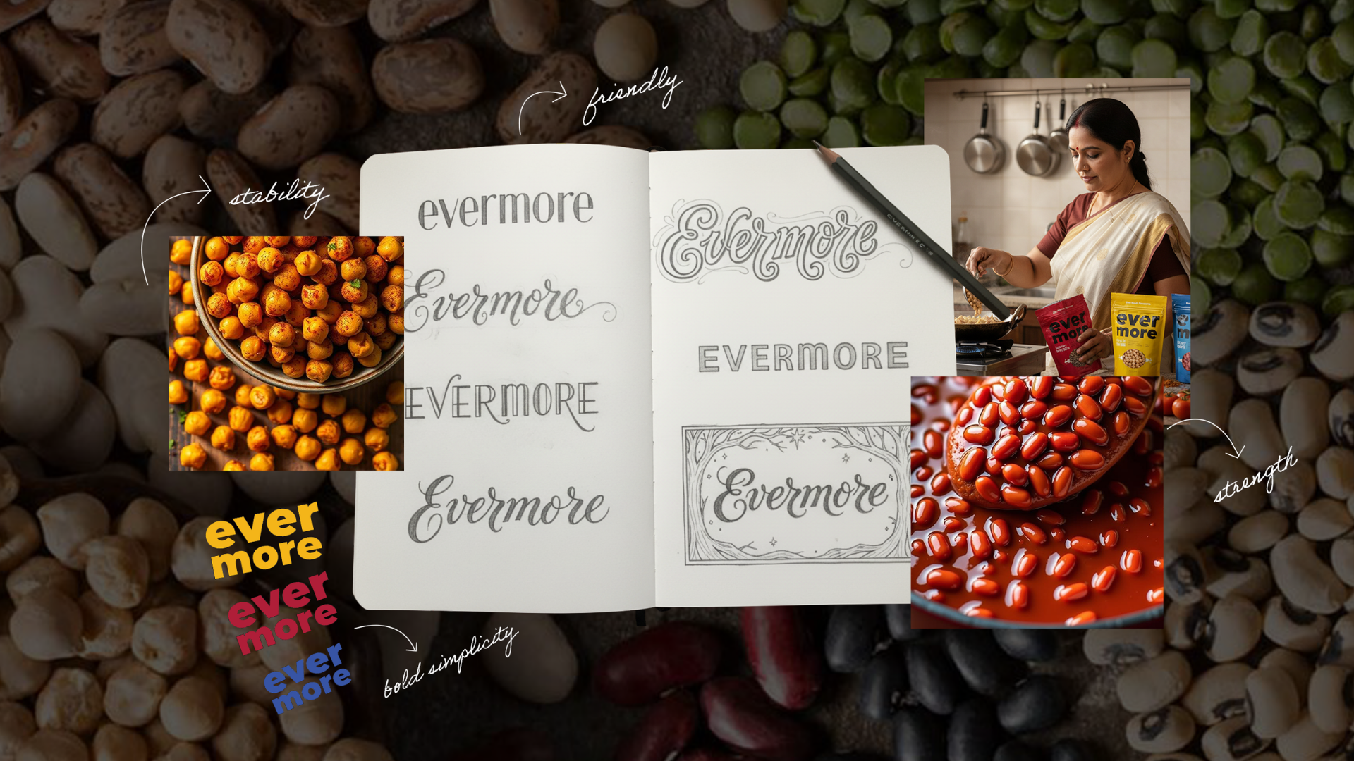
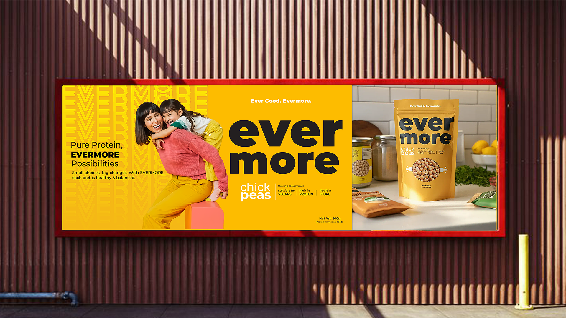
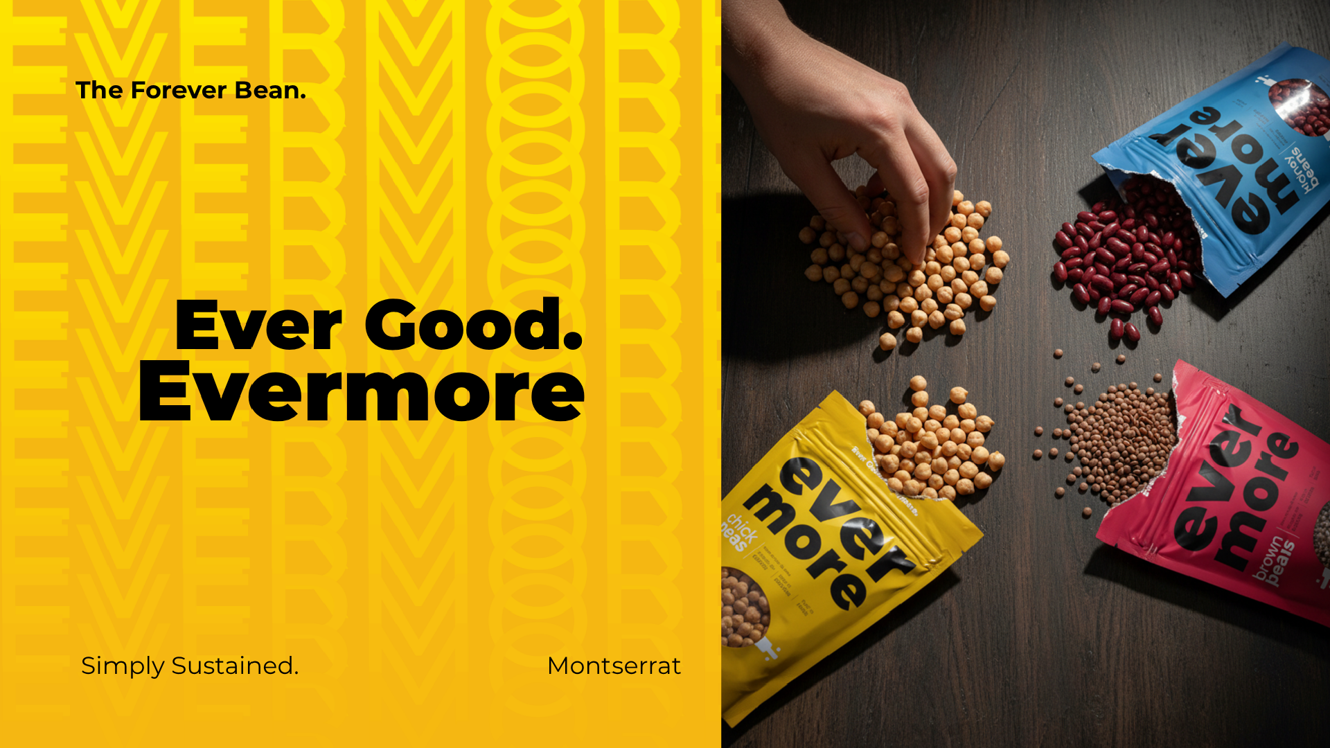
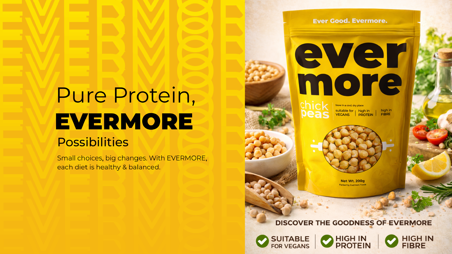
The identity features a strong lowercase wordmark that feels confident, modern and approachable. Bright colour blocking gives every product a distinctive personality: sunny yellow for chickpeas, deep magenta for brown lentils and royal blue for kidney beans. A circular transparent window showcases the natural ingredients inside, reinforcing the brand’s focus on honesty, quality and freshness.
Clean typography and a clear information hierarchy make important product details easy to identify, while the tagline “Ever Good. Evermore.” communicates consistency and everyday goodness. Nutritional benefits including high protein, high fibre and suitability for vegans are presented clearly without overwhelming the design.
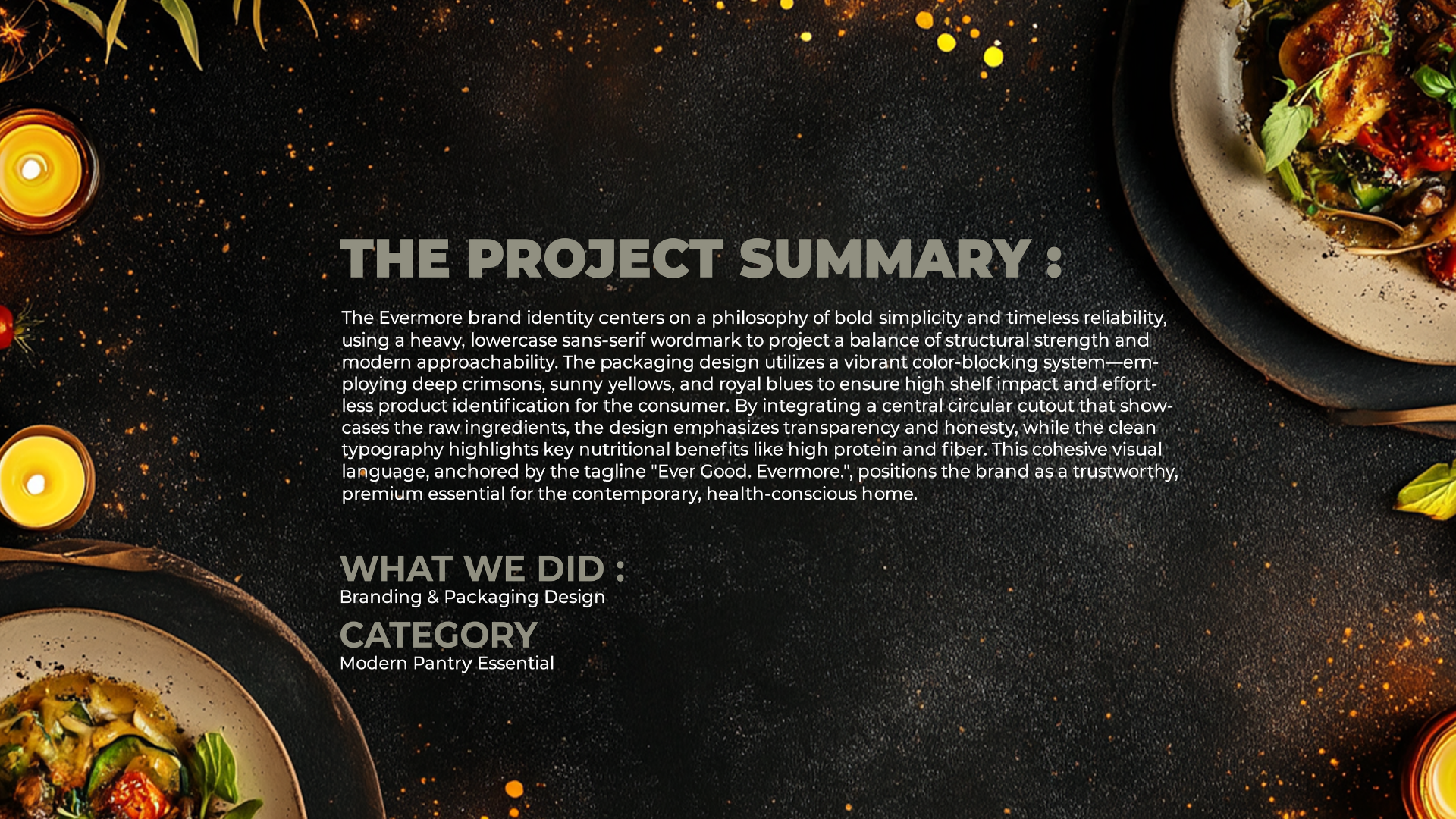
The result is a bold, practical and cohesive brand identity designed to create strong shelf impact while appealing to modern, health conscious households.
 Up-Brands
 Almighty
 Desember Design Studio
 Daria Levina
 Yuliya Likhacheva
 carola matalinares
 daniitenaa
 StudioMordius
 Simon Pendry Creative
 Sti&Co Design
 Yasmin Sherif
 Roberto De Simone
 aseelstudio
 Rabia zouina
 UPRISE
 HazelBishop
 Qianyu Liu
 siyajacob
 Rohan Barwal | D2C Brand Identity, Logo & Packaging Designer
 Karen Salem
 omarchafik
 nastyaabeketova
 Roberto Núñez Studio