
BERI EXTRADishwashing Liquid — Packaging Design ( Official )
Overview
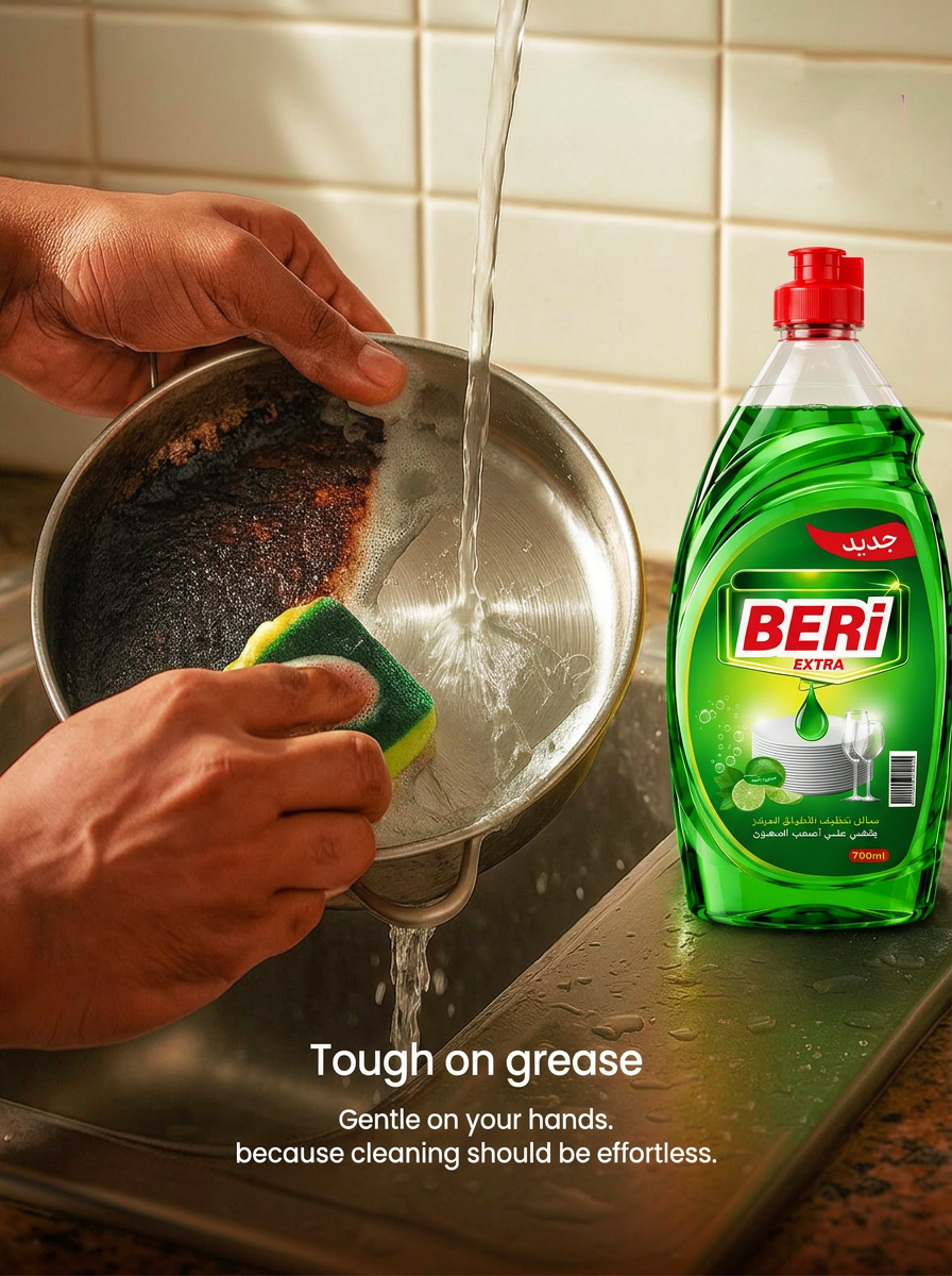
A packaging design for BERI EXTRA Dishwashing Liquid, created to communicate the product’s cleaning power while maintaining a fresh, energetic, and visually appealing appearance.
The main objective was to create a distinctive packaging system that stands out on the shelf, communicates the product benefits clearly, and allows different variants to work together as one cohesive visual identity.
Design Concept
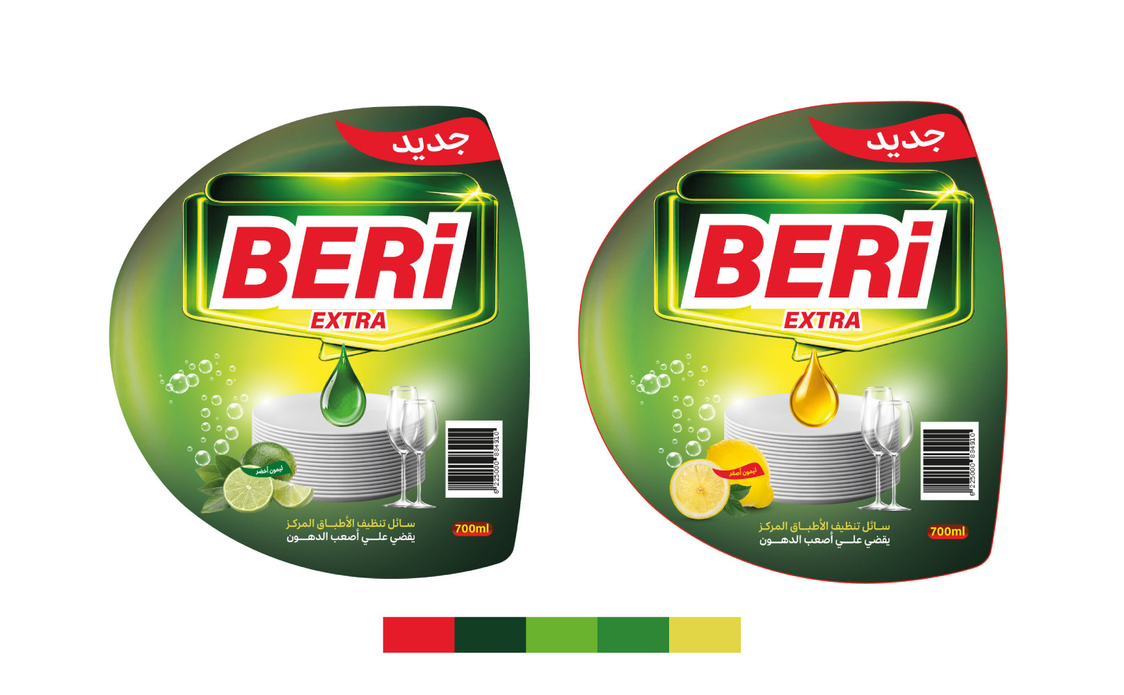
The design combines three key ideas:Power + Cleanliness + FreshnessThe visual language is built around:Dark and vibrant green tones to communicate cleanliness, freshness, and nature.Yellow accents to create a sense of energy and freshness.Red elements to strengthen brand recognition and attract attention.Bright gradients and highlights to give the packaging a dynamic and energetic appearance.The overall result is a bold visual direction that combines strong cleaning performance with a fresh and vibrant feeling.
Visual Direction
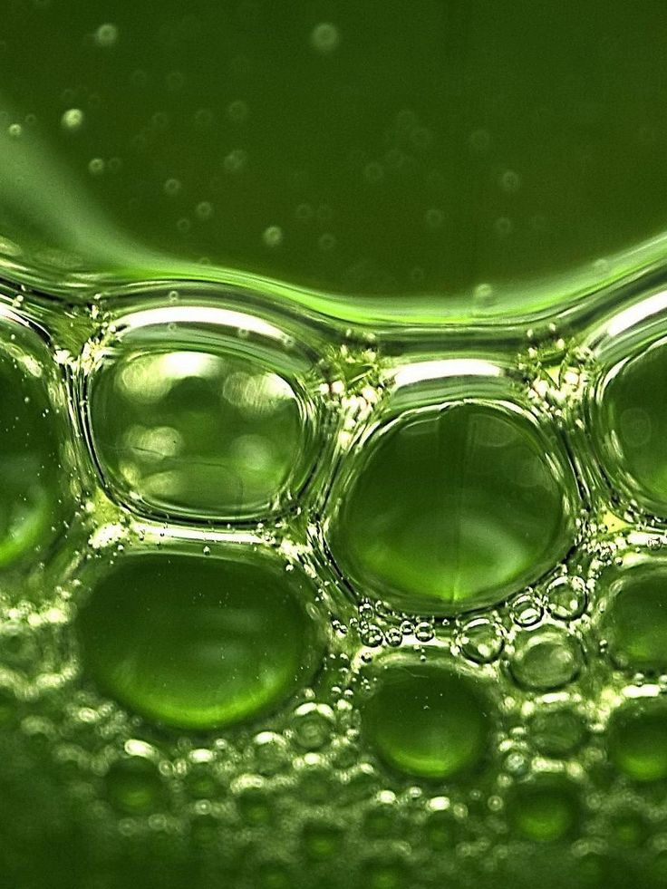
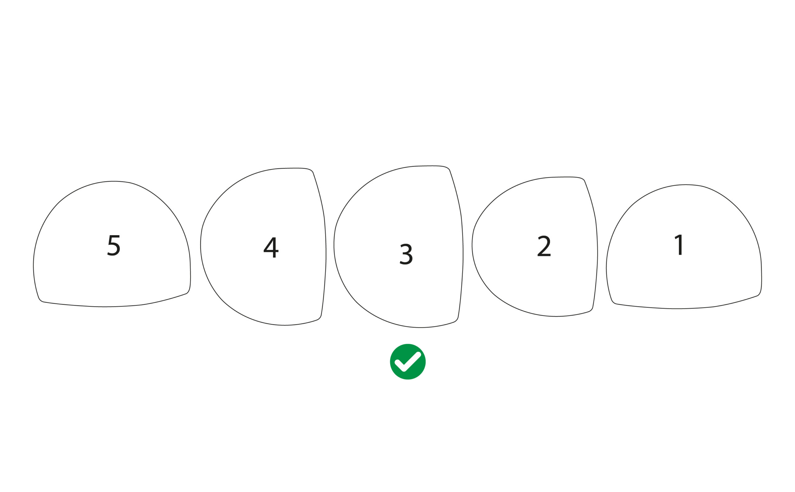
The visual direction is based on dynamic curved shapes inspired by the movement of liquid.Gradients, highlights, and glowing effects were used to create depth and make the packaging feel more energetic and premium.The BERI EXTRA logo remains the main visual focal point, ensuring strong brand recognition and readability from a distance.
Product Variants
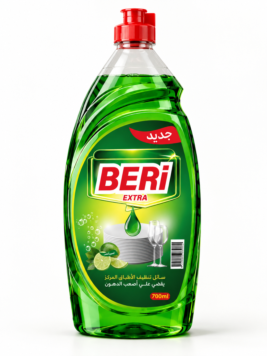
Green Lemon
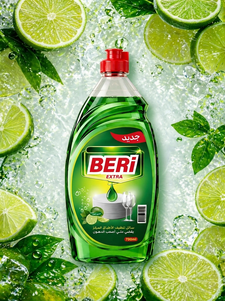
The Green Lemon variant uses different shades of green combined with a fresh green lemon visual.The color palette creates a natural and refreshing feeling while reinforcing the idea of cleanliness.
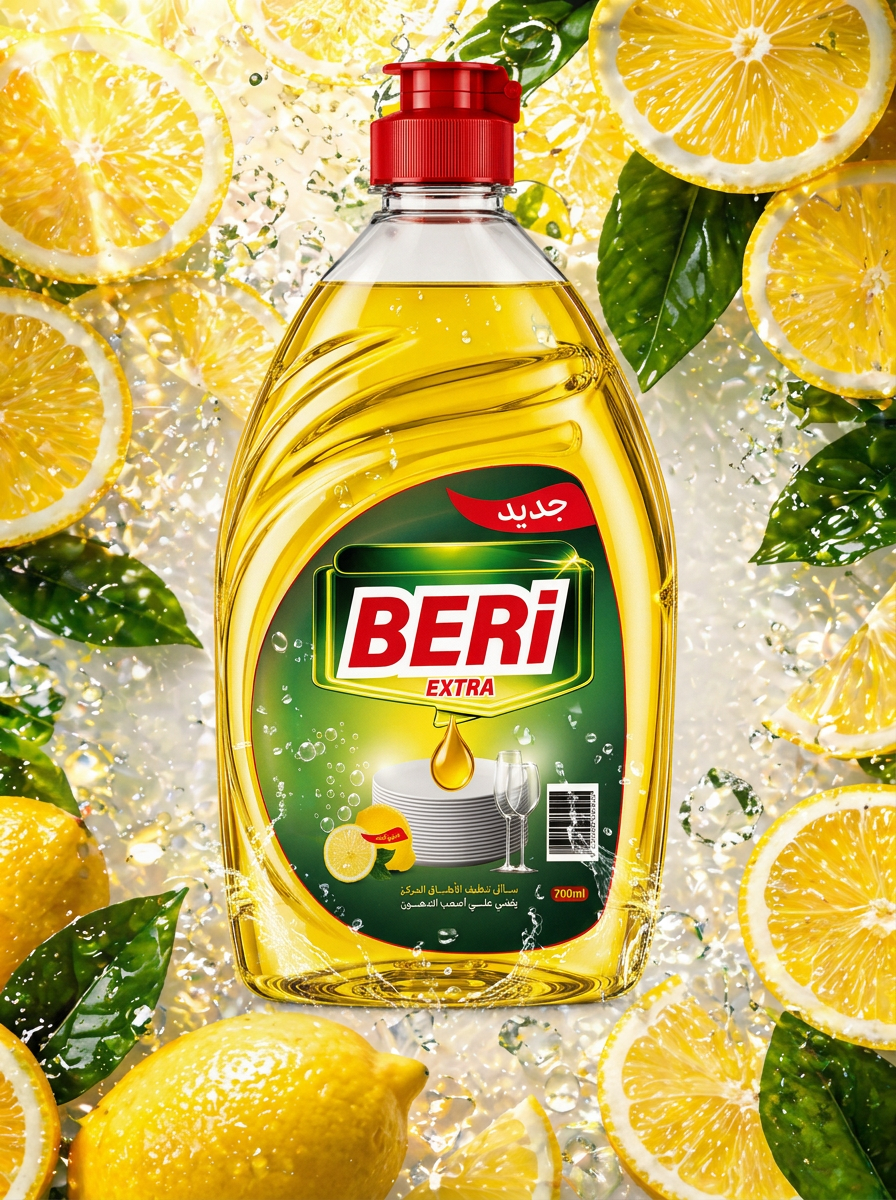
Yellow Lemon
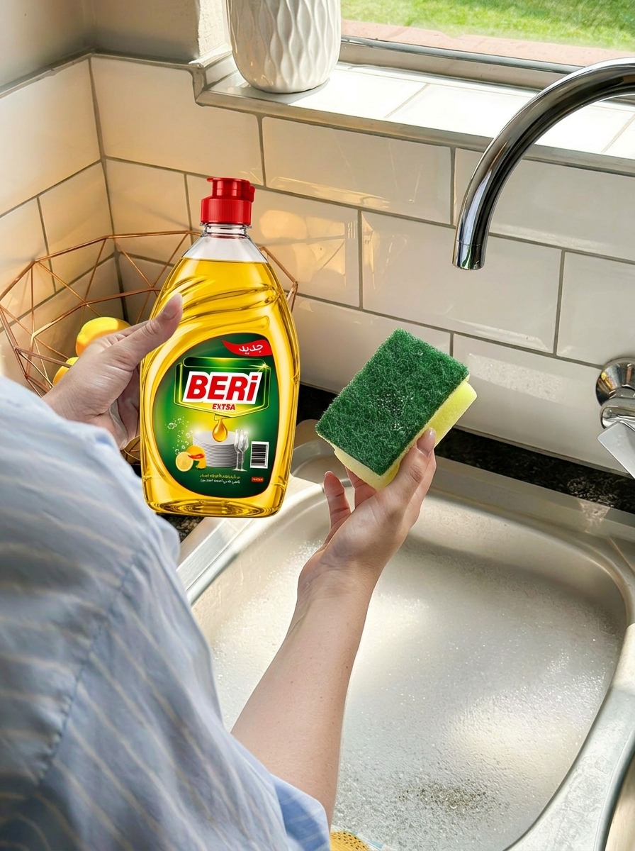
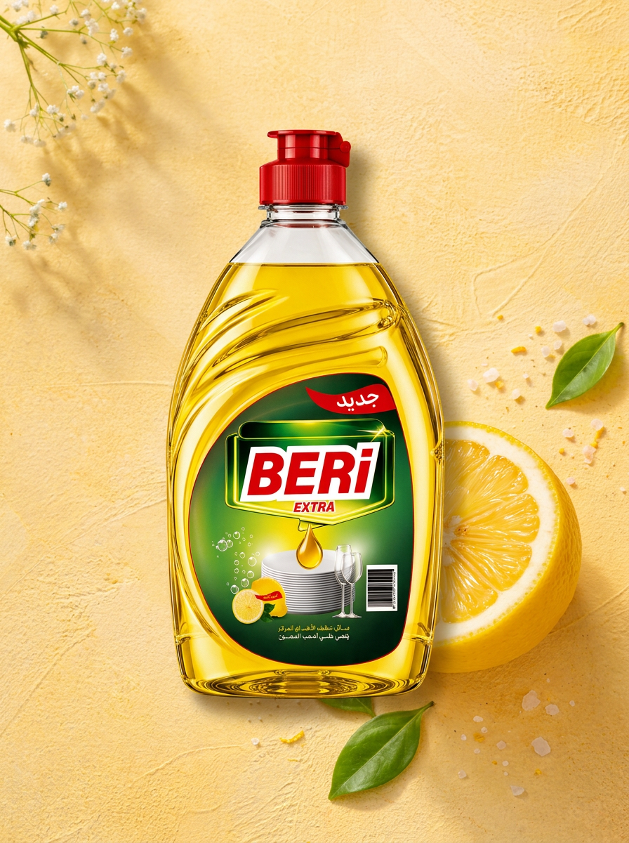
The Yellow Lemon variant introduces brighter yellow tones with a yellow lemon visual.The brighter color direction gives this variant a more energetic and vibrant personality.Both variants follow the same design system to maintain strong visual consistency, while using different colors and lemon visuals to distinguish each fragrance.
Color Palette
The color palette was carefully selected to support the product personality:Red
Used to attract attention and strengthen the brand identity.Dark Green
Represents cleanliness, nature, and strength.Lime Green
Adds freshness, energy, and a natural feeling.Yellow
Represents lemon, freshness, and energy.White
Creates a clean, simple, and highly readable appearance.
Packaging Composition
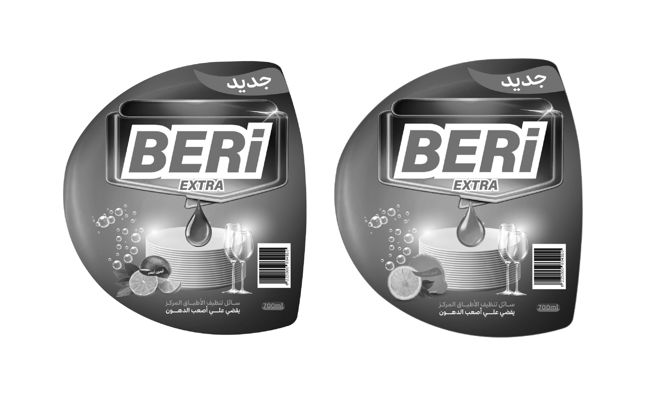
The packaging follows a clear visual hierarchy:BERI EXTRA
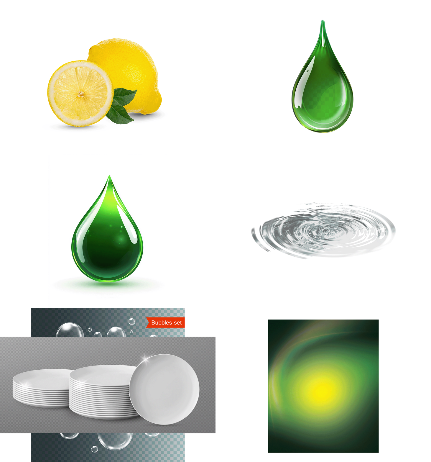
The main focal point and strongest branding element.Lemon Visual
Communicates the fragrance and freshness of the product.Dishes & Glasses
Visually communicate the product’s main use and cleaning function.Liquid Drop
Connects the visual story to the product itself and its liquid formula.700 ml
Clearly displays the product size in a simple and accessible way.
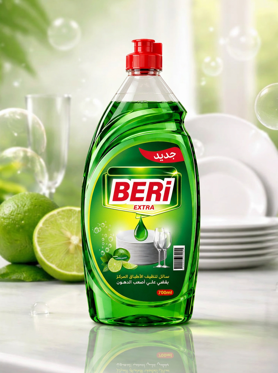
3D Product Visualization
The packaging was presented through 3D product visualization to showcase the final design in a realistic context.Lighting, reflections, shadows, and material details were carefully considered to enhance the packaging shape and create a stronger product presence.
Final DirectionThe final result is a bold, fresh, and cohesive packaging system that makes the product easy to recognize while providing a flexible visual language that can be extended to additional fragrances and variants in the future.
BERI EXTRA
Clean. Fresh. Powerful.
 lunapanda
 Tridimage
 Analoguecreative
 lettera7
 alchimistestudioParis
 Lana B
 Colossal
 Pivot Studio
 M&A CREATIVE AGENCY
 monther al omari
 Anastasia Cherepanova | xtramez
 Hollóka Grafikai Műhely / Graphic Design Studio
 BOLD branding
 Antonia Skaraki
 Pâmella Lorrany
 Z9BKAdsgn
 Francesco Paternoster
 b1studio.ro
 Chris Creative Works
 Boordon
 Dmitriy Kuzovlev
 Brand Society
 yasharpic