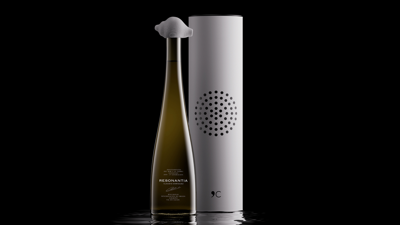

Resonantia, wine packaging as a sensory experience. By Roberto Núñez Studio.
Resonantia is a new white wine brand created for the Claudio Enríquez winery in Sanxenxo, Galicia, on Spain’s Atlantic coast. Its identity is rooted in the story of Claudio, a third-generation winegrower whose family has long made its living from both vineyards and the sea, a tradition he continues today.
Claudio’s experience in these two worlds has shaped his sensitivity to nature’s rhythms and his way of interpreting the changing conditions around him. Drawing on this background, Roberto Núñez Studio developed the branding and packaging, including the name Resonantia, derived from Latin and meaning resonance.
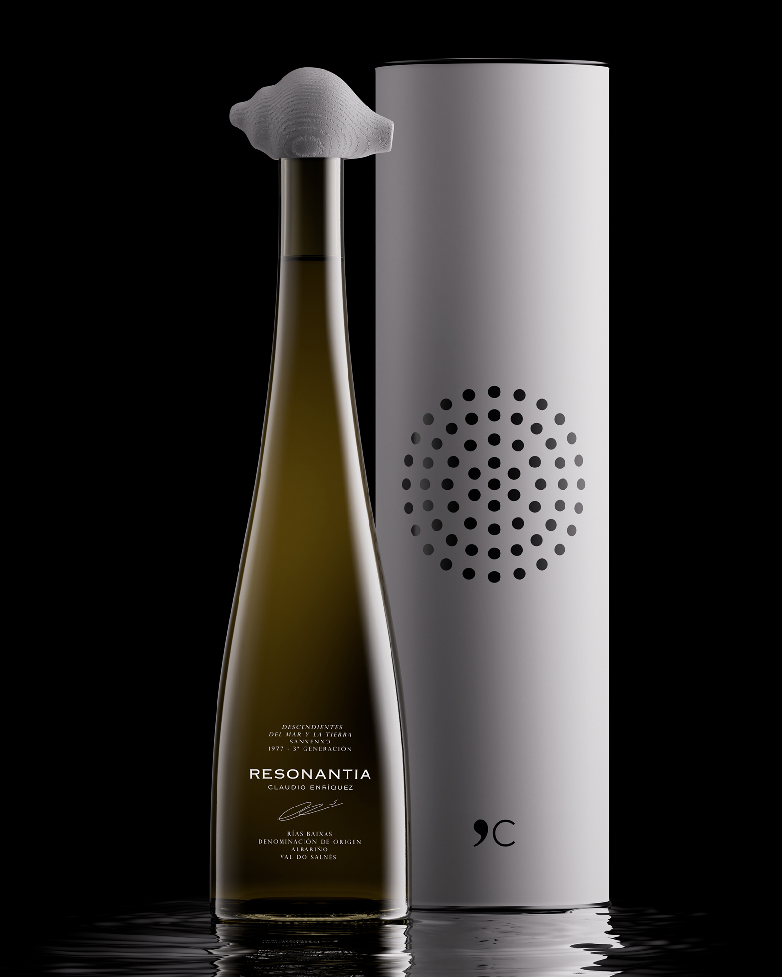
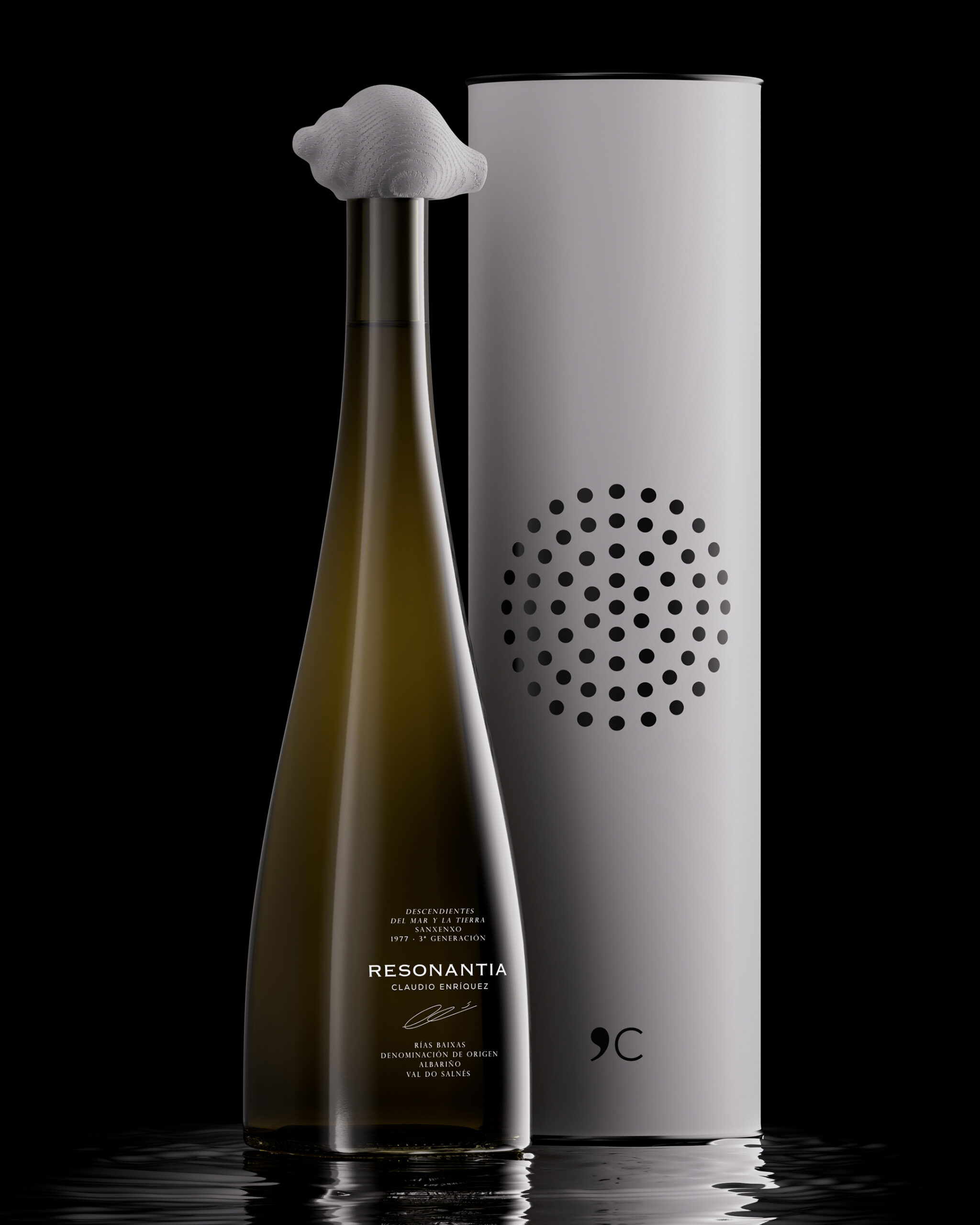
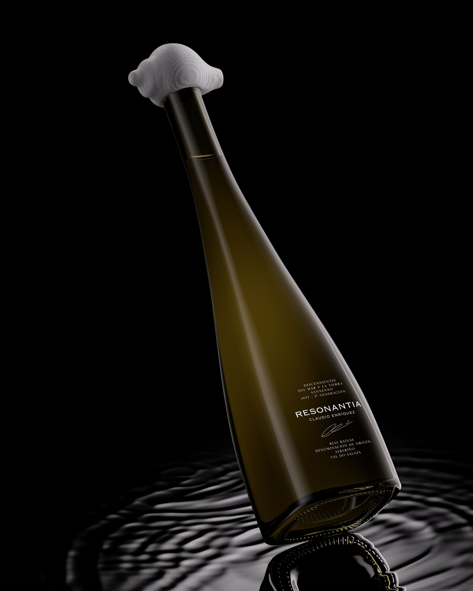
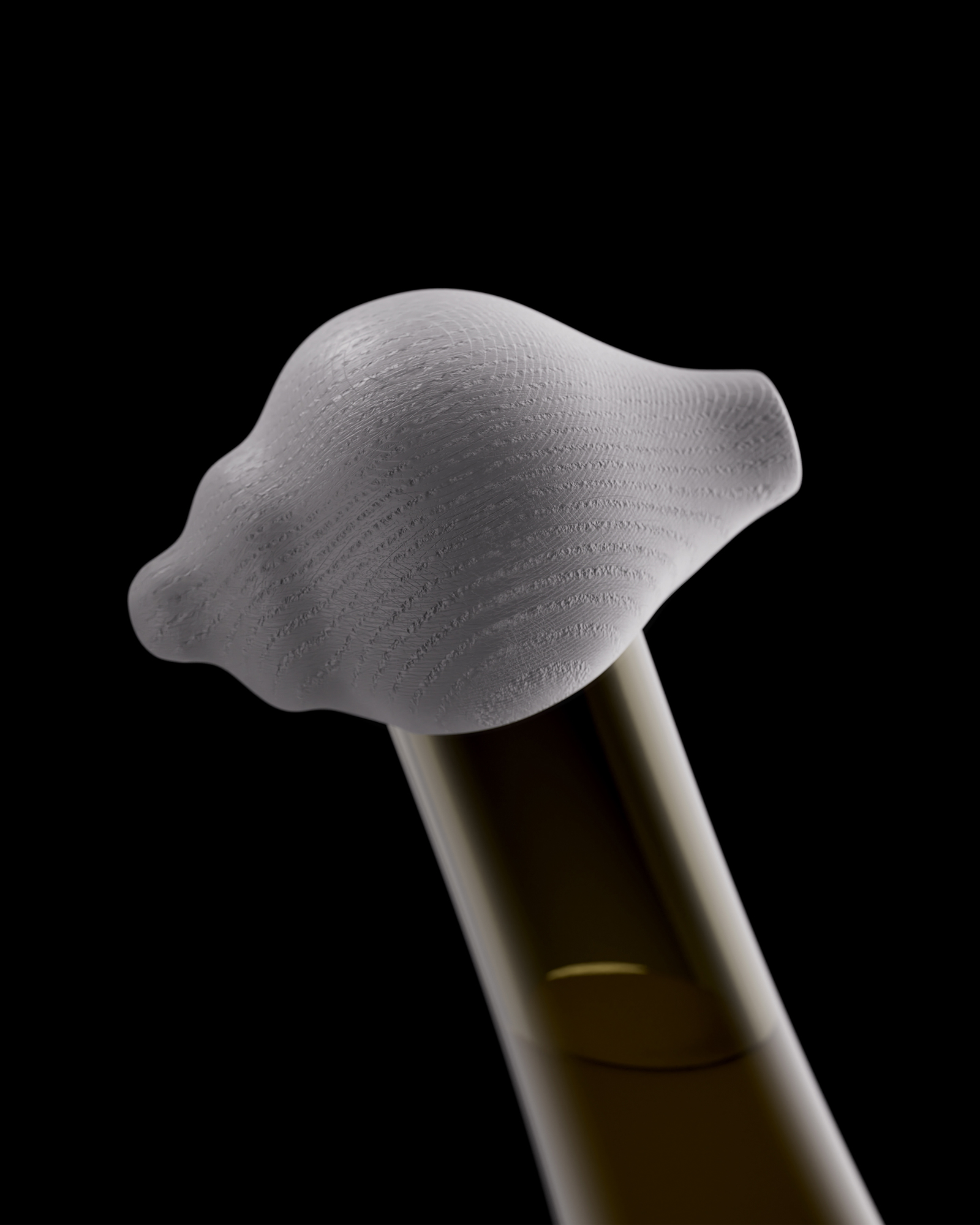
The packaging brings together a sculptural stopper carved from ash wood and inspired by a seashell with a bottle featuring refined geometry and a square base. Together, they create an iconic, immediately recognisable presence, introducing an innovative approach to design within the wine category. The presentation is completed by a canister featuring graphics that highlight the symbolism of the project.
Beyond its visual impact, the packaging introduces an emotional dimension to the consumer experience. Its sculptural character invites a closer interaction with the product, while the distinctive stopper makes the opening of the bottle part of that experience. It also holds an unexpected detail: when brought to the ear, it reveals a soft sound reminiscent of a natural seashell.
Curator’s Insight
The challenge with a name like Resonantia is making an invisible idea visible without slipping into nautical cliché. The design answers by letting the stopper be the only literal form and abstracting everything else. The canister’s dot field fades in size toward its edges, reading as vibration or sea spray rather than an illustration of either. The label sits low on the glass, leaving the long neck bare so the stopper has room to read as a sculpture. Its pale finish still shows the ash grain, which keeps it feeling like wood rather than plastic and ties it tonally to the white canister. Small italic serif lines sit beneath a wide-set sans wordmark, adding a quiet signature note.
 CreativeWise
 ANNA ONISHCHENKO
 Denomination
 VANESA GARCÍA ESTUDIO
 Julia Persuk
 Kingdom & Sparrow
 Agustina Bo
 Matcha DNA
 Atelier 9AM
 Jie Yee
 43oz
 monther al omari
 Rajat Chaple
 timaddington
 Brandesign
 Nouna design
 Rabia zouina
 Derrick Lin
 Sophiagdotcom
 Sofia Nikishina