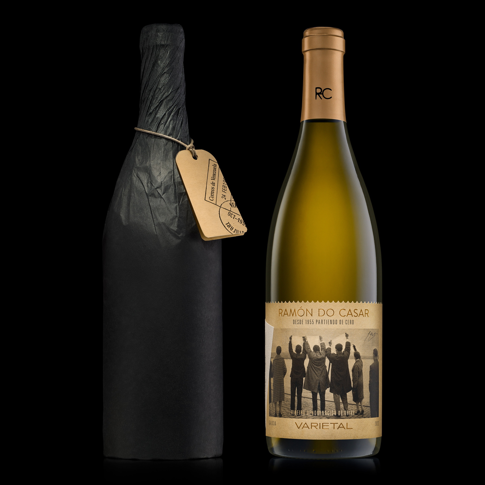
The history of the Ramón do Casar winery goes back to 1955 and the life of Ramón, a Galician emigrant (Galicia, Spain) who, faced with the poverty and lack of opportunities of the time, left for Venezuela to fight for a better future. The challenge: to define a new brand positioning, carry out are styling of its identity and create a limited edition packaging.
Solution.
Ramón do Casar, from 1955 starting out from zero.
The approach conceptualises a story of reinvention and personal achievement.
The storytelling and the graphic solution set out from an iconic photograph of emigration in the 50s, by Alberto Martí, and is complemented with elements like a superimposed label recalling the stickers on the emigrants’ suitcases, and an identifying tag. The design develops the idea with graphic elements from the postal service of the time, using a hand-written text that tells of the long-distance love story between Ramón and his partner.
Production
The idea of the case and the handle in an unusual position called for meticulous planning of its construction. Fine materials were used: local oak to highlight the wine’s Atlantic origin, and a magnetic closure to add prestige and a conceptual parallel with the idea of the suitcase.
Sustainability
The project values the culture of effort. The storytelling and packaging project the overcoming story behind the brand, serving as an example and inspiration for society. On the environmental side, the papers used are FSC certified and in one case are made from 100% biodegradable cotton. It was also decided to use local oak wood for the case, enhancing the winery’s Atlantic origin and minimizing the impact produced by transportation.