

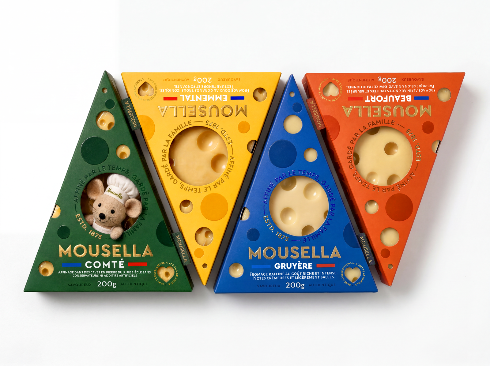
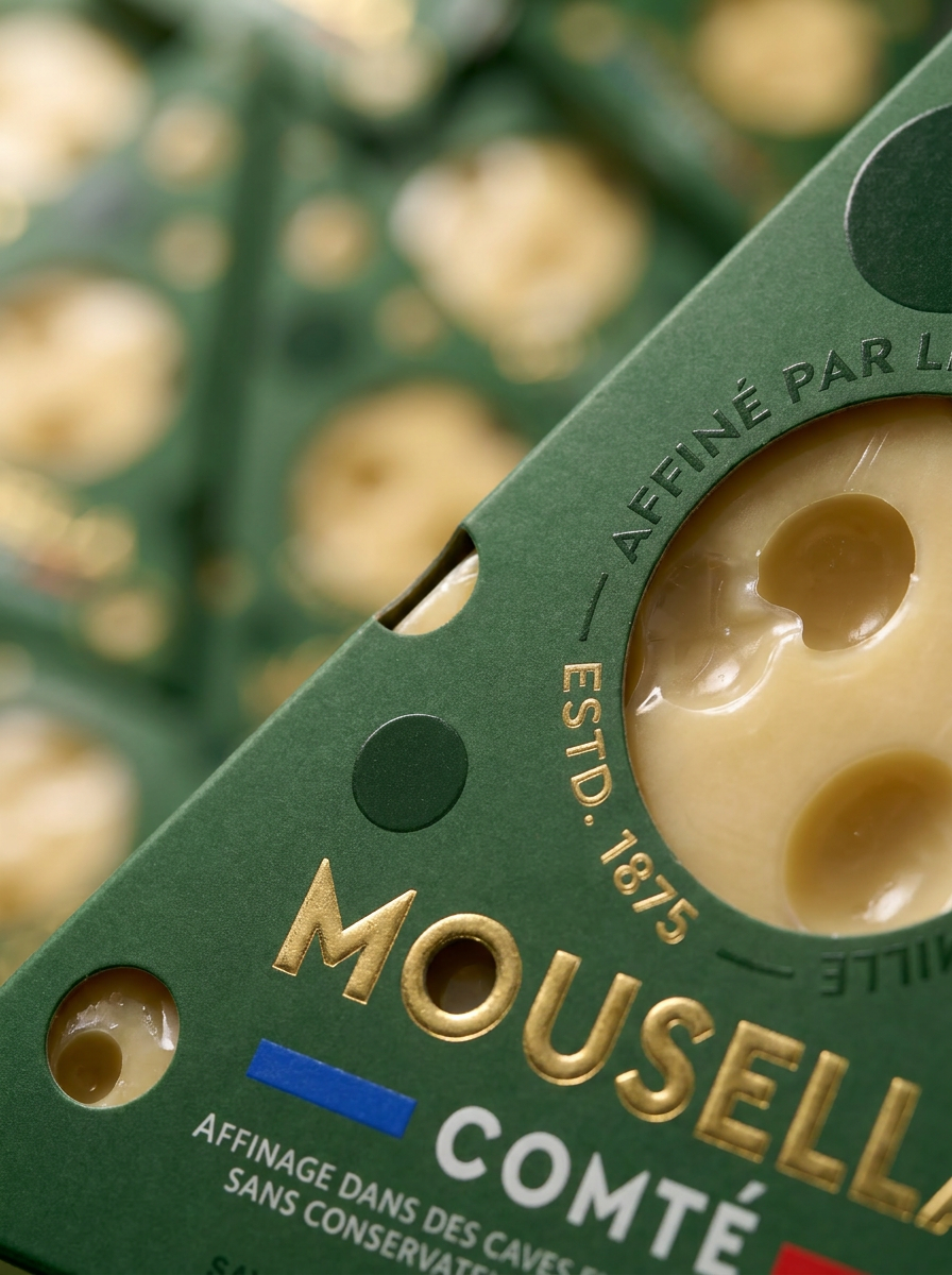
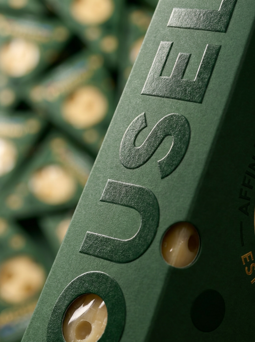
Packaging design for Comté combines tradition with a subtle sense of humor. Inspired by cheese-aging cellars, the design uses shape, color, and a hidden mouse detail to reflect the product’s character, history, and flavor variations.
Curator’s Insight:
The cleverest move is the decision to make the die-cut holes serve two functions simultaneously. They’re a visual reference to the cheese’s characteristic eyes, and they’re also product windows. Most packaging treats those as separate design problems; Mousella solves both with the same cut. The result is a box that doesn’t need to tell you what’s inside because it’s already showing you.
The four-color range system also deserves attention. Green, yellow, blue, and orange is an unusually bold palette for a category that defaults to kraft brown, cream, and burgundy. It signals variety without resorting to flavor-descriptor language on the front face… the color does that work instead, keeping the front panel clean enough for the oversized vertical logotype to own it completely.
The hidden mouse detail is worth reading carefully as a structural choice, not just a personality flourish. Comté is a long-aged cheese with a serious AOC heritage, and the packaging leans into that — “Affinage dans des caves en pierre,” “Estd. 1875.” The mouse introduces levity without undercutting that credibility, precisely because it’s hidden rather than announced. It rewards the buyer who looks closely, which is a different relationship than a mascot printed front-and-center.



 monther al omari
 Biaa
Biaa Akim Melnik Design Studio
 M&A CREATIVE AGENCY
 Valérie Colace
 Reynolds and Reyner
 bachir bachchar
 Maria Gruzdeva
 Hailey Yoon
 宏洛图品牌设计HONGLT
 Rosario Lo Iacono
 Panagiotis Maravas
 43oz
43oz Thirst
 Carreto Concepts Design Studio
 pastellofactory
 Omar Altayeb
 Cocoon Prague
 古戈品牌
古戈品牌 Pascal Riviere Design