The objective is to design a brand new packaging of an existing highly used product which is underrated in terms of packaging. The identification can be either form-wise or graphic-wise. Understanding and eliminating the problems is the main purpose. The solution can be redesigning the form or in the form of strategies to be followed upon.
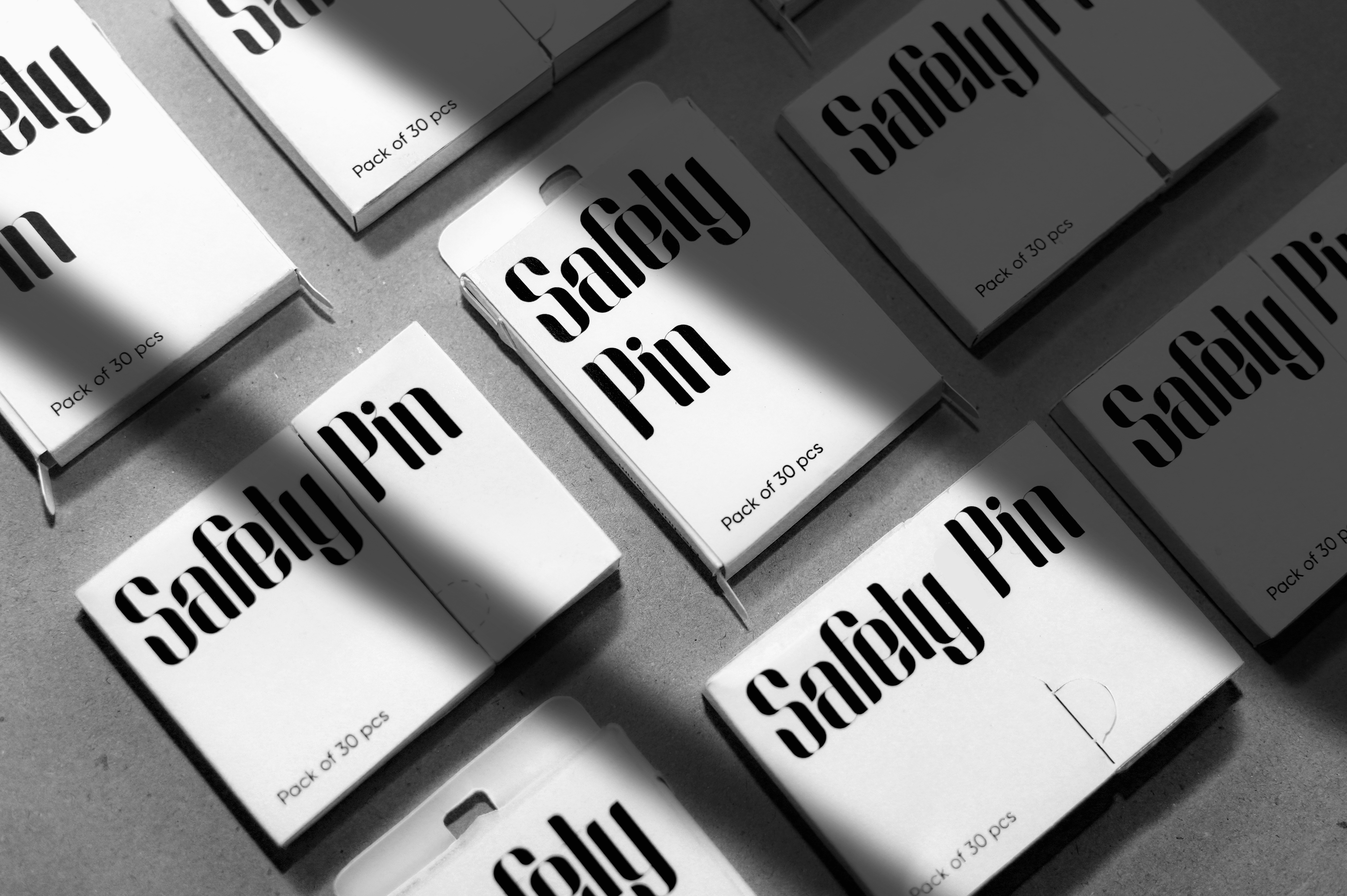
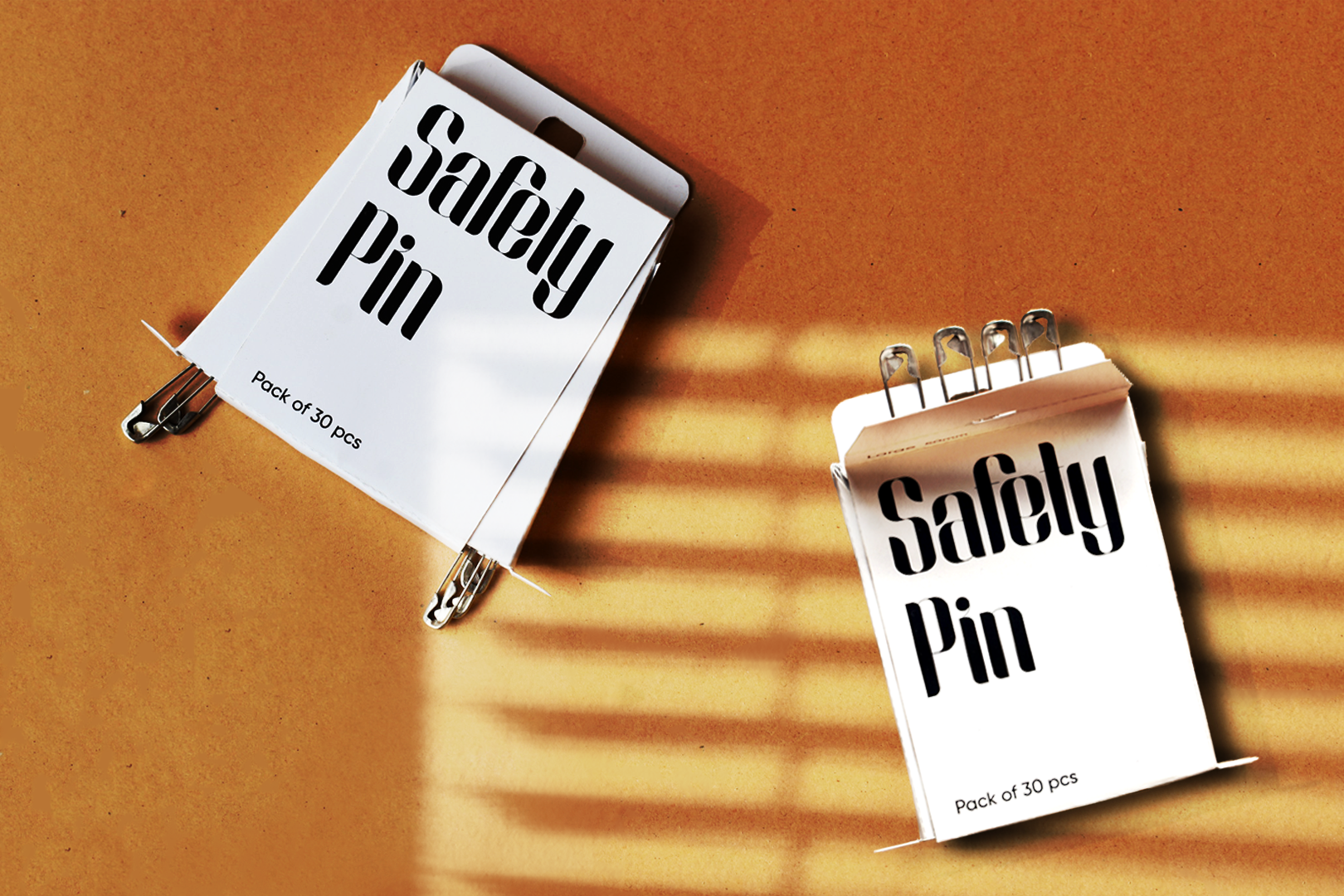
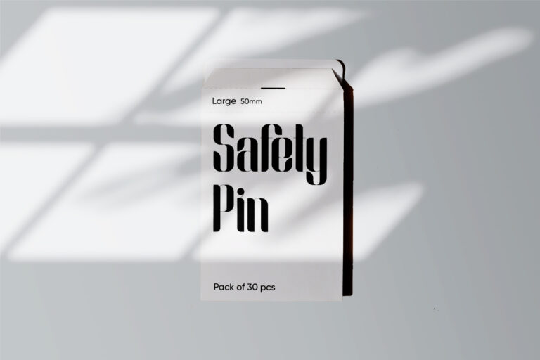
The idea behind the brand is to keep things basic and straightforward. Because safety pins have their own identity. Hence, our branding would simply read “safety pin” rather than any firm name. We chose a white paper overboard box to protect the pins & environment and take all essential safeguards. While having black screen printing on it. But we were also debating silver paper because it gives off a steely vibe just by glancing at it.
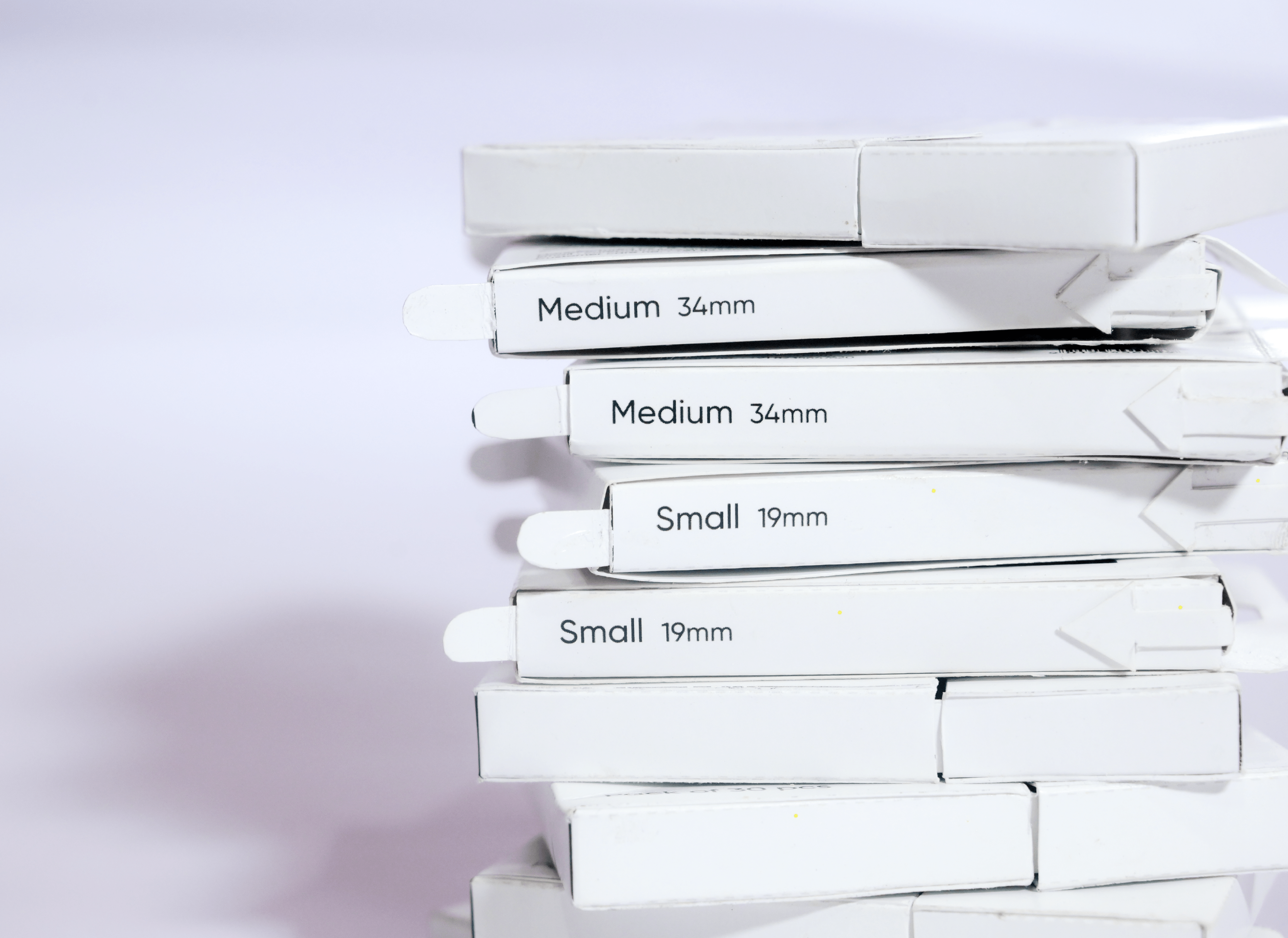
Each box has 30 pins, with 10 of each size (small, medium, and Large). Because users’ needs vary from situation to situation. They may require small pins in certain cases and large pins in others, Also it’s cost-effective. So we decided to put everything in one place and segregate them so that finding the appropriate size would be simple.
Considering our target demographic, The reason for keeping the colors black and white is that the product is gender-neutral and is used by both men and women as well as young girls. In order to stand out from our competition in the market, we decided to keep branding simple.