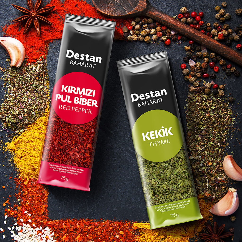
The aim is to simplify a wide range of product groups by design, eliminate confusion and strengthen the family structure.
For this purpose, the logo has been re-designed with a simple and strong expression. The family structure has been strengthened with the use of white on a black background in the brand area. For the natural and simple design language, no product image is used in the packaging. Instead, it is aimed to show the product itself by using as much transparent area as possible in the packaging. With the color coding in the circular structure in the variant area, the product is clearly and dramatically highlighted. Variant expression has been strengthened by using color coding on the bottom of the packaging.

