When we received a brief opening with “The Arotsker & Sons distillery was born from a great Ukrainian family tradition,” we immediately knew: this one was going to be cordial. Cordial and beautiful in a European kind of way.
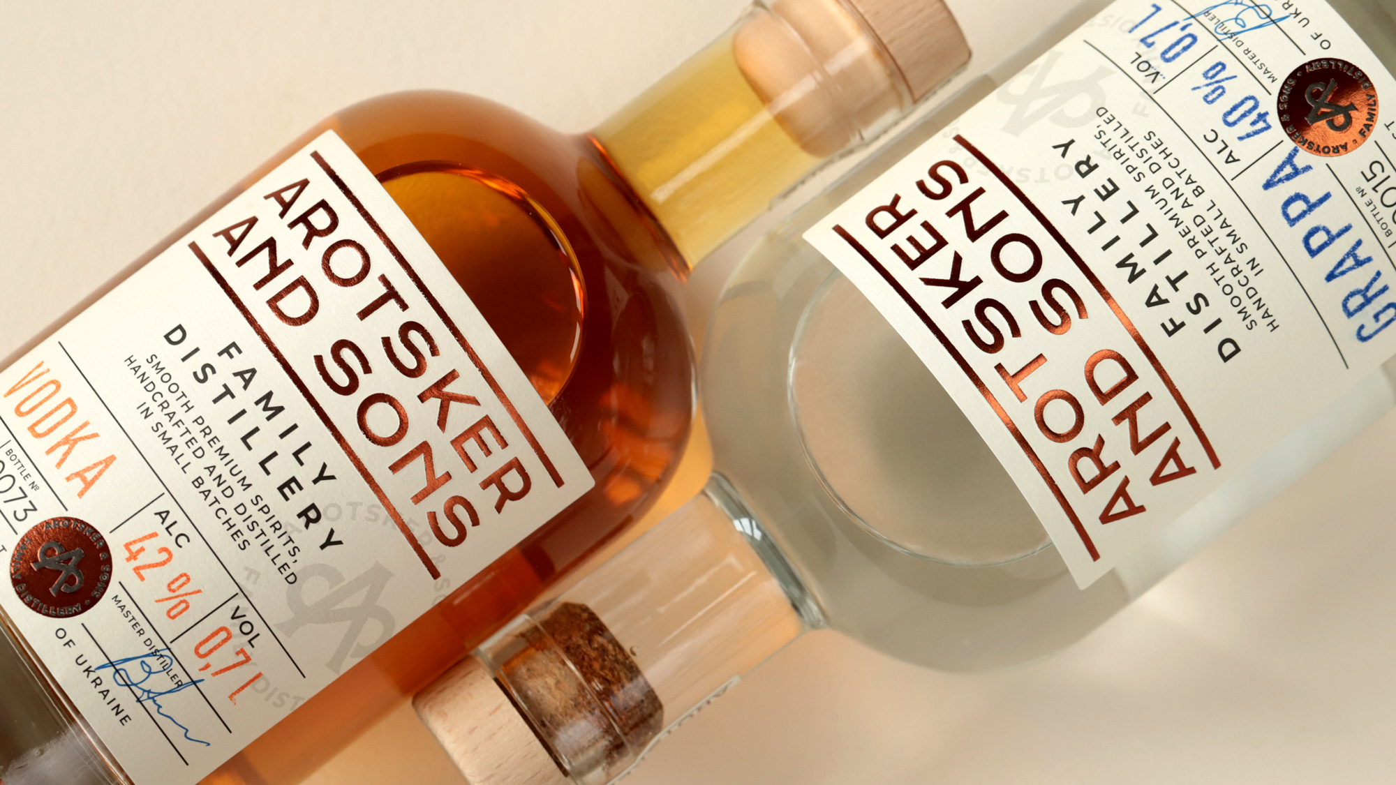
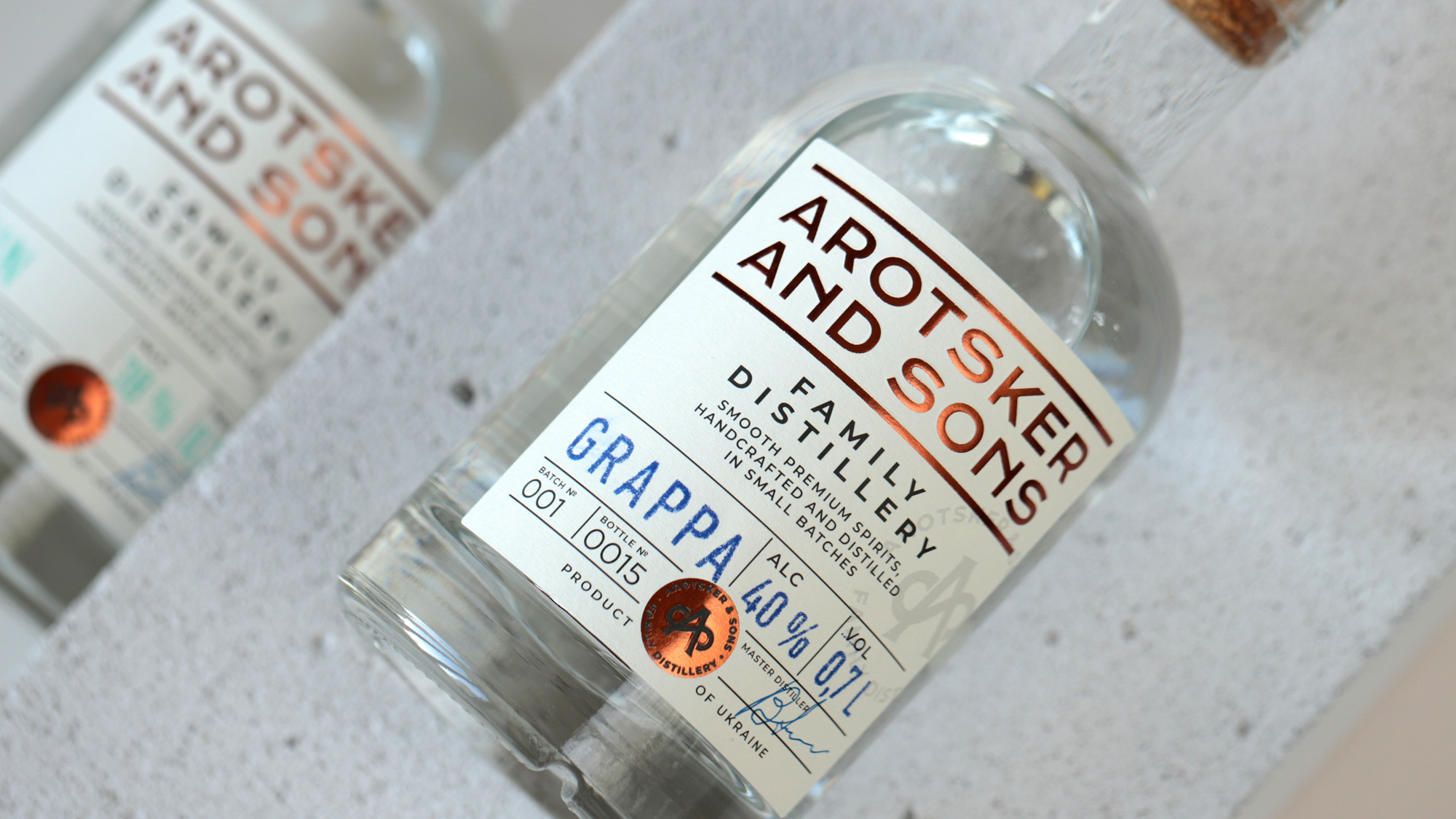
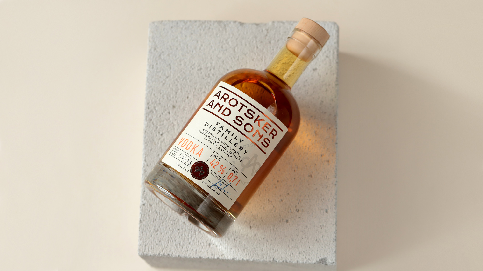
It all began with the birth of Volodymyr Arotsker in 1930. He would come up with mild homemade horilka recipes for everyone to enjoy during loud get-togethers with friends and warm family gatherings. His signature on the label would come to guarantee product quality. His children and grandchildren would become the ambassadors of the family business turned professional distillery. And the first three spirits produced there would be horilka, grappa, and gin.
‘A’ is the first letter in the famous Ukrainian family’s name. We recreated it as intertwined ‘A’ and ‘S’ as if gathering a circle of the family’s progeny around them. With its coppery color and elegant plasticity of form, the logo is reminiscent of the alembic, a device used in the distillation of spirits. Our goal was to create a monogram that would have a deeper meaning, could be interpreted on multiple levels, and gained value over time.
The literally hands-on approach the producers used for every bottle—from the scientific precision in selecting ingredients to the masterly formulation of recipes—inspired us to implement some smart branding ideas. First, we went with a classical, streamlined design characteristic of premium spirits in the Western tradition. Second, we added a unique serial number on bottle labels to make every bottle feel special. Also, labels are hand-printed and have individual color coding in addition to the usual information like the beverage’s name and strength. The overall laconism of the design is offset by the meticulous approach to label decorations and printing. It’s crucial to be uncompromising while picking materials and partners who could properly implement one’s idea—as much as while choosing a respectable beverage among those currently taking metropolitan HoReCa by storm.