In the new age we live in, the competition for sales, branding and more effective communication with the audience has reached its peak.
Most insight business letters provide a better opportunity to compete with differentiation, and trying to look better and ultimately sell quality products requires different designs.
One of the most effective factors of a brand’s superiority over other competitors can be the packaging that both looks attractive to the audience and properly displays the product capability and ultimately leads to more sales.
Challenge: In design, I faced a challenge that should be created far from the market of new and different design that is fast, attractive and expressive, which was created after the idea generation that I explain below.
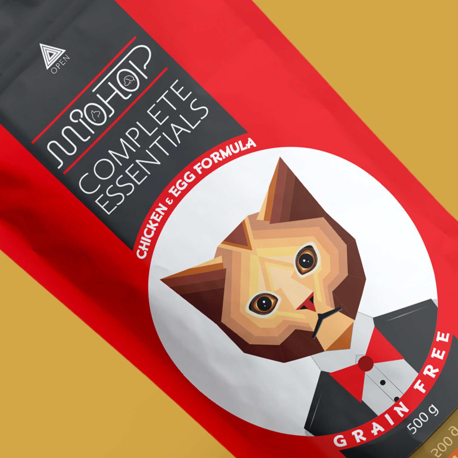
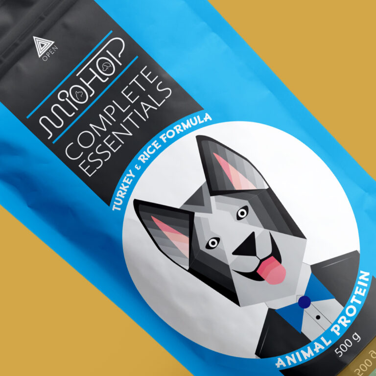
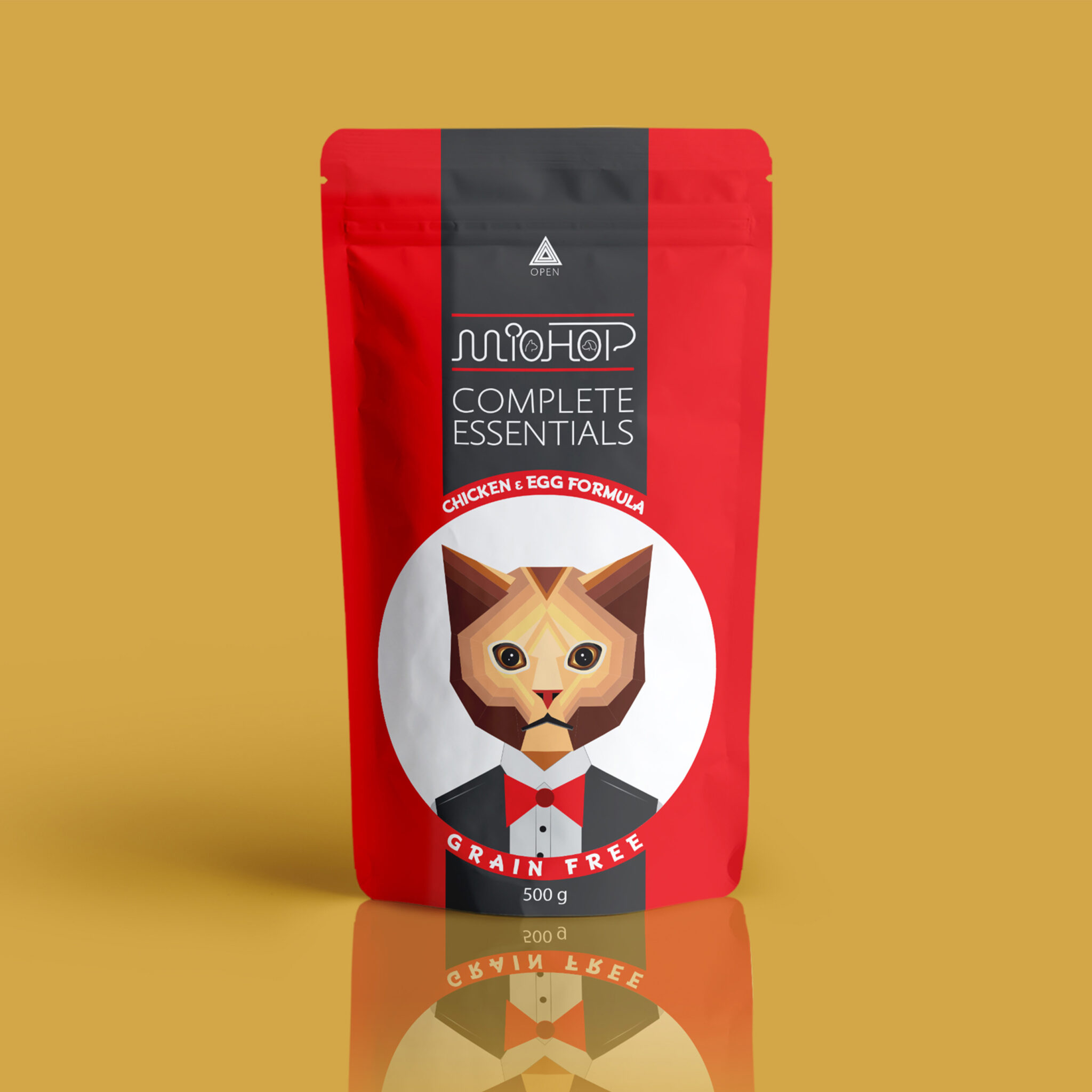
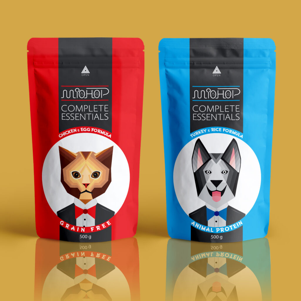
MioHop Dry Food Packaging In designing pet dry food, we have tried to design the packaging in a simple and secluded space in relation to the whole market of this product and differentiate the product when it is on the shelf next to other competitors. . For this reason, blue and red colors have been used in the design, and also the image of the waiter cat and the waiter dog in the center of the design has been used to show the nutritional nature of this product for these animals. Instead of the image of food on the packaging, dry is used, which is a sign of serving food and is differentiated from other products that are produced for these animals (such as incentives, supplements, etc.) and this product is quickly and easily Convenient to use. Easily accessible to the customer.