In the new age we live in, the competition for sales, branding and more effective communication with the audience has reached its peak. Most insight business letters provide a better opportunity to compete with differentiation, and trying to look better and ultimately sell quality products requires different designs. One of the most effective factors of a brand’s superiority over other competitors can be the packaging that both looks attractive to the audience and properly displays the product capability and ultimately leads to more sales.
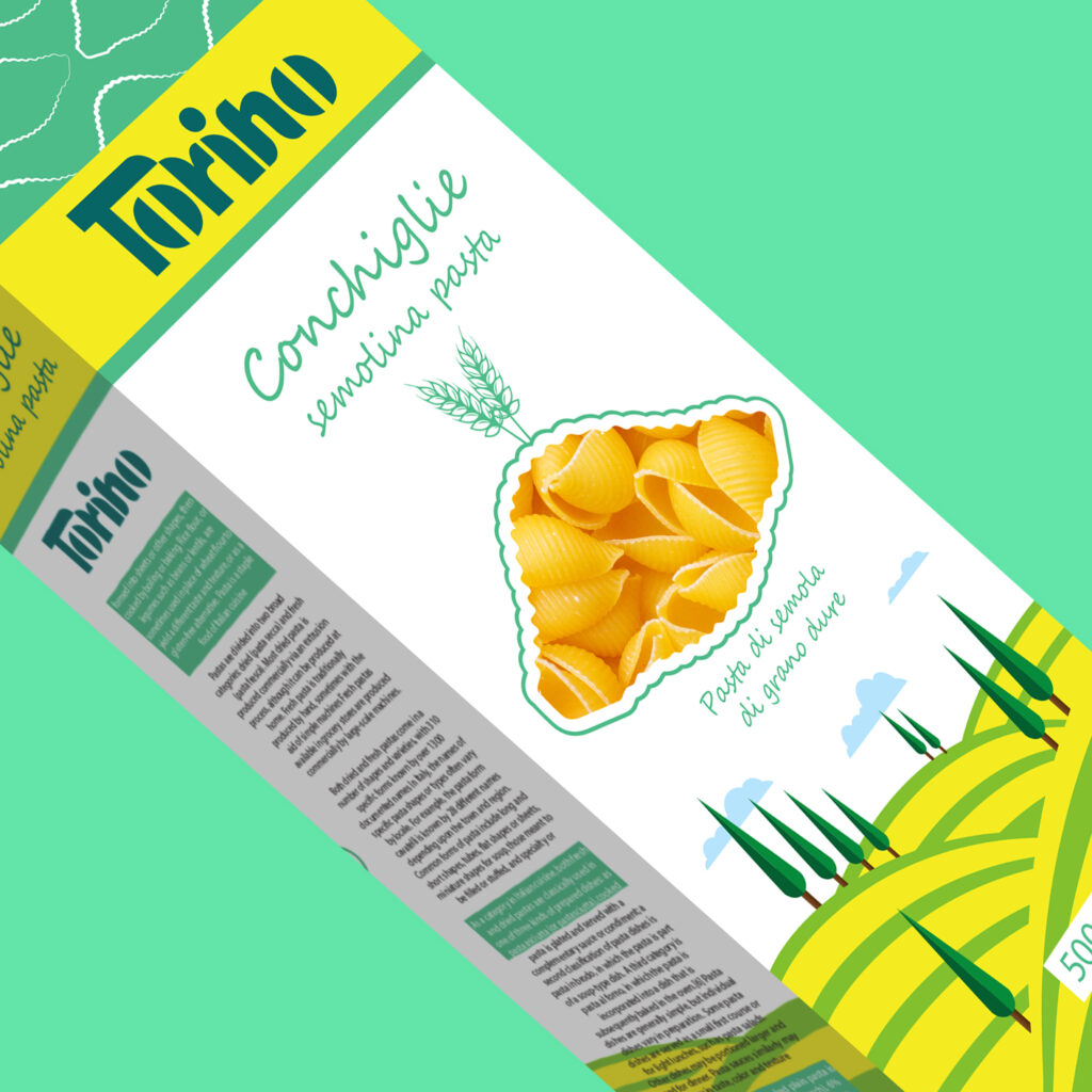
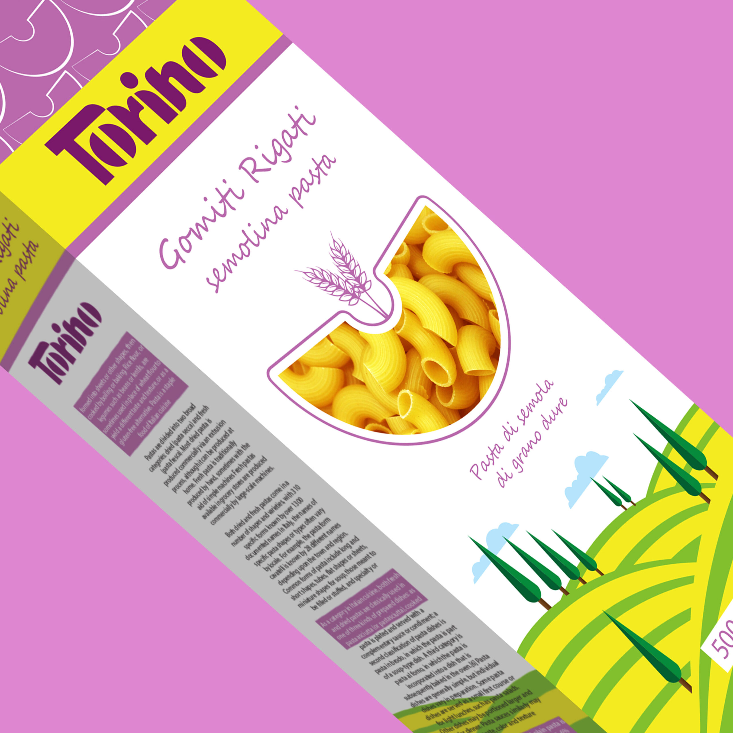
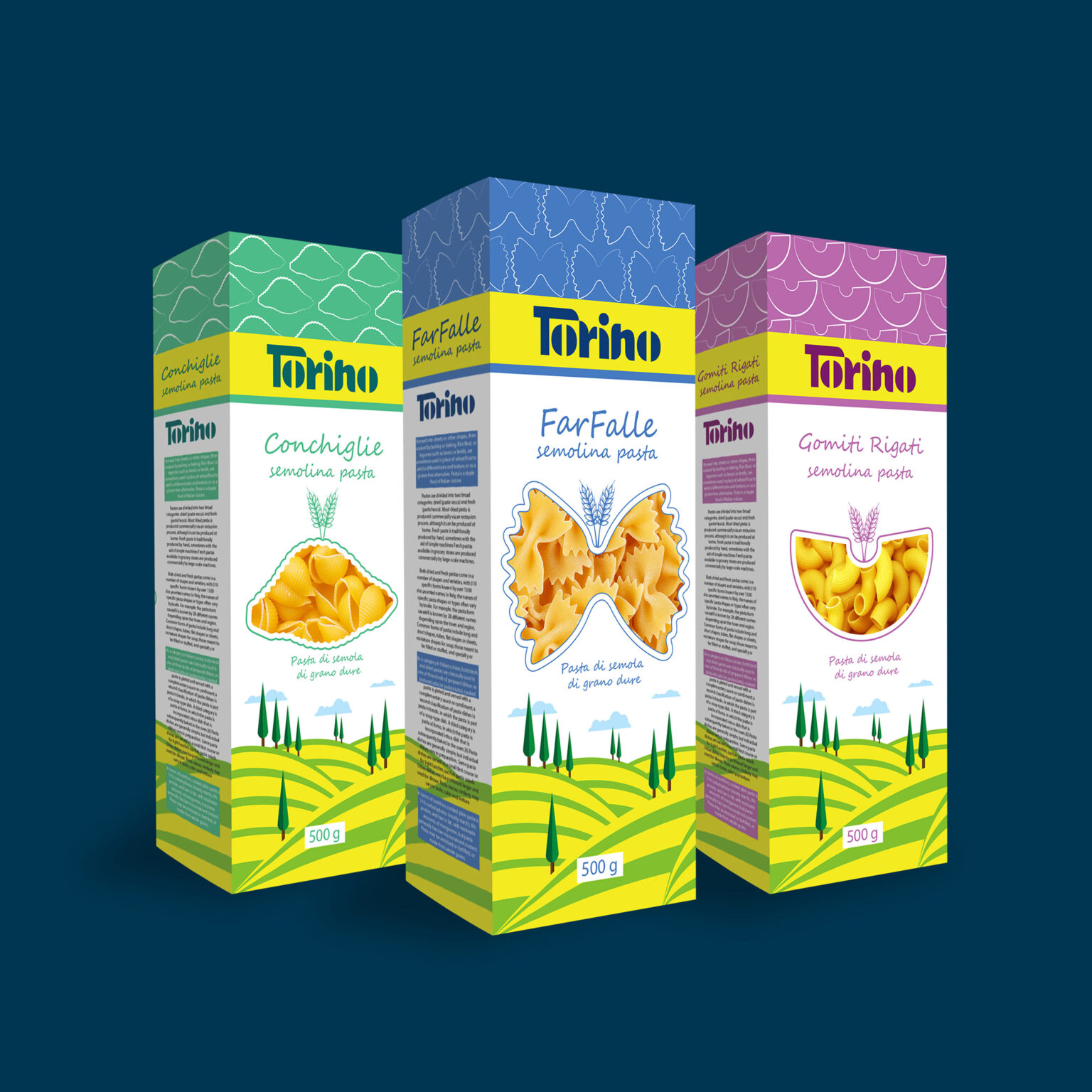
Packaging challenge: In Torino packaging, which is in 3 forms of pasta :Farfalle , Gomiti rigati & Conchiglie and the type of packaging is box, which has more stability and a better overall view. But in the design of the space of beautiful Italian farms inspired, in the lower part of the illustration of the farm and cypress trees and two colors green and yellow, which is a symbol of wheat, yellow is used, and also the space above the design in 3 colors based on the product form of pasta :Farfalle , Gomiti rigati & Conchiglie selected It has a pattern image of each product and the yellow bar where the logo is located is a solid yellow color used, the symbol of wheat and the color of the product itself. And in the center of the design, I used a secluded space with a white background with little writing that in the part where the product is seen inside the package, I used the cut of the form of each product, which at first glance the pasta form is completely clear and expressive for the customer. And achieve the main goal of sales closer and closer.