Sun Bread Sun Best
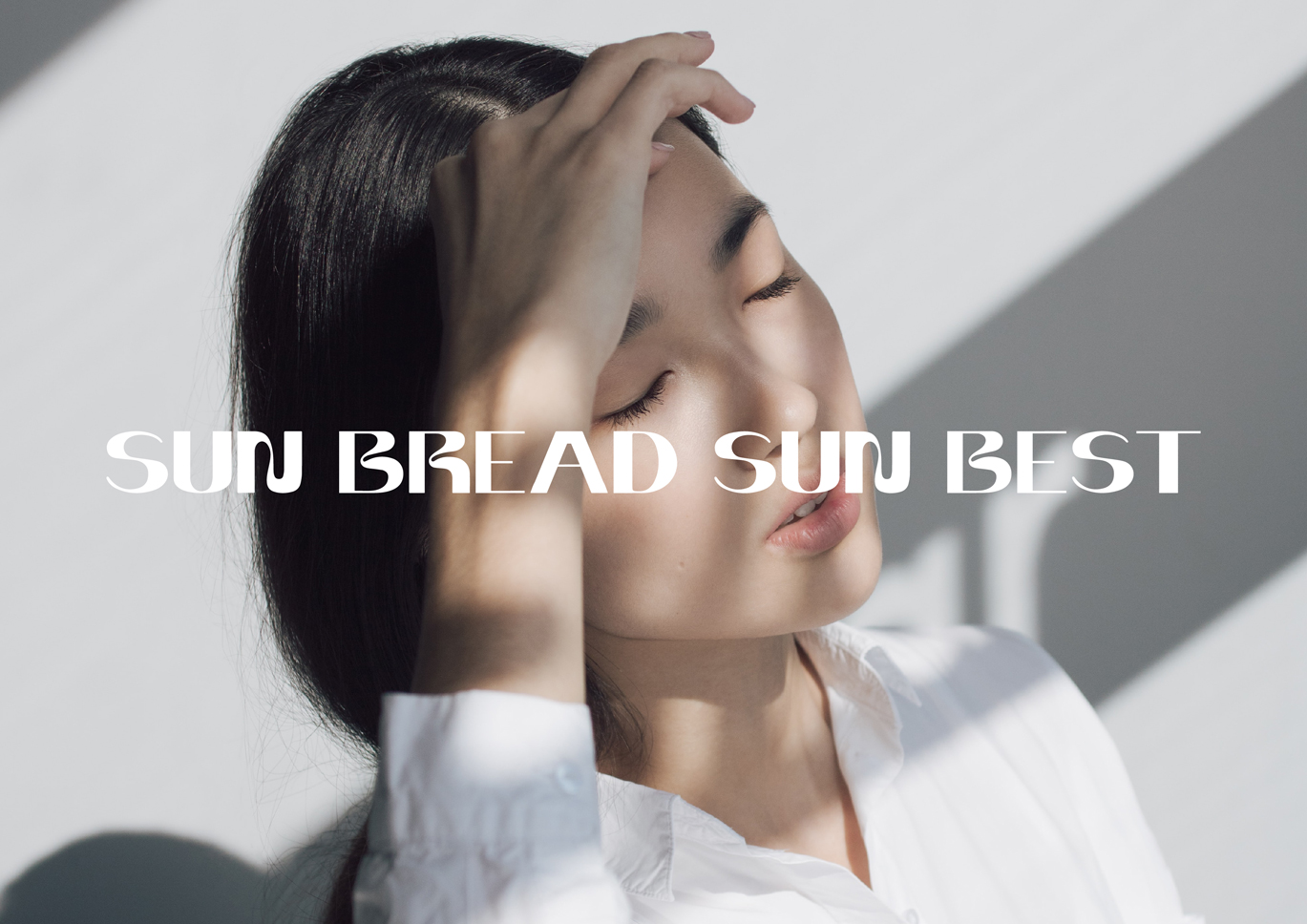
New Sunscreen brand product in Thailand. They’ve developed the formula to have a creamy texture that is light and soft like bread. The focus is on urban and new-generation women who are looking for sunscreen options that suit their lifestyles and tastes.In accordance with their market strategy, they commissioned us to designed their brand logo, their packaging design, and the Dealer’s communication that will help them to be perceived like the counter brand’s quality that the important point of dealer marketing strategy.
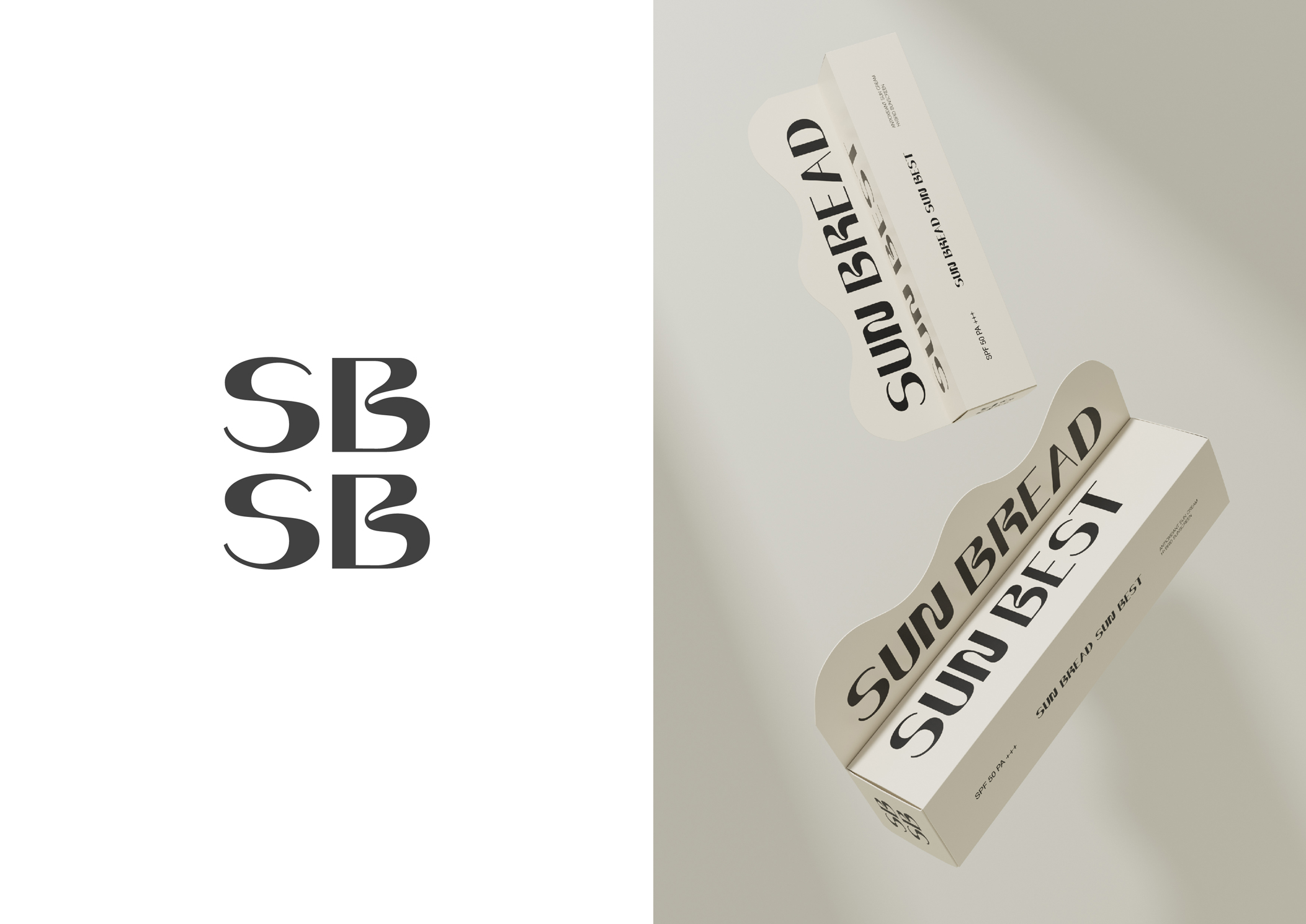
Brand Mark – SUN BREAD SUN BEST typeface made from specially made letters It shows a feeling of softness and softness. to help show the key benefits of the product. Especially “S” and “B” letters that made more special than other letters. And we made the secondary logo ” SBSB” for a small space and use it like a symbolic is a good solution for a long name brand like this.
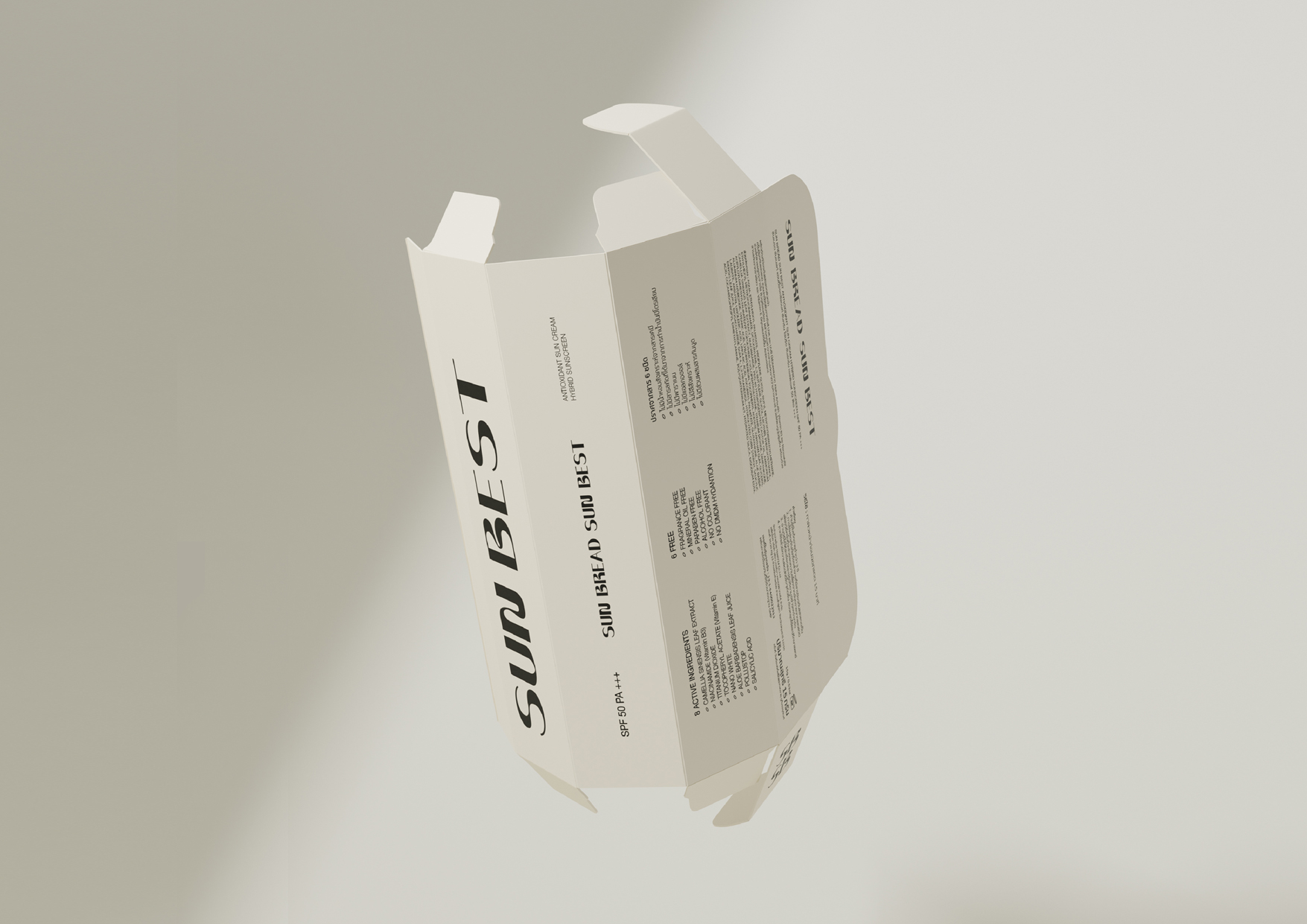
Packaging – We decided to design by don’t use “Bread” to do the design but we choose the other way that presents the emotion of cream and bread instead. The overall packaging is designed to be clean white. Provide clear and minimal information. What’s special about this packaging is that it is designed so that the assembly does not require glue, in addition to reducing the use of chemicals, it also makes the brand pass on the real cleanliness. It also has a design that when assembled the box has a protrusion that looks like a display sticking out to differentiate from other minimalist brands on the market.