IRON HORSE – A ‘STORYTELLING’ BRAND CREATION
The Famous Transcontinental Railway was completed in 1869, bringing people from East to West and into the Napa Valley.
The train was affectionally known as the ‘Iron Horse’.
With the train came a wealth of new species of flora, fauna, and vines (previously unknown to the West) and an eclectic mix of different characters who came to tend to the land where grapes of this winery grow to this very day.
The facility is still run buy the descendants of these quirky misfit – the vines tended by their great, great grandchildren.
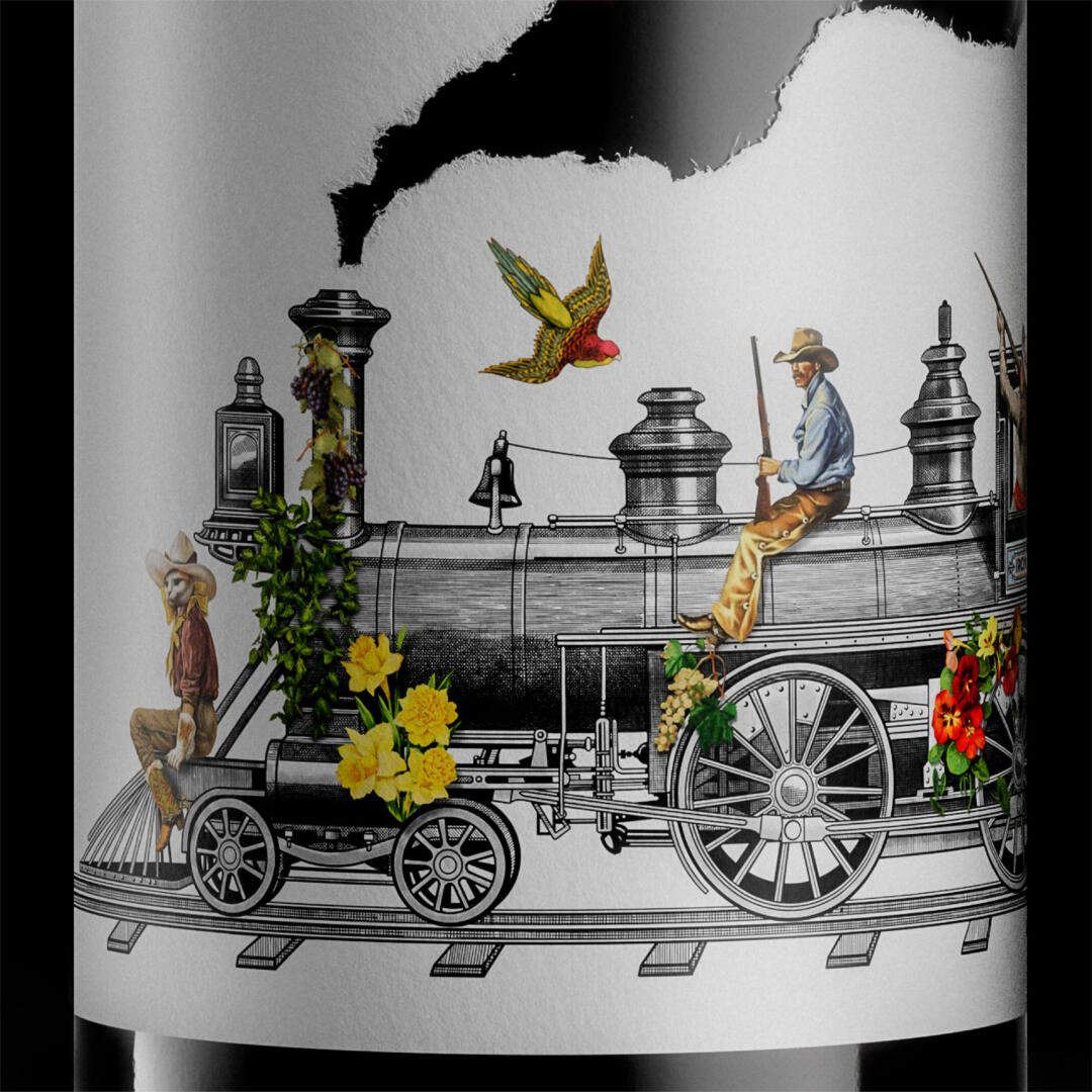
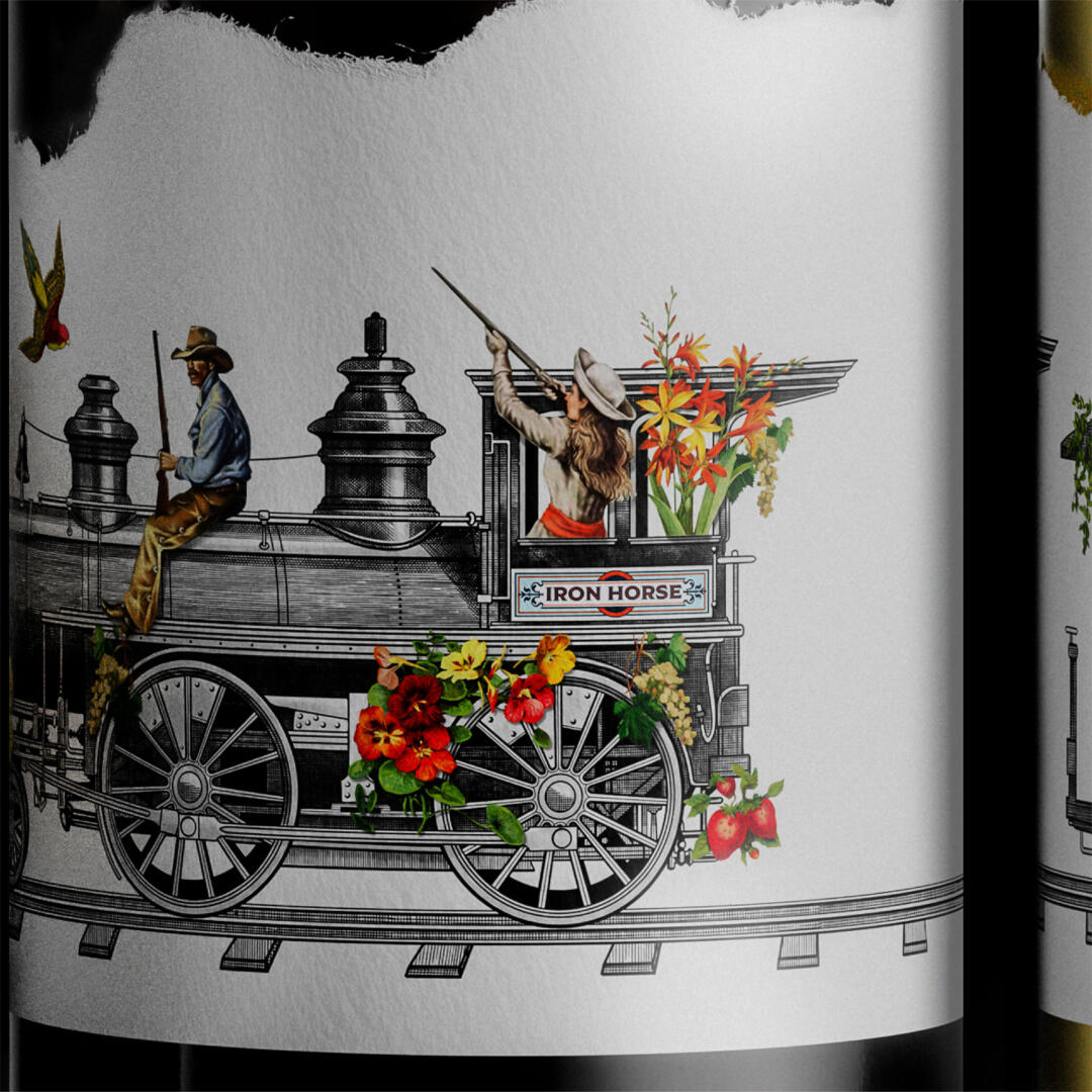
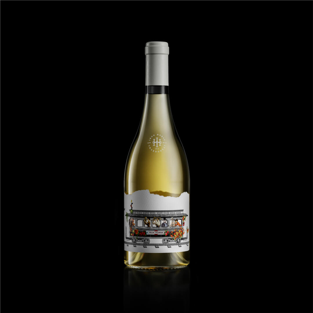
We named this collection of wines ‘Iron Horse’ to tell the story of the Estate’s past. The design describes the rich, complex flavours of the liquid and the generations of care that have gone into the land and the vines.
The Iron Horse project began with Brand Strategy and naming. We went on to create the brand identity, which combines equestrian inspired metal-work (the horse’s ‘bit’) with the forms found in railway engineering (the tracks).
We went on to create the packaging design executions of the Pinot Noir and the Chardonnay with beautiful illustrations created by the brilliantly talented artist Alex Machin.
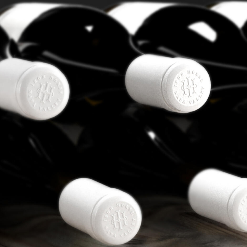
The tasting notes for the wine provided inspiration for the content of the illustration, with floral notes backed up by a lightly fruity and robust mouthfeel. The slightly smoky oak barrel flavours influenced the ripped edge of the heavy paper stock. The blind embossed closure resembles a Blacksmith’s
branding iron. It feels like this element could have been used to deboss the branding into the label on
the front of the bottle. It’s just one of the many details that add up to make the Iron Horse brand into a compelling story – drawing people in to try this extraordinarily captivating wine.