Simi Mama Birtoka is a small family business dedicated to selling high-quality organic products, including jams, juices, syrups, and chutneys. Their core values are family, nature, and health.
Since the target audience is primarily families with children, I envisioned a friendly and playful identity for the business, steering away from a more elegant and clean design.
The packaging design was guided by the following principles:
- Simplicity and cleanliness.
- Use of natural paper materials to reflect the organic nature of their products.
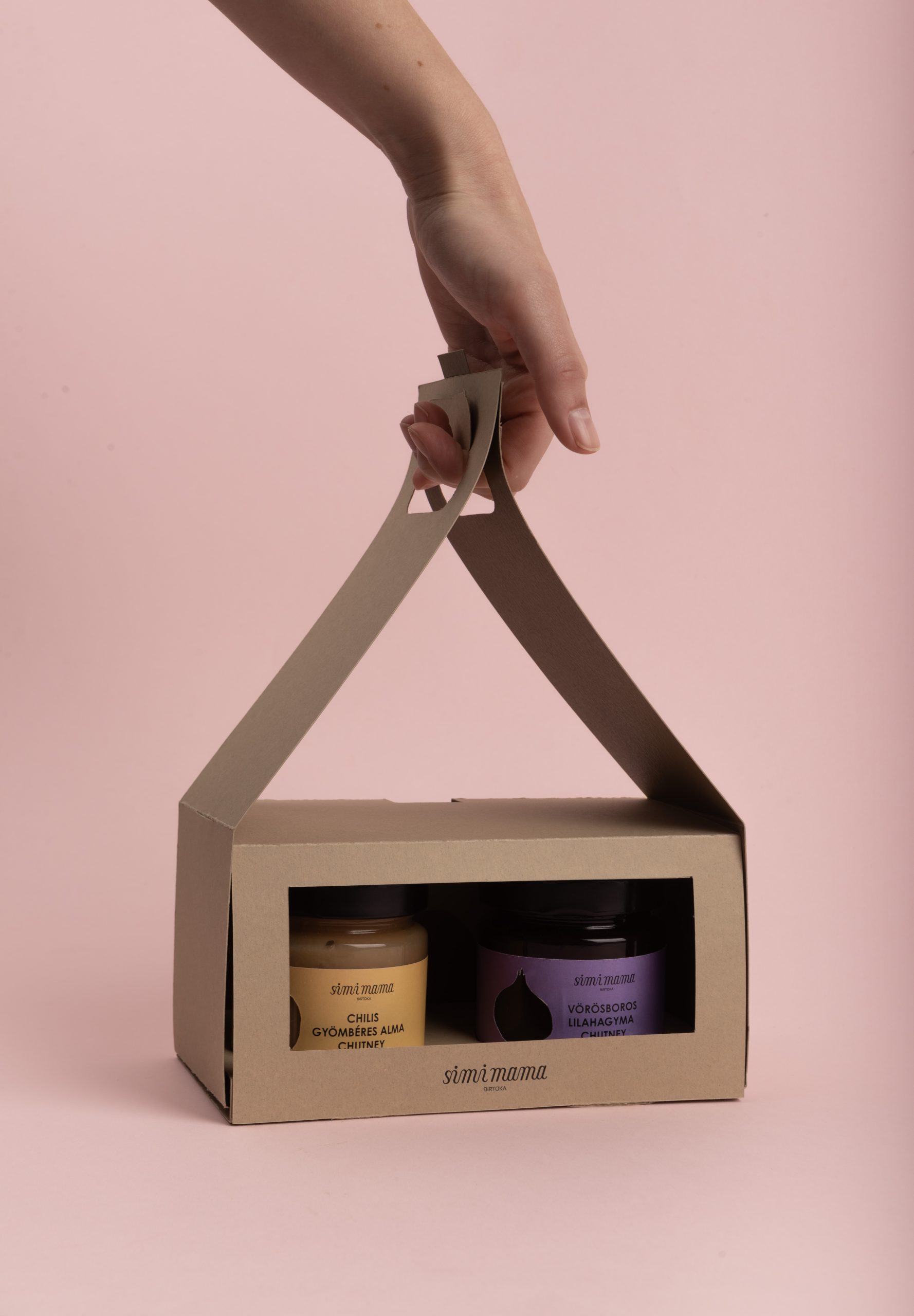
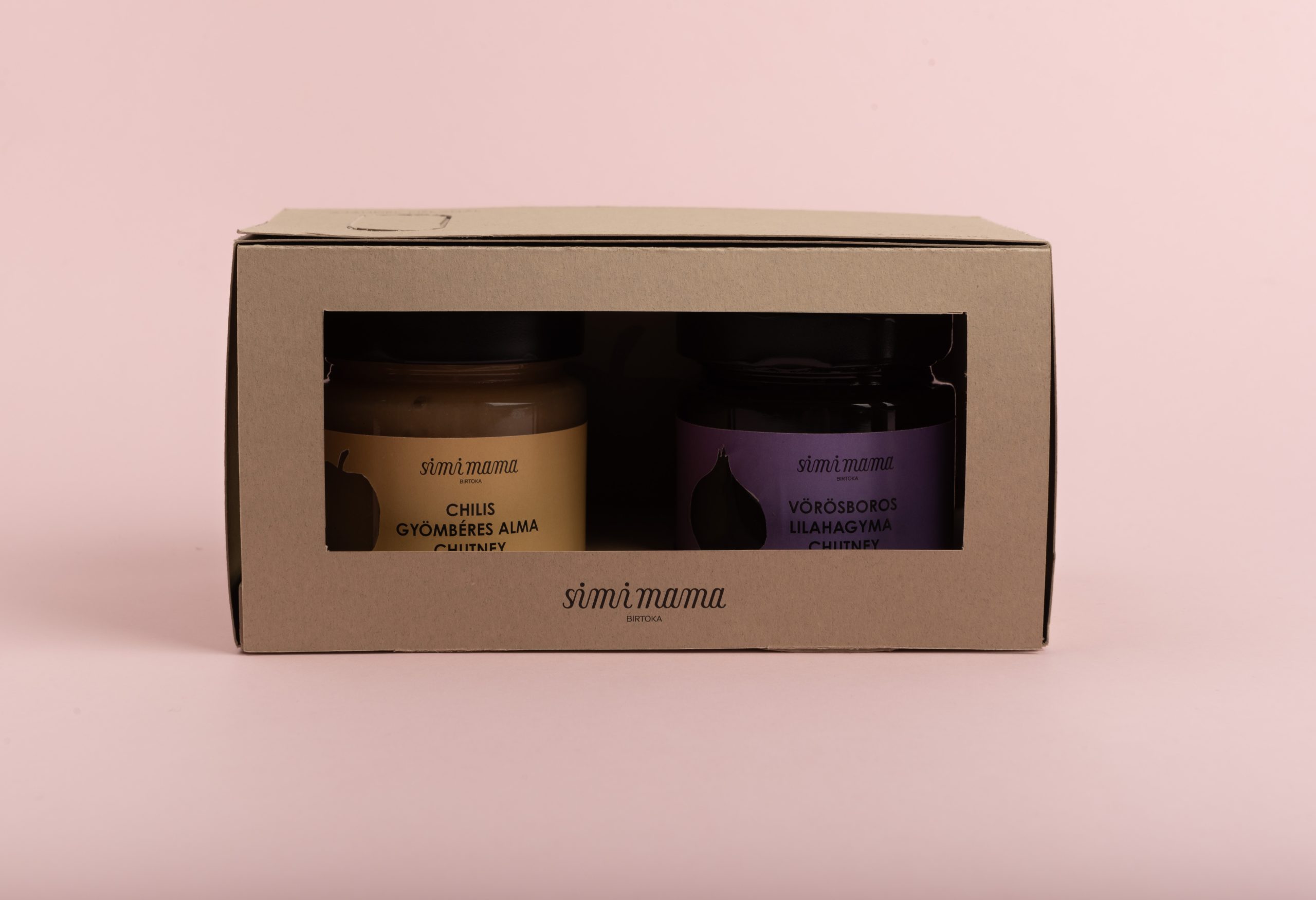
- Transparency to allow visibility of the products within.
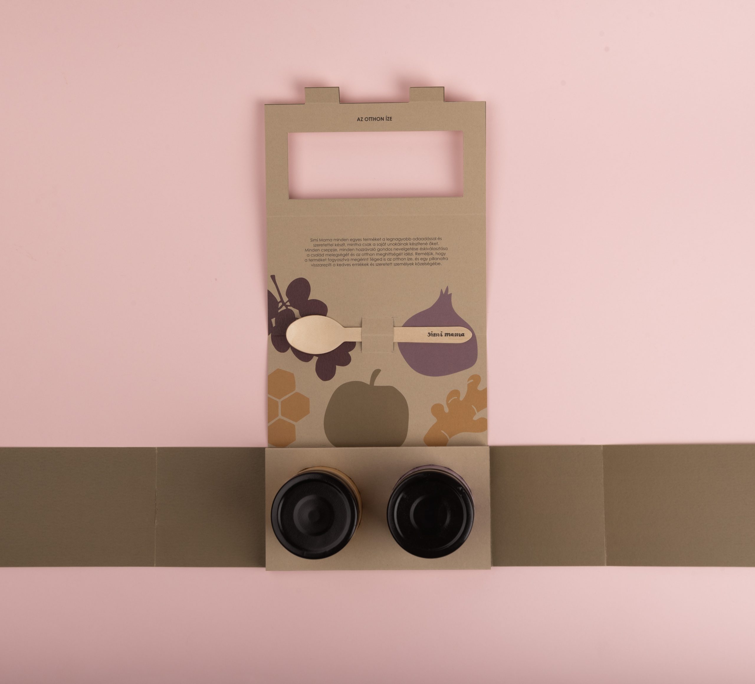
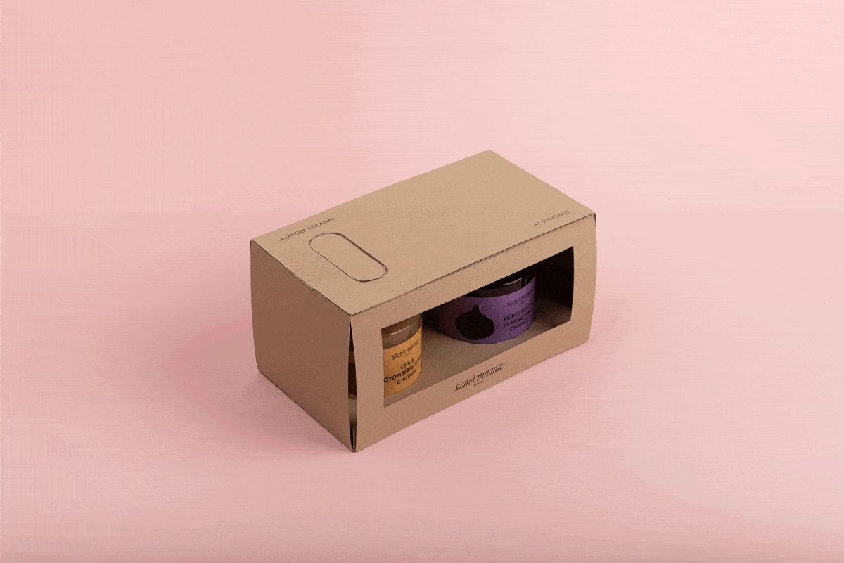
- Easy transportability with stackable boxes and carrying handles.
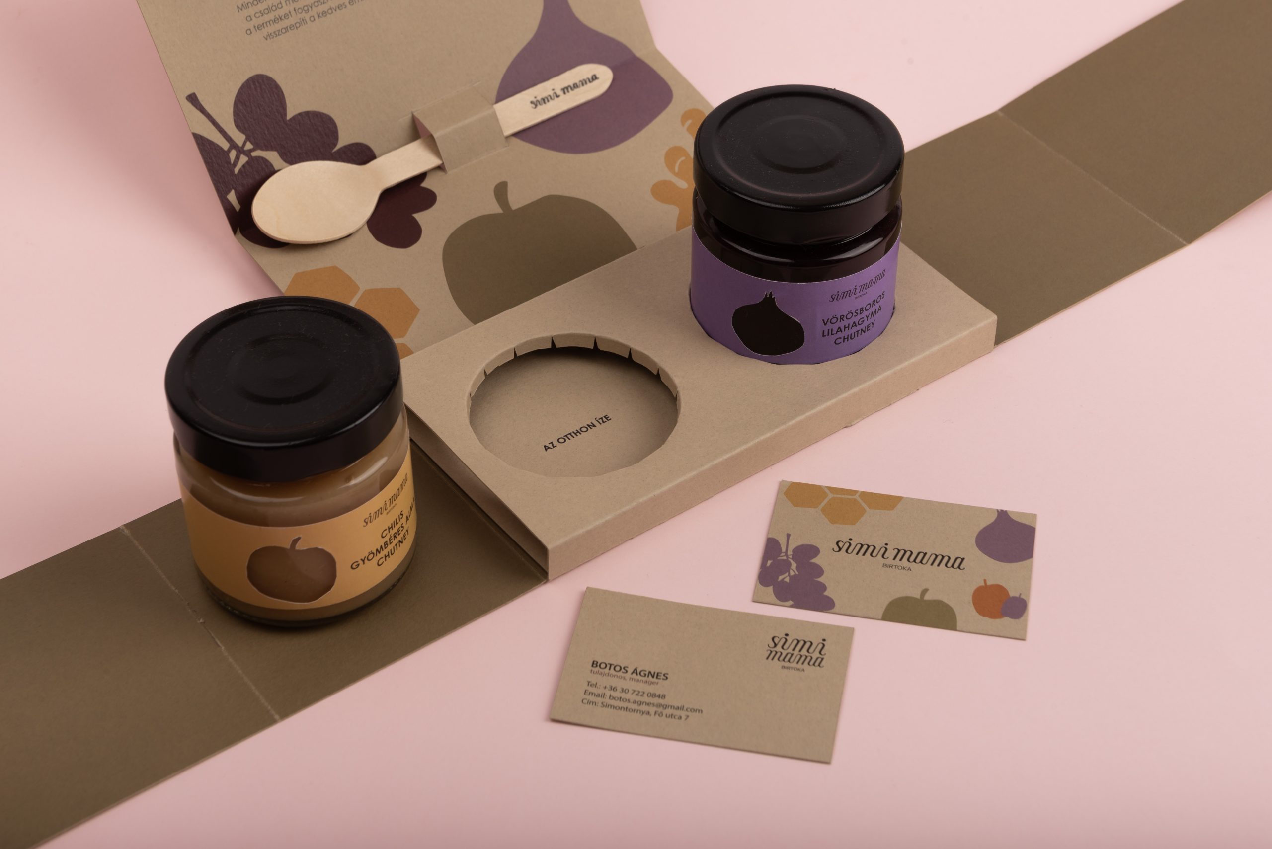
- Inclusion of a small gift: a spoon branded with the Simi Mama logo.
Given the weight of the chutneys, special attention was given to the load-bearing capacity of the handles. The handles support the products from the bottom, creating a roof-like structure, giving the appearance of a house shape, echoing their slogan: “The Taste of Home.” The inner sides of the handles are colored, adding depth and visual interest.
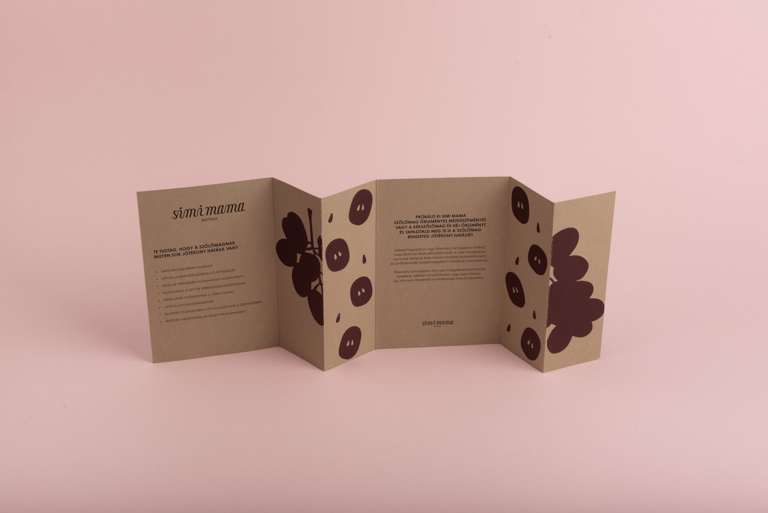
Upon opening the packaging, customers are greeted with a welcome message and illustrations of the key ingredients used in their products. The “Taste of Home” slogan is also prominently displayed, reinforcing the brand message as customers remove each item.
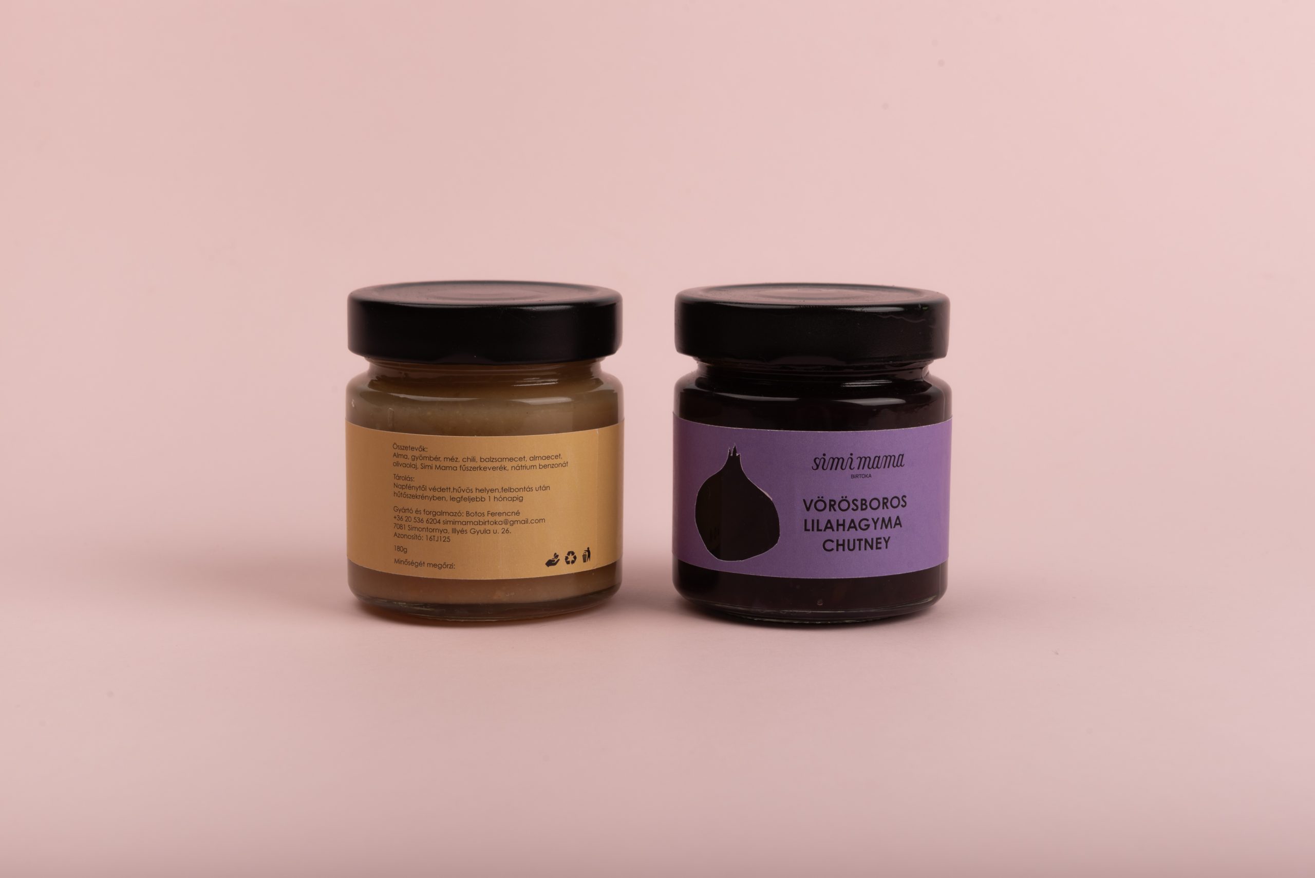
For the product labels, I aimed for a clean yet friendly look, using colors that reflect the characteristics of each product. Emphasizing the contents of the jars was crucial, so the label height does not obscure the product inside. Additionally, I incorporated a peek-through window shaped like the primary ingredient, offering a direct view of the product.