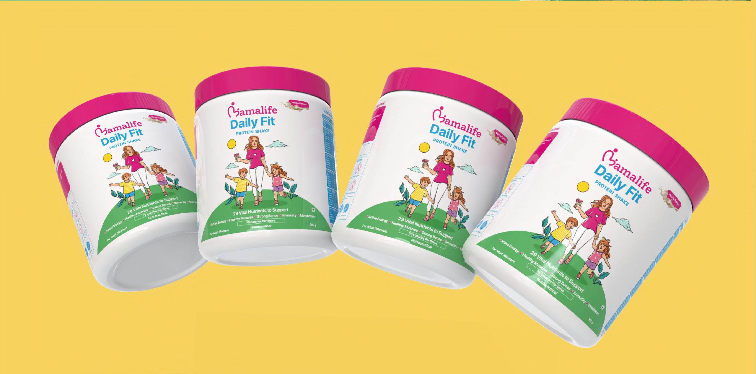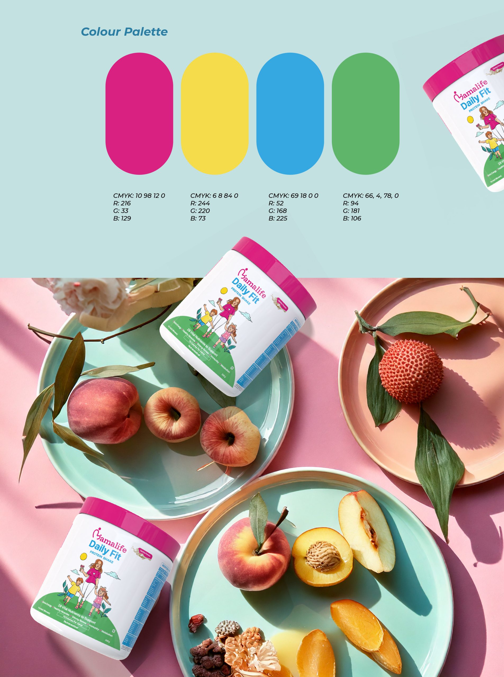
We crafted a packaging design that seamlessly blends warmth, energy, and the essence of motherhood. The goal was to create an engaging visual identity that resonates with mothers who prioritize health and wellness while nurturing their families.
Illustration concept:
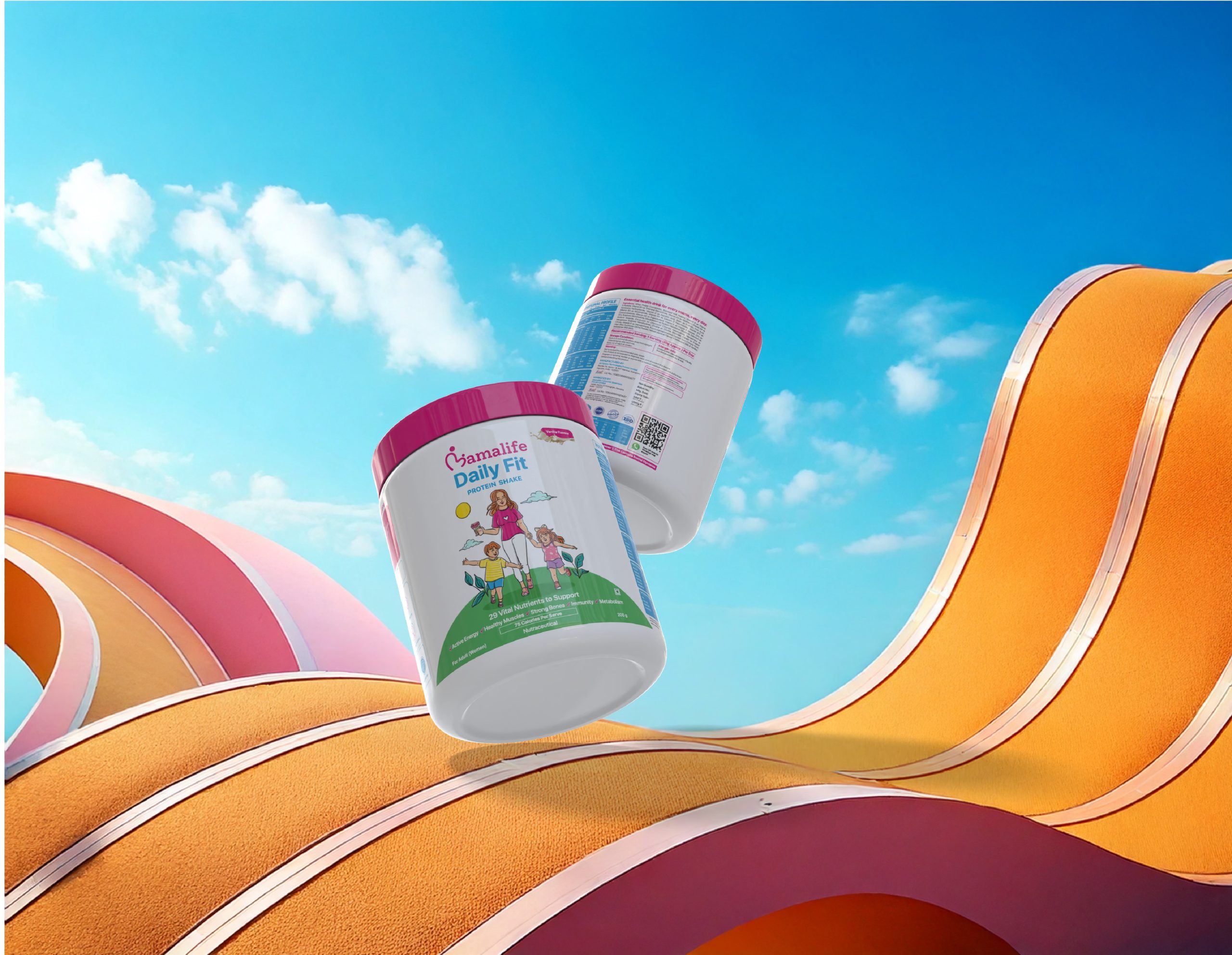
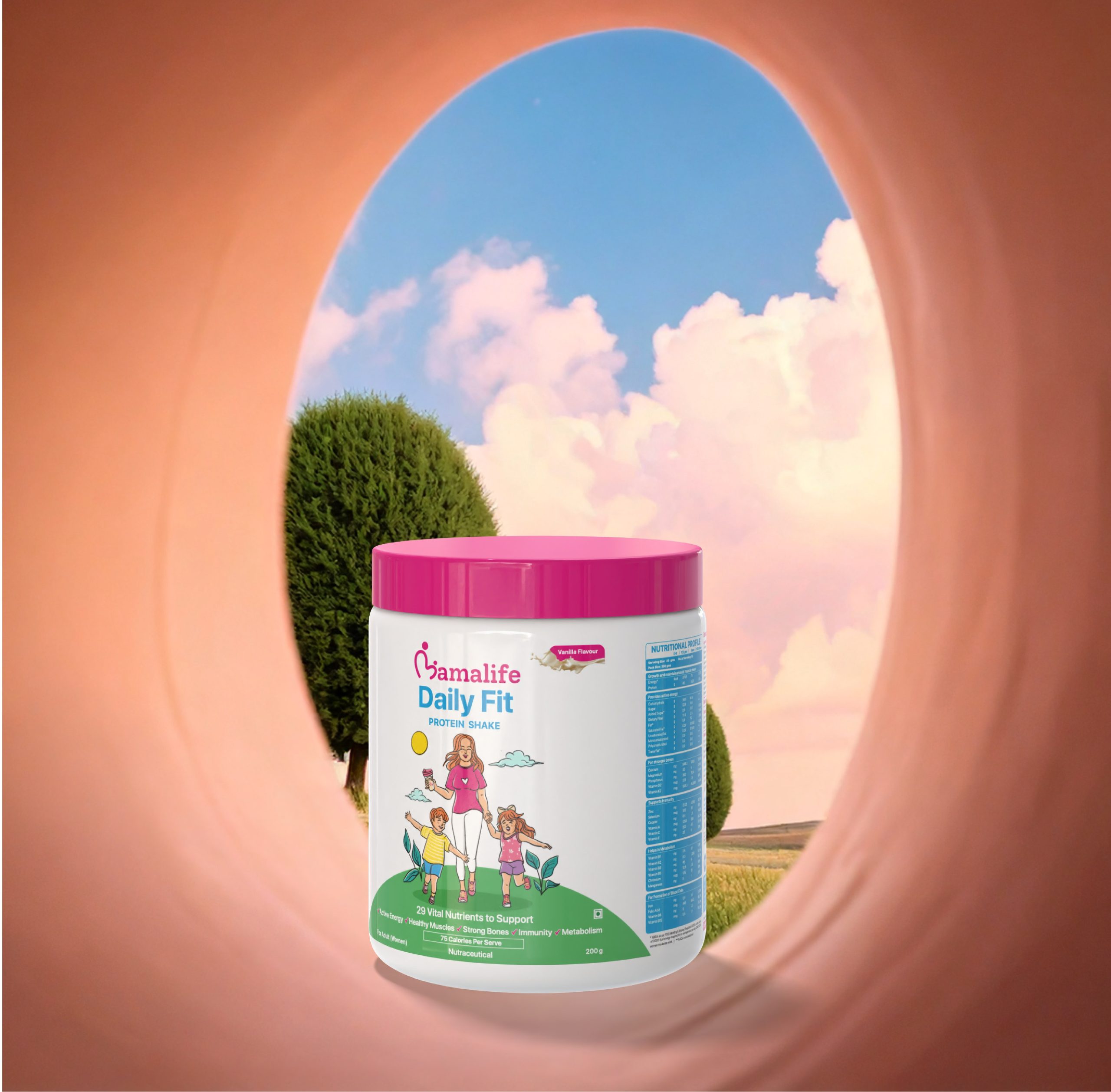
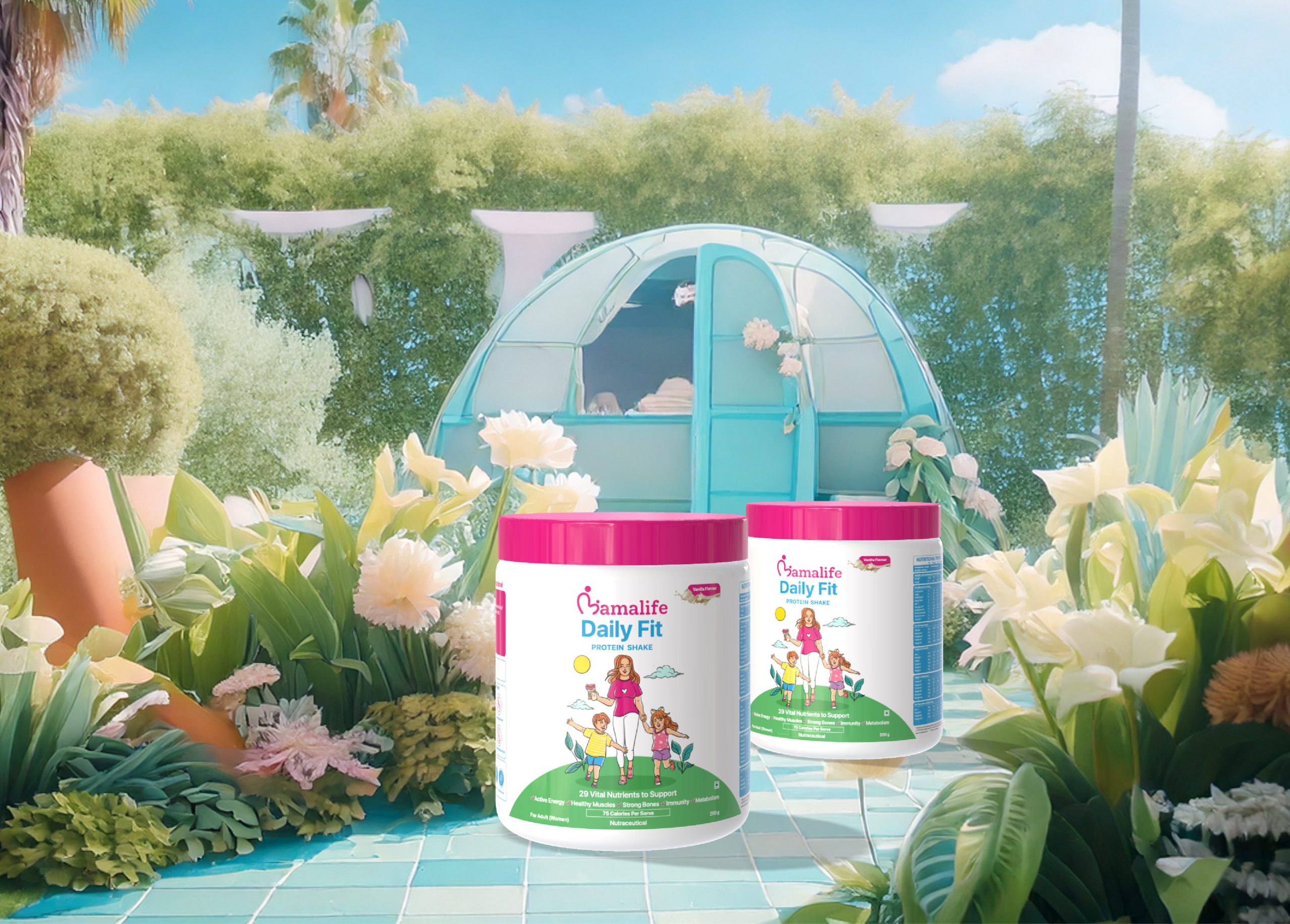
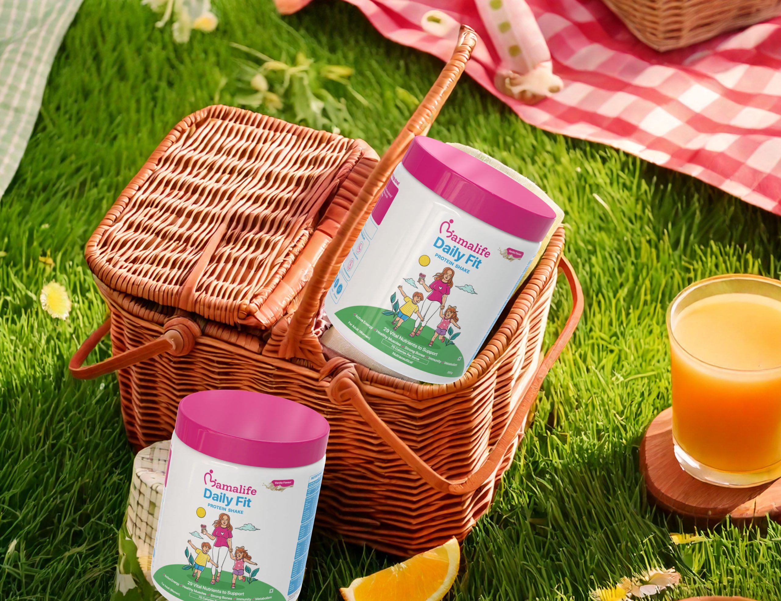
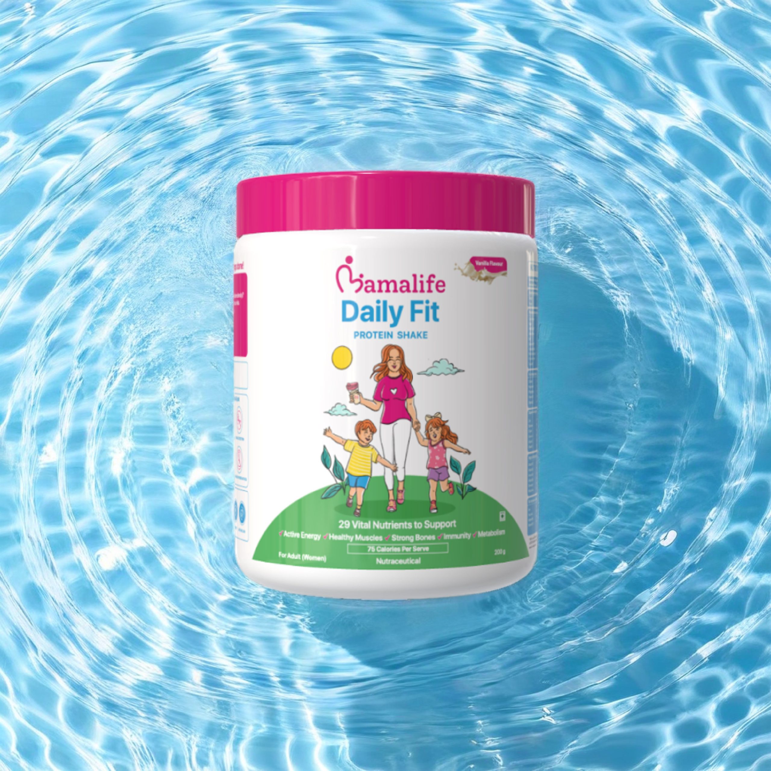
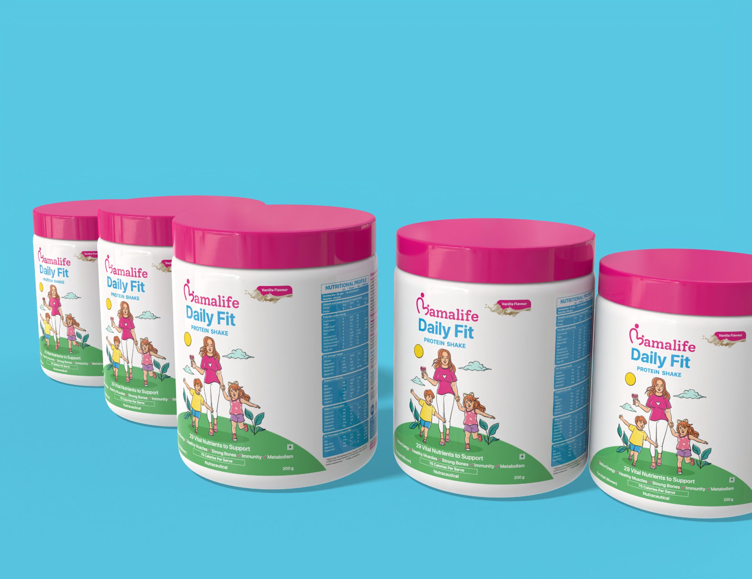
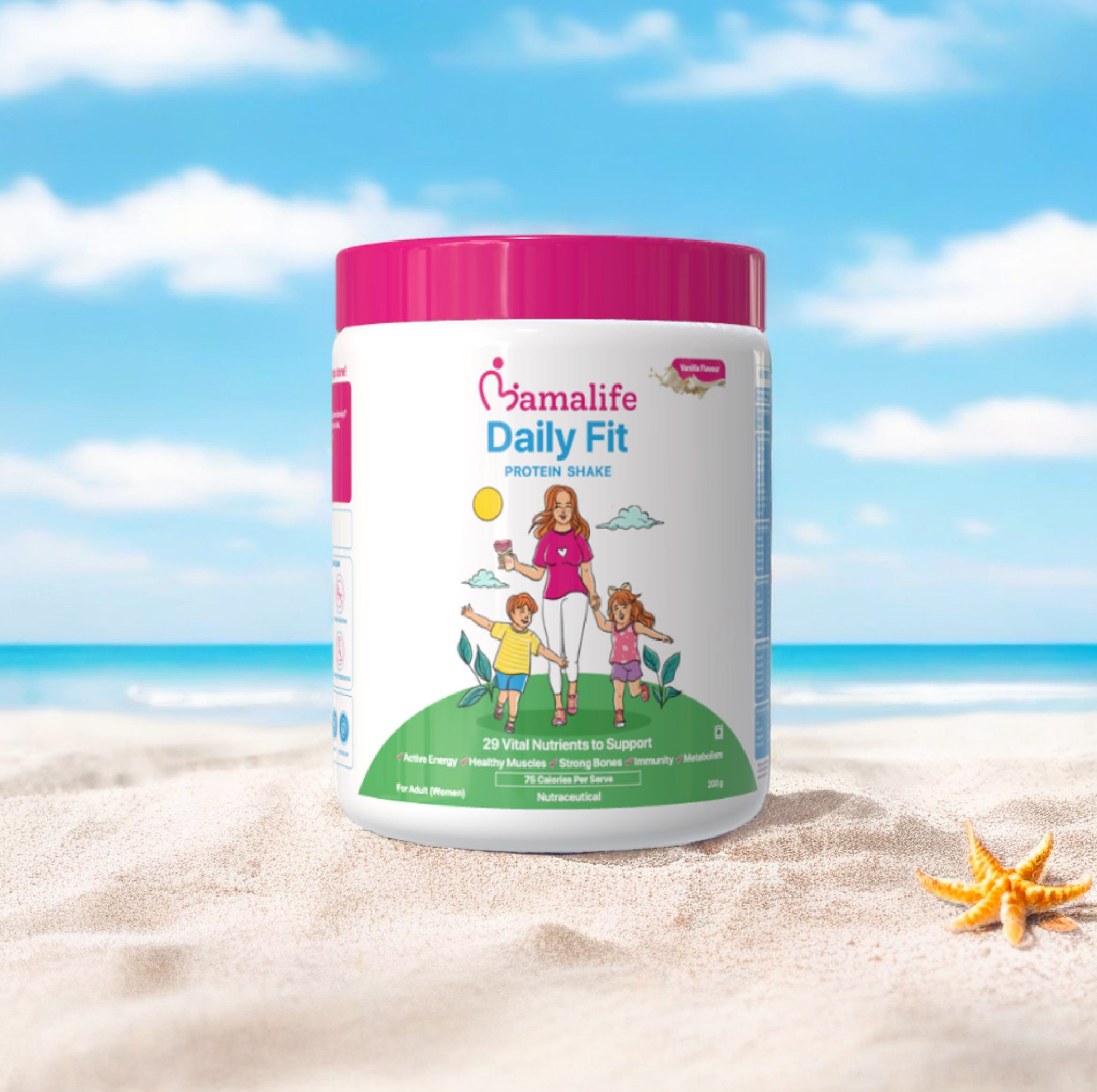
The packaging features a dynamic raster illustration that captures a heartfelt moment- a mother enjoying playtime with her two kids. The scene embodies vitality and an active lifestyle, aligning perfectly with the product’s core message of daily nutrition and family well-being.
Design Approach
Brand Alignment: The illustration was carefully designed to reflect Mamalife’s brand colors and aesthetics, ensuring visual consistency across the product range.
Emotional Connection: By portraying a relatable and aspirational family moment, the design fosters an emotional bond with the target audience—mothers seeking wholesome nutrition for themselves and their children.
Dynamic Composition: The artwork incorporates movement and depth, making the packaging visually engaging and enhancing its appeal on retail shelves.
Outcome:
The final design successfully bridges function and emotion, creating an inviting and memorable identity for Mamalife Daily Fit Protein Shake. It stands out as more than just packaging—it tells a story of love, health, and active living, reinforcing the brand’s commitment to empowering mothers on their wellness journey.