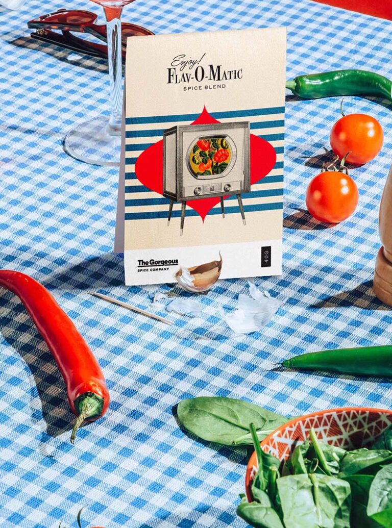
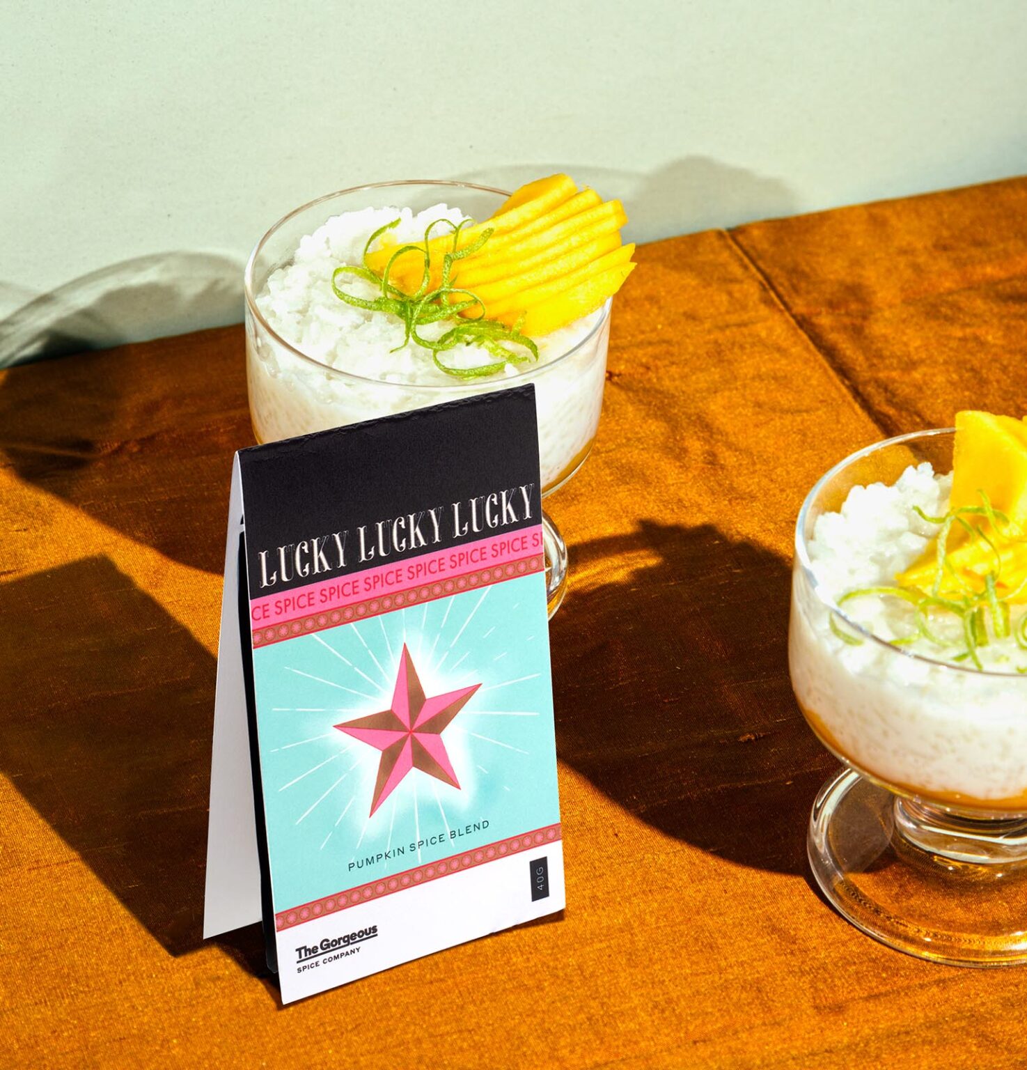
A longtime client with a deep background in advertising and creative strategy came to us for help building a subscription spice brand where every month’s signature blend would arrive with a narrative that was alive and tangible. It’s no fun for ongoing customers if there’s no surprise. Each blend would need to have its own clear identity, but still feel like it came from the same source, whether somebody picked it up in their mailbox or in one of the carefully curated regional retail outlets in which they can be found.
The Gorgeous identity — irreverent, flexible, deceptively chaotic — is rooted in a playful pastiche of pop cultural touchstones, from astrology through to tiki, from film noir to westerns. Think of Gorgeous as an adventurous record label, with a market of fans ready to trust in their offbeat choices, excited for each new release. The blends are packaged with recipes, kitchen playlists, and product recommendations. Despite the individual identity and typography for each blend, a subtle brand system emerges through cues such as a repetition of core colors.


