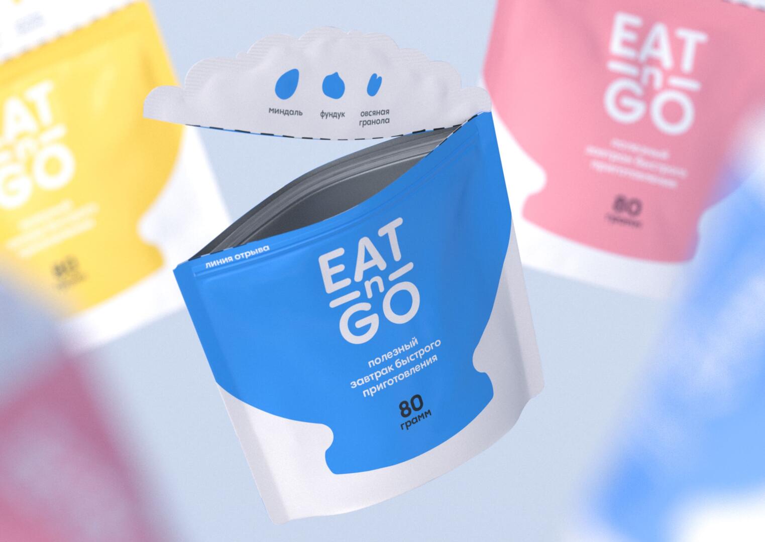
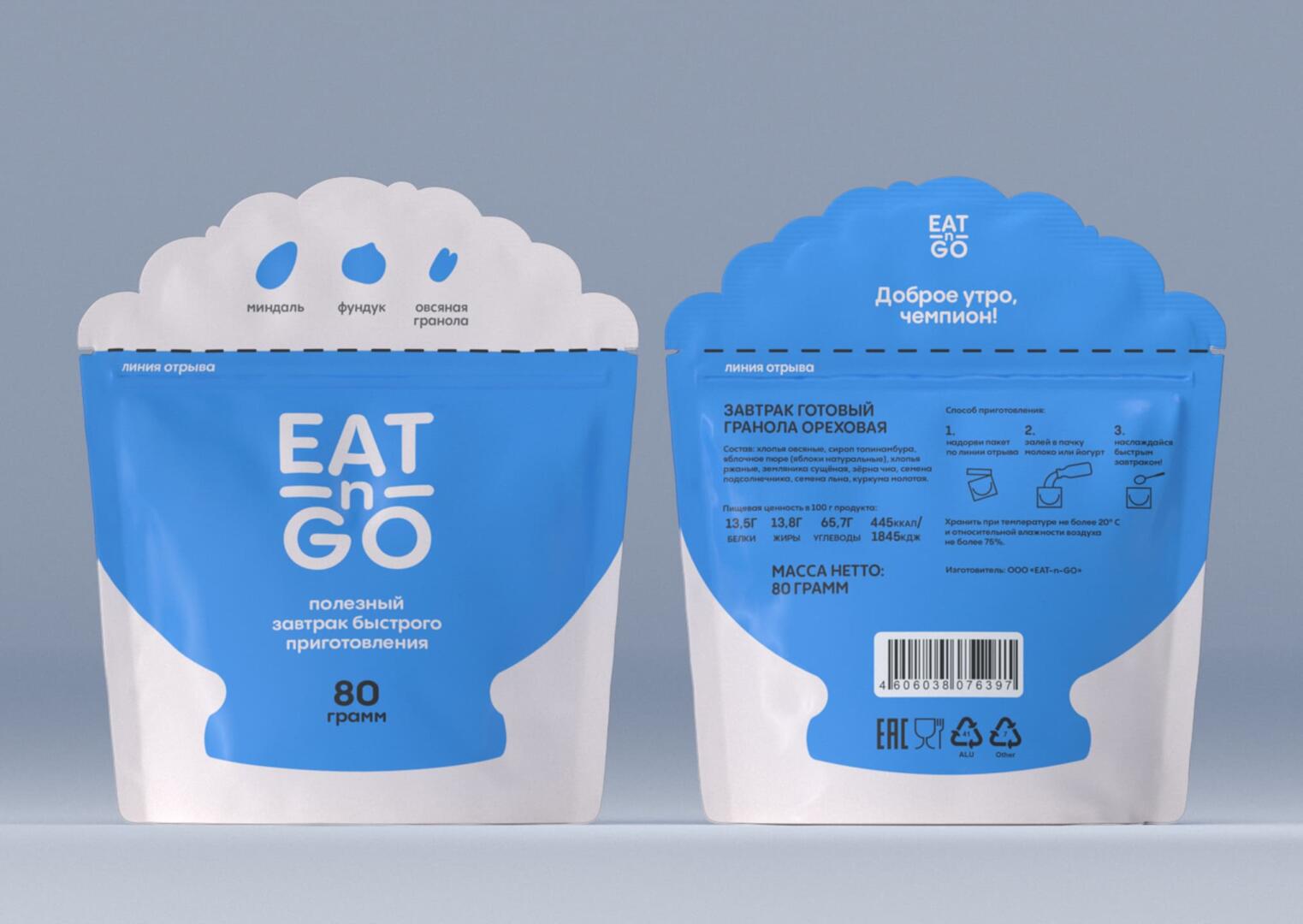
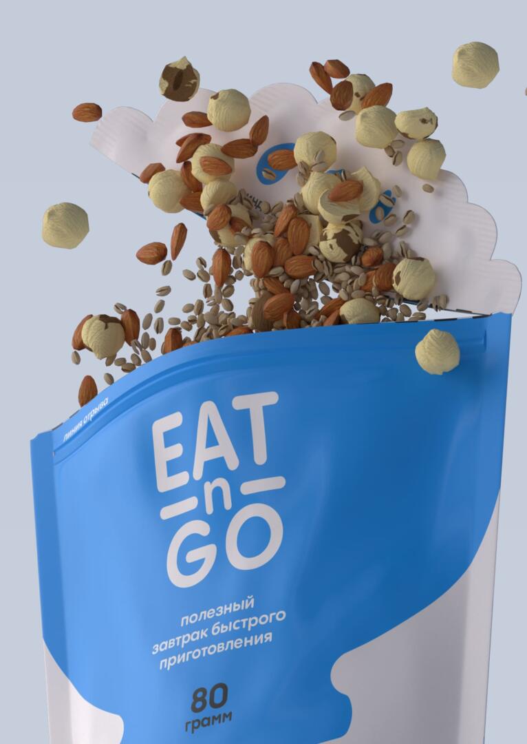
Eat-n-Go is a set of ready-to-serve portioned breakfasts, where the package could be used as a bowl. A pouch is designed for one portion of granola – 80g. That maintains the idea if there is no proper dish at hand a consumer could simply add some milk or yogurt to the opened package and enjoy a healthy breakfast.
As far as the idea was to show that a package could be a handy dish, so that the main design constant is a bowl. The naming perfectly represents the essence of a quick breakfast – eat and go. No doing dishes or cooking.
The packaging design is very clean and easy. To be more customer-friendly font types are rounded. It also provides a feeling of the product’s naturalness and fairness. The back side of the package repeats the constant of the front – a bowl, so it could be recognised on a market shelf no matter which side it stands to the customer. Due to its bright look, the package is very recognisable on a market shelf. The front side includes only useful information instead of distracting attention with a bunch of accents. It is important to mention, that package involves a person interacting in the first stage: after putting it in their hands it greets customers with its cheerful treatment on the package stub.
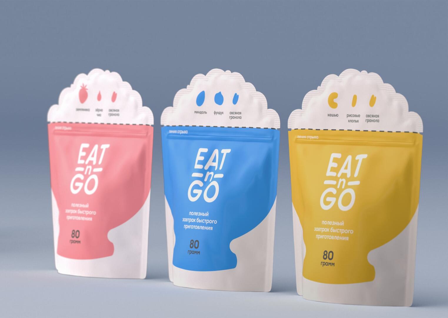
The pouch is provided with a ziplock to minimise the chance that the product wears off or gets wet. The set consists of three SKUs that differ from each other by their content. As far as the design is pretty minimalistic, the main difference occurs in a bowl by changing its color. There are also content descriptors on the package stub made as minimalistic pictograms and followed by short descriptions.