Bora means Best in Suaili, but for the refugee families and communities sponsored by Associação Lar, Bora! means an opportunity, a new hope for the future.
By integrating refugee families in villages facing depopulation problems, where they are provided land, knowledge and resources to work in agriculture, Associação Lar guarantees a better future for all involved. The chance at a new beginning for these families is also a rejuvenation for these communities.
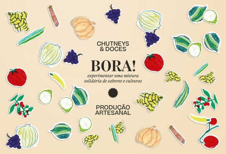
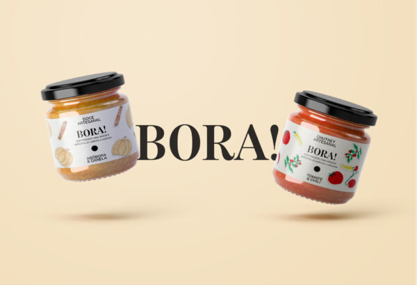
Bora! is the product, but above all the symbol, of this initiative: prepared with the products planted in the village, according to recipes from their countries of origin, each jar is decorated with fruits that were drawn by the children of these communities. The layouts are simple, elegant and direct, with nothing but the name, a small description and the ingredients. An understated baseline upon which the children’s drawings and imagination can run free. The drawings are colourful, happy and naive, typical of happy children who face tomorrow with optimism. Used as stickers to be applied manually and freely, each packaging is as unique and unpredictable as child’s play.
Therefore, Bora! — the name which the children themselves chose and that in portuguese can also mean “Let’s go!”— is written with an exclamation mark, thus becoming an optimistic call to action and to the creation of a better future.