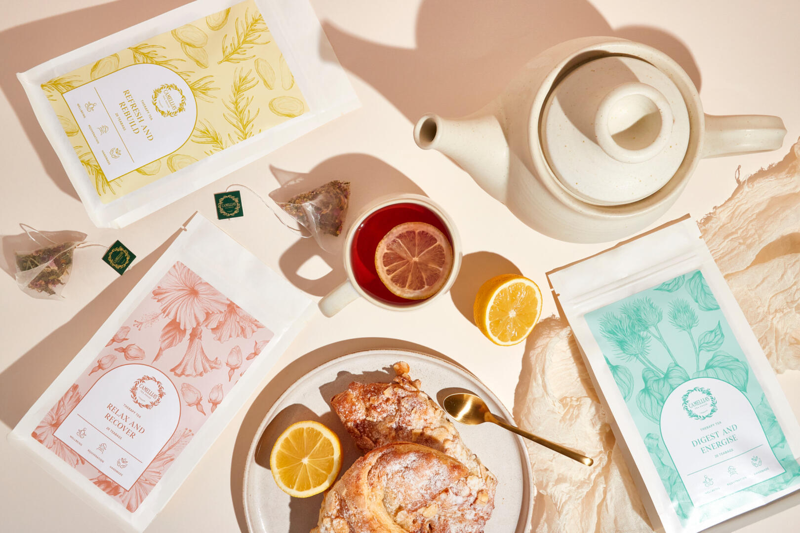
Camellia’s Tea House collaborates with some of the finest restaurants, hotels, spas and tea lovers worldwide. I worked with Co-founder Ajit and his team to refresh the established brand identity and create new packaging that reflects the brand’s vibrant and passionate nature. With a broad range of loose leaf teas and tea blends, they needed a packaging solution that was clear and flexible enough to work across their entire collection. The new eco-friendly pouches are bio-degradable and compostable. The colours of the labels represent the six tea types that they offer. For example, green is for green teas, blue for Oolong teas and red for fruit teas. The Therapy Tea blends feature hand-drawn illustrations of key ingredients on the labels to distinguish them from the loose teas. In addition, a collection of icons were created to communicate the various tea flavour notes, uses and origins.