HÉRIOSE – FRENCH WHISKY
Maison Boinaud approached us to create a new look in the spirits market, without breaking with tradition. This century-old cognac house is embarking on a new adventure: the creation of a French whisky distilled in Charentais stills.
Our concept: the French Twist. Shake up the heritage, mixing it to create an unexpected encounter. The French Twist is always simple yet daring in its associations, styles, shapes, and materials to convey the vision of tomorrow. The brand has fun with its own contrasts, openly embracing them: heritage & modernity, charm & conviviality, authenticity & audacity… The brand’s universe is a perfect balance of elements: unexpected, offbeat but always elegant.
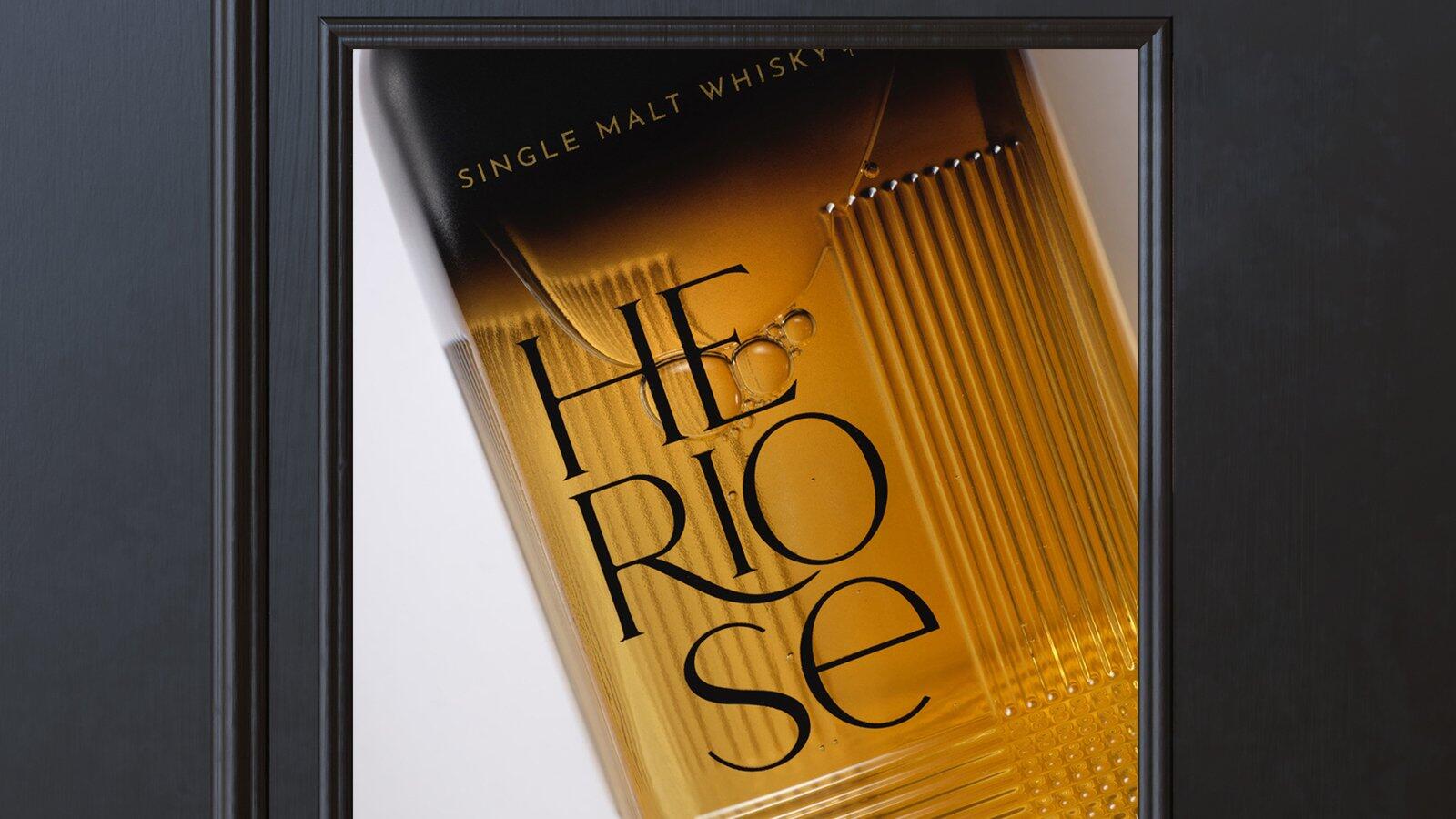
It needed a name and it was up to us to invent it: Hériose was born. One word, two challenges: to claim our heritage and dare (“oser” in French) to reinvent it.
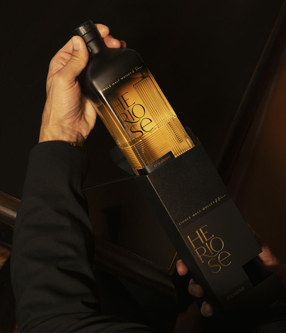
The bottle design is an essential part of the brand’s image and an important distinguishing feature to continue this mix of genres. With a square base and rounded shoulders, the Hériose bottle has character. Daring to mix two styles, two eras, to reinvent French glassmaking classics.
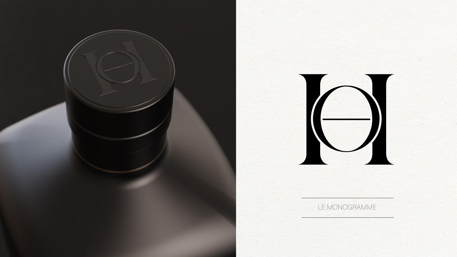
The Hériose logo was intended to express its differences loud and clear. Reading over 3 lines, it mixes several typographies and occupies considerable space, while remaining elegant. The iconography and brand identity focus on a mix of materials, textures and atmospheres to create the unexpected: Hériose has played the mix & match card.