THE CLIENT
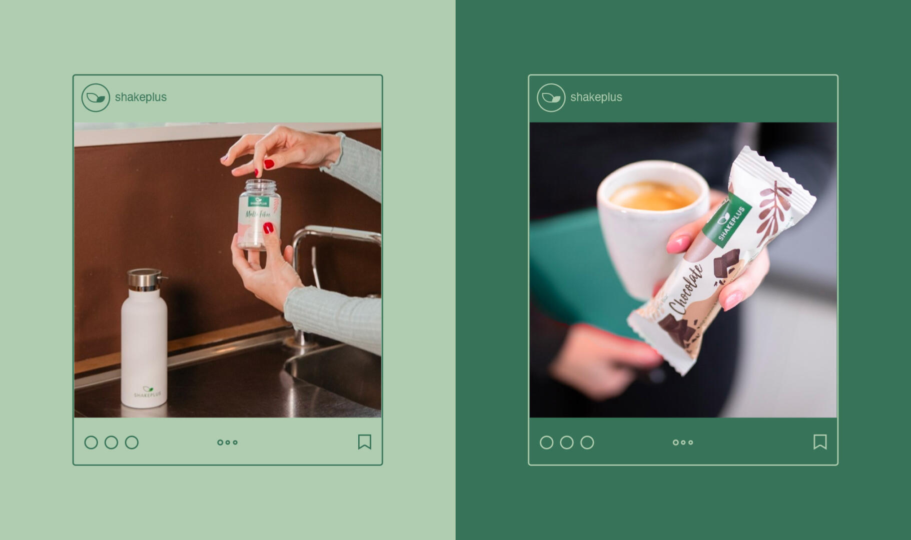
ShakePlus is a natural dietary supplement company based in the Netherlands. They use natural products such as strawberries, cocoa, and coffee. ShakePlus helps control and lose weight without harming your health.
THE KEYWORDS
Classic / Strong / Natural / Comprehensive
THE SOLUTION
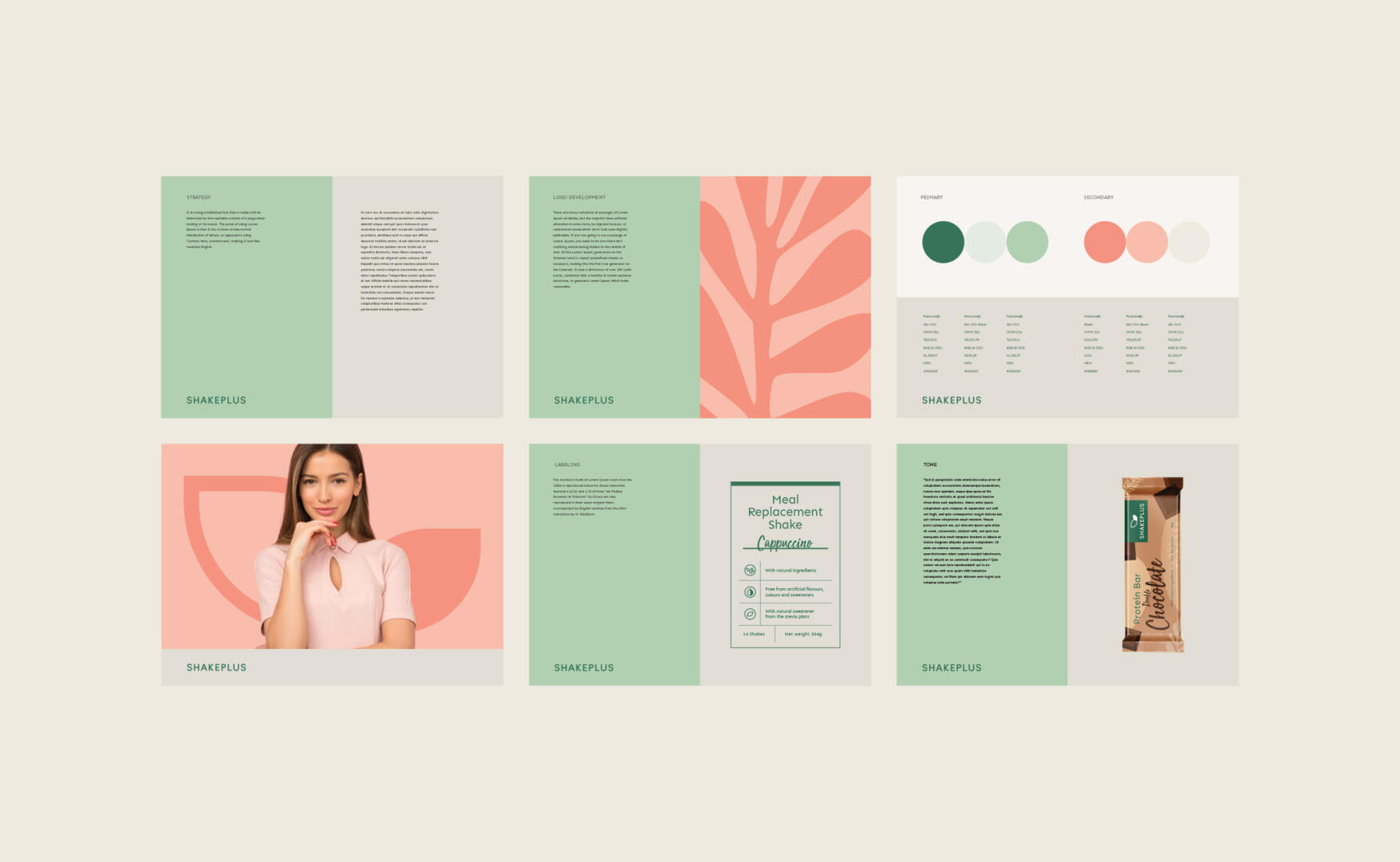
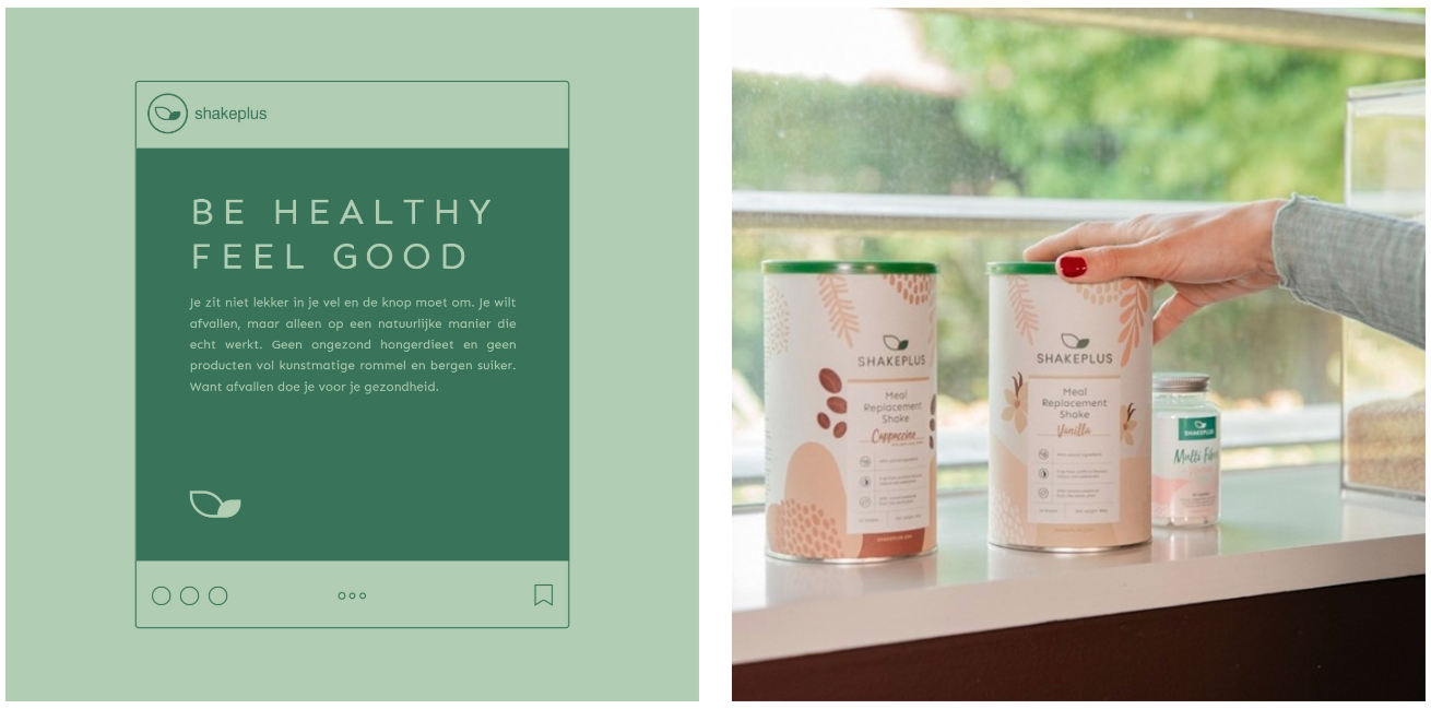
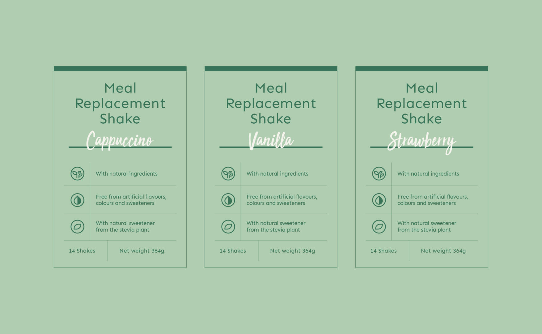
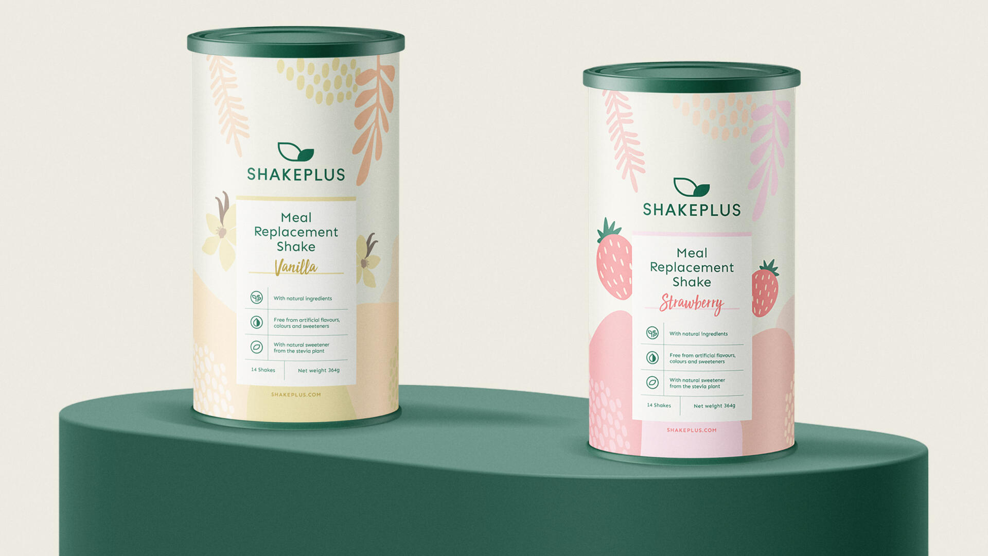
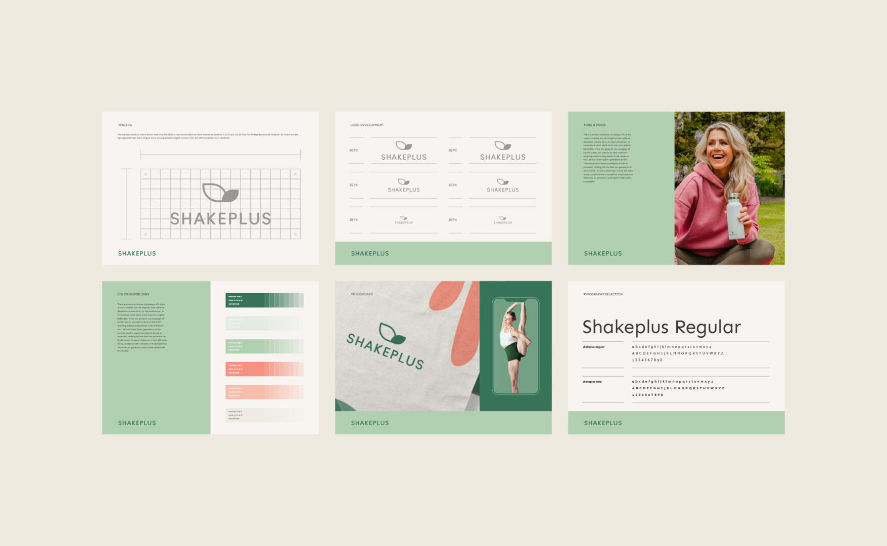
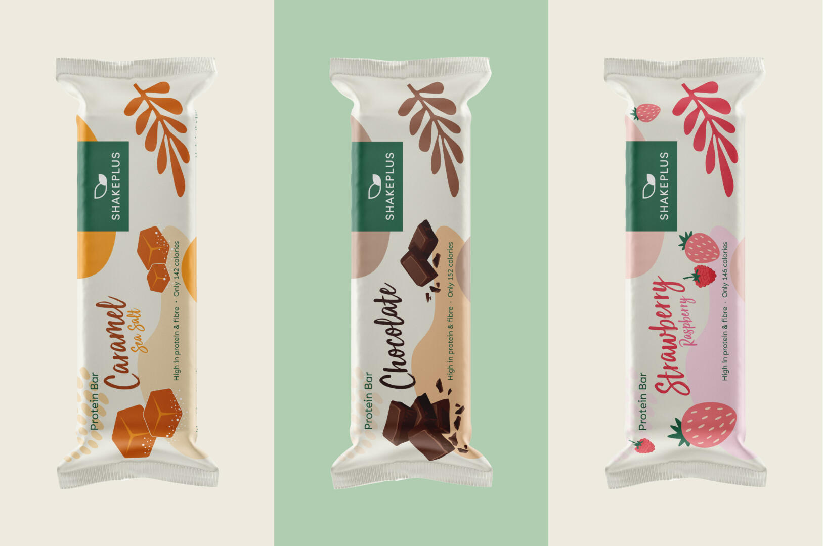
It was decided to use a classic font type for a timeless look and convenience. At the same time, to show the naturalness of the products, we created a color palette out of green and fruit-associated color shades. To be exact, we used the colors of the products and ingredients that the ShakePlus products are made of.
Especially for the different products’ aromas, we created different patterns that illustrate the content of the specific flavour. We applied it as a non-vibrant background and left the centre of the packaging white for the product name and its highlights.
For the packaging labels, we used a simple layout, including icons for better understanding. We used cursive font for the names of the flavours, to highlight them and draw the attention of the viewers.